Feedback on how to draw foliage for jungle/forests
-
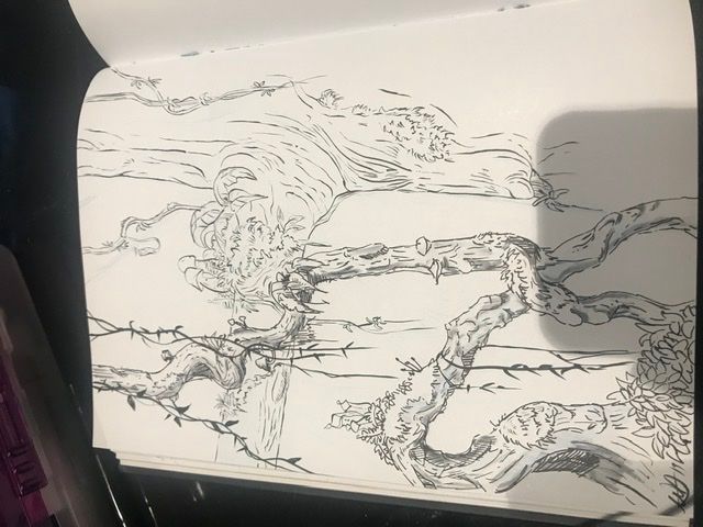
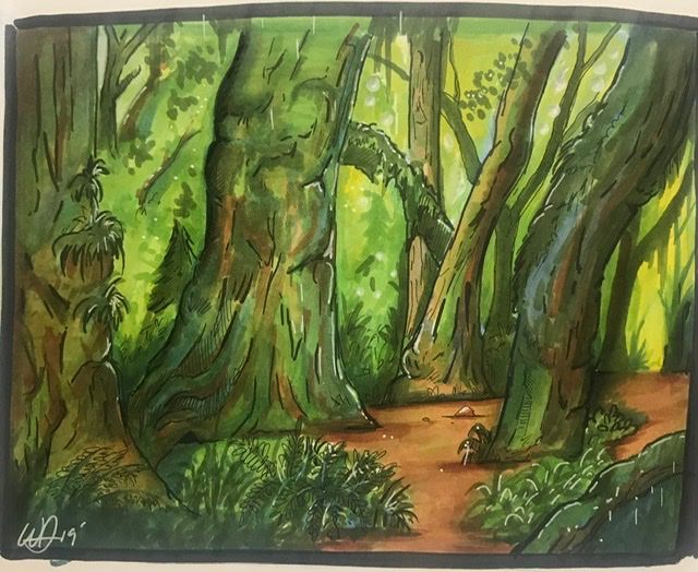
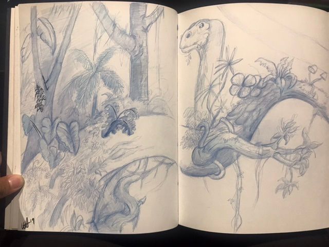
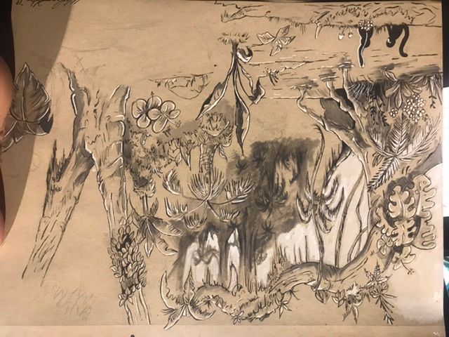
Hey everyone, just wondering if I could get some feedback and advice on drawing dense foliage in jungle and forest scenes. I feel like it’s hard to make not look clumsy and sloppy trying to get the diverse range of plants you see in some artworks. Here’s some of my sketches.
-
this vid is a bit long but may have some good bits of advice https://www.youtube.com/watch?v=3zD6Lz91eqI
I think your sketches are nice defo heading in a good direction.
-
@wharce I also think you are headed in the right direction. I think your colored piece stands out the best because you can play with the values and colors to break things apart.
-
@Phil-Cullen
This video is amazing! I’ve been looking for a class/ tutorial like this. I’ve always wanted to know the name of the guy who did the environment art for lilo and stitch and Tarzan thanks a lot! -
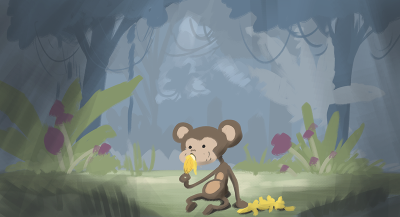
Specifically with trees, and environments in general, I think the best way to go about is to build the implication of detail. We artists have a really bad habit of over illustrating, where we're painting every leaf.
What I've been trying to learn this last year is to pull WAY back and over simplify things to imply the general idea of something. With forests, what I've been finding is that setting a color tone and then making variations in a really tight value range (the difference between the leafy areas, the open space and the trunks is like 2% darker). People are really good at interpreting what a forest is, so the less direct visual queues you give non-artistic people, the quicker their imagination can just ignore the background and they'll fill in the details on their own so they can focus on the main subject matter. End the end, we don't want their attention on the background at all. We just need them to immediately recognize it's a jungle for example.
-
I just put this together in the last 10 minutes or so to give you an idea of what I was referring to (reading back my comment I'm not sure I made sense on the value piece). Basically I was looking to imply jungle with things you might associate those shapes with - palm fronds, vines, some basic leaf shapes. If you go into a photo editor you'll see the value ranges in there are ridiculously small, but our eyes are super good at interpreting value contrast.
Then you only really spend your time on the foreground elements because the background should just fade away to focus in on what you want to show someone.
It's kind of like how if you look at the sky, you're thinking "clouds are white, sky is blue" but if you take a picture of it and pulled it into Photoshop, the actual color/value difference of the sky and clouds is far closer than we initially think it is.
-
@wharce Awesome hope it helps, its long but some good info in there
-
@Phil-Cullen Dude - this video is really great. thanks for sharing!
-
@Phil-Cullen Cool video. The first 20 minutes is a class on it's own talking about layering in perspective. Thanks for the tip.
-
@Judy-Elizabeth-Wilson @ChloeB-artistry no probs happy to share resources
