Beauty & the Beast feedback wanted!
-
Hi everyone,
I hope everyone is doing okay!
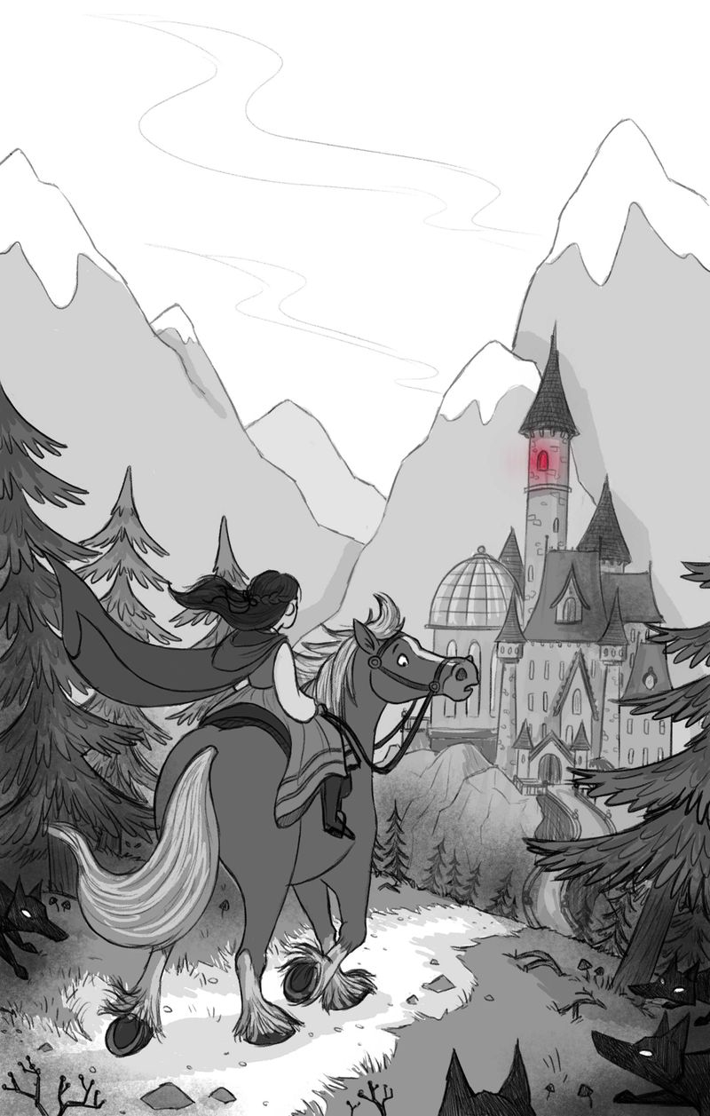
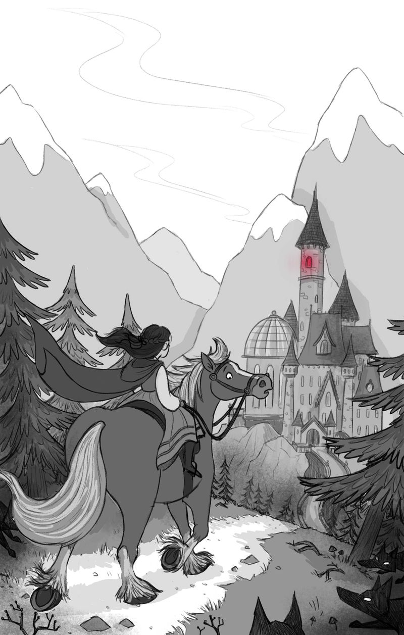
I need a good constructive critique on from you all on my Beauty and the Beast rough. I was approached by The Bright Agency a couple of weeks ago and they said they were interested in representing me (dream come true as that is the agency I've always wanted to be with) and they've asked to see a sample piece from a fairytale. They said they wanted to see how I approach backgrounds as I don't have any in my current portfolio, which I don't, so I really want to give this piece 110% as I really don't want them to tell me to come back to them in 6 months when I've improved or whatever.
Hopefully this has come at the right time as I was made redundant from my job 2 weeks ago so I've kind of been thrown into trying the whole freelance thing full time for the next few months to see how it goes. I wanted to wait a bit longer to take the plunge, but i guess things happen for a reason...so i really hope this works!I've just put some rough values on the piece for now, but I would love your opinions on the composition and the storytelling? Also, horses are THE WORST to draw, especially from the back, so does the shire horse look right to you?
Thanks everyone!
-
@hannahmccaffery OMG girl, I'm so jealous!! Bright was my dream agency for such a long time! Now I'm happy at Astound of course, but daaaang Bright has got some quality artists. Great going!
Okay so for the piece! Very nice work so far, there's so much to love! If I could suggest something however, I think this looks a bit cramped. Not sure if the vertical format is best for this. I'd have a tendency to add some space horizontally and push the castle to the right, space things out so they don't overlap. That would also allow you to tell a story from left to right that follows the reader's eye: first to the left the wolves (they're very subtle now, if you have more space you can make them more prominent and more threatening), then the eye falls on Belle and her horse, then the eye falls on her destination, the castle, and that glowing window. See what I mean?
Next, the castle. I'm not sure about your perspective here. The door to the castle seems angled to the right. The middle part of the castle is facing us directly, and the tower with the red windo seems to be facing left. It gives a feeling of pieces not belonging to the same whole. If you do push the castle to the right to space things out, then I'd angle the whole castle, not just the red window, towards the left.
Lastly, you're doing a really great job with atmospheric perspective here especially with the mountains and pine trees. There's a great gradation of values there that gives a nice depth to the image. However, the middle level with the castle and the front level with Belle and horse are very similar in value. I think the level closest to us need to be darker to be consistent with your atmospheric perspective. It would also make the characters stand out more! Some good opportunities for big contrasts there.
I hope that helps! Again, congrats and I hope you get it!!
-
@hannahmccaffery I love this. I think your horse has such great character and reads as the focal point (hopefully that was the intention). It feels like it may need a crop though. I first viewed the illustration in the post and it had such great impact and flow, but I realized the top was cut off in my screen view. Once I clicked on it and viewed it in full, it felt like there was too much negative space toward the top of the illustration and it really detracted from the characters. Otherwise, it looks incredible! Congratulations!
-
@hannahmccaffery It is really beautiful Hannah, great work of backround, I would also suggest to move the castle right, so taht it desn't overlap with the horse. I like the wolfs style.
-
@NessIllustration I feel quite out of my depth with Bright to be honest, but it's worth a shot anyway!
Thank you so much for your brilliant feedback and I totally agree with everything you've suggested, it's weird how you can't see it yourself until someone else points it out isnt't it?
I'm definitely going to add some space horizontally and space everything out and really emphasise those wolves. Gahh you're right about the castle too, I seem to do this with buildings (they're my weakness) I muddle up the angles etc so it looks odd, so i'll rework that too thank you for pointing it out! I'll work on the values too, something else I'm not overly confident with! Thanks again")
@Erin-Cortese thank god the horse reads as a horse haha! Ahh okay, you could be right actually, it does look a bit better with the sky cropped off a bit. I wanted to mountains to show the scale of the environment etc, but it does seem to distract away from the characters, so i'll work on that thank you
@MichaelaH Thank you! Yes you're right, now that you've said that it's really bugging me that I've overlapped the castle with the horse!!
-
Really love your drawings, and beautiful background. So inspiring, makes me want to tacle with the classic fairy tales too.
Somehow the composition is not optimal to me. I think maybe it is because the castel and the character on the horse are roughly the same size, and they both want my attention equally. I kind of get a sense that she is entering an unknown and a bit scary situation (especially with all the dark wolves around). But on the other hand her posture communicates that she is confident, almost like a worrior. I am a bit uncertain about her emotion in this piece.Just a quick thought, I would make the character much much smaller if I want to show her being a bit scared, and entering an unkown world. And I would make the castel smaller, and maybe try a few more postures for the character if I want to show her being heroic and brave.
-
@xin-li Thanks so much for your great feedback! I see what you mean about her posture, I need to decide what her emotion is, I think it should be scared so I'll work on changing her posture to reflect that
That's a good idea about making her smaller thank you!
I'm not sure what to do about the castle, it was my intention to show a bit of detail on it to make it seem ominous and abandoned etc, but maybe you're right and it is too big and it doesn't need to be the centre of attention! -
@hannahmccaffery I think it can stay big and intimidating if you want to show the character is scared. Then this should give you plenty of oppotunity to design ominous and abandoned castel with details.
-
That's awesome news Bright seems like a fantastic agency to be represented by.
The piece is looking great, one thing I would say is the castle maybe seems too big. It's almost got the same mass as your characters, I would shrink the castle this might help add depth. Another thing that could help with depth is to lighten the values of the castle and mountains gradually so the furthest mountain is barely visible, this might give you some atmospheric perspective, like there is mist or fog obscurring the mountains.
There seems to be a lot of negative space at the top, is that for text. The piece might look better landscape as was mentioned you could pull the castle further right to add distance between the characters. Love the expression on the horse and the wolves, nice work.
Good luck with Bright, hope it goes well.
-
My first impression when I saw the piece was that it looks really stunning and I can understand why someone wants to represent you. I would just say tighten up your story kind of along the same lines as what @xin-li was talking about. I like the wolves and I like the expression on the horses face but together I don't think that they are telling a clear story. The wolves look threatening and they are so close that with one little leap they'd all be on top of the horse. The horse should be terrified, running at this point, but instead it looks curious mixed with a bit of concern. I also think Belle would be looking at the poiny teeth surrounding her. My first thought was to put the wolves in bushes with only eyes glowing but that would be hard at that angle. Anyway, It looks great and I think you've handled the environment well.
-
@Phil-Cullen Thank you, I hope it is too...if they take me on after this sample eek!
You're totally right, i've made the castle smaller and it looks sooo much better and adds more depth to the piece. I'm rubbish at the whole values thing, I tend to just go straight to colour but I'm trying to get into the habit of adding values as it is starting to help, so I've tried to do that with the mountains like you've said.
Thanks so much for your great feedback!
@Zachary-Drenski Thank you so much, that's really kind of you to say! Yes you're right, it seems odd that the horse isn't more scared considering the wolves are in plain sight. I've adjusted it now to make it look like the wolves are lurking in the darkness so it's implied for only the reader to notice them, but the horse can hear noises and rustling, which is maybe why he could look concerned? Thanks so much for your great feedback
-
@hannahmccaffery hi, Hannah! I’m so happy for you! With your work and skill level, you really desrve this.
I think your illustrattion is lovely. Though given that you want to show off your background skills in this piece, I feel like it would be better if you make a sprawling landscape with creepy looking trees, an eerie fog, wolves stalking Belle, and the castle looming in the distance. In my opinion, that would be a stronger scene. Also, perhaps you can spruce up your castle too. Make it more menacing looking, add more story to it. Afterall, it is as much as a character as Belle is for this scene. Perhaps show more hints of it’s former glory. Emphasize how it’s now in bad shape.
I hope this helps. Blow those agents off their socks!
 ️
️ -
Okie dokie, what do you all think?
I've spaced it all out a bit more and you're all right, it looks so much better to have some breathing room around the characters. I've also tried to change the posture of Belle so that she shows so emotion, god knows why I just had her sat on the horse so stiffly haha!
My idea for the wolves is that they're just lurking in the darkness so it's the noises that Belle and the horse hear, which is why they look more concerned than terrified, I hope that comes across to you all?
You were all right about making the castle smaller too, it adds so much more depth. YOU'RE ALL AWESOMEMy values are still a bit rubbish as I usually just go straight to colour, but i'm trying to get into the habit of doing the values stage now. The mountains will probably be very simple, just a nice textured brush or something, but I'll worry about those later as I'm still not 100% happy with them!
Anyways, let me know what you think! Thanks again everyone, you've all helped SO much!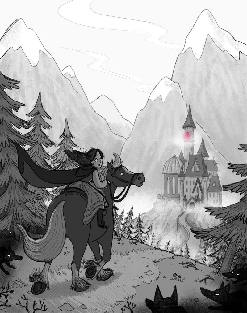
-
@Nyrryl-Cadiz Thank you so much, that's so nice of you to say
Thank you for your great feedback, I've tried making the illustration a bit wider but maybe you're right and it would work as a sprawling landscape! I definitely want to add more character to the castle, I want to make it look quite dark and in bad shape, which I'll hopefully be able to do when I come to colour it Maybe add some ivy over parts of it and statues etc! -
@hannahmccaffery sounds amazing! I’m excited to see your final piece. Whichever way you’ll choose, i’m sure it’s going to be gorgeous!
-
@hannahmccaffery Wow this is amazing, you have improved the piece so much already! Kudos!!
I think maybe I'd make the wolf in the middle bigger, it could put more emphasis on them and show that there are wolves closer and farther, surrounding her. There's a convenient empty spot there where you can afford to make wolf bigger
And then, the castle looks a lot better! But maybe the depth is a little bit too shallow, I think you can afford to make the sides look like they go further so it looks less flat. Do you know what I mean?This will be an amazing piece, Bright will be blown away!!
-
I drew over this; I hope you don't mind.
I tweaked the horse a little by lengthening and enlarging his rump a little and thinning his torso slightly. Also I added a girth strap to hold the saddle on. It's all nit-picky, and might require moving Belle and the horse forward, so it might not be worth the trouble to you. Here it is:
I drew horses obsessively for the first 10 years of my life, so I don't have the trouble with horses that a lot of non-horse-obsessed people (aka normal people, lol) do.
Beautiful work overall! Like I said, my critique is nit-picky and most people probably won't notice what I mentioned. Your lines and composition are all lovely. I can't wait to see the final. Congrats on the agent contacting you, too!
-
@TwiggyT Oh brilliant, thank you so much! I can definitely tell the difference with the rump and I completely forgot about that strap thingy - just shows I know nothing about horses haha!
Thank you for taking the time to do that draw over@NessIllustration Gotcha! I'll apply those changes now, you're definitely right! Thank you