Portfolio website redesign, need feedback
-
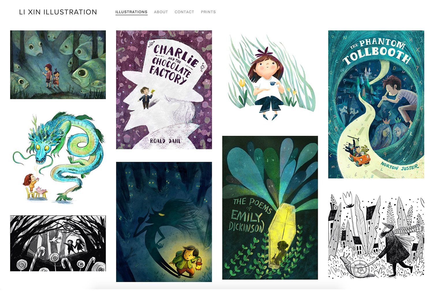
Hi, guys. I am in the process of putting together a new portfolio website. Here is the index page mockup so far. I will work more on the header typography, and personal logo etc. I also plan to have a project page for each thumbnail presented here, some have a seriers of images, some shows process of how I made the images, some have both. But I am curious on how you guys think about the illustration curation so far. I am interested in knowing:
- I want to work with children's book illustration, and book cover design for young adults. Does this portolio fits what I am aiming for?
- Are there too many different mark-making techniques/ styles that makes the portfolio confusing?
- Which images should I throw out? rework?
- What are missing?
-
@xin-li I love the selection of works you have put together here. I think they work well together and show a lot of movement, good composition, beautiful color pallet, feeling, mood, and wonder. I don’t think there are too many different kinds of mark making. There is some variety, but it looks like it came from the mind and hand of the same person. I think the variations are nice and still cohesive and word fit perfectly with the work you are trying to get.
If I look at the content with a critical eye for what is missing, maybe there could be more in the way of “home” scenes where the environment is inside. You have beautiful outdoor settings with a lot of whimsy. There are several single person illustrations or just two people. Maybe the addition of group interactions would round things out. Also varied ages.
Overall I think it is going great. Good luck!
-
@xin-li I really love your works! I especially love how they all look so whimsical and rich in colors. I absolutely agree with @JennyJones they all fit perfectly and cohesive. I also agree that you need some in-door scenes to show how you handle the environment. What I want to add is probably some sequential art and some different races child. Good luck to you!
-
@xin-li hi! I think your images are amazing. I wouldn’t change them. I can see your distinct style in each one. My one suggestion is to put all your book covers in one tab and the illustrations in another. This will help ease your client’s viewing process. If you don’t have enough pieces to separate them, then I suggest it’s time to get crakin’! I hope this helps.
-
Thank you so much for the feedback. I feel very encouraged.
@JennyJones @lenwen I do miss pieces with indoor enviornment. I looked through my folders, and I could not find any. So time for me to draw some indoor scene :-). I will try to incorprate different age group and races in the inddor scene.@Nyrryl-Cadiz I debated with myself if I shoud separte the book covers into a different tab. I ran into 2 issues:
- I can lable "Book covers" for one tab, but I could not find a single lable for the rest of the work. "Illustration"? "childrens book illustration"? "art"? but the book covers are also illustration work... so I am confused.
- I think I might not have enough good pieces to start section my work. Need to make more good art

-
@xin-li Book Covers and Illustrations sound great. That’s what I was also thinking. Book Cover arre technically illustrations but they’re more specific. Your viewers will understand. If you only have a few pieces then it’s time to start working. You got this.
Portfolio: nyrrylcadiz.com
Instagram: https://www.instagram.com/nyrryl_cadiz/
YouTube: https://www.youtube.com/channel/UCbJCF1Im8ZO7hpGWTKOJMuA -
@Nyrryl-Cadiz thank you for the input. Now I will get back to make some more art :smiling_face_with_open_mouth:
-
I think that selection of your artworks looks cohesive and makes an overall impression that the author is mature and knows what is doing. I would see more of your works with pleasure!
The one thing I would say is missing are the more complex scenes with people or maybe kids interacting with each other. -
I love your work! It looks very cohesive for sure, I echo what the others said about maybe having more complex scenes.
I just dealt with this same issue about how to organize things. I ended up having a similar layout to yours but then a side menu that directs to more a comprehensive selection of each type of work.Also, side note, when I clicked the link to your homepage in your signature, it didn't work. Maybe that's on purpose, but just thought you'd like to know.
")
-
@Kasey-Snow Thank you for your feedback. And thank you for letting me know my website is down. I am using preview mode to edit the new site in squarespace, and I managed to delete my current home page by accident. Now I got it back up runing again.

-
@xin-li said in Portfolio website redesign, need feedback:
I want to work with children's book illustration, and book cover design for young adults. Does this portolio fits what I am aiming for?
Are there too many different mark-making techniques/ styles that makes the portfolio confusing?
Which images should I throw out? rework?
What are missing?I am delighted with your works. But black and white photographs should be removed to begin with, because they are confusing (although they are amazing). They also need to be collected more in a separate portfolio.
And do not forget to adhere to the whole range of color - blue and purple.
I wish you success!
-
@dorrismillerrr I do not agree completely, because I think the point is to display a range of colors and works in monochrome / black & white can definitely be among them (though not overwhelming) to show what you can do with a limited pallet and they show how well you use values.
@xin-li I think your portfolio looks very cohesive. I would add a couple of artworks and maybe add some additional color schemes in those ones. Maybe some full spreads with text placement.
I think you’re definitely on the right track on the path you’ve set out for yourself, it’s very motivating and inspiring to me! -
@dorrismillerrr thank you for your feedback. I know some people separate B&W images in a separate tabs in their portfolio. But I will keep them together for now, I might revisit this decision at later point :-).
@nadyart Thank you for your encouragement. I am working on coming up with a few images which have indoor settings. Looking through some of my story ideas, trying to combine testing out characters/settings for a story and making portfolio pieces. I will definitely looking into some different color schemes. Autum is coming soon, maybe I will paint some autumn color for the next piece. -
Thank you so much for feedback so far, and lots of encouragement.
Finally, I updated my website (www.lixin.no) There is still so much to do:
- I need to design a logo, tweek the typography and design of the site
- Still miss squencial work (picture book spread examples)
- Need more indoor scenes, variation of setting in general.
I decided to throw the website out there, and set certain amount of time aside to imporve the site every week as an ongoing thing, instead of waiting for it to be perfect (which will never be).
I added some process images to some illustrations - you can see them after clicking some images. I think it is interesting to show a bit of the process, so people can see how I work, and what they can expect when collaborating with me. But I am not sure I am doing a good job of showing process. I consider making a new section called "process", and do it in blog style.
Any thoughts?
-
I love your work I am a huge fan. It definitely speaks to your market, well done! Looks soooo professional-Good Luck!
-
@xin-li That's how I show my process, I do it in a blog and then have a link from the polished work to the process, that way people who want to see it can find it easily but the people who would be put off by rough sketches or a screenshot where I still need to fix a bunch of things aren't distracted by it.