Improving/revising work from book covers class
-
Hi guysl,
I haven't posted in a long time because I was taking the book covers class and it required all my art time just to keep up. Now the class is finished and I'm revising some of the interior illustrations assignment for Les Miserables. While doing these, I accidentally developed a new "charcoal" technique and was still figuring it out when I submitted things for the last critique, during which Lee and Jaime rightly pointed out that my first two interiors had a more developed and atmospheric style than the last two. This is actually because I hadn't worked on them as much, so I'm continuing to revise them in order to make them more "atmospheric."
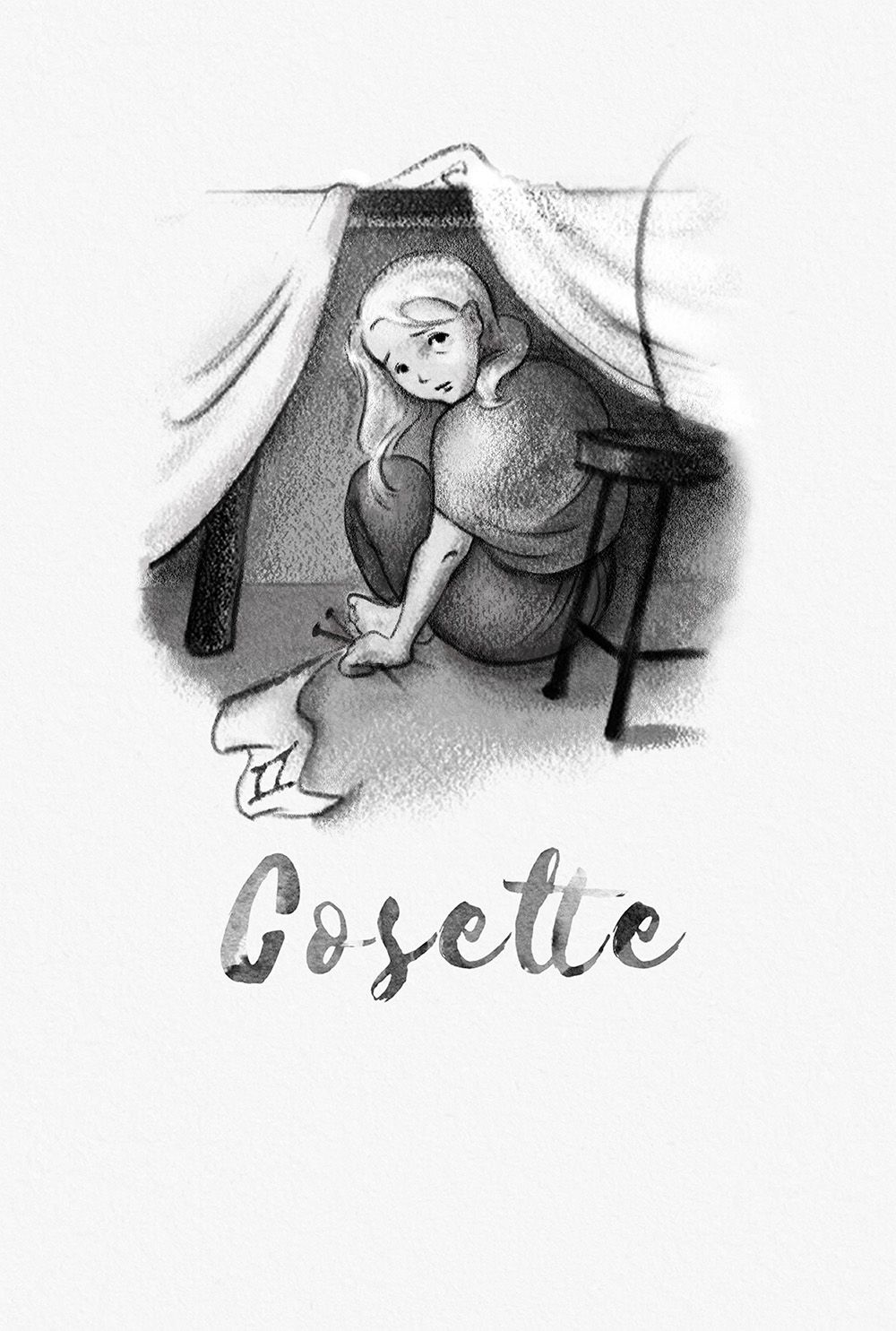
To that end, here is an example of one of the more finished interior illustrations:
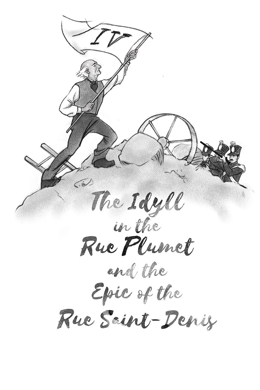
Here is my third of four illustrations prior to revisions, i.e., in the less atmospheric, more "graphic novel style":
And here is the revised, more "atmospheric" version with darker and lighter backgrounds:
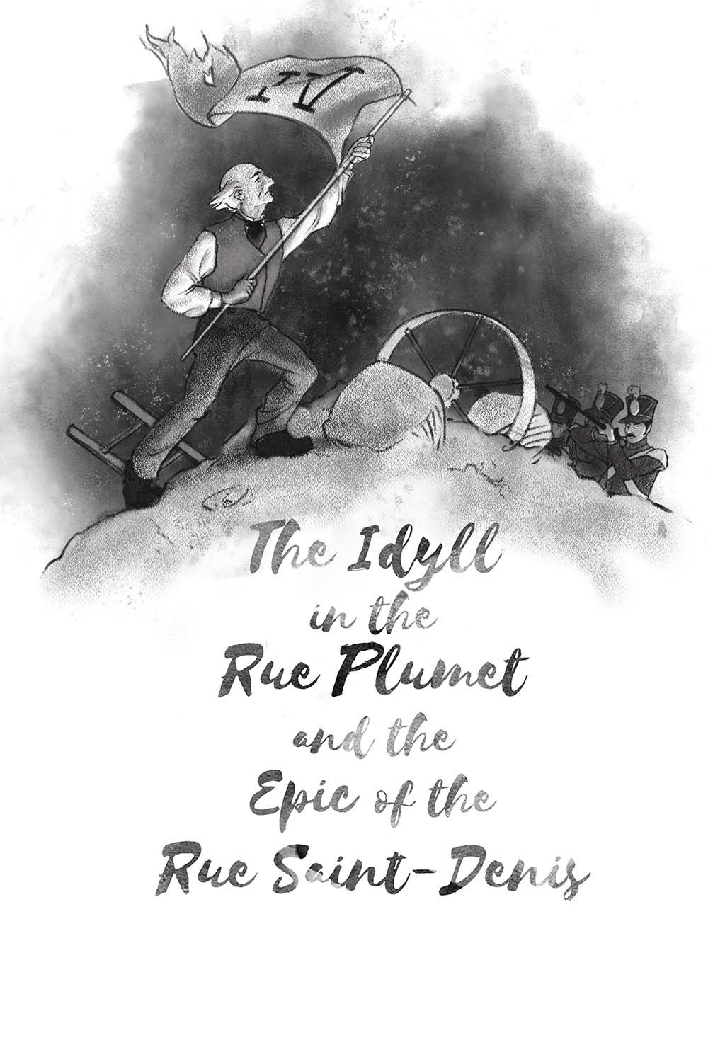
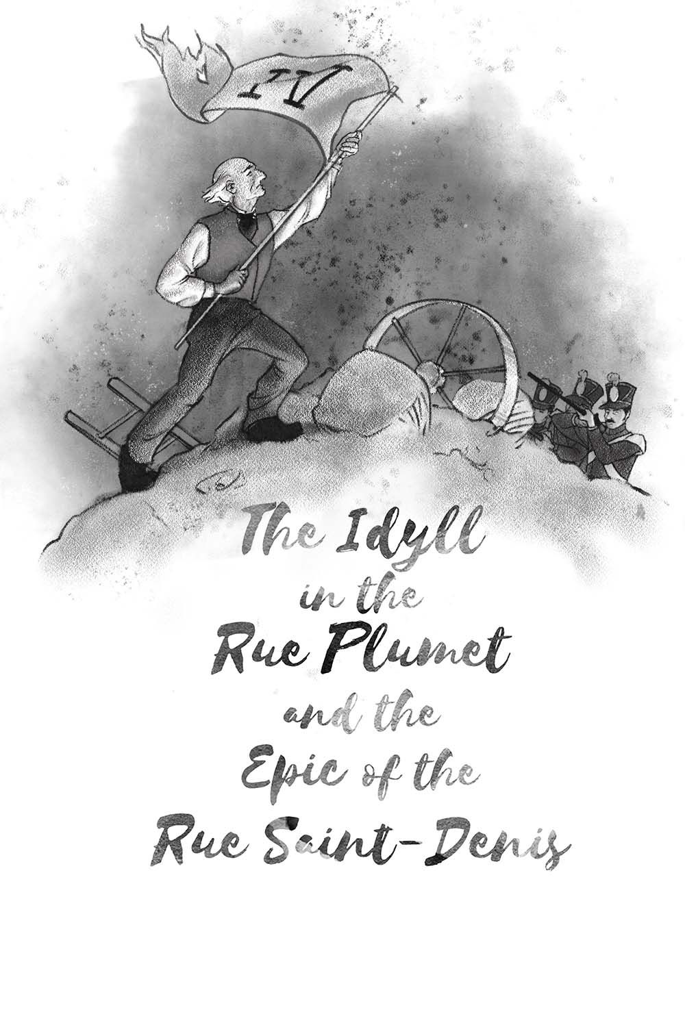
They do come out a little grainier on the forums, but the jpegs get the idea across. I'd welcome your thoughts! In addition to adding lighting and background, I also revised the drawing slightly, but what I am really curious about is do you think the last two are a good match in style with the Cosette drawing, and do you like the darker or lighter background version better?
Thank you, and I look forward to catching up on the forums!
-
Hi. These are lovely. I like the grainy charcoal look. I think the Cosette image has a nice range of values that help define your focal point, but in the other image, either the dark or lighter version, the values aren’t really driving a focal point. In the darker, my eye keeps returning to the light circle and the soldiers are getting lost in the dark. Maybe use the lighter one and push and pull the darks and lights around in the nice hazy background. I think you can really play around with that. If you lighten his vest a little and push the dark just behind him. Then lighten the smoke behind the soldiers and darken their vests. Maybe. Just some thoughts.

-
I saw your Cozette piece on social media-just lovely!
-
@burvantill Thanks, Lisa! I agree. In fact, the dark version was an attempt to get more contrast with the main parts of the figure, but I like the light one better. When I lightened the vest yesterday I was losing other effects, but maybe I'll rework it today. It should be doable.
The soldiers I was sort of hiding or keeping secondary, but I agree that they could be a little lighter.
@lmrush Thank you!
-
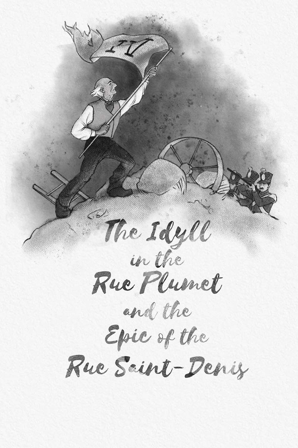
@burvantill or anyone--Does this work better?
-
@LauraA yes!

-
@burvantill Yay!
-
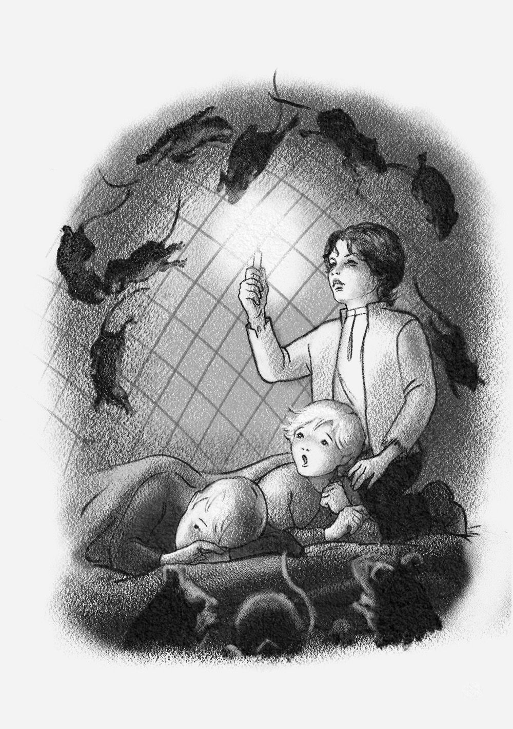
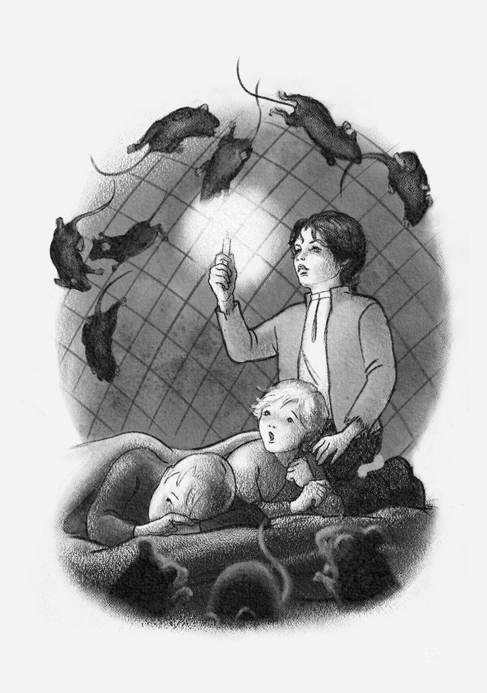
Trying to get all these finished before the end of the week when I go on vacation and can't take my Cintiq with me. This is the third of four interior illustrations for Les Misérables from the book covers class. It's the one I've probably worked over the most and done in a dozen variations, even though it's just a spot illustration! I hope this means I'm learning something from the process.
The idea is that Gavroche is taking care of two small boys and brings them to his home, which is inside a large elephant statue. They sleep in a mesh cage because the statue is swarming with rats, and the smaller boys are frightened. Gavroche is playing tough to help them calm down, though he's really tender-hearted.
Anyway, critique away! I think, for example, the the rats could still use improvement, and I wonder if Gavroche (the oldest boy)'s face it a little too detailed, but he keeps coming out that way! But what I'm really wondering most of all is how much punch the overall piece has and how can I improve it, given that it's going to be a small illustration. Thank you!
I'll post the last one, another small illustration, soon.
-
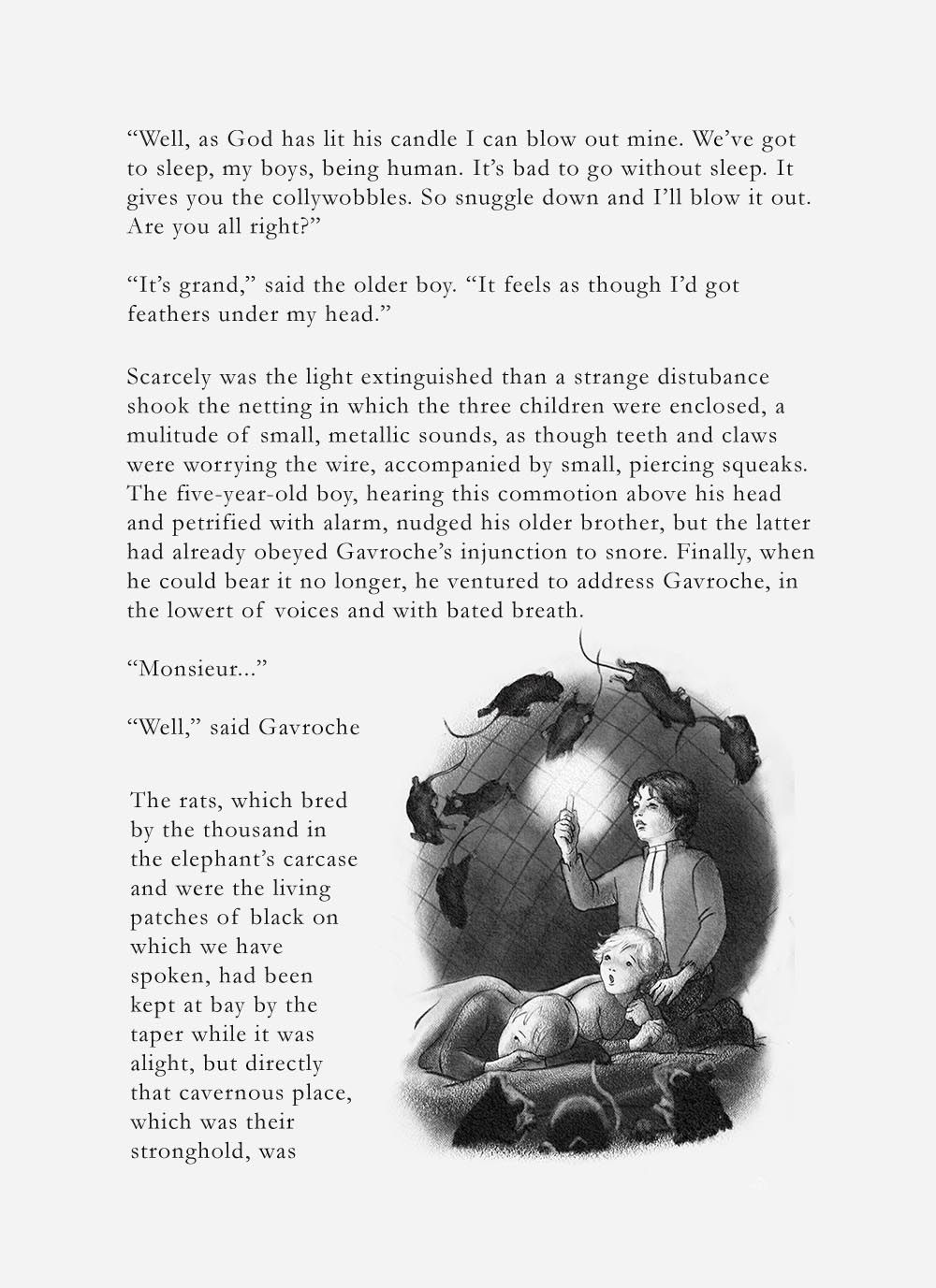
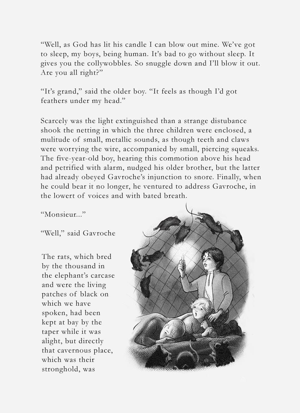
Which is better? I think the light one but I've lost all objectivity. Also asking for serious critique from anyone who feels so inclined. I want to finish this thing! Thanks!
-
@Laura Beautiful work! The background rats in the lighter version are much more legible but the foreground ones are still difficult to read. I'd like to see a somewhat sharper edge on them and some lighter values in it. The shapes need to be more refined as they're unclear right now, especially the left one. I like the idea of the kids being in focus and all else blurred but it's not working completely yet. Overall very strong work — love it!
-
@Su How's this? I firmed them up but then took down the value, because I really don't want them to take center stage.
-
@LauraA That weird z thing on the older boy's leg is one of those stray Photoshop marks. Didn't notice it until now. I'll get rid of it, but just ignore it for now.
-
That looks better! Your illustration looks really nice on the book page. Great job!
-
@Su Thank you!!
-
Love the style! Perhaps balance the long title a bit more so it's not so vertical?
I don't know where you landed with this piece as I see it's from last year. -
Hi @Adriana-Bergstrom! Most of this series is on my Instagram now. But thanks! I can always take a look at revising these pieces later for a portfolio website.
-
@LauraA
Wow, Beautiful covers! May I ask what class you took on Book Cover design? I am trying to learn how to do book covers and looking for anything that would help me learn more. Thank you. -
@RG-Spaulding There is a live SVS Book Covers class that has been offered twice that I know of. When I saw people's work from the first one, I asked to be on the waiting list for the next one. I really liked it! But right now there don't seem to be live critiqued classes, and I don't even see the course in the "all courses" list. So maybe write them and ask to be put on a list!
-
Thanks @LauraA I will keep checking.