
 , I would love some feedback on these colour studies. Which one works better? Are my values ok? These are just the local colours, no highlights or shadows included.
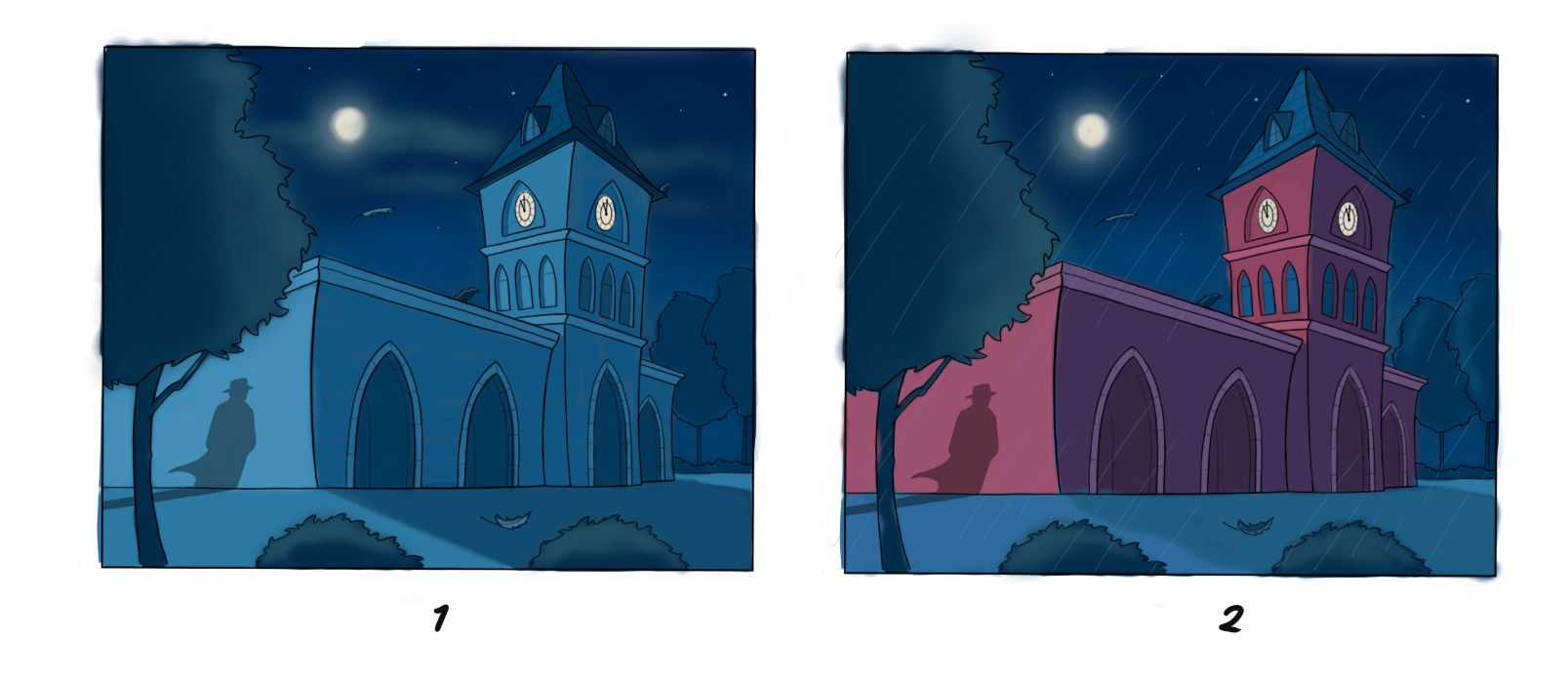
 Will keep picking away at it.
Jun 14, 2019, 7:37 PM
@Erin-Cortese Colour's a thorn in all sides.
I'm partial to option 1. It gives a nice sense of moonlight. If you really dial up the warm light behind the clock it would make a nice warm contrast in all the cool.
I'm less partial to option 2. The red's nice and cool, but it makes me feel like there's a big ol' spotlight somewhere off camera.
I think the values are working fine ")