Group run through creative environment design week 3 art and feedback
-
@ErinCortese That's really helpful. I don't even know if I was thinking about whether it was a sketch or a finished piece since I was just trying to get it done but that in itself shows I need to think things through more before I start laying down the ink. This was with a dip pen and technical pens are a little easier for me still but I definitely need to practice forethought and do more control work. Thanks.
-
@demotlj I should mention, inking is not my strong suit, but here is a quick video by a professional ink artist that really helped me to understand inking techniques better. There are quite a few close up shots that let you see how the fine details are laid down.
-
@ErinCortese really fantastic!!!!
-
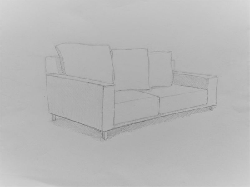
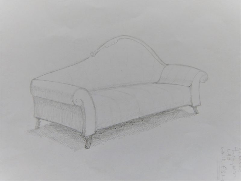
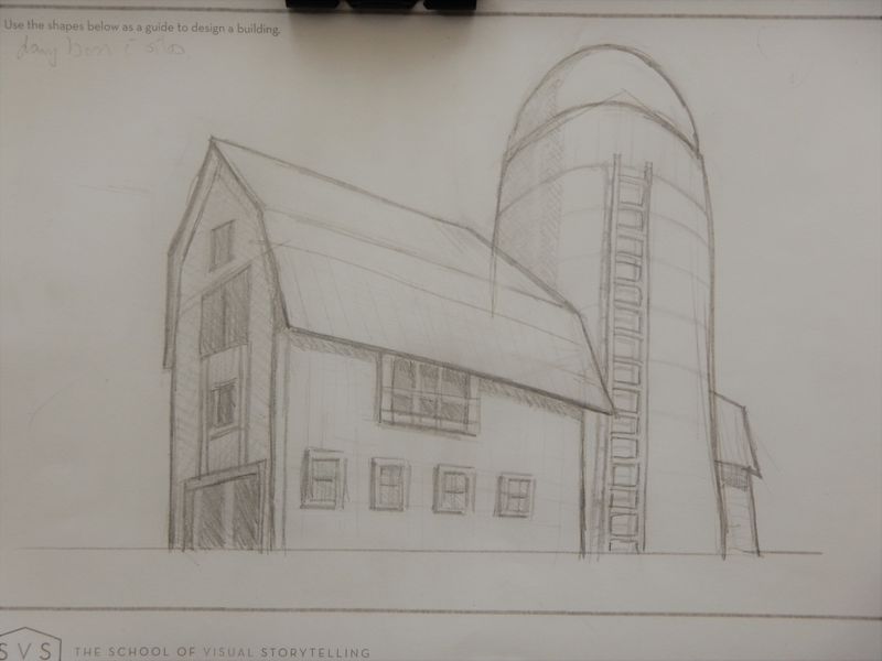
bad pics , but here are two couches and a building (dairy barn and silo)
I tried in photoshop but the tablet is my nemesis lol@Braden-Hallett if you have any crits I am open to anything! And anyone else.........fire away!
the dairy barn I actually did on the printout homework page so there are lines there that I can't erase.......two show up pretty strongly.....one is on the roof line below where the "bend" is in the roof and one is a line dropped down from the silo through the barn, can't erase ! I could put it into photoshop and do it but time is of the essence for me today and this was just a sketch for learning

-
@Coley love the barn. The roofing in the back corner could poke out a bit more, and the ladder be more to the right on the cylinder, other than that I’d say you nailed it
-
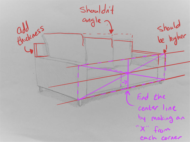
@Coley Hope you don't mind, I did a little draw over of one of your pictures. You're doing a good job for the most part. I would just suggest maybe going ahead and drawing out a few perspective lines to help you line things up.
Hope this helps. Also, if you haven't already, I would suggest that you watch the class by Jake Parker about perspective.
-
@Buddy-Skelton I don't mind , thanks so much! I am quite appreciative
 I started Mastering Perspective course but haven't gotten very far into it, it's on my list to get through! I did struggle with the back of the couch and the arms. I guesstimated the middle of the couch..........I should have known to use the x trick as I did do Will's perspective course. I need a lot more practice and help such as this. Thanks, it is a learning opportunity for me
-
@Aleksey thanks! I think you are right on the roof and the ladder. I appreciate the comment

-
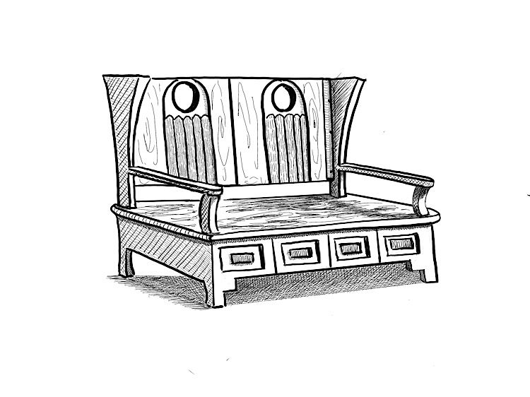
My “couch.” What I learned from this one is that I hate drawing furniture. My characters will have to sit on bean bag chairs.
-
@demotlj Very cool design, and nice crosshatching!
-
@ErinCortese I have no words... okay maybe some... THIS IS SO COOL.
-
@demotlj said in Group run through creative environment design week 3 art and feedback:
I hate drawing furniture
I'm so happy you said that. Everyone draws these amazing sofas, yours as well by the way, and my mind goes completely blank.
I had this idea of drawing a comic where my character lives in this cute tiny house... While doing this exercise I realized that he can't own anything and will probably live on the floor. :smiling_face_with_open_mouth_cold_sweat:
-
@murielle Wow, thank you!
-
@murielle These have all been so inspiring here-and with yours I am now starting to see how they will help you and others make great environments. (It was a head-slapping "dah" kind of realization...)
-
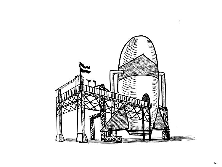
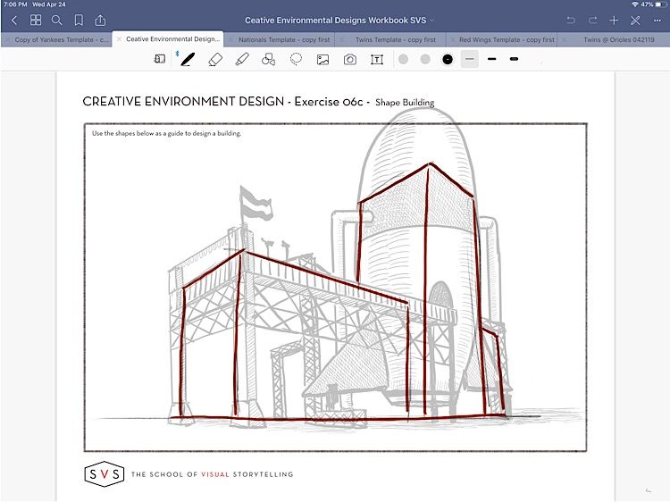
So I also drew a barn and silo as @Coley did (great minds think alike) but mine looked so similar that I decided to try a new one and did this space rocket launch pad. I don’t know if it strains the definition of “building” too far but it was something I’d never attempted before as is obvious from some obvious structural problems. I’ve added an overlay of the assignment so you can see that I did at least adhere to the lines.
-
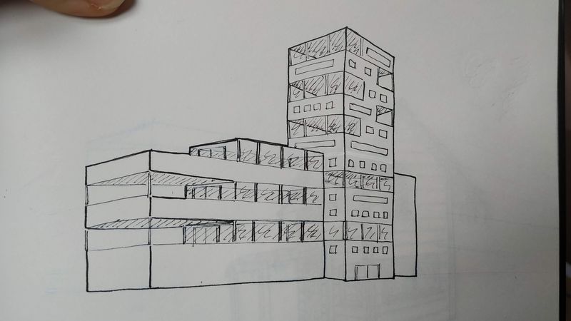
I officially gave up on the sofa design. But I tried to put in some work on the other building. I'm just not feeling it.
With the houses, I still felt it was related to work I wanted to do, and I felt more motivated to give that a try.I don't like this design and I can see so many mistakes (perspective and all), but it's all I got.
-
@murielle did you use any references? Can you show them?
-
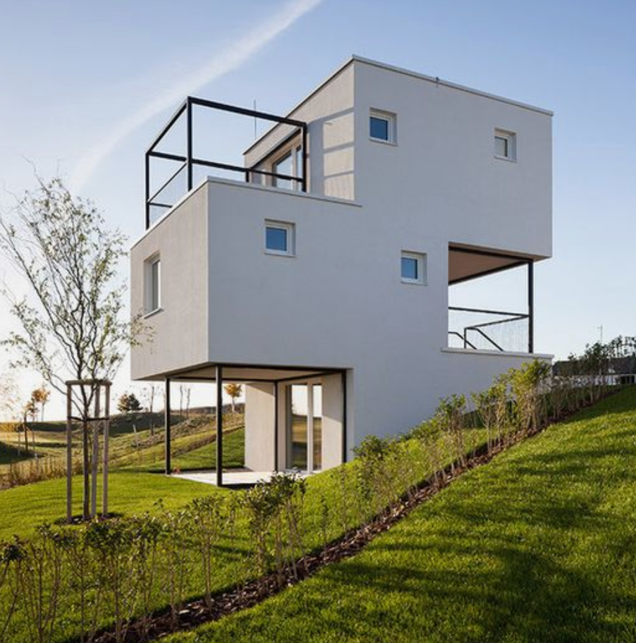
@Heather-Boyd Yes and no. I used the reference below, but it was only as inspiration. I wanted the 'open' areas to be windows. Like an office building.
-
@demotlj I think it looks great! I'm no expert on perspective but it looks good to me. From dairy barn to rocket.... Maybe the first cow in outer space?
 seriously though, it looks structurally sound to me and a good image.
 -
Hey everyone, I'm going to take a break from these exercises. I'm short on time, and since I'm really not happy with my results on this exercise I want to redo them. I had hoped to get a lot more out of this then I did.
I will pick up again when my crazy schedule dies down.