Creature design... All input Welcome!
-
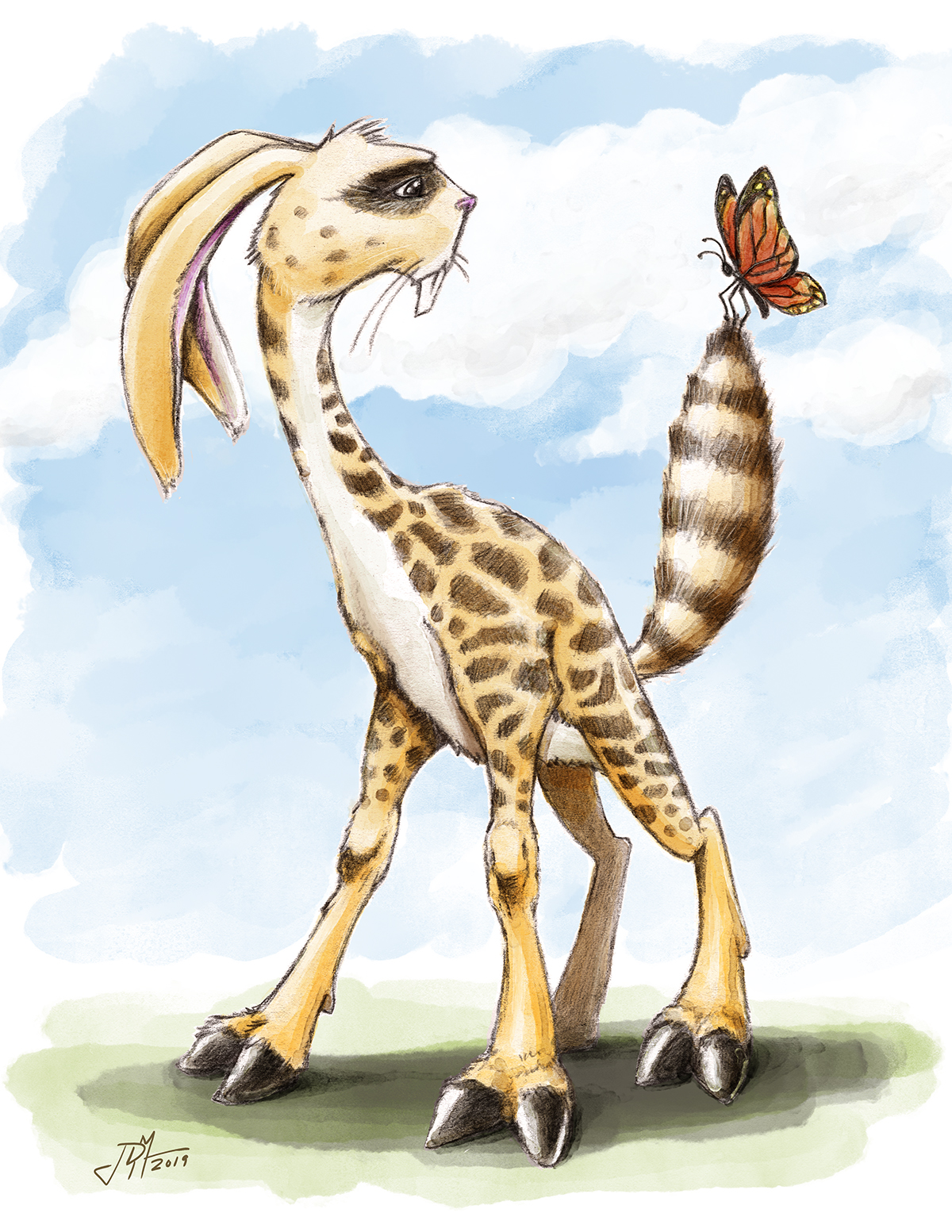
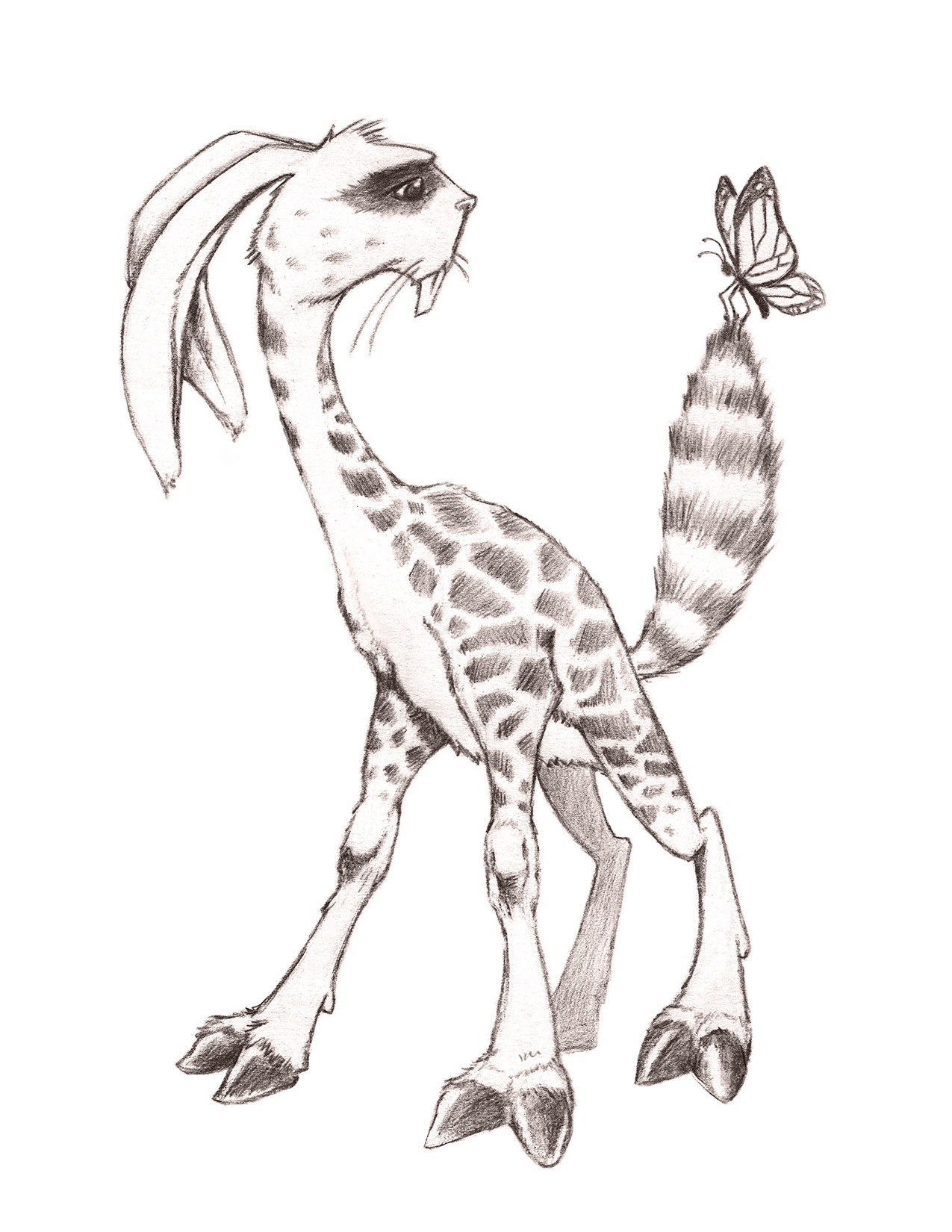
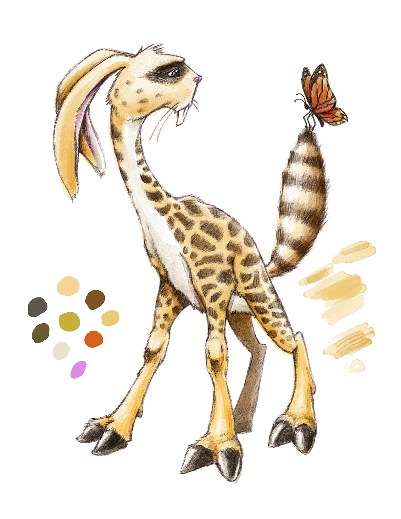
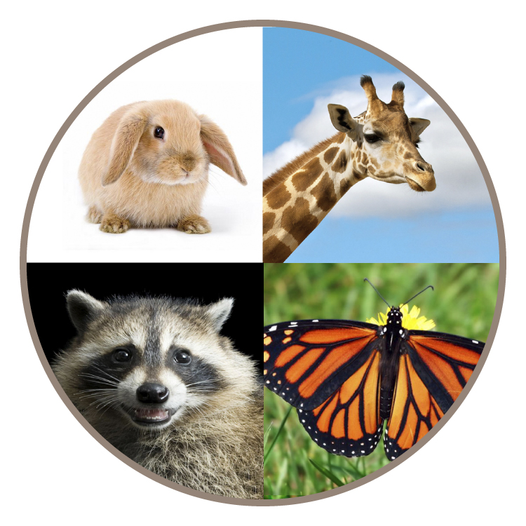
Hey gang! I finished this illustration up a couple weeks ago and these images show some of my process and reference. My goal is to gain some traction in the children's book world and I know I really need to improve in a ton of areas. Can anyone see what I'm lacking here? Thanks so much!!


-
First off, great creature design! really fun and can totally see this in a children's book.
As for areas of improvement, the thing that stands out is the color. It looks liked alot of it might be in the same value. Perhaps try looking at the colored illustration in black & white to see how close the color values are. The color looks good, but if you have some areas with greater color values the illustration could really pop.
Anyway, great stuff and keep up the good work!
-
@Justin-Moss Thanks for taking the time to review this and give your insight! What you said makes total sense!
-
@jasondmcintosh Neat creature! Combining a bunch of animals seems like a great exercise

There are a few good videos on svslearn that have to do with character design (monsters, animals, people, characters, etc) that'll give you some new tools to work with when it comes to using basic shapes when creating characters and the reasons to use them.
I'm curious, is the racoonaburaff (bunnagirrcoon? racagirbun?) meant to be friendly? Scary? Huggable? Dangerous? How is the audience meant to feel about this creature?
-
@Braden-Hallett thanks! This is the “Raffoon”. My daughter came up with the idea, and I thought it was funny. But y’know, you brought up a good point...I never once thought of how the audience should feel about this creature. Duh. I really respect you as an artist...what sort of design/illustration/color flaws do you see, or what would you change?
-
Have you heard of Terry Whitlatch? She is a creature designer she did a really cool podcast i think everyone would benefit from listening to.
It was on the Academy of Art Illustration podcast. She talks alot about what to think about when designing a creature. I really how you designed this and I think you would love thay podcast. It has a video component too. -
@jasondmcintosh It depends on how you want the creature to come across, I suppose. Right now I get a kind of predatory vibe (I think it's from some of the sharper angles and those pointy girraffe toes). If you wanted it come across as friendlier, I'd soften in up (round out the toes and muzzle maybe?) maybe dial up the fuzziness factor?
I really like the colours

-
@Braden-Hallett Thanks, Braden! That's good advice!
-
@Aleksey I appreciate the suggestion. Terry Whitlatch is one of my favorite illustrators of all time. I'm going to look up that podcast this morning and listen as a I draw. Thanks for taking the time to reply!
-
Thats a really cool creature! One of my all time favorite artists Aaron Blaise did something similar with a few paintings.
-
Neat idea creating a hybrid creature! I'm curious...do you have a back story or personality for this creature? How do you want it to come across to us? Right now, it looks sad, timid (droopy ears), a bit weary (the dark eyes), and unsure of the butterfly.
-
@Johanna-Kim Thanks for the input! You totally are right on. I created this creature without any backstory or intent. I just glued it together and you're totally spot on...by doing that, it loses a lot of personality and punch. I need to THINK when i draw. Great feedback, thanks!