WIP Count of Monte Cristo Book Cover
-
I would appreciate some help on this... I've never done a book cover before, and I'm not sure of the format required. I downloaded a template from somewhere for book jackets--I'm wondering if it's better to do the whole jacket or just the front cover? It occurred to me that "wrap around imagery" would be more effectively displayed if one can see the front and the back, but I'm wondering if that's just overkill...
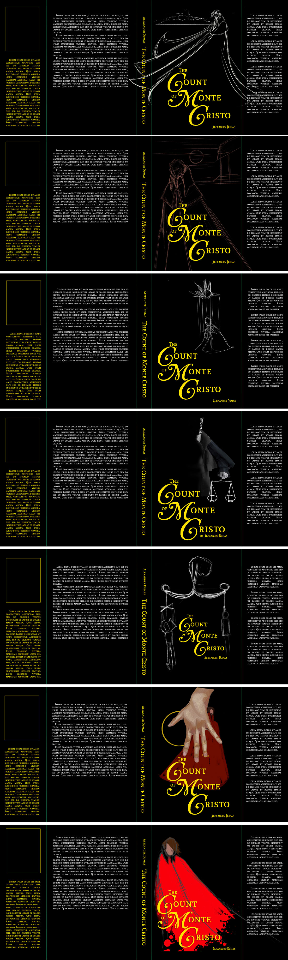
Secondly, I'm wondering which image is the most effective. I'd really like to keep a simple black cover, maybe with some gold metallic foil lettering. The seven different looks below are just mockups with some stand-in imagery and rough sketching.
I don't know if folks are familiar with this classic novel, but for those who are I'm hoping they can comment on the composition that best fits. For those who haven't I'm hoping they can comment on what's the most dramatic.
This book is about lost love, personal transformation, insanely intricate manipulative machinations, remorseless revenge, and finally the nature of forgiveness (or lack thereof) and what it can do to a person. Ultimately, the "hero" doesn't win as much as he reaches the limit of tolerance for his own actions and decides to move on. He doesn't get his lost life and love back. It is, in some ways, a highly melodramatic serialized novel with a lot of romanticism.
In short, it's Dallas and Dynasty all wrapped up into one. In period costumes. With swords and suicides.
I would appreciate any advice and constructive criticism offered. Thanks so much!!
Children's Illustration Portfolio: https://www.coreyartusillustration.com
Art Portfolio: https://www.coreyartusimagery.com
Mastodon: https://mindly.social/@Coreyartus
Pixelfed: https://pixelfed.social/Coreyartus -
Hi Corey, I like only the first one the best, I read the book, when I was young and the background prison and his mighty figur is really what I see the best for the book. It looks really good. Maybe I would not make the straight line straight, but wavy because of the sea. The coat, it would look better if the line goes before C and after T and before M, so that these first capital of the COunt of Monte... are easy to read.
-
Me too! I like ghe first option best. It has a hint of mystery that the Comte de Monte-Cristo has as well!
-
@Coreyartus I agree with the first option.
-
I like the first one best. I'm just wondering what it would look like if you flipped it horizontally? That might make a better lead in to the book.
-
I like the first one as well
-
Like everyone else, the first one appeals to me most as well BUT I like the spattery torn rags on the last one which I think hints at revenge and his personal hardships.
May be you can have a play with different text variations as well?
I also feel the blurb areas seem too text heavy. Maybe see actual books of a similar genre and check out their copy treatments.
I don't know how detailed this project is meant to be but I also noticed that there's no room for the publishers logo.
I like the black background and your stylized treatment though. It gives it a more modern feel to a classic story.
Does this help?
Cindy -
I can't tell you how helpful all this advice was. Thank-you!!! I went away to a theatre conference and let it percolate for a while. Coming back to it with fresh eyes let me see a lot of things I didn't before. All of your advice was great!!!!
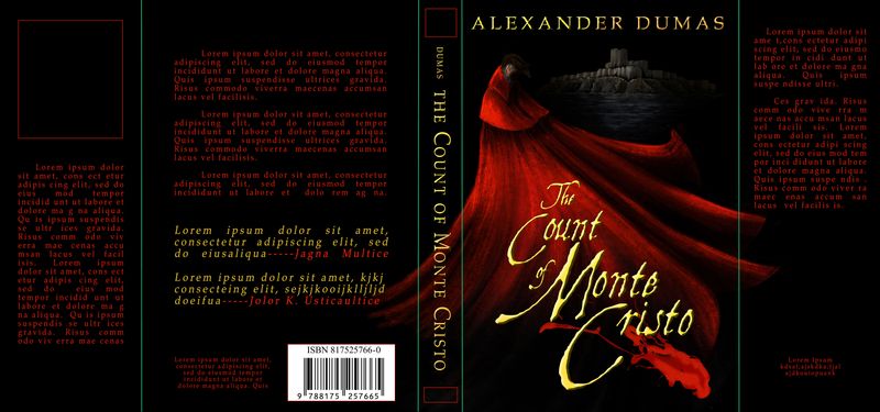
I decided to commit to a golden metallic text closer to actual period script. I also found a strongly "classic" text to accompany it, and I think they both offset the illustration nicely.
@MichaelaH , I took your advice about the horizontal sea and created some actual water, but flipping the image sorta took care of the spine/cape issue, I feel.
@DaniDuck , I think you were correct about flipping it. The cape's lines flow with the text better that way, and I think having the figure against the spine just makes things more comfortable somehow... When I did that, I realized the shadows on the text had to be flipped because the source of light was common to all the elements. I discovered that I drew the Chateau d'If with the light coming from the right, and now that the light was coming from the left I'd have to flip it, too--meaning the image is actually backwards. But I figured, well, I learned my lesson: figure out the source of light correctly first. LOL!
@BraveScribbler I really liked the bloody cape effect, too, but then I realized it was sort of going into "Count Dracula" territory... I put a blood spatter as a compliment to the title text, and I tried a bunch of drips and spatters throughout but I couldn't shake the vampire feeling... So ultimately I decided not to use it. But it could be an interesting effect for that Stoker Dracula novel... hmmm... I did take out some text as you suggested, and made room for a fake ISBN spot and a the publisher's logo on the spine. Thanks!!
So... I still have time to make changes before the deadline. Any more advice?
-
It looks fantastic, I don't have any other objections expect, it looks really good.
