March Book Cover WIP - feedback welcome
-
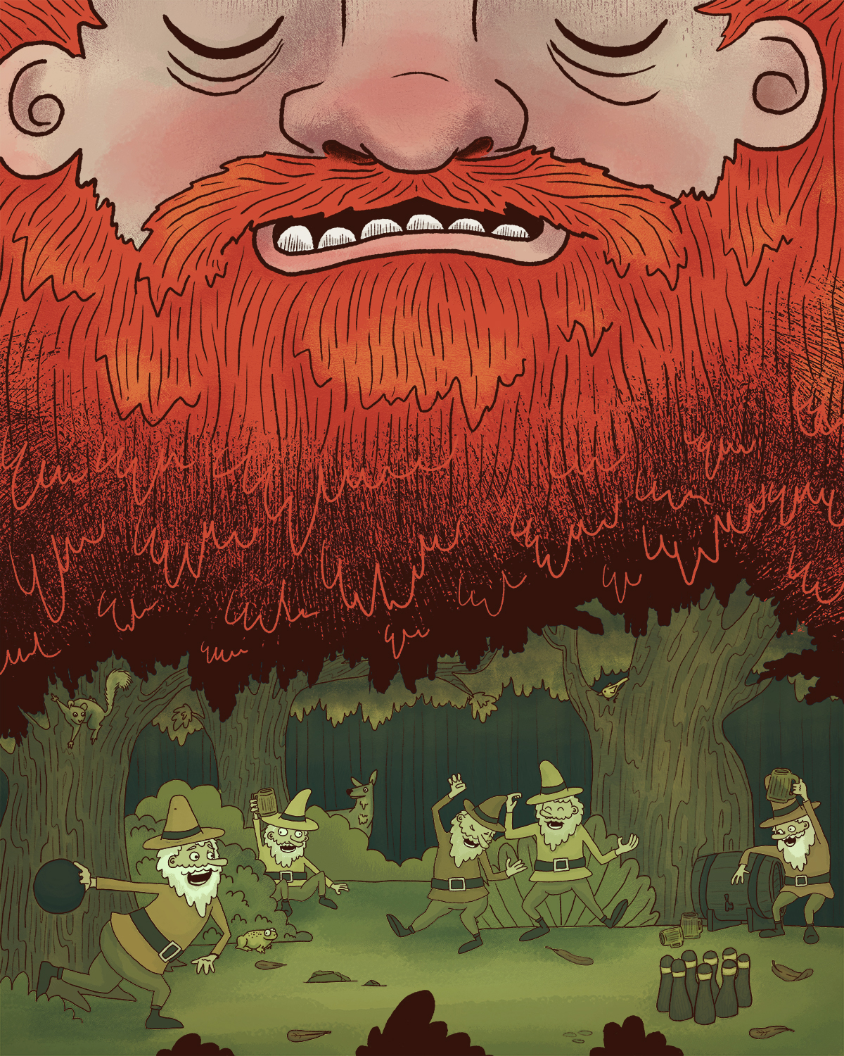
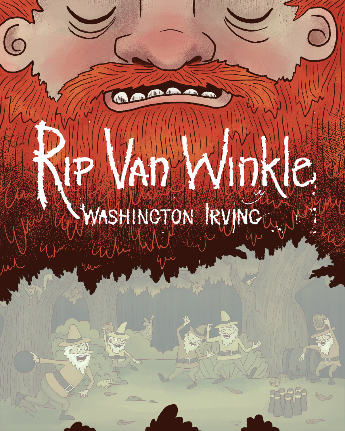
I did this piece back in November for folktale week and it was a little rushed but I really love the concept that I came up with and I want to rework it a little. I got some feedback that the bottom scene looks a little stiff so I want to redraw that part of the image - I also got some feedback that the large space on rip's beard would be the perfect place for a title if I wanted to turn it into a book cover so I thought that this art challenge would be the perfect motivation to get it done!
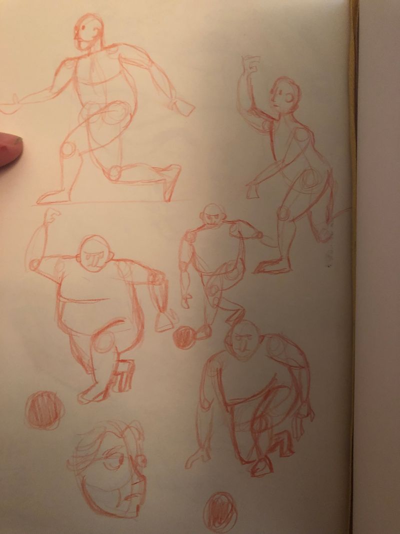
I'm currently working on some gesture studies of bowlers to try to get some more natural looking poses. I kind of like the bigger guy with the furrowed brow, I might try to play with the POV in the bottom to be able to use that angle.
-
I love the bearded man, really strong part of the new cover (did the folktaleweek also, was great challange). Will you change the down part?
I am not good at giving feedback..I saw only one thing now, the nose is in the middle of the cover, but his right face side is wider than his left side, if You understand what I mean; his left ear has hair beside and his right ear is cut off.
I am looking forward to see more. -
@MichaelaH thanks I hadn't noticed that the ears were uneven, I'll have to fix that, good catch. I will be redrawing the entire bottom part of the image (but probably keep a similar color scheme) as well as create some sort of title treatment (all the stuff thats been whited out in that second image).
-
Hi Taylor,
I love the juxtaposition of Rip's large bearded head above the partying dwarfs below. The energetic orange of his beard and the overall style pulls me in. So I'm guessing that this is Rip as a young man with his beard, then when he finally awakes, he'll have a white beard? Though I love the orange beard, Rip Van Winkle's grey or white beard feels more iconic. Question to consider: would people know it's the story of Rip Van Winkle without the title?
re: the dwarfs, I don't feel that they are drawn stiffly. But it will be interesting to see how they change with your revision.
re: the composition, you've got a great first, second, and third read with Rip's head, then the dwarfs, then the forest wildlife watching curiously. The humor is great!
re: font: The title font works for me, like the letters are getting worn at the edges. Wouldn't you also want to also place your name as illustrator somewhere?
re: genre: Would this book cover version be for a middle grade or chapter book? Or perhaps a picture book? Feels more MG or CB. I think the original story was for middle grade readers, but there have been multiple retellings from PB to MG.
Looking forward to seeing how your cover evolves.
-
@StudioLooong - I'm loving this book cover! I'm also excited to see what revisions you make. The flow of the face to the forest scene with the dwarves below is very nice. I like your gestural sketches but also like the feel of the characters as they are - sort of a Ricky and Morty vibe. Perhaps it would be nice to have the tree line behind the keg curve a little more so that it isn't quite so parallel with the page? Otherwise, again, I really love the concept and can't wait to follow this progression.
-
Thanks so much, lots of good feedback to consider!
The original drawing was supposed to be the moment that rip is falling asleep - so his beard is still red. I think it could be cool to try a version in white - I wonder if that would make the trees look like they're snowy?
I think that it does read as rip an winkle without the title (if you know the general premise of the story that is) but I feel like most book covers have the title on them and if I'm wanting to use this as an example of a book cover I feel like it would be good to include it. Are you thinking it would look best as a title-less cover? The white title is just roughed in real fast to show kind of what I'm thinking but isn't the final.
I don't think I'd put my name on the cover of the book if I'm just doing a mock cover. With more of a middle-grade book I see them going both ways and I'd like to keep as much text as possible off the cover.
Taylor Woolley
(Formerly Taylor Ackerman / StudioLooong)
Website: www.woolleystories.com
Instagram: https://www.instagram.com/woolleystories/ -
@StudioLooong Snowy trees would look cool. Maybe the beard could start off as white from the top and then transform into red towards the bottom? Then the dwarfs would still be in a forest that could be spring or summer time? Just a thought.
Re: the title, I wasn't thinking of making it a title-less cover, just that I wondered if others could tell what story it was without the title. I actually never read the original story. I think I read a version for young kids in elementary school, and I didn't actually remember the dwarfs, so much as that Rip was lazy and drinking something that made him fall asleep. So for me (and I may probably be the 1% that thought this way), I couldn't place the story right away. I just thought it was a really cool image.
re: keeping the text minimal, I tend to agree. I love minimal covers with mostly image. And you have plenty of room in the beard area should an art director decide to add your name. OR, it could be added at the bottom of the cover, and the middle bush omitted.