Resources for choosing color schemes?
-
Hi guys! I'm really trying to work on speeding up my process this year so I can produce more original work. My perennial roadblock is that I have a really hard time paring down options in any aspect of illustration--it's overwhelming!
Right now I'm trying to figure out an efficient method to develop a color scheme. I do have a decent handle on color theory, how it works in composition (to focus attention, move things forward, etc.) and I have some of my own preferences. And by using David Hohn's technique of applying color mode layers on top of a value study, I'm getting a handle on keeping the values consistent and accepting the fact that they have to come first. That was hard to do!
I have watched all the SVS videos on color at least once, and if someone thinks there's something particularly helpful there in terms of developing a scheme, could you please point it out so I can rewatch those sections? I also like @smceccarelli's color scheme videos on YouTube. And I am aware of the fact that I can go search movie stills or other illustrations and grab a color scheme to try.
But something is missing. I'm currently staring at a page of 9 color schemes which I have applied to a value study, many of which are similar and none of which seems satisfying. And I have no idea why.
If you have some pointers or other resources that you have found particularly helpful in choosing a color scheme and applying it to a composition, would you mind sharing it here? Maybe we can all learn from each other in this area!
Thank you!!
-
@lauraa there is a debate out there that values need to come before color. I have tried to do values before color and when I do the pieces usually turn out darker then I would like or muddy looking. What I found is within photoshop I will get all my local color down. Then I will add a layer adjustment at the top and drop the saturation all done to zero. This way I can turn it off and on as I work to check on the values.
I think it all comes down to what works best in your process. Over the years I have picked up tricks from many artists and if they work I have built them into my process. No one way is correct.
-
@lauraa Steal it :)! I had a teacher who is really good at color and told us that when he was working for a newspaper way back he had to produce a lot of paintings quickly he didn't have time to mess with color so he took successful schemes from illustrations he liked. Eventually he really developed his "color muscle" and didn't need to do that any more. You can't really plagiarize a color scheme, haha, and by using something you know works, you can learn faster. (The values and/or mood of the referenced piece should be similar to what you are going for though)
Also limiting the number of colors makes things more harmonious, applying a transparent colored "wash" layer over everything using the multiply or a blending mode of your choice also can bring things together. Also working in complements with a ratio of 60:40, 70:30, or 80:20 works well usually. Many successful artworks I find are usually complementary/split complementary or analogous.
My mind works color over value so agree with @Chip-Valecek and sometimes I often go straight to color studies and work 'reverse'. I also would suggest thinking of the mood you are trying to acheve and working based on that and the psychology of color (Red=hot, passion, pain, romance, adventure. Blue=cold, tranquil, water, clean, sad. Green=life, nature, sickness, radioactive. Yellow=Sickness, joy, warmth, sun, light. etc.)
-
@LauraA I like to use these color palettes from Pinterest where they take a photo and pick the prominent colors out of it! I'll adjust them a bit as I go along to account for my own values and elements, but a lot of the time my inspiration and starting point will be one of those. There's nothing like having a reference to continually go back to and look over when you feel like you're slipping away and getting away from your core palette.
vanessastoilova.com
instagram.com/vanessa.stoilova/Check out my Youtube channel for tips on how to start your career in illustration! www.youtube.com/c/ArtBusinesswithNess
-
@LauraA Here is a tool that Google has created that enables you to compare the color palettes of different pieces of art. Perhaps, if you found a piece that has the emotional impact you prefer, you could use their colors?
Children's Illustration Portfolio: https://www.coreyartusillustration.com
Art Portfolio: https://www.coreyartusimagery.com
Mastodon: https://mindly.social/@Coreyartus
Pixelfed: https://pixelfed.social/Coreyartus -
On traditional work I usually start with a three color palette plus white and sometimes black. I only add others once I've established the basics and usually only where I know I want additional range or saturation. I also "grey out" my colors with a complement I'm also using. Digitally I sometimes do similar methods but it's a bit to annoying usually unless using Corel.
Sites I like for coming up with digital color schemes:
http://www.palettefx.com/ - Colors from photos
https://color.adobe.com/create/color-wheel/ - Adobe's color scheme tool
http://paletton.com/#uid=1000u0kllllaFw0g0qFqFg0w0aF -More for UI but another tool to play with color schemes.
Last but maybe best for you:
https://coolors.co/app - generate a random scheme which you can constrain to matching one color -
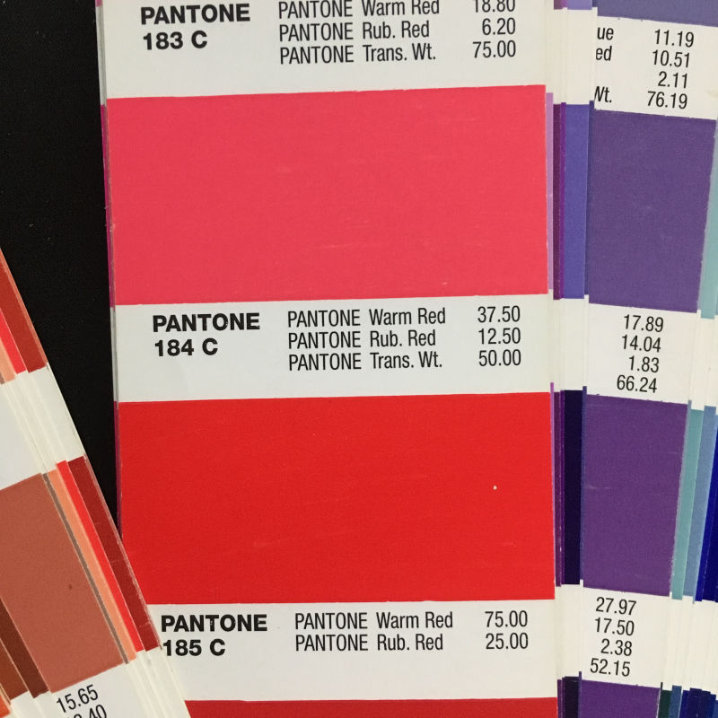
@lauraa I bought the solid coated and uncoated Pantone books a while back. As it helps to have all the colours in one physical place. Screen colours can often be deceiving to how colours look against different kinds of light.
Next to each strip it tells me what percentage of colours I need to mix together to make each colour. A colour recipe book.
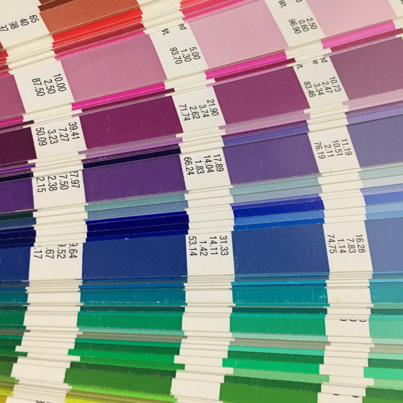
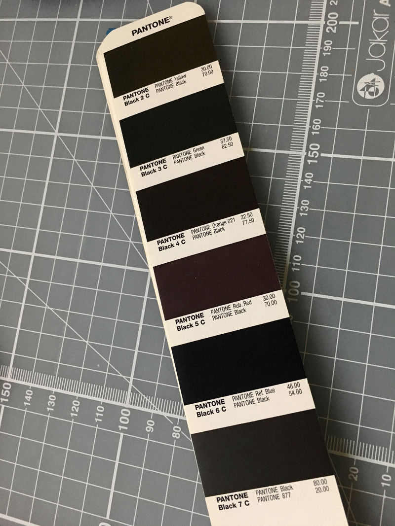
I like having all the different blacks together. It's a great reference tool. And colour memory bank. There's certain colours I love coming back to and these books spark that memory. -
Whoa, this is great info, guys!
@Chip-Valecek and @Teju-Abiola I see your point that I can deviate from the usual process. But since for now I think I am still getting used to checking values, I will stick with values first for a while to cut down on confusion. Then maybe I'll deviate!
@Teju-Abiola For whatever reason, I shy away from those techniques with one prevailing color, at least on the first pass. I think it's because I'm so used to observing from nature, and many of the children I am painting come from some real memory I saw that did give me some kind of feeling, even if I was unaware of why. But I have also noticed that I am exaggerating, for example the one I am trying to do now is a night scene in the city and I am emphasizing all the warm yellows streaming from the windows. So thanks for making me aware of it! And your advice also relates to the whole keywords idea, which I need to imbed more into my process.
@NessIllustration, @Coreyartus @ThisKateCreates, thanks for the resource suggestions! I will check them out today.
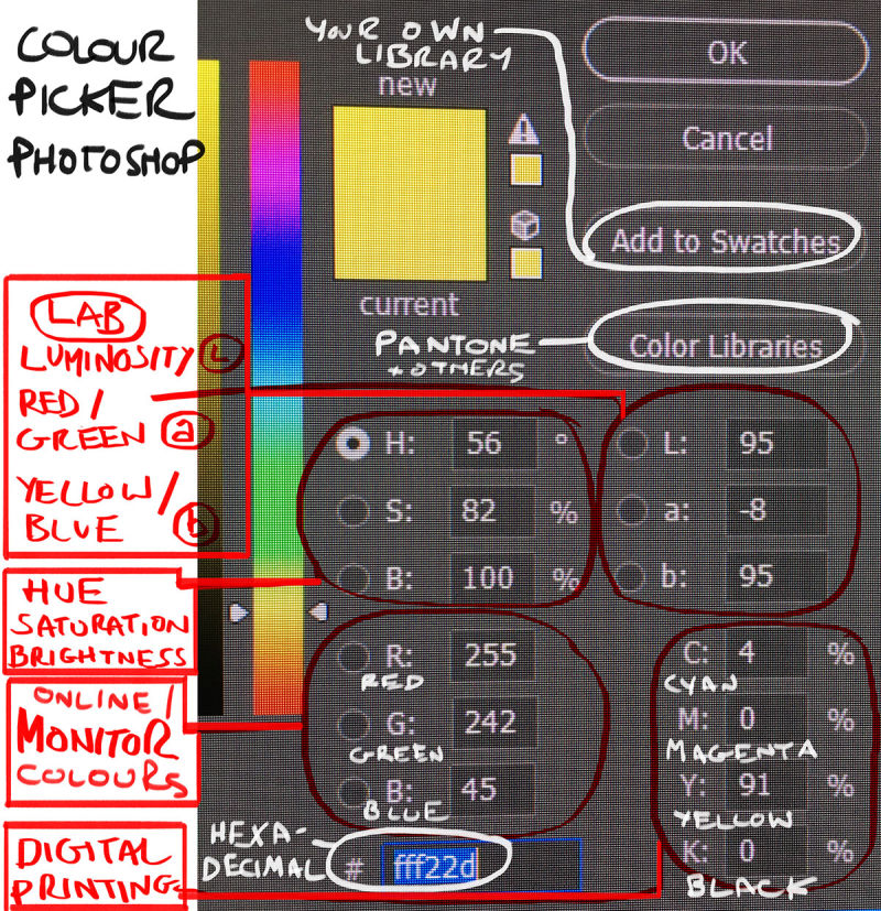
@sigross I am curious about something in the Pantone book. Do those numbers (the "color recipes") correlate in any way to the numbers in the PS color picker? In other words, is there a way to use them to achieve a certain color in PS? If so, that would be a great way to check color accuracy, which is in the back of my mind as something that I need to address as soon as I get my work flow under control. I think that up until now, I have always wanted to just use my eyes in order to train my color discrimination, but I like the idea of the book as a memory bank as well. It would make me more aware, like you said, of what colors I prefer. Is the set stable or do they add and subtract colors yearly? Do you know where one might buy one in Europe? Online, even? (Cringing while imagining the cost with VAT
 ).
).Thanks so much! I knew I could count on you guys! I hope to be posting some color schemes soon for my WIP.
-
@lauraa The Pantone book is percentage values of colour for mixing paint or for CMYK digital printing. Some colours you pick with say the eyedropper tool (hexadecimal value) can't be printed using the subtractive colour printing process. The LAB values L, a, b in the photoshop colour library of books represent Luminance (L), Red/Green (a), Yellow/Blue (b). This is to reflect an approximation of what the eye can see. In all honesty I don't often look at the numbers on photoshop. If I see a colour I like in a photo I've taken I open the photo in photoshop and use the eyedropper tool to make a swatch. Then have a go at mixing it by sight. But I guess it's good to learn which colour is dominant so you don't mix too much paint.
I just bought the pantone books online for £60-£70/$75-$85, 2nd hand ones go on ebay for a good price. New on amazon is about £130/$165. There's about 8 books in the collection and they do add to it, but generally colours stay the same! I bought mine about 5 years ago and haven't felt the need to update. I like the way they fan out and you get bathed in colour. Great for walking outside and checking what the colours look like in the sun compared to indoor artificial light.
I've only really used the pantone coated and uncoated colour palettes (sometimes metallic) on Photoshop due to almost everything I print in colour is screen printed so those values match the sorts of colours I'll mix with the paints available. When using metallic paint like Liquid Chrome I just can't find that colour in photoshop! And it's very difficult to photograph too.
-
@sigross Ah, so you are using traditional paint for your originals. Yes, I agree an objective way to measure color could be helpful, especially with neutrals. I used to mix a lot of oils, always by sight, but now I am doing almost all digital.
Which book did you buy? Was it this? https://www.pantone.com/products/graphics/formula-guide.
Thanks for the tutorial! I never even noticed the color libraries button before. Cool! I had an idea what the RBG and CMYK numbers meant, but like you, I usually just use the color picker or choose the color by sight. But if I hope to print, I need to learn this stuff.
How would I know which screen colors can't be printed using the subtractive process? That's what books use, right? (Pardon my ignorance!).
And yeah, those metallics are notorious. This I know from studying medieval art, where the gold leaf photos are always terrible. For that matter, most art photos are inaccurate.
@ThisKateCreates I used the coolors app (and tried the others) yesterday and it's so fun. I may be addicted!
Yesterday I was seeing color schemes everywhere I went. You guys have opened up another level of awareness for me, not based so much on copying accurate color or even interpreting impressionistic color, but on harmony within the scheme itself and making it work with value. That was the piece that needed developing. Thank you!!
-
@lauraa Yes those are the Pantone books I have. The subtractive (CMYK) process colours out of gamut are shown in the colour picker by the little triangle with the exclamation! mark.
Printing on Silver based C-type paper uses RGB printers - predominantly used for photography work, although some illustrations work well on this format too. But CMYK printers have improved a lot and have now added other colours. So worth looking for one of those like the Canon Pixma Pro 10s inkjet printer, which has a 10-pigment colour ink well. So home printing has been proper upgraded in the last few years. I've seen a lot of giclees that have had rare metals and varnishes added on top for the hand finished touch. So that's an option if you want to get some gold leaf in there.
The printers I use in London just want the files in RGB now and no longer require me to convert to CMYK, so that's a blessing. I do have a copy of all their printer profiles so I can see what the colours look like on different paper surfaces.
EDIT - Colour settings - then you can load your RGB and CMYK printer profiles in here:
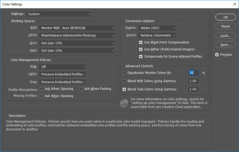
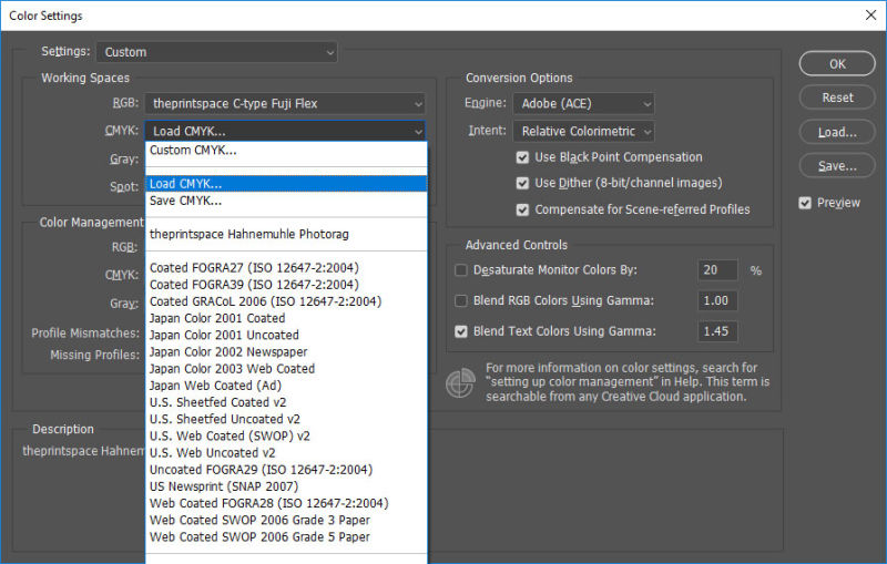
Hope this is helpful to get you on the printing train. Choo! Choo!

-
@coreyartus
Wow! That Google tool is so cool! Thanks for sharing it! -
@miriam Thanks! I'm fascinated by it, and can play for hours! It's dangerous. LOL!
")
-
@thiskatecreates
Wow! These are great tools! Thanks for sharing them! -
@coreyartus This is everything! Thanks for sharing it. I have a much better sense of the color palettes seeing them in the different works. What a great tool