Portfolio piece wip
-
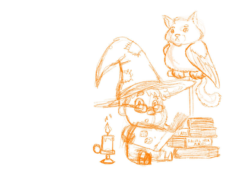
Hey everyone. So I watched the video on how to make a children’s book portfolio and decided to start on my first piece. My main concern is the camera angle. Is it ok to have spot illustration pieces that aren’t showing a lot of perspective? I know it’s an unspoken rule where you shouldn’t have the character looking at the camera but I kinda like that expression. What do you think?
(Also that is a catbirb)

-
Please take my advice with a grain of salt, so to speak, since I'm a newbie. I think it's cute that he's breaking the '4th wall.' What about the catbird looking down at the main character?
-
Hmm that’s not a bad idea it may work better.
-
Hi! i think you piece is really lovely. In my opinion, i believe it’s really okay if you choose not to put much perspective on a spot illustration. A spot illustration, in my opinion, is supposed to be a fairly simple scene. As for your character facing the camera, i’d say, go for it. I think that no looking at the camera is mostly for movies anyway. And even now, movies are featuring more fourth wall breaking characters. I’m really excited where you’ll take this piece.
-
@nyrrylcadiz thanks! This is great feedback
-
@aleksey The only time I played a wizard it had a catbirb. Best familiar ever! I love the image but don't know what should be in a portfolio.

-
@aleksey I like the character's expression and positioning. This is not a straight-on perspective, there is a slight side perspective here so I would not worry. It's very cute and looks like it would make a great spot illustration!
-
It's a nice cute piece. If you are going for a portfolio piece I'd maybe try and tell more of a story with it. Have the main character staring at the book with a furrowed brow really studying the text...maybe even the tongue is sticking out a bit like some people do when they are concentrating. Then maybe the owl cat is so bored and it's head is tilted back giving a huge yawn. Maybe the book's magic and there's a little bit of a glow coming off the pages.
-
@aleksey I like your drawing. I think the perspective of this piece is perfectly fine. I wasn't aware of an unspoken rule about characters looking straight at the camera, but a slight adjustment of the cat-owl's gaze, and the boy's gaze would add to the storytelling, which IS valuable in a portfolio. (i.e., the boy's eyes could be looking at what he's reading, with the cat-owl trying to read over the brim of his hat, or dozing; he and the cat-owl could be looking at each other)
-
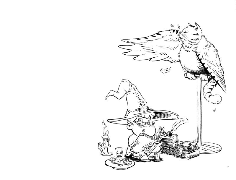
Thank you all for your feedback. I made some changes and I think I like how it looks. I’m trying to embrace the effect I get with a brush pen I might try a pen nib next time because I got some really positive numbers during Inktober on my Instagram when I tried a pen nib so that might be where I go. But next step is values and colors. What does everyone think?

-
@aleksey The expression on that cat birb! I feel like the cup and plate and character would work better overlapping. To draw them into the same image.
-
That turned out great. Nice line work. I've been working more in brush and pen nib myself.
-
@evilrobot thanks have you been using any sources to learn?
-
@aleksey Absolutely. I've been watching all Richard Friend (he's a comic book inker) videos here: https://www.youtube.com/channel/UC7LX4yIzUWcvb1u8tdR3E2g/playlists
I recommend the inking tutorials play list and his render like Wrightson playlist. He has a couple beginner tutorials but watching him ink and explain what he's doing helps a lot.
As far as practice I've just been doing pages and pages of hatch marks with the brush and hunt 102 nib. Honestly it's all about learning how your hand works the best some people work better pulling towards their body and some people get a better result pulling away. (I work better pulling away from myself.) Also I've printed out a bunch of my old drawings on Bristol in blue and practiced inking them. -
@evilrobot Awesome! Ty! I really appreciate it.
-
Also a little tip about the nibs (or most nibs) When you first buy them new they usually have some kind of chemical on them that they use to prevent rusting. It screws with the ink flow. I take a match and burn the end of the nib (don't get it glowing red just for a few seconds) it burns all that coating off and the ink seems to flow a lot better. Also use a sable brush I like the raphael 8404 #2 or the Windsor Newton series 7 brushes are OK (I've had quality problems with them having damaged hairs) I work in digital a lot but you just can't beat the line quality you get from using the real thing.
-
Yeah i like making lines with physical tools. Coloring though im ok with doing digitally maybe if i ever get anywhere in my art career i can spend time learning how to paint better
-
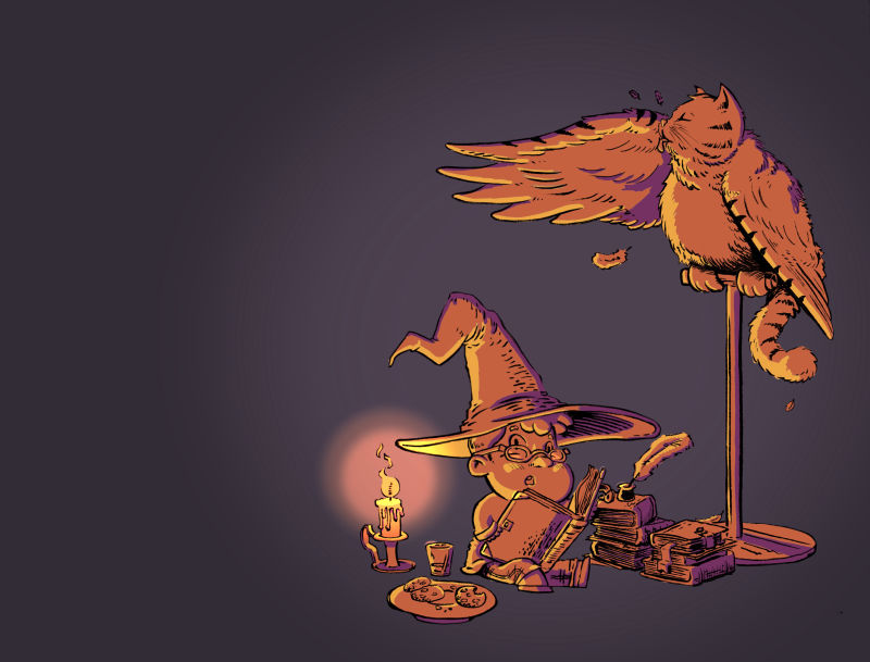
Ok I think it’s done. Whew ok portfolio piece 1 done!
