Help a beginner with tone/lighting?
-
Hi everyone,
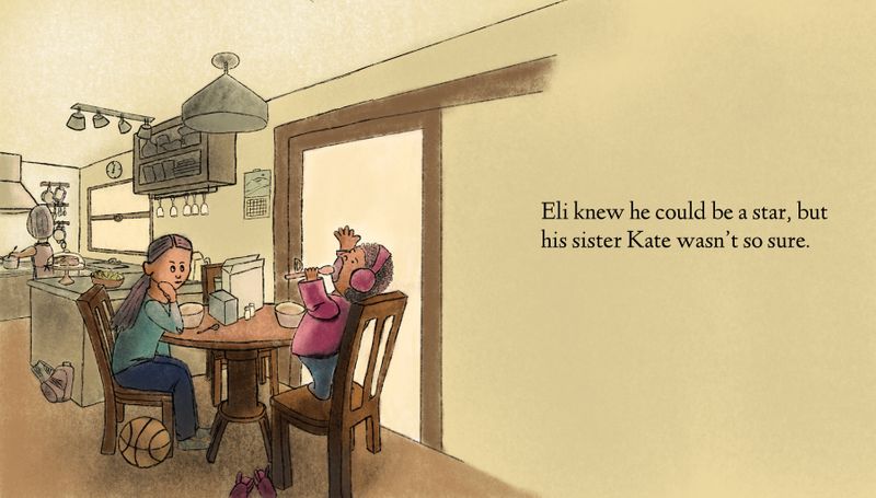
I’m new around here. Have been taking the fundamental curriculum of classes and it’s really helped me since I started drawing seriously just in April. I’ve been playing with some thumbnails to figure out tone for my latest drawing, but can’t decide which to go with. Would love to hear from y’all if you have any feedback?
Thank you!!
Tina -
Hey @yeungtina!
I like the layout on this page a lot, already. It's got a great sense of depth and the environment feels really solid.
Before I can offer any lighting crits, though, I'd have to ask some questions:
-
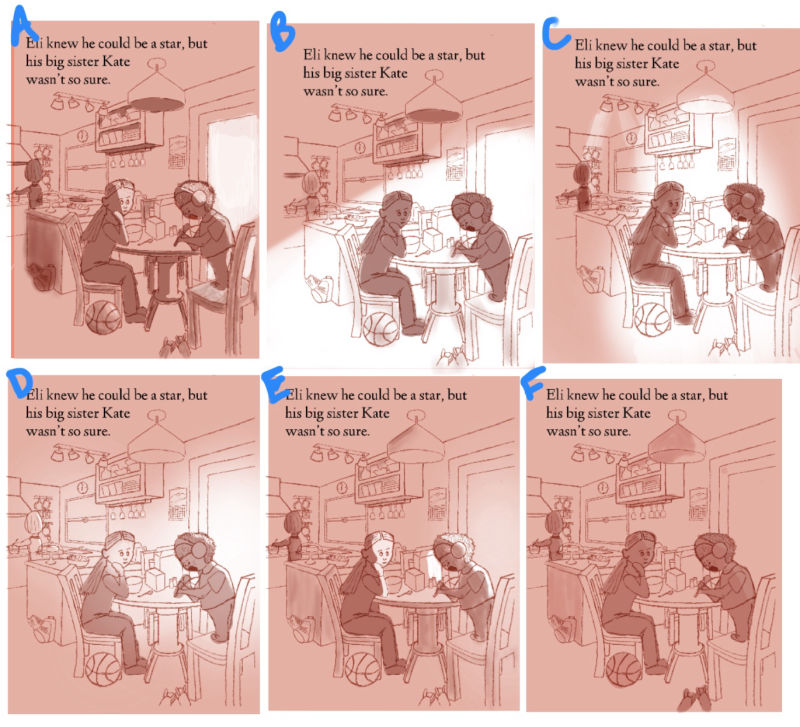
Are these thumbnails indicative of the final intensity/saturation of the light that you're looking for, or are they just place holders for the basic lighting.
-
You've changed the shading/tone for some of the items in the scene across the various thumbnails. Are those going to stay the same as if in response to the lighting, or were you just experimenting as you went on?
-
Will this be the color palette that you'll use in the final piece? Or are you just doing tone studies?
Let me know, and I'll try to give you a good run down
")
Aaron
-
-
Hi @Aaron-Pierce , thanks for the quick response! To answer your questions:
-
These aren’t the final intensity, just trying to figure out where to have light coming from and how harsh it should be.
-
For the smaller items I was experimenting as I went on to figure out how much contrast in the smaller items distract from the characters. Will definitely be adding more tone variation in the details once I decide the main light source.
-
This is just a tone study, the final version will be colored. (Right now I’m thinking yellow for most of the background, blue for the girl and pink for the boy. Both characters are dark-skinned.)
-
-
Eureka! Now I can give you better suggestions
 Thanks, @yeungtina !
Okay, so I'll hit them in order:
A - I think this one is actually pretty close to perfect, though I'd tone down the light on the door and add the same subtle light to the window, and give mom some slight shading. Don't take quite as hot of a tone for the highlights on the kids though. Remember, light diffuses as it moves through a room, so it'd be slightly less intense as it hits/reflects off of them.
B - The light is very distracting on this one. I do sort of like how the kids pop a bit more, but I'd say if you're going to do it like this to push out the background, tone it down considerably.
C - Honestly, I'm not a huge fan of this one. I can't even tell you why to be honest, I think it's just that the lighting feels forced and isn't super clearly defined on the kids.
D - I think the tone of the lighting on this one is good, but I wouldn't diffuse it like this one is. Confine it to the window and door and shade the kids more similarly to how you did on option A.
E - This one is closer, but add the light to the window again and don't hit the cereal box quite so hard, it distracts from the kids. I think the way you've got the kids lit on this one is more accurate, but tone down the intensity some.
F - This one works (I'd add the darker hue back to the backpack by the counter again, that was great contrast), but I think it strays from what you wanted to do. I do like it.So final verdict, I'd say do a combination of A, D, and E. Use the tone from E on the door and window (like in D), the shading of the kids from E ( just bring down the intensity a bit), and I think you'd be on the right track. Though I gotta say, the more I'm looking at F the more I like it lol. Just add the tone back to the backpack and that might actually be a winner lol
Hope this helped! I'm looking forward to seeing the final piece, like I said before I really like the layout and I think with some colors it'll be great!
-Aaron
-
I like E the best - the biggest contrasts in the image are on the characters which makes them stand out and attracts the eye to them
-
Thank you @Aaron-Pierce @NessIllustration !!! I will definitely incorporate your feedback into the next round.
-
Hi! I personally like lighting B mainly because I also using that kind of setup in my work. It would be nice to have an afternoon lighting on that scene.
-
I like D the best, because I think the backlighting of Eli makes him seem like the star he thinks he is. It shows his shape well, including the microphone, which communicates the story. At first I thought B because it has those advantages too, but I like how a little bit of light hits the sister's face in D.
-
Thanks for everyone’s input! Here’s a new colored version I’ve been working on. Suggestions welcome!