Perspective critiques please!
-
Hey all,
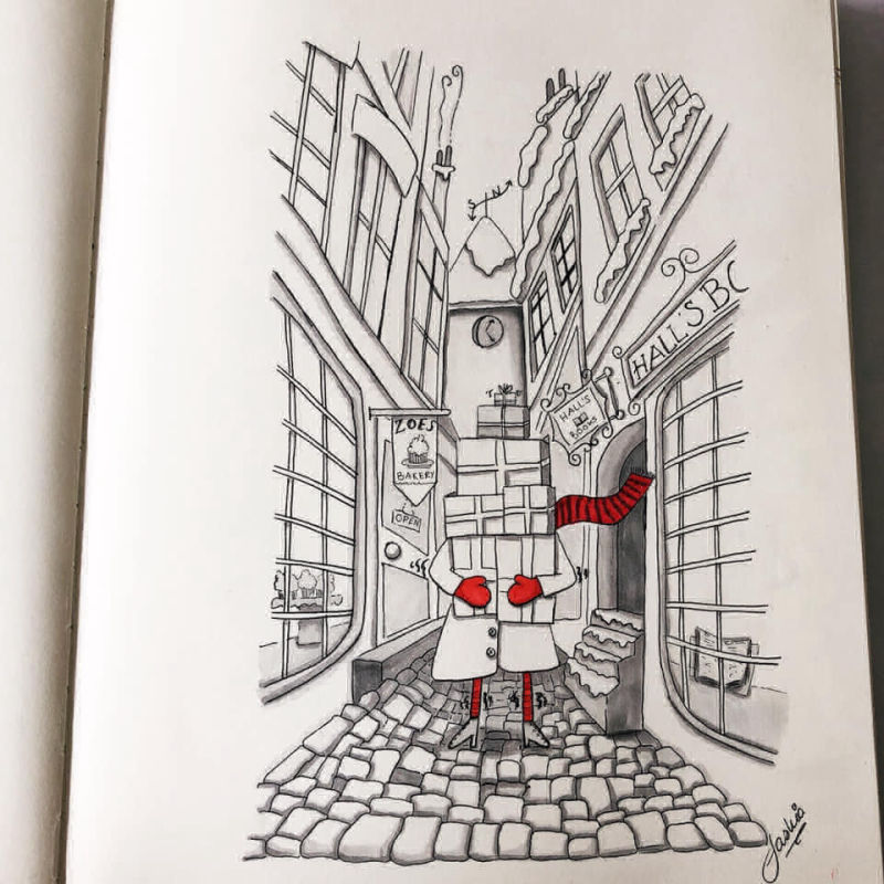
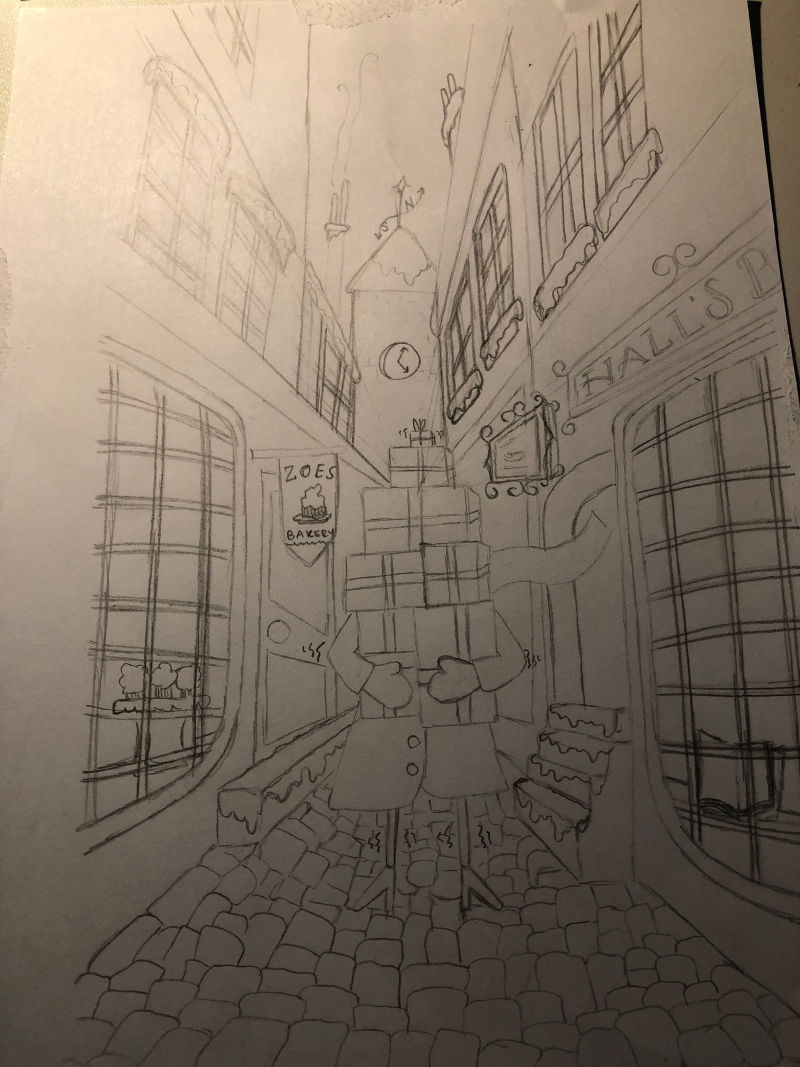
As many of you know, I have a hard time with the perspective bit. I have studied and am still studying the complexity of it all and have made a drawing now that I would love for you to pinpoint me on things I could have done differently.
As it is a bit of a comical illustration wise, I did not want it all to be tight lines but a bit loose, but not so loose that it fringes your eyes. It still has to have a realistic form to it all. Something I would do different if I do this one over, is actually putting the left step (to the bakery) on top of the cobblestones...

Some of you might already recognize it from instagram.
-
@sas on thing that pops out at me is there are Several tangents going on with the lines
-
This is one of those illustrated scenes in which I would suggest breaking the "rules" of perspective in order to achieve the "loose" perspective described in your original post. Currently I would define this as "wonky" perspective. Not realistic or believable perspective at all. I don't write this as a judgement -- lots of great illustrators never use "realistic" perspective. But you seem to be going for more than that, and so I offer this suggestion below. Good luck as you continue to refine your understanding and skills.
-
@davidhohn @Sas and your reply raise a question I have always had - what are the things you should do as an illustrator to make playful perspective look playful rather then just wrong? Should you, for example, still use vanishing points but just exaggerate them or bend them? Should you make sure each object is true to itself even if the overall picture doesn’t all fit in perfect perspective?
As a musician I know that In jazz, for example, improv works because the musicians stay in key and maintain the measure counts even though they play around with the melodies and rhythm but I haven’t been able to figure out with perspective what rules need to be followed and which can be abandoned when “being playful.”
Laurie DeMott
instagram.com/demotlj -
@Sas I love looking at this illustration. It is fun and has a playful feeling about it. I have nothing to add, as @davidhohn did a great job of offering advice. I, too, would love to know what makes an illustration wonky vs wrong.
-
@demotlj For me, a big part of drawing something with wonky perspective is making sure that the parts that are intentionally wonky are far enough off from where they should be in "correct" perspective that it looks purposeful. If it's only a little off it looks like a mistake.
The second part for me is if someone is going to make something with wonky perspective they need to exaggerate it in a way that enhances the character of the object or space.
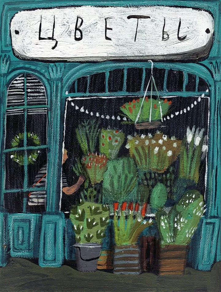
I love the way Alisa Yufa uses wonky perspective to add energy and character to her work. In this piece with the blue shopfront she bends all the lines in a way that gives the building a bouncy energy. If she had done this in correct perspective, the repeating verticals and horizontals of the building would have provided a quiet stability but the way she's chosen to warp things conveys the sense of charm and excitement that she (or maybe the person pictured) has when coming across this little shop.
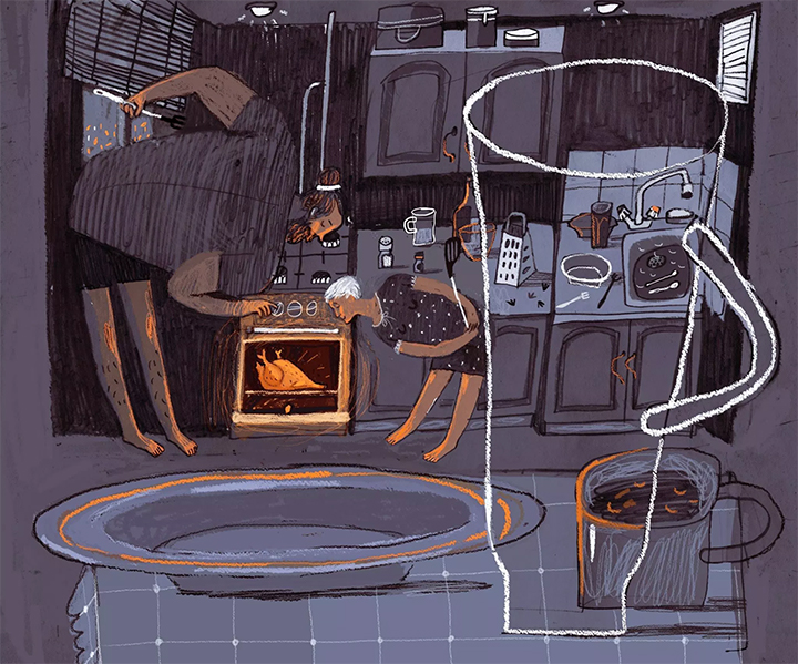
Here's another really nice one where vertically, the bend in the perspective of the room mimics the arc in the figures' legs. Horizontally, rounds forms still uniformly hold a little bit of an elipse where square forms are pushed almost completely flat. She does this to artfully harmonize the shapes in the room - the rectangular cabinets and counters, the tiles on the walls, the stove, the squareness of the man's upper body, the pattern on the table cloth.
Taylor Woolley
(Formerly Taylor Ackerman / StudioLooong)
Website: www.woolleystories.com
Instagram: https://www.instagram.com/woolleystories/ -
@demotlj I will often "build" my perspective correctly in my first base sketch, then on top of it draw it a bit more wonky. As for what I draw wonky and what I leave, it's kind of an instinctive process but if I had to try to explain it, in a structure I'll often leave about half the lines correct and draw the other half wonky. I'll also draw some of my lines bent or curved in the middle when they're supposed to be straight, but they'll still start and end where they're supposed to.
Note that this isn't a technique that will work for all wonky perspective styles as some are more deformed than others! Mine is mostly correct with some swagger haha
vanessastoilova.com
instagram.com/vanessa.stoilova/Check out my Youtube channel for tips on how to start your career in illustration! www.youtube.com/c/ArtBusinesswithNess
-
@nessillustration Maybe, just like in my music analogy, you have to be confident enough in the rules before you start playing with the rules. I think it will be a few years before I'm secure enough in what I'm doing to get swagger! I love yours though; it's really great.
-
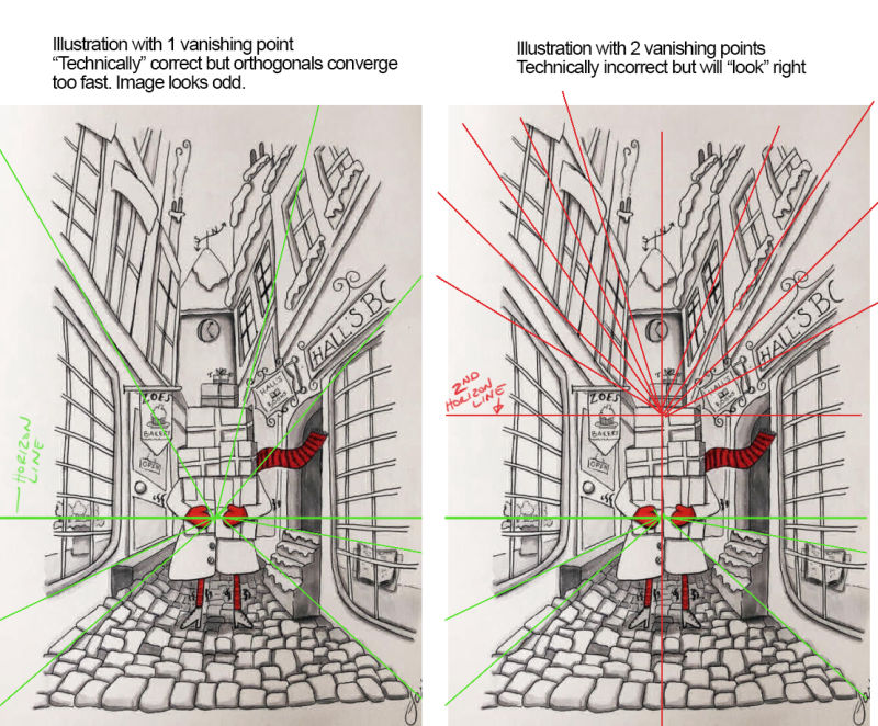
@davidhohn Thank you so much for your answer! So when making a wonky perspectival illustration it's allright to use two horizon lines? Is it only usable if you're using one point perspective or can you use it in, let's say a two point perspective of an inside environment?
I will redo the drawing using your suggestion. Thank you again for taking the time to clarify this and giving the suggestion!

-
@demotlj Maybe the same goes for this? I don't really know. Perspective is still pretty new to me and as I am a perfecionist, I need everything to look as it should be. That's why I made this illustration, to see if I can get off the "correct" road for a bit and just play around with it all.
Maybe you should just play around with it and see what music will be played on your paper?
-
@alicia-spilde Thank you so much Alicia! Perspective is so difficult! But I think that when you're practicing it enough, it will be a blast.
I dont know if you already have it but I have bought a book called How to Draw by Scott Robertson. It is a highly complicated book but it's interactive so you can scan QR codes with an app that belongs to the book, and watch Scott explain everything in detail. It's just like being in a virtual class!
-
@studiolooong Oh this looks like so much fun! Specially in the bottom illustration where it looks like the wall needs to be bend to make room for the huge man!
Looking at the illustration however just looks weird or something. I don't really know where to pin point is. Maybe its that we see much more of the kitchen counter than what we should. Do you see what I mean? It does look friendly with all the roundings in the illustration. -
@nessillustration This works so good though! It doesn't look "off" or anything. It looks like it fits right in the illustration.
-
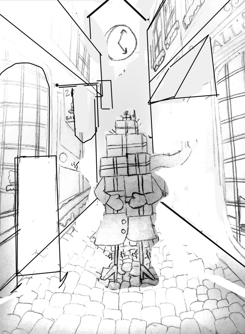
So having done a very rough sketch redo using @davidhohn suggestion with the wonky two horizon lines, I am keen to hear what you think of it before taking the illustration to the next step.
Ps. I changed that last top left window and curved the two store front windows again cause I just didn't like the way they looked now
-
@davidhohn Should I have put the horizon line higher up? What makes it that you put the second horizon line up. Is it an unwritten rule of rule breaking? Sorry for these questions. Im just so eager to learn this skill and still have a very long way to go.
-
1 point perspective is really tricky and it always sets up a "looking down the train tracks" type of feeling that is often hard to work around. There are 3 things I would advise for this kind of perspective:
-
Be careful with scale: your alley is too thin for the shot which makes all the angles more severe. Widen the alley and it will feel less cramped. Remove the stairs and anything that sticks out too far into the alley. Also, your buildings are too small which makes us be able to see too much of them. Run them off the page and you eliminate the harsh diagonals at the top of the page somewhat.
-
Use as many horizontal objects as you can to interrupt the diagonal lines. THings like awnings and signs, etc. work great for that kind of thing
-
"Cheat" the perspective. As david mentioned above, You can mess around with the vanishing point and still have it appear correct. In this quick sketch I really relaxed the vanishing points as they got near the top of the page which is where the real problems come in.
Hope that helps some. Good luck! : )
SVS Faculty Instructor
www.leewhiteillustration.com -
-
@lee-white You know, for someone who barely uses linear perspective -- you sure seem to know a lot about it!
It's almost like perspective is a tool you use only when it suits the needs of your image . . .

-
@sas Adding some thoughts to the first drawing:
what is very important to me when doing wonky on purpose, is to keep some sort of general rules from typical perspectives and then keep the rules you impose on the wonkiness as well
Important things - vertical lines - you either keep them straight and or you curve them for optical reasons (not because one of the buildings "dances" for example" and a particular effect
-
if you keep them straight you can either keep them all straight perpendicular to the bottom plane (the street plane)
-
or you make them taper slightly at the top as appears in your drawing, in that case you imply a second vanishing point at the top that unites all verticals somewhere very far outside the drawing. In that case, objects closer to the cobbled street on the vertical planes (on the facades) will appear bigger on their bottom than on their top. Meaning for example the first floor windows, all will have a larger bottom sill and a slightly shorter upper sill. In your frawing at the house on the right in the second view plane there's a window that looks like it's counterperspectival
-
if you curve the vertical planes slightly same rules apply but you should curve them all sort of in paralel with the same amplitude. otherwise some see to fall into the street
I think that either curving or tapering slightly can soften the very exagerated lines of the perspective
ibut i also think one of the main issues is actually scale and understanding how things become smaller the further they are from the viewer. The windows and doors should be narrower. Each window in the successive planes should become narrower and narower. also important to give depth and scale, the cobblestones are ineexplicably straight in the front and curvved in the back. and worse, they all seem the same size. Because of perspective they should appear smaller and smaller and narrower as they are further from the front. Also a rectangle in perspective would look like a paralelogram and if you draw the diagonals in that paralelogram you would have the middle. that's a way to correctly split a window for example into correct proportions. I agree with the street seeming too narrow and ditching the steps. the one on the left looks like it would go on forever and the ones on the right look like they are way to steep. as a general rule about stairs and steps usually in normal steps the heights of the step is lower than the width of the step (only on ladders or very very steep ship or attic stairs they are higher)
The entire flight of stairs on the right of the character has 4 steps. it's behind the character but it still looks like one step reaches up to his knee. think in real life, that never happens. also, look at his show size, imagine it would have to actually fit on the step. Tiny details like that can give things more realism. you could have stylized the feet to be very tiny and unrealistic in which case it wouldn't have bothered because it still wouldn't feel like he can't put the foot on the step. but if you make the stairs big enough to fit his feet you will see that the stair would reeach way into the street so either make a smaller stir in the background, in a faraway plan or ditch it alltogether.
your horizon line is sort of at the navel of the character as davidhohn shows abve. that would look like a child would look at the scene. it implies that the viewer has its eyelevel at the navel so in my opinion i think having the facades seem to fall into the street would imply again the samllness of the kid/viewer.
i'm not sure if all this makes sense. i can't draw right now on the drawing but i hope it's helpful. i agree with what people already said. to me wonkiness has to work somehow and at least keep the "things appear bigger nearer to the front and smaller nearer to the back" kinda rule
sorry. this is all over the place
-
-
-
@Sas Also this https://www.youtube.com/watch?v=mozbtxnmgsU&spfreload=5
Just understand the principles, no need to construct the perspective with a ruler in the case of the cobblestones for example, you can aproximate and make them irregular and so on but keep the idea in mind of things slowly and gradually becoming smaller towards the back.