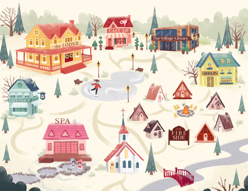
Village map illustration
-
Good evening
")
I just finished this piece for a commission and would love to hear your thoughts on it! I'm not sure how much I'll be able to tweak at this point since there were a lot of very specific restrictions (it's a website graphic that's meant to be functional, with clickable buildings). I had specific restrictions about the colors, composition, even the types of buildings. But I had a lot of fun with it and I'd like to put it in my portfolio - I'm just not sure it's strong enough to be a portfolio piece since I spent so much time on it that I literally can't tell anymore! Thoughts?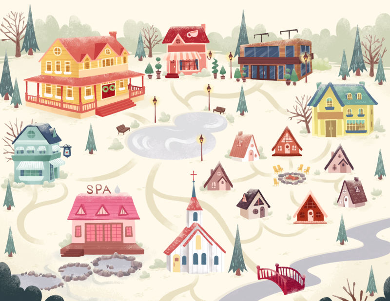
vanessastoilova.com
instagram.com/vanessa.stoilova/Check out my Youtube channel for tips on how to start your career in illustration! www.youtube.com/c/ArtBusinesswithNess
-
@nessillustration
It's really a beautiful world build/map! I don't think I have any constructive critique on it, because the colors all communicate well, and it does what it is supposed to do really well - gives direction. And from what I've seen of your work, it really fits in well.
Also, I'm not working in the field right now - so take this with a grain of salt. I think there is a place for illustrations like this in portfolios as well as in children books. @smceccarelli just posted an image/client piece where the values were meant to be subdued so as not to draw too much attention to one thing. You both got work for a piece that was more information based/visual exploration. It's good, solid professional work from an actual client that communicates with your style and the portfolio you've already built.I guess the only thing I would say is that industrial building on the top right doesn't really feel like it belongs in the same world as the rest of the buildings - everything is so 19th century quaint victorian style - but that might have been a direction you received from the client, and I really only noticed it after staring at the image for 5 minutes trying to find something constructive to tell you :-p.
Love it - brings me back to my childhood with Neopets.
-
@nessillustration This looks very cute! I like the color palette that you chose. Given your restrictions, I think this piece is as good as done. Is it portfolio quality? I really think it is. However, it's up to you to decide if you want it in your portfolio. Again, great work.
-
@nessillustration I love it. It is really well done, the colors are great and it's charming. I think it looks good enough for a portfolio, but I am not an expert in these things!
-
I think it´s a nice, solid and good-looking piece, with a nice vibe to it. Definitely portfolio-worthy. And there´s a lot of potential work out there for maps and similar (actually so much so that it´s in my list of things to add to my portfolio). I could also see this used as end-papers, or, with some nice type, as book cover. There’s a category of book covers (I think Lee and Jamie called them “pattern-based”) that have intentionally no main focus.
-
This is beautiful and you should definitely put this in your portfolio as it shows that you could do editorial/packaging/advertising (etc) illustrations too
-
There's so many details!
 Would never want to leave a website that looked like that!
 -
It’s beautiful! I love it. At a conference this summer an Art director mentioned that everyone should know how to draw a map. I think it would be a great thing to add to your portfolio. Great job!
-
I really like this overall; I'm just wondering is the Spa an important element to the project. My eye was immediately drawn to it as the only word and no other buildings have names.
Cheers
-
Thank you so much everyone for giving me your thoughts!
 I hadn't considered how this can apply to many different things - editorial, packaging, end-papers... Thank you all for bringing me this perspective!
@kaitlinmakes You have a good eye! This building is the "media center" and as such the client wanted it to be more modern than the others! In fact, most of these buildings will have text on them later on, on that sign space I left above the door, which will greatly clarify all of that!
@rcartwright Thanks for bringing it up!! All the other buildings will have text as well that I left blank for the graphic designer, and I have no clue why I did only the spa handwritten
I must have had a brain freeze haha! Thanks for bringing this to my attention!I'm waiting for feedback now, and after I'm done with the tweaks I have to do a few animations for this as well - smoke out the chimneys, fire from the firepit, skaters on the ice rink, water in the hot springs.. Your comments really helped me see the potential of this piece and I feel a lot more confident with it now! Thank you very much everyone

-
I thought you might like to know, we made a few last little tweaks and the final illustration will be like this! I'm also making animations for the skater, fire, smoke out of the chimneys, and river!