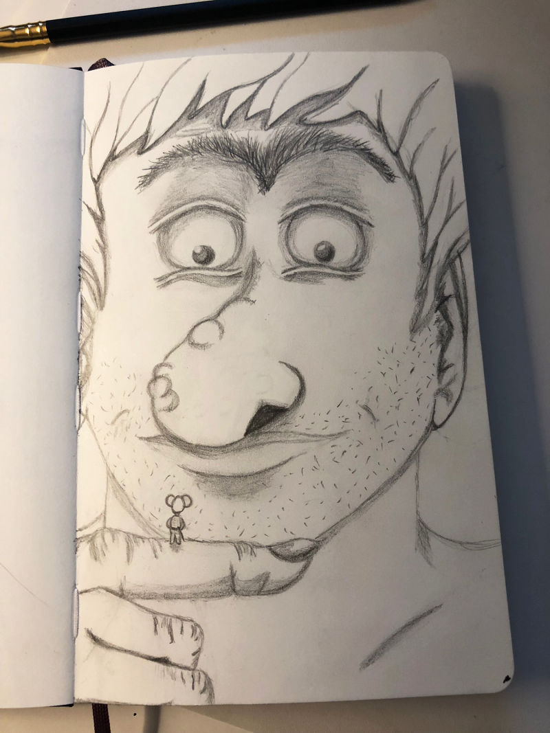
A shady problem (posting trial #2)
-
Hi guys.
Oh how scary it is to open up my sketchbook to you, but if I want to learn, I need to do this!
So I was sitting in the train yesterday heading for work and this idea started to take form in my head. I started sketching and after a while there was a giant sitting on my paper. I added shading but now I am sitting here, scrared of adding more because I think it will be too much.
What do you guys think? I think his face is a bit flat or something.
And his nostril, would you put it somewhere else?
Would you lessen up on the shading in some part or add more in others to make him more “realistic”? I don't really know what I am doing... haha
-
Hi Sas! What direction you take with your shadows depends on what you're trying to do, because there are all kinds of styles. But if you're wanting to make it look more realistic, I'd suggest using yourself as a model and making observations about how shadows behave. (I have a photo library of ridiculous mirror shots which I hope no one ever sees!)
First of all, your character design and your idea are quite cute! So there's definitely something there in your imagination that's worth pulling out and learning to draw the way you want it to look.
For shading, start by thinking about where your light source is, or where you want it to be. Here it looks like you've got it coming from above, but it's a bit shallow (as in, the shadows make thin stripes suggesting shallow depth), which makes your drawing look like a relief. Lit from above, the eyelids would put more shadow on the top of the eyeball, but not necessarily all the way around. The shadows currently make the most sense around the mouth, which looks realistic and where you have some indication of a cast shadow. There should also be one under the neck, and on the top part of the ears, for example. If you look in the mirror with light coming from above you will see this right away.
But also, think about the mood you are trying to create. Light coming from above looks a bit like an interrogation (think of police shows). Observe the light around you and decide which kind of lighting suits the mood you want. Maybe for the mouse this scene is an interrogation! But your giant looks friendly, so maybe not.
Also, think about how the eyes fit into the sockets and how the skin goes over them. (There's a great part of a critique in one of the online classes somewhere that talks about this very thing with eyeballs, but unfortunately I have no idea where it is!)
And finally, for the nostril, I think your placement on the nose is fine, but the very dark value draws a lot of attention and the angle of the nostril looks wrong along the bottom. (The eye gravitates towards value contrasts.) Look at your own nose in the mirror with your face at the same angle. You will see some skin along the bottom of the nostril and perhaps part of the septum inside. And probably the bottom of the shadow won't line up with the outside contour of the rest of the nose.
Sorry, that's a lot of stuff, but once you know a few things about light and shadow you will improve really fast and it's fun! If you subscribe to the videos, have a look at Jake's Light and Shadow class. I'm sure there are others, but right now they've all kind of blurred together in my mind and I can't remember what's where anymore. Just filter for fundamentals and lots of good stuff should come up.
And if you want, post successive versions and ask again. I've seen people get really good critiques that way!
-
@lauraa Hi Laura! Thank you so much for taking the time to look into my drawing and looking into all the problem spots! I so appreciate that. I’m going to take notes on my sketch and trying out your advisory points for sure!
The videos you’re referring to are on my list
 First I’ve to finish the lesson I’m on at the moment. Gosh there is so much to learn! I want to learn it all at once!
Again, thank you so much. I sure will put out advancing sketches as I go, keeping your notes in mind!
-
What a charming sketch! You've done a great job with the giant's facial expression. Since the mouth is very close to the figure on his finger, it could potentially make it scary, but you've balanced it with contrast and detail so we are looking more toward his eyes, than his mouth. Well done! If you lighten the intensity of the nostril like Laura suggested, it will help keep the focus more on the eyes as well.
@LauraA has already given you a great advice. I will also recommend looking a reference. It could be photographs or your own face if you want to go the realistic route, it could be other artwork if you want to stylized quite a bit. I will also say that you will be well served with continuing in your perspective studies, until you get the basics down and can draw basic 3D shapes in perspective. That will help you so much when it comes to shading.
Thank you so much for sharing! I'm glad you could overcome your fears and post some work. Critique can really help you grow!
-
@sas Our sketchbooks can always be a frightening thing to show others, but it's a great way to improve!
I hope you don't find my advice too dry or blunt, but first I would say that you should be more willing to make a mess, make mistakes and make more, especially when it comes to the work in your sketchbook. The questions you are asking can be solved by trial and error by redrawing your giant again 4,5 or 6 times in thumbnails on another page and then again on another page and again etc trying out new ways and styles.
Should his nostril be moved? Probably, but maybe that's because the nose is anatomically wrong in the pose he has (though if your are going more cartoon like then maybe it's not a problem. Don't worry about that though, just spend a minute redrawing it in a different position or a different style and see what works better.
Is his face flat? Not necessarily, but your body type and face shape are in a more realistic style, whereas the features are more cartoon like, especially in the eyes, so you could either do a cel shaded style or learn about the planes of the face and really understand where the light is coming and how it will affect those basic forms and go more realistic. Hey, why not try both? Or both in a variety of different styles spending a few seconds to a few minutes on each one.
If you have ever seen the movie Napolean Dynamite he comments about how he spent 3 hours shading the upper lip,and although it's just comedy it can be quite true that many beginner artists are spending too long getting the details right when the foundations are wrong and the only way to fix those foundations is to start to enjoy building a load of terrible houses until you gradually find the one that won't fall down. And with that i'll leave you with Napoleon:
-
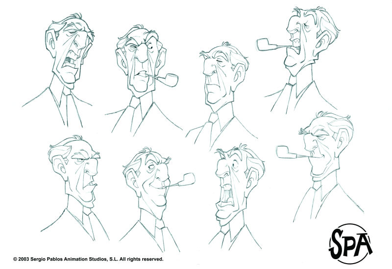
I completely echo @Gary-Wilkinson comments. Sketchbooks are for playing and learning and, while there´s nothing wrong with wanting to experiment with shading, it’s not possible to get it right until you know the construction and planes of the face and features (or of anything else you want to draw). So instead of spending time on shading, I’d suggest spending time on drawing your giant again and again, (in a smaller size, maybe ;-)), or even better, drawing real faces of people, or copying character sheets, if you prefer to concentrate on a stylized version of faces.
That´s something that is not so obvious but it’s true: you don’t need shading to suggest volume. A well constructed drawing will immediately appear dimensional, even if it´s not shaded at all. Here is a sample from Borja Montoro: one of the artists who does this to mastery level:

-
@gary-wilkinson I dont find your advice blunt or dry! On the contrary! It's so helpful! Thank you for that. Indeed I wanted to go more of a cartoonish thing but still didn't want the whole thing over the board cartoonish. I wanted to give him a giant nose. I shall take your advice to heart and look into other peoples work and first worl out the thing so its atleast anatomically correct! Back to the drawing board that is.
Ha Napoleon Dynamite. All I can remember from that movie was his dance :face_savouring_delicious_food:
Thanks again Gary!
-
@smceccarelli Thank you so much for your answer! I shall look into Borja Montoro and study his work. And indeed sketchbooks are supposed to be messy but I'm this perfectionist that want picture perfect sketchbooks where people will look at and be like ahhhhh, that's so good! It is something I am trying very hard to step off of. That and stop comparing myself to others
 Darn this whole drawing thing had become a huge self exploration adventure!
I see what you mean by the shading thing. It is quite possible to get strong dimensions by putting down a strong expression without the help of shading. Expressions is something on my top three that I need to learn before heading forward.
-
@sas Take the eyes apart and pulls the pupils together looking at the little fellow
-
@sas You say "this whole drawing thing has become a huge self exploration adventure." I've come to the conclusion that success in any creative field has as much to do with mental strength as creative skills. Art schools should offer courses in building up one's psychological fortitude for the long haul!
-
I like the mirror suggestion. Pretend there is something tiny on your own index finger and take a picture of yourself looking at it. I do mirror and picture references of myself for expressions because I know what feeling im trying to convey. Drawing it out lightly and slowly lets me build on the idea gradually without committing to anything. That is my approach though.