Music Wip- Update- Color Help
-
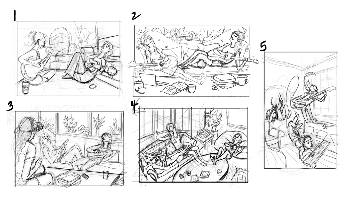
Hi all. Here are my thumbnails for this month's theme. I did about 12 and narrowed them down to 5. I was envisioning these friends hanging out on a hot summer day, and they started an impromptu jam session. They are a bit lazy because of the heat, but are still into the music. Number 5 is just a random wild card I threw in.
These are still just rough and I will be further refining perspective, anatomy, and how the characters and all the props in the scene will look. But overall, which composition do you like best?
EDIT: While I was initially going for that lazy feeling, which one do you think I should enter in for the contest? I would consider the wild card 5 even if it doesn't fit my initial idea. I would probably paint one of the lazy ones on the side anyway, even if I entered 5 into the competition.

-
5 of course! the rest seem to be more about the heat or the furniture than the music.
-
@heidi-ahmad Thanks! I guess I was going more for the feeling of lazy playing. When you're so tired, but you still must play! I can see where 5 better illustrates music in general though!
-
can't wait for the winter so i'd be more like 5 xD
winter person -
@heidi-ahmad Haha. I know what you mean. I'm looking forward to fall first though. xD
-
I like 2 for your lazy concept.

-
I think 2 fits your description best too. The fan and drinks give the impression that it's hot, which explains why the musicians are so wilted. Maybe the drinks could be in glass cups with ice cubes? I also wonder if something that would make the piece a bit less symmetrical might add to its strength. Maybe something large in the foreground?
I really enjoy all of your sketches.
 So much excellent emotion.
 -
Thanks for your feed back everyone. Good suggestions @KathrynAdebayo !
-
P.S. I edited my first post to clarify that I'm willing to go against my initial idea, if more people like #5 best.
-
I Love how dynamic 5 is! Definitely 5.
-
I agree with @Heidi-Ahmad. You can certainly make great images with the first group but 5 is without doubt all about the music which is key for the contest. The others are simply using music as an element to the other components. Love the energy of the girl rocking out on the right, though the pose of the keyboardist has me confused. Is she laying down or is she jumping off the furniture to play the notes with emphasis? Overall it's a really cool concept and pushes the level of competition in the contest!
-
5! It's fun! I figure go for it.
-
I like them all but I like the groove of number 4.
-
@tessaw Five stands out to me - i think it would make a very nice portfolio piece!
-
Thank you everyone. I think that I'll go with number 5. @Jon-Anderson they are all supposed to be floating, kind of like they're in an anti-gravity situation. I'll explore that specific thumbnail with a few more iterations so I can play with poses and getting it to read clearly.
You guys are so awesome and really keep me on track. So grateful for your insights.
-
These look really good. I like #2 & I agree @KathrynAdebayo's comments. The candles and mugs make me think of wanting to be cozy & warm, so drinks with ice would really help convey the concept.
-
Hi Tessa,
To me #5 has more frenetic activity and wimzy. So naturally it will atract attention.
But #2 has a sort of rising and falling motion like a sine wave, or melodic music. More of a quite appeal.
Will
Pardon typos
Sent from my iPhone -
I like 5 the best too. It seems the most fun image to look at, it has a ton of crazy energy!
-
I love the energy of 5. But you nailed it with lazy playing in 1. Maybe you can go back to one some day. Can’t wait to see the finish!
-
I'm probably late to this party! 5 for the contest, but several of these would be awesome to work up later! I like them all.