Brave- Merida fan-art WIP feedback please
-
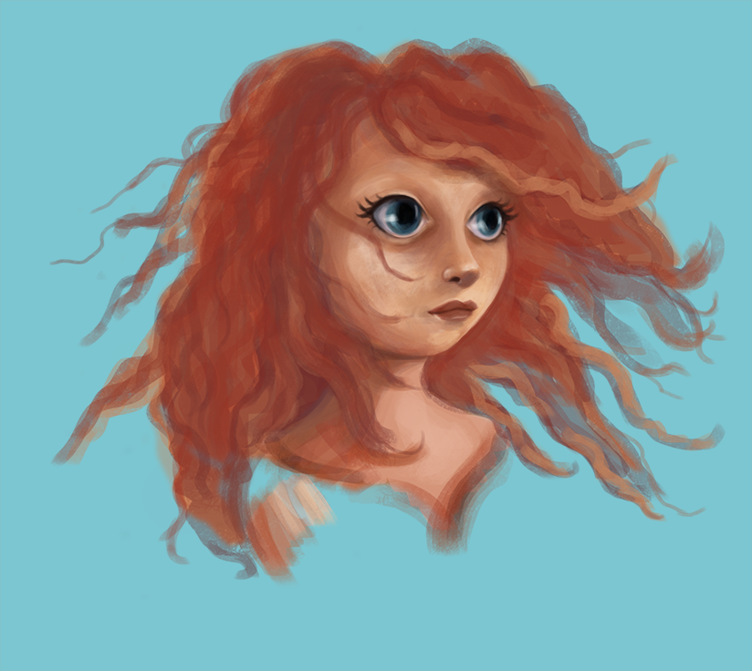
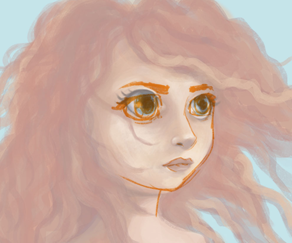
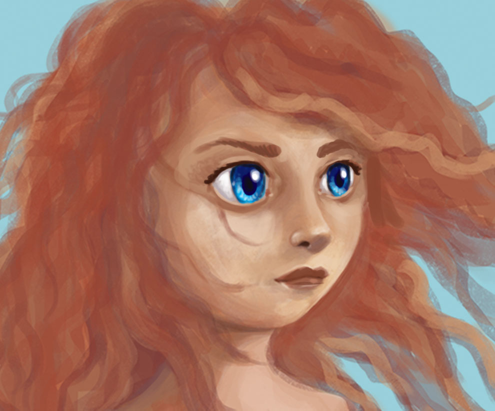
Hy guys, I'am kinda stuck with this one, something is really not working but I cant see what and So its hard to fix. I haven't worked on the hair, nor eyebrows yet, but still...
any ideas?
-
Hello - this is looking good - here is what i see as the major differences - i think that the first thing that strikes me about her face in the poster is the contrast of texture between the face and the hair...i have not seen this movie but i just google her name and most of the images had the same look - her skin is Very smooth and here hair is wild and alive and vibrant and full off light in many of the photos i saw - i would cheat a little bit and bring the original into photoshop and use the color picker to see what color her shadowed hair has ....i think it is much more saturated that we might guess a shadow would be - what i see in the facial structure is that they her eyes should be set far apart ...more the an eyes width apart - the vertical lines at the end of her eyebrows seem very important...adding a fierceness to yer beauty...her eyes are much smaller also than you have painted - her hair in proportion to her face should be larger - also in all of the photos i find of her her forehead is an important shape and is not obscured by her awesome hair - her hairline seems always to be clear..the distance from the top of her eyes to her hairline an important distance that adds to what is recognizable about her - in most of the images i found of her her eyebrows were more toward the middle between her eyes and hairline - her eyes should have much smaller pupils - this adds to her fierceness - also the redness of her nose and cheeks is more saturated in what i have found - also she should have an impossibly small nose ..but a longer nose ...there are very few profile images of her but check one out and you will see her nose in a much clearer way... mainly the perfectly smooth skin and eye size though..i would do the color picker for the hair and maybe eye color ..i think it will open the whole thing up if you saturate things a bit....hope this wasn't annoying.. : )
-
@Kevin-Longueil Thanks Kevin for your help. I'd just been working on the face now. Ill try and put the eyes farther apart. that might work. Ive used the photo for reference. maybe by adding eyebrows will help aswell
-
Hi @Leontine-Gaasenbeek - the first few things that jumped out at me were the lack of eyebrows (which I see you have already commented on) and also the black eyeliner effect on her eyes. It really distracts from the overall red hair and eyelashes Merida has in the film and I think that throws me off quite a bit. And then as Kevin mentioned her pupils should remain small to add that fierce intensity that is part of her rebellious character. Finally as you begin to get more detail on the image - her hair here looks thick and heavy. But I think her hair is actually finer and while curly also a bit frizzy. So some of your detail work with thin lines and stray hairs would really go far as well.
-
I found this awesome tutorial - she shows how to render a face like the one you are working on - very impressive ....http://nataliebeth.deviantart.com/art/Complete-Digital-Painting-and-GIMP-Tutorial-339824344
-
@Rich-Green Thanks Rich, Ill take your comments with me whilst working on this one.
-
@Kevin-Longueil Thanks, Ill check it out!
-
Pay really close attention to the shape of the eyes. Jake Parker talks about how our brains turn things into symbols and eyes seem to take on an almond shape symbol where the top and the bottom of the eye are the same shape and size. In reality eyes have a deeper curve on the top and a subtler flatter curve on the bottom. Animated characters usually push that contrast so you get the Disney style gumdrop shaped eye. Also the color around her eyes get's a bit dark and it's kind of making her look tired and maybe older than she should be. You have a good start on the hair remember to start with big blocky shapes and work your way down o a few detailed hairs. It's all about illusion with hair.
Hope that helps. It's looking good so far.
-
@Jonathon-B thanks so much for your comments. Its really helpfull!
-
No problem. Here's a link I was just looking at about painting hair. https://www.pinterest.com/pin/515943701034172000/
-
Hi @Leontine-Gaasenbeek I hope you don't mind, but I took a minute to do a little paint over. I'm not the best at this, and I'm not saying THIS is the solution, but I thought it might help a little.


-
Hey there, I thought I'd chime in too. I'm a HUGE fan of copy work and I assign this kind of thing all the time! It's great practice because there is something so tangible to work from. I think we should all do these kinds of projects throughout our whole career! So great job getting this going.
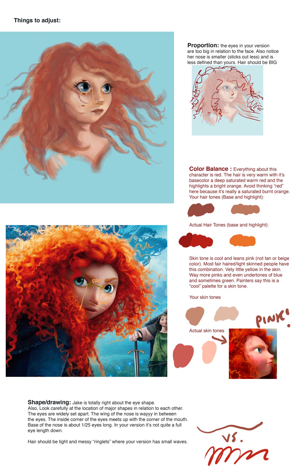
When I assign this type of project, I have my students do a careful analysis of things before starting the painting. This helps a ton with getting it right and having it go smoothly. First we start with a break down of all the major shapes and design elements. Then we move to value and what kind of finish will be required (rough brushwork vs. rendering). then we get into color breakdowns and any other detail that is needed.
When doing this kind of work, I advise you to put some reference images on your page (especially if it's digital because it's so easy to do). That way when people see your work they can compare it to the source very easily. It will also help you see where you should go when you are painting.
Here's a quick breakdown of some things I noticed with your version when I compared it to the actual brave character. Feel free to use it as a start or make your own "style guide" as needed. : )
Happy painting!
-Lee

-
@Jake-Parker thank you very much for the effort to help me with this. Super! Ill take your advice to the next fase!
-
@Lee-White Wow, Lee, thanks for this 'breakdown'. Its really very helpful. You've put so much effort in this for me, and it makes me eager to continue.