Small illo
-
Ok, I am buying time before tackling larger projects. The book dummy I was working on is currently on pause and I should be starting a new one soon (that is another story). I am working on a 50-things illustration but I am hesitating on the threshold of investing the next 100 hours into it. Meanwhile, I bide time working on vignettes for a little challenge issued for Europolitan SCBWI - it is supposed to be for a notebook cover.
Feedback welcome!!
-
I'm sorry for being useless but i love your dragon
Edit: wait, you may want to check your perspective in a program like caraspace (free perspective tool), the figures and the books look like they're in a different spaceEdit 2: maybe it's just the book under the tail that's throwing me off
-
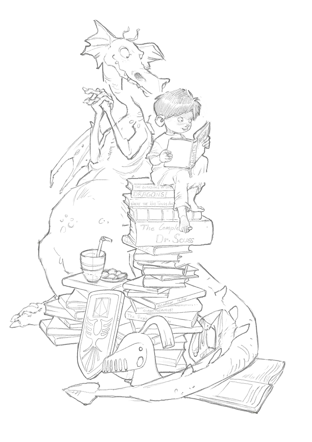
@smceccarelli I think the books the boy is sitting on should be more in a vertical stack. The way they are positioned now he should be falling over.
-
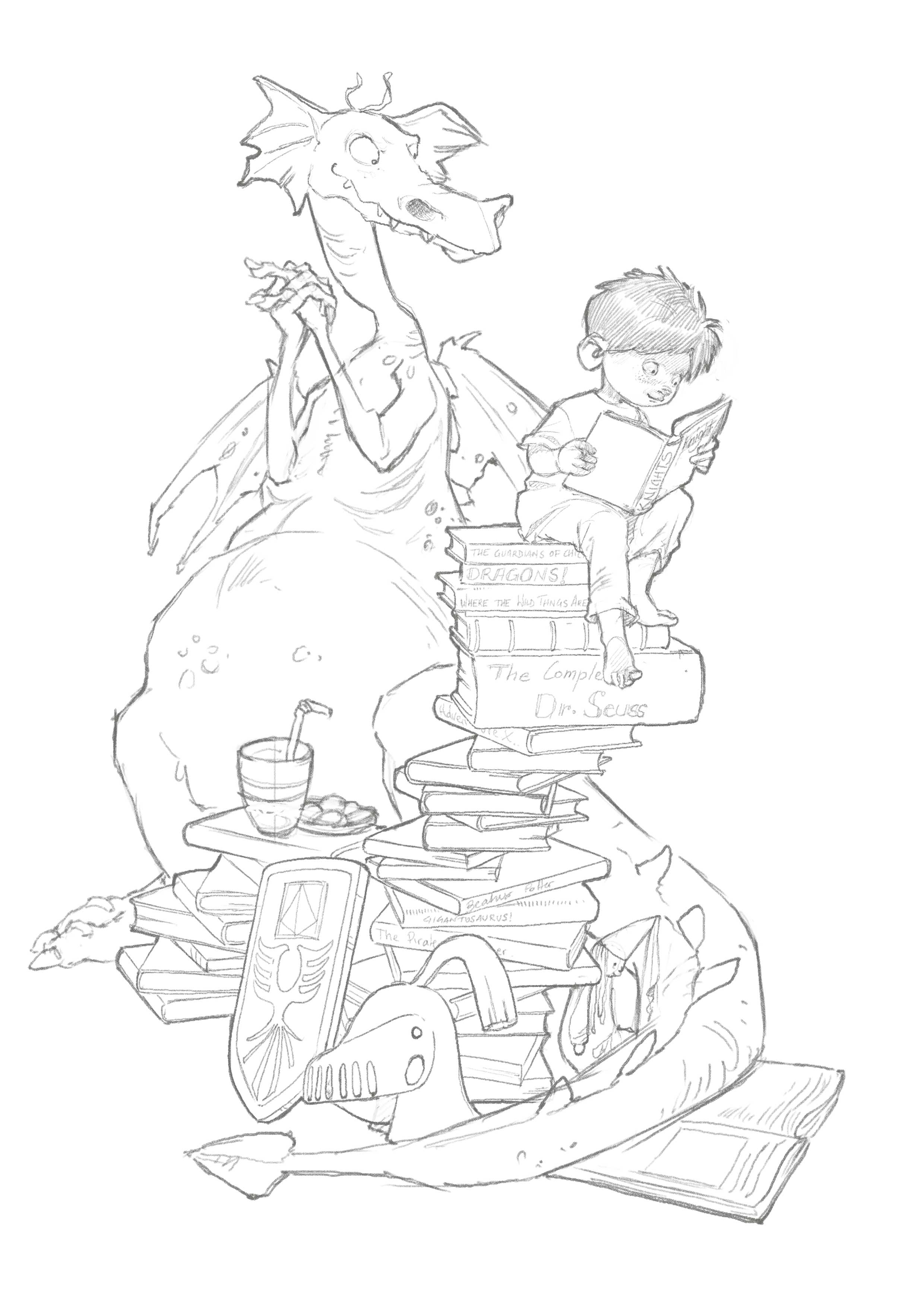
I did a quick little tweak on moving the books over, rotating the boy to sit straight and bring back the dragon head and rotate it so it looks to be looking at the book as well.

-
@Chip-Valecek THANK YOU!! Very good changes!
-
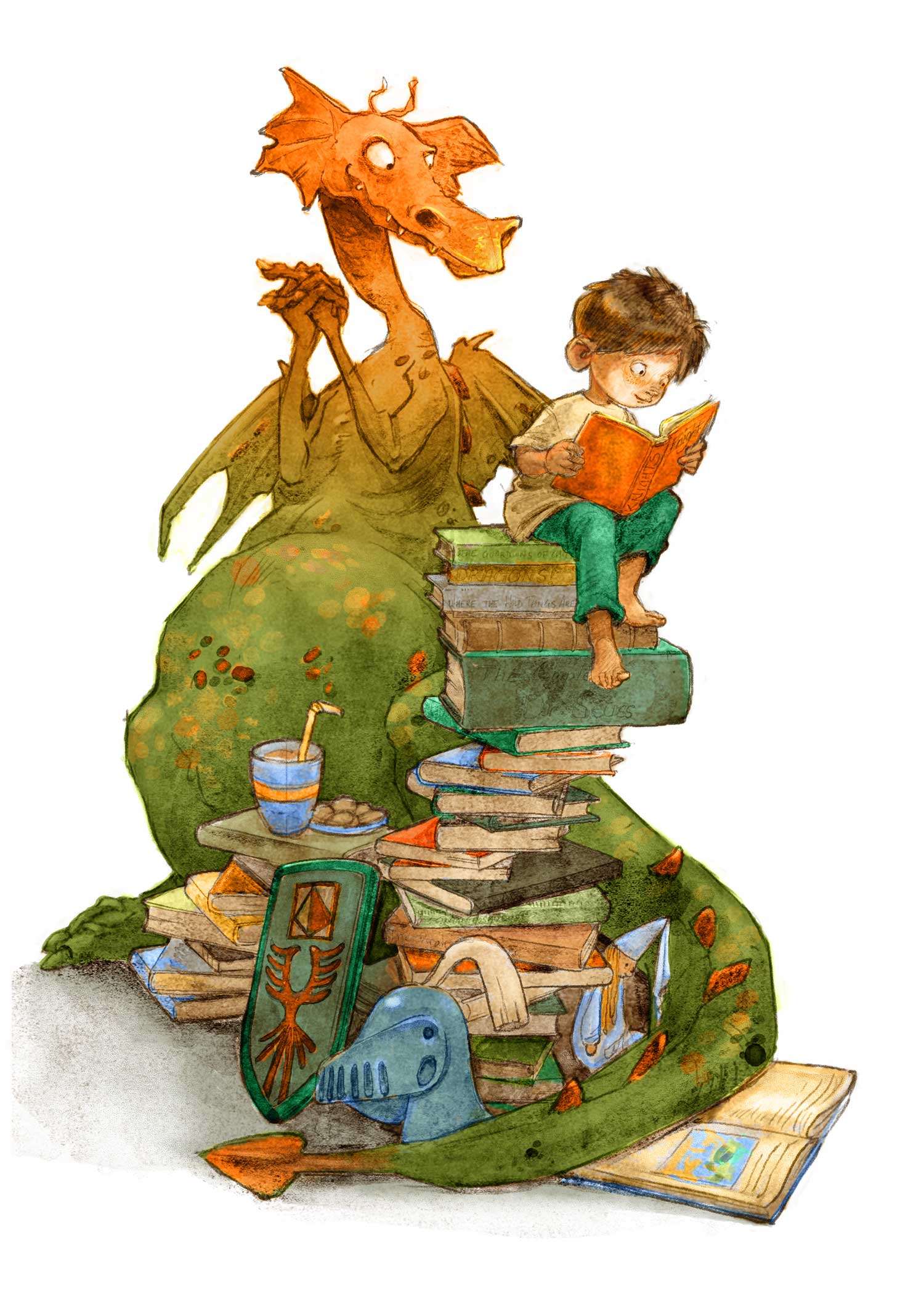
Trying out a completely new process - very interesting experiment! Not finished yet, but I thought I'd share a WIP shot before going to sleep, because I am completely not sure of what I will do for the next steps....
I have taken @Chip-Valecek suggestion and moved the books over and changed the position of the dragon's head, but I have kept the two silhouettes separate (so the boy is still bent over the book).
-
@smceccarelli Looking good, what is your new process you are trying?
-
I love how the story is told here

-
@Chip-Valecek . Some of the feedback I got is that my work is best when it is looser and more sketchy...so I decided to try out some more "accidental" brushes and to keep the lines visible. I had experimented with digital watercolor in ProCreate but never in Photoshop. Somehow, the number of options in the Kyle´s set intimidated me. This time I decided to try his "Wamazing" brushes...which are really amazing, very weird and fun. Also, I sorted out my layers in a different way. I am not sure I like the texture he put into the brush (it is a bit heavy-handed, I find), but I am probably going to switch to opaque brushes to finish, so it will be pushed back a bit.
And I do agree that my work looks better when it is not too polished. And its faster too!
This realization reminds me of an anecdote in QUentin Blake´s biography. Apparently in his first editorial works, the art director decided to publish the sketch instead of the finished illustration, because he liked the sketch better. This prompted Quentin Blake to remain at the "sketch phase" of his illustrations, and that is how his style began. -
@smceccarelli Your drawing skills are so strong, that your line art works well on it's own. I think your very expressive characters and strong gestures are what really sets you apart, and for me that makes the style of rendering a secondary thing. I think it is nice to have different rendering styles mastered to better adapt to different projects, but strong drawing skills are a must. Good rendering can't hide a bad drawing or composition. Love the watercolour look on this
 After I got the Brushbox plugin I noticed that I mainly use just three of Kyles watercolour brushes; the basic 80, variagated woom and Fine detail. I probably need to expand more
-
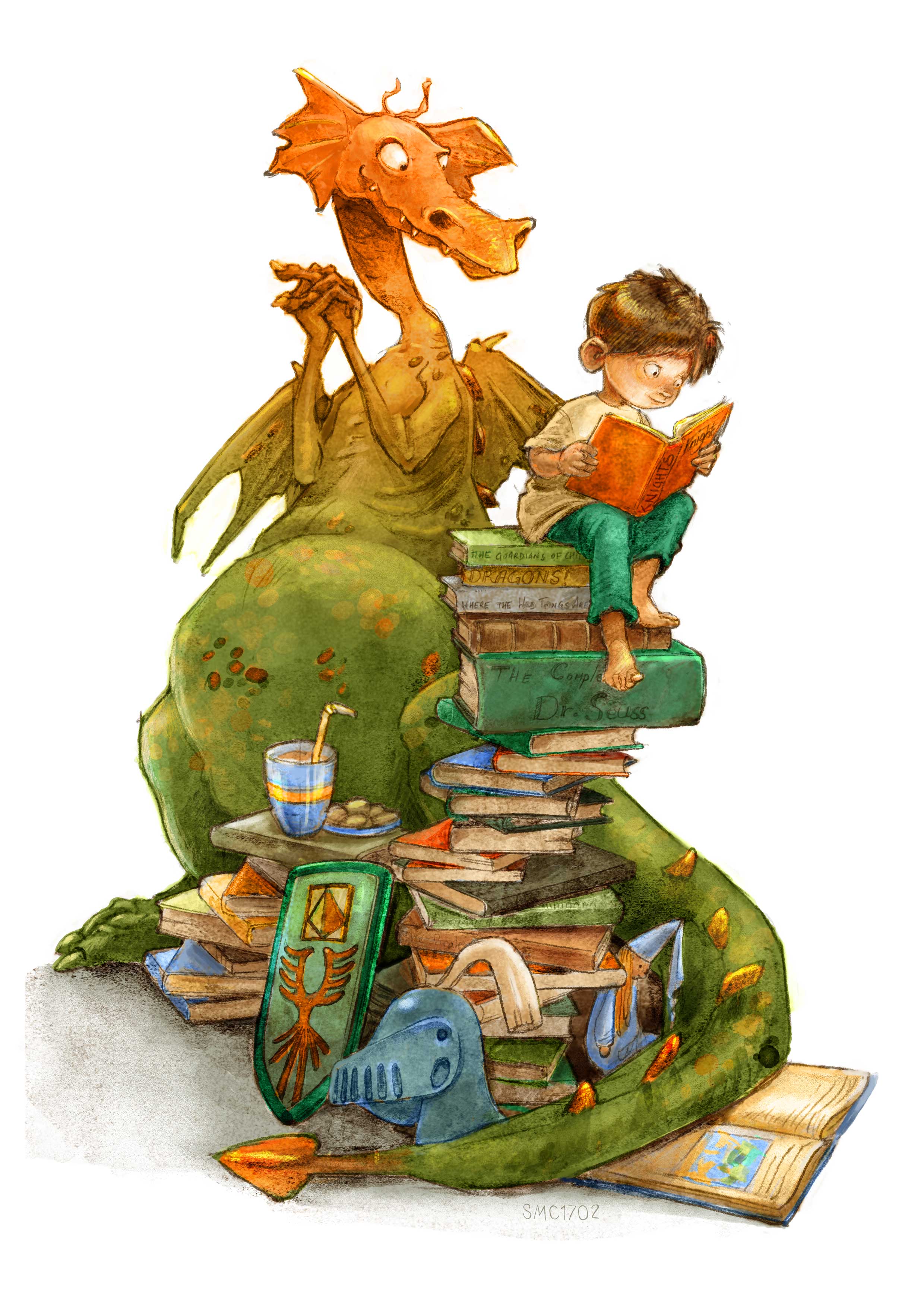
Thank you all for the great input! Here is the finished image. @Camomilla, I normally use only very few brushes within an image - so when I want to try something you, I pick 2-3 brushes I want to try and do a picture with those only. I will definitely try yours!
The majority of my work so far is done with Kyles "flat oil canvas" brush - mostly by itself. This one is done the "wamazing 80" brush and some touches of the "Gouache-wet" brush.
-
@smceccarelli Awesome
 Love your dragon and the controlled clutter, it makes for an interesting image. And please share what brushes you like as well - even the cheat sheet that came with the set is intimidating

-
Great piece @smceccarelli ! It looks awesome : D
-
@smceccarelli I love this piece - especially the color change on the dragon and the light coming from the book illuminating the boy's face - one thing keeps tugging at me though and that is the jousting helmet - there is something about it...mechanically? that is not working i think - maybe if it were not in perfect profile it would make better sense to me - feel free to ignore - this really is a wonderful piece as is!
-
Way to go with experimenting with style and process! I've been doing experiments too lately, and its fun to see what is the same and different.