Practice Images
-
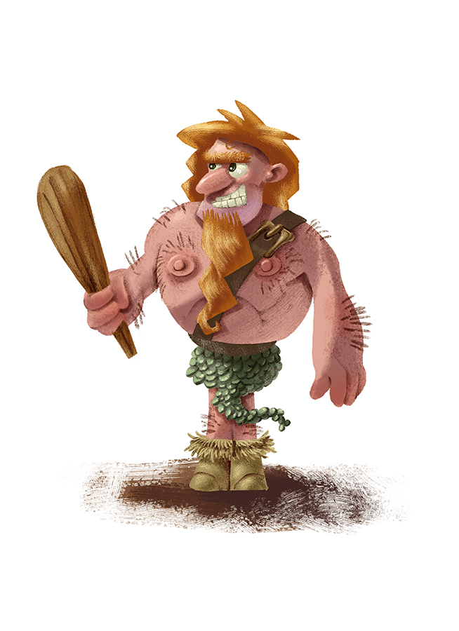
Just some practice.
-
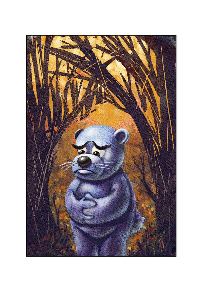
Character I'm working on for a dummy book project.
-
Bear says 'I feel hungry!' Nice!
-
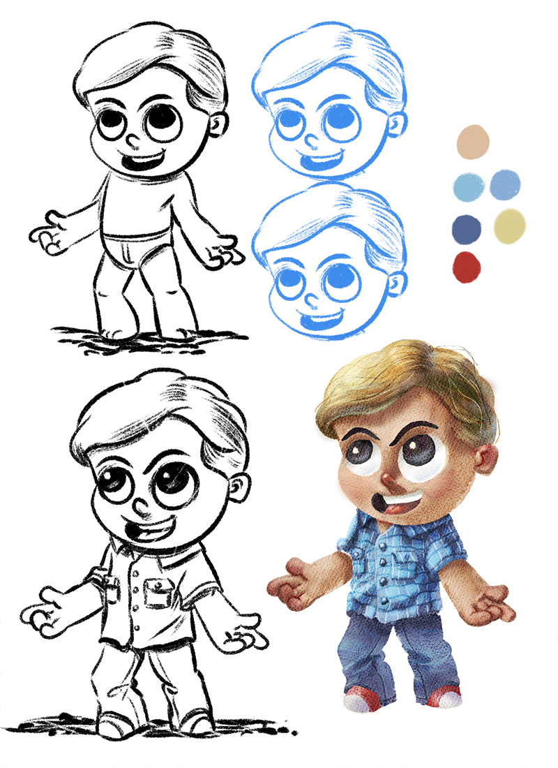
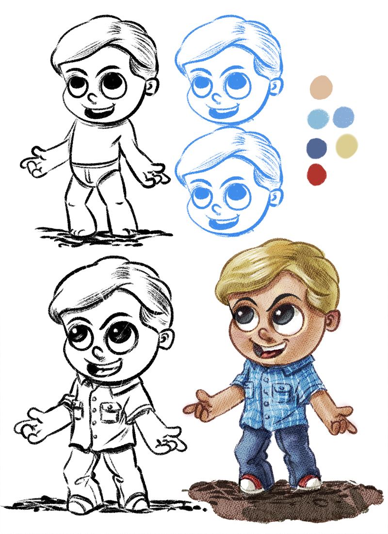
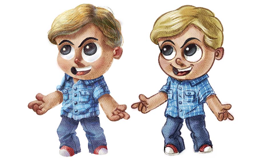
And the same character in the style I've been using. Not sure which route to take. Leave the lines or go for the more rendered look.
-
I think it looks good the way you have it now. nice.
-
@evilrobot Hey William i hope you don't mind - i made a side by side to look at and post - for me the first image is more appealing - the second image is really nice too but the first seems more pro to me - i do like the hands of the second figure though - the index finger in the first is a bit large and you corrected it in the second...so you get the same way obviously
 one thing i would love to try on both is to treat the eyebrows differently and see what it might look like - they look possibly flat and almost out of place to me....maybe it is just that they are solid black? maybe put your scratch lines through them or make them a dark shade of a different color beside black... just to see - anyways they are both really nice images for sure and one could be perfect for a comic and the other a book - feel free to ignore - it really looks like you have nailed your own style and process - very impressive!
-
@Kevin-Longueil Thanks for the input I appreciate it. It's so hard to be confident about something like style. One day I'm convinced I should go with a style with the lines for speeds sake and the next day I'm sure I should render more even though it takes longer. Then you have questions about what is marketable and what's not, what feels right to you personally, and so many other questions....sometimes it feels all I do is question myself. Yeah, I hated the hands on the first one. Some things work OK in line but when you render them they look horrible. Trying to work out ll the bugs before I render out any of the dummy book pages. Again thanks for the feedback.
-
I think both styles are good and both have their rhyme and reason. So instead of choosing one of the other, maybe the way to go is to keep both and to pick the one that is most appropriate to the project and the time available.
There is a question that I have been asking myself since seeing your work for the first time and following through all your beautiful pieces. Is there a reason why you have chosen to keep all your character features and proportions similar? I think your draughtmanship is great, you have a great sense of color and you definitely know how to render, so I was wondering why you have chosen to limit yourself so strictly on character proportions and shape language. It looks good, but it seems limiting, while you have the skills to give yourself more freedom...and especially with multiple characters in a story it may be a potential pitfall. I do not mean to be critical, but I needed to ask
-
I agree with @Kevin-Longueil - I think both look good, but the 1st one definitely looks more polished and pro. I also agree with @smceccarelli that keeping them both for different projects is a good idea -- using the lines would be good for a comic strip or even for an advertisement where they want a more cartoonish look. I also agree about the eyesbrows though - they kind of throw the eye out of the image. Also, there's just one more thing that struck me immediately...I don't know how to say this...but the nose on the first one is a little...disturbing. It looks a little too much like...another part of the anatomy. Maybe change the color a bit, change the shape just a bit or shade it differently? Other than that, I really like these images! You've got mad skills

-
@smceccarelli @amberwingart Thanks for the comments and insight. For some reason I do tend to like the short characters (most being only one to one and half heads tall) I can if I want paint very realistically and I also (not lately and it would take practice to get back into it) draw very accurate anatomy. It's just a case of utility and also me finding what I like. I like characters with big heads, hands, and feet
I actually use to try and draw my characters with more anatomy, but then I'd get all the anatomy comments...biceps are wrong...blah...blah..blah...when proper anatomy wasn't what I was going for. So now I'm like there is nothing about this image that can make anyone possibly think I'm going for proper anatomy it's a cartoon and that's it.
Also I simplify so much so I can do the character turns. I can not turn a realistic character and keep a likeness. I found the only way for me to do it was to simplify the head and body down to basic shapes. So I guess the secret to my style is I'm not good enough to carry a story with more complex characters.
So this project I'm working on now I'm trying to use very simple characters and I'm going to try and concentrate on getting better compositions and working on my story telling.
-
@evilrobot Ah!I see where you are coming from! I would still want to throw in a caveat that formulas may turn out to limit your potential - does not have to, as Mangas demonstrate over and over again, but is a potential risk. You can be cartoony and disregard anatomy while keeping a high variability of shape and design language - Stephen Silver (among many others) is a good example of that. Carter Goodrich and Nico Market are even better. Just some unsolicited thoughts - I wanted to share because it was nagging me somehow...feel free to ignore and forget!
-
I think it would look cool if you kept the lines in the face around the eyes/mouth/nose and left the rest without. A little combination of both.
-
@Leontine I was thinking perhaps the bear is lost, or separated from his mother ... hungry works too

-
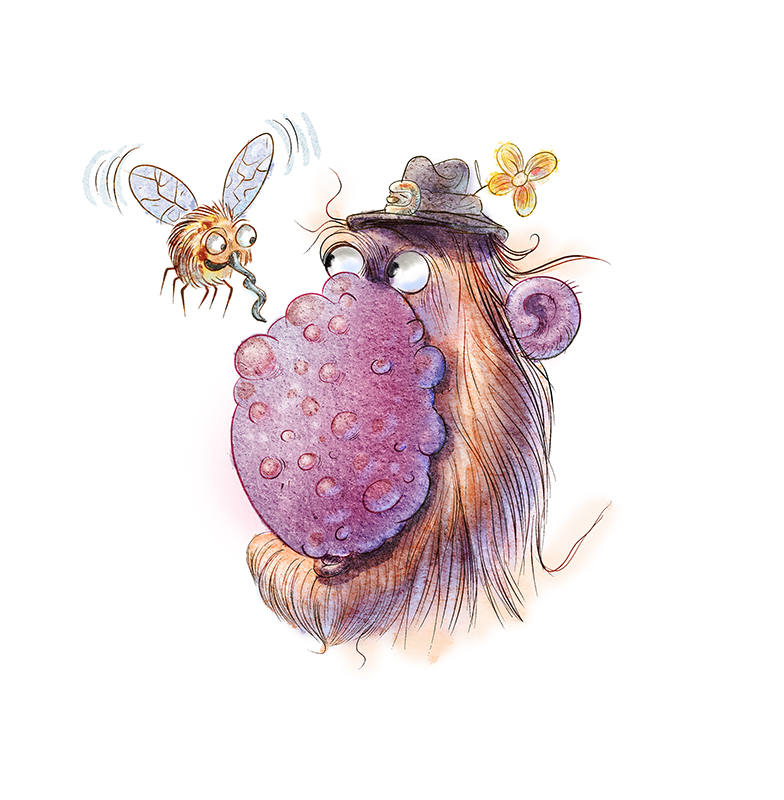
Working on some new digital water color and ink brushes. First test.
-
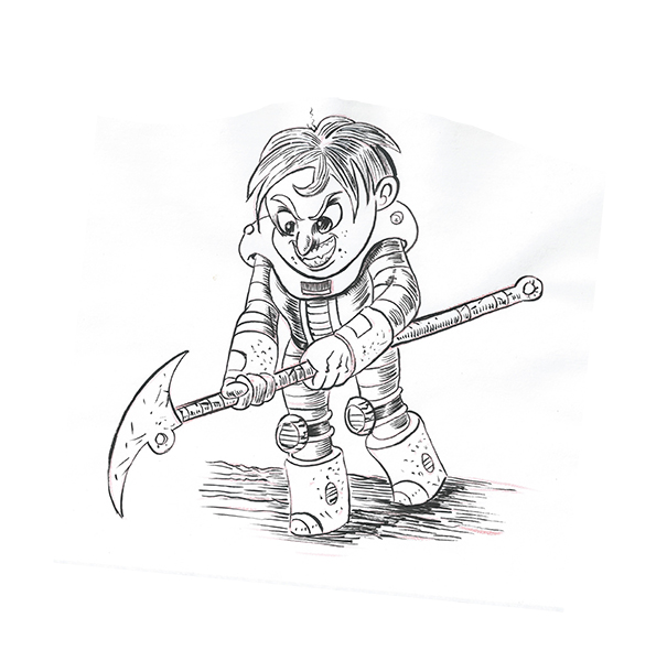
And some traditional practice with sable brush
-
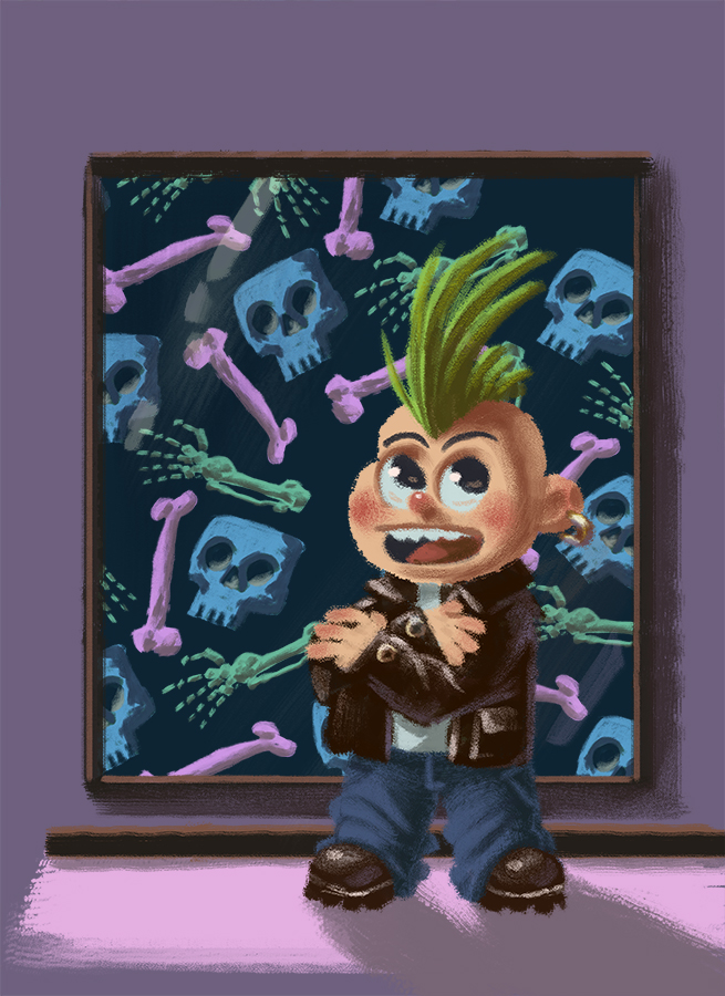
Just testing out some things I noticed while studying some other artists work. I'm toying around with the idea of going more in this direction.
-
The guy with the mosquito is awesome!
-
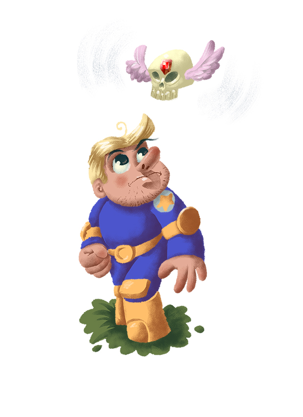
More testing.
-
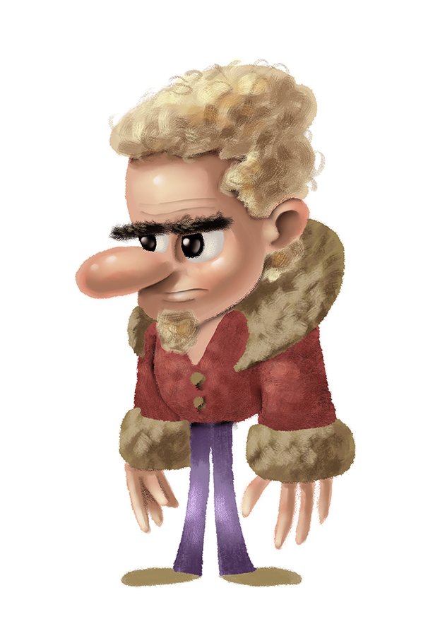
Practice some texture and other stuff.
-
More practice with texture and rendering. Also working on expanding the shapes I use for characters as per some critiques.
