Kids...
-
@smceccarelli Lovely drawing as always...I have a couple of thoughts as to what might help..first thing I'd try is moving the ears up a bit on the head...at the moment they look a little too low down, sort of elvish, and I think that's making the head look a little funny in relation to the body. Hopefully that would fix it..I was wondering if you were going for a slightly clunky, ballet dancer-in-training look, because that comes across! (in a good way)....but if it still looks 'off' you could try raising the head a little bit....the line of action from ankle to neck is lovely...the head obviously doesn't follow that, intentionally I think...but you could lift his chin very slightly if you wanted him to feel a tiny bit more natural in the ballet role. That might not be needed though! All personal opinion though and it's very nicely drawn already!
-
@smceccarelli Love your drawing as usual - i think there is just a bit too much twist in the ribcage just under and to the left (our left) of the chin - if i put my thumb over the characters right shoulder for a few seconds when i take it away it does not match what my brain filled in...does that make sense.... i think just widen the shirt at the top so it extends a bit onto that shoulder and it will reduce the implied twist and shorten the arm that looks a tiny bit too long because of the twist - that shoulder would be raised just like the one on our right is another way of describing the same issue i think - if you showed some hint of the anterior deltoid on that side too it would remove the twist and dipping shoulder issue - really nice drawing!
-
Thank you every one for super useful feedback! Every hint was right and the drawing looked much better.
@Rebecca-Hirsch - I reduced the size of the ear and thinned the arm
@Dulcie - just moving the ear up (his left one) made the whole drawing feel a lot more natural. I did not move the chin up because of time mostly - I would have to redraw all the features to match the new perspective, and that is something where I still struggle a lot (drawing faces without reference is still a challenge)
@Kevin-Longueil - Your points were absolutely right - the deltoid hint and a slight change in the angle of the top chest made everything fall into place. I also shortened the left forearm slightly, to have the elbow line up with the waist.
So here is heading for final - not perfect but nearly there.
I have now practically decided to definitely embark into a 100 kids project in the span of about one year - aiming at testing different rendering styles and different levels of stylisation - while learning more about children anatomy and gestures. This is number 2 - and now in my natural painting style.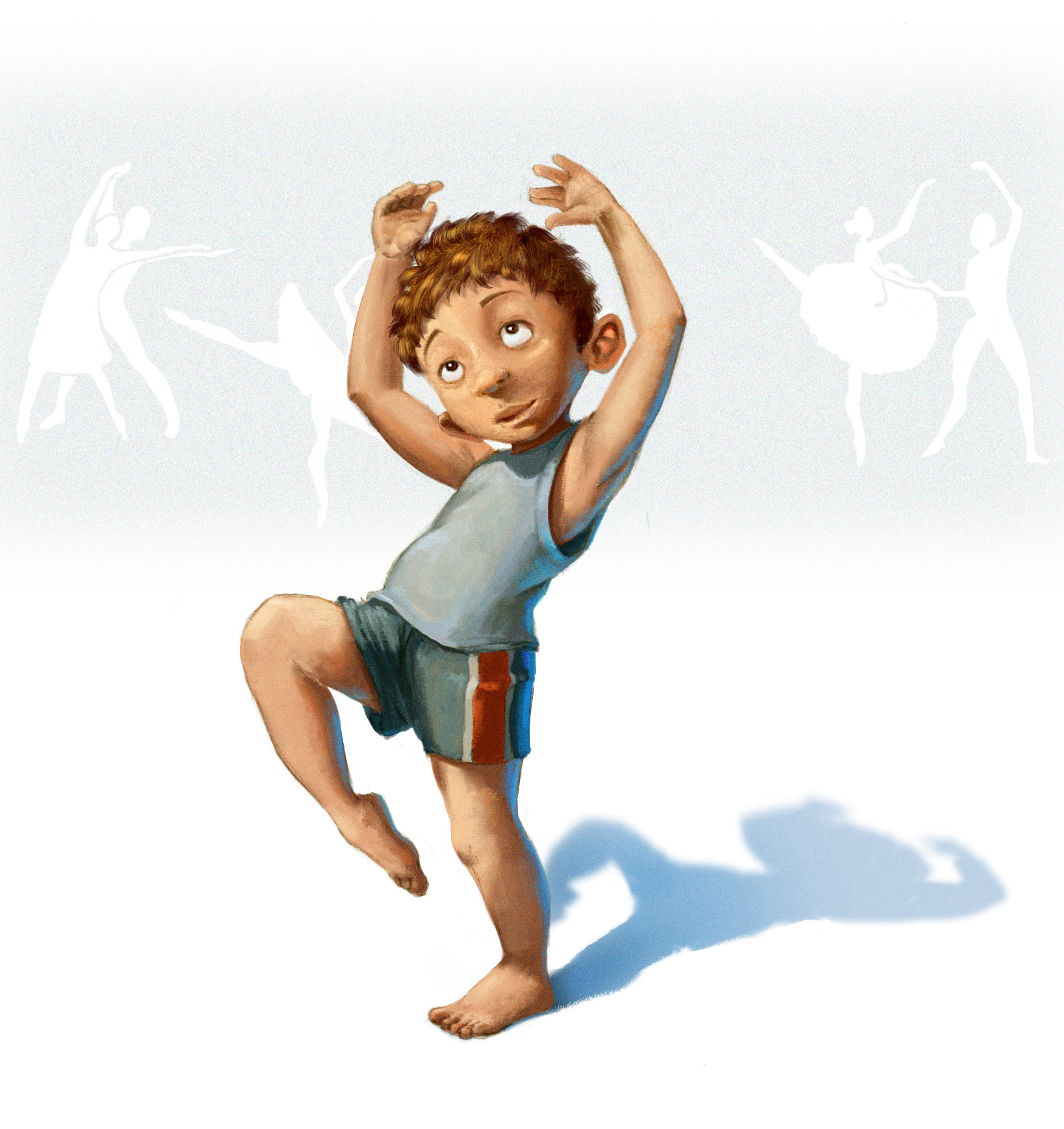
-
Love this little boy, two of my boys take dance lessons. Love it.
-
What a great idea to do 100 kids and the illustrations are so cute! You have really captured "kid-dom"

-
@smceccarelli This is such a great project and your characters are so wonderful! For Billy tho, I feel like you might not see that much of his ear on his right side(our left if looking at the screen)…I know his ears stick out a bit but it seems more like it’s leaning/bending towards the floor instead of sticking out like the other ear. I did a little Photoshop placement mock. I don’t know if this is really correct but it just feels a little better to me…also try doing the pose and then take a picture of yourself doing it, you’ll have instant reference and get a better idea of what it should look like!
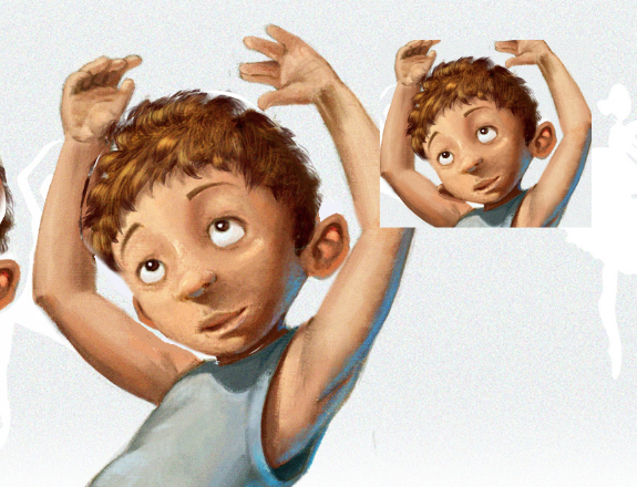
(But then I think it makes his arm look off now....so ok to disregard..lol) -
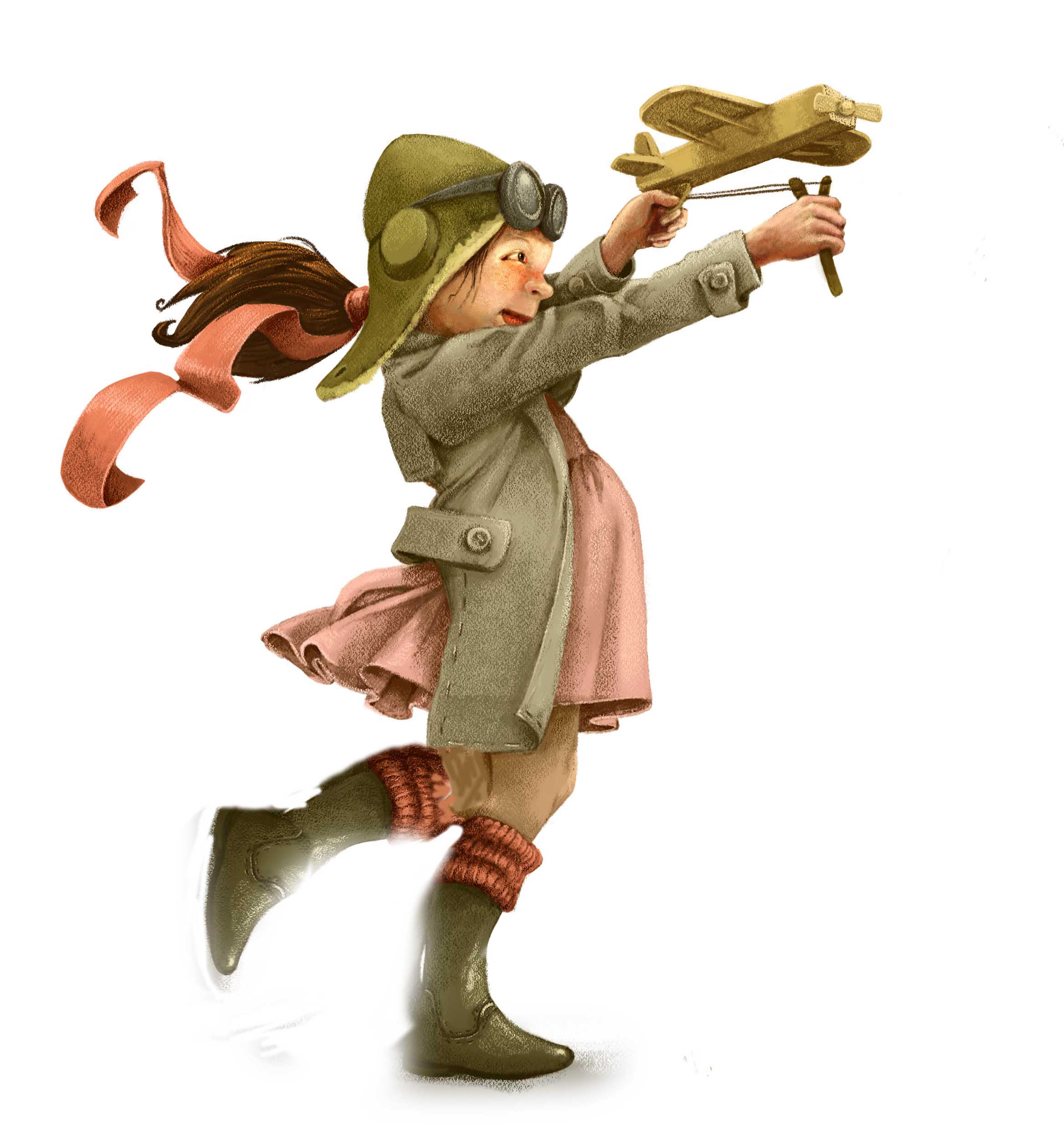
@smceccarelli Hey love the picture, I wonder if the silhouette of the character would be stronger if one of her legs was up. Just a thought.
-
@Jason-Bowen Hey that is really interesting! Yes, it does look more dynamic, though I am wondering if it is disturbing the balance of the pose?
Thank you for your thoughts, anyhow, I will keep it in mind! -
Adorable, so well done, love the motion in this piece!
-
This painting style felt completely unnatural and odd - not sure if it works: I feel bad when I am not rendering...So input welcome. Also wonder if I should keep posting the kids here? I am officially announcing the 100Kids projects at my next post (number 4), but if I really pull it through and keep posting here, it is going to get a very loooong post!

-
@smceccarelli You could do 25 groups of 4 and post when you have each group finished.... each character within the group could relate to one another in some way - or you could increase the character count per group and reduce the posts - but i think doing it this way you could add a story telling element to the characters just by the implied association of the grouping.....could generate some nice portfolio pieces and/or story ideas... this sounded like a good idea when it was in my head... anyways thought i would share the thought

-
You could always create a page on your website and when you update it let people know to check them out.
-
Just seeing these! Such wonderful detail and rendering style in your paintings, the girl with the plane and the dancing boy have such a classic look to them, very appealing in sketch and painting. What a fun idea, can't wait to seem more!
-
Nice updates. The newest one still looks great even with the reduced rendering.
-
@smceccarelli Post whatever you like, it's such fun to look at. And I'd much rather hang out here in the forum in my brief spare time then get lost in Youtubeland, so post away!
-
love how you handle these, great detail and style!
-
What's your social media? I'd love to follow you on this challenge.
-
@AWall I am posting on Instagram, FB and Twitter. My handles are smceccarelli (Twitter) simona.ceccarelli (Instagram) and the hashtag is #100Kids. I am not posting daily - my life is too complicated for that!
Thank you for your interest! -
I am following @Kevin-Longueil advice and will do a couple of "series" within the set of 100, probably each crowned by a full illustration at the end - the best may make good portfolio pieces as a set, or at least that is my reasoning.
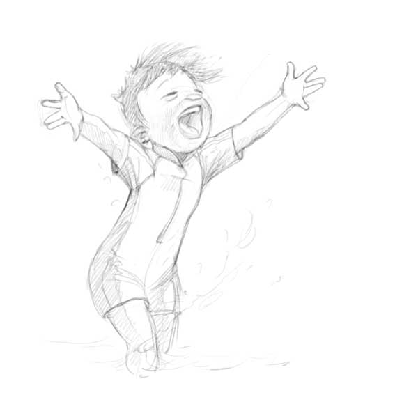
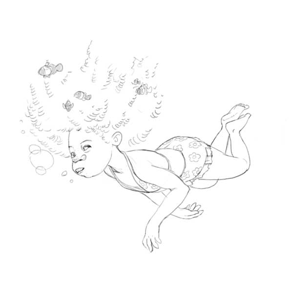
So, I am making a series of kids at the waterside right now. I will post them all at the end, meanwhile I am bouncing these two sketches in the forum: does the anatomy and proportions look correct? As you can see, I am also following the forum's advice to feature some different ethnicities
-
very nice, I like what you are doing...