Kids...
-
This painting style felt completely unnatural and odd - not sure if it works: I feel bad when I am not rendering...So input welcome. Also wonder if I should keep posting the kids here? I am officially announcing the 100Kids projects at my next post (number 4), but if I really pull it through and keep posting here, it is going to get a very loooong post!

-
@smceccarelli You could do 25 groups of 4 and post when you have each group finished.... each character within the group could relate to one another in some way - or you could increase the character count per group and reduce the posts - but i think doing it this way you could add a story telling element to the characters just by the implied association of the grouping.....could generate some nice portfolio pieces and/or story ideas... this sounded like a good idea when it was in my head... anyways thought i would share the thought

-
You could always create a page on your website and when you update it let people know to check them out.
-
Just seeing these! Such wonderful detail and rendering style in your paintings, the girl with the plane and the dancing boy have such a classic look to them, very appealing in sketch and painting. What a fun idea, can't wait to seem more!
-
Nice updates. The newest one still looks great even with the reduced rendering.
-
@smceccarelli Post whatever you like, it's such fun to look at. And I'd much rather hang out here in the forum in my brief spare time then get lost in Youtubeland, so post away!
-
love how you handle these, great detail and style!
-
What's your social media? I'd love to follow you on this challenge.
-
@AWall I am posting on Instagram, FB and Twitter. My handles are smceccarelli (Twitter) simona.ceccarelli (Instagram) and the hashtag is #100Kids. I am not posting daily - my life is too complicated for that!
Thank you for your interest! -
I am following @Kevin-Longueil advice and will do a couple of "series" within the set of 100, probably each crowned by a full illustration at the end - the best may make good portfolio pieces as a set, or at least that is my reasoning.
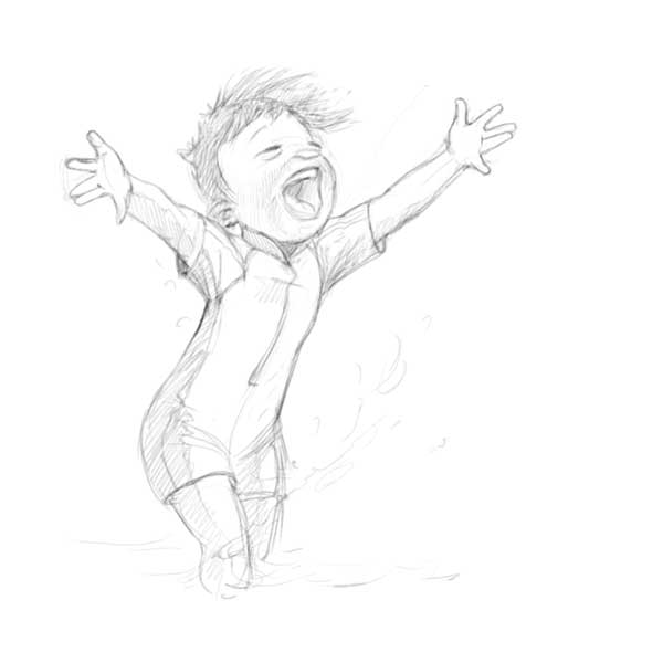
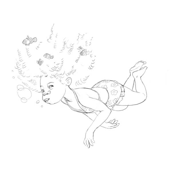
So, I am making a series of kids at the waterside right now. I will post them all at the end, meanwhile I am bouncing these two sketches in the forum: does the anatomy and proportions look correct? As you can see, I am also following the forum's advice to feature some different ethnicities


-
very nice, I like what you are doing...
-
@smceccarelli These look awesome! - i love them both especially the girl with the clown fish in her hair! - the boy maybe needs some super minor tweaks i think - to his head, ear and right arm - i think the back of his head needs a tiny bit more mass - not much - the ear is a tiny bit too low and because the thickness of the top ridge of the ear is equal to the bottom it looks like it is tilting forward instead of laying back and tilting away - the right arm i know is foreshortened but i feel it needs to be a tiny bit longer in the wrist area - possibly separate the two fingers that are touching so that the hands are not mirroring each other - super minor stuff - and possibly incorrect but it's all i could come up with

-
Aw...These are adorable!

-
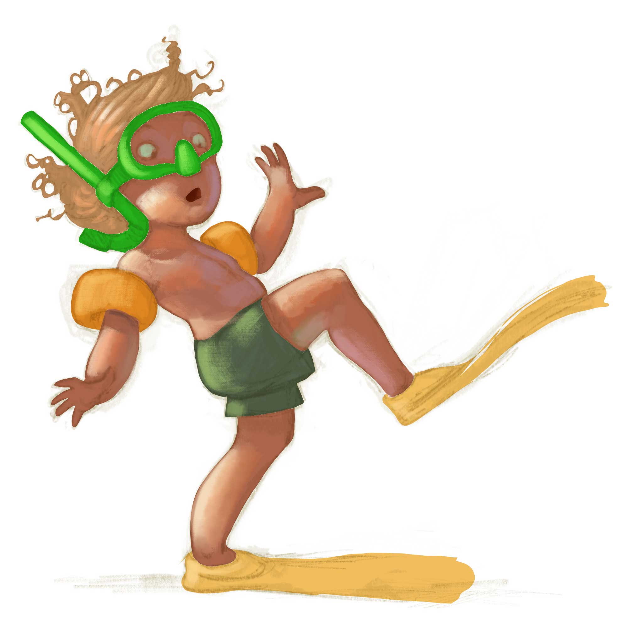
Well, I am at number 9 right now and I have already an identity crisis. I really love rendering - light and surface texture and all strings attached. But, I want to experiment with simpler, more straightforward forms of rendering, which I think are sometimes more appealing (like Szymon Biernacki does). The problem is, whenever I do not go into full rendering it looks unfinished to me.
Here is what I am working on right now. To me this would be stage 2 - still far from finished. And yet I look at it and I wonder if it could be considered finished at this stage - wether it has any kind of "finished" sense to it. What do you think?
-
It looks unfinished to me, especially compared to your previous characters. The left hand looks weird and is much larger than the right. The face in particular looks unfinished. I think in your style if you want to make it simpler try omitting the texture and just render it smooth with lights and shadows. Let the brushstrokes give an illusion of texture.
-
@smceccarelli All wonderful drawings and gestures as usual. With this latest one I would say yes it does look unfinished...like it is following your usual method and it's in an earlier stage of development. I've just been on Szymon Biernacki's website (http://biernac.com/) to work out what style you were aiming for....that wonderful piece with the whale has a simpler method of rendering, but other pieces still look very detailed to me in terms of rendering (and closer to achieve with your usual method).
Thinking about the whale piece, to get the same style I would have thought you'd have to use the lasso tool to create flat colour areas, then lock it and use a grainy texture brush on top to add the detail. ...like those hills look like a lasso brush creation....then the trees look like they've been done with a triangular brush....the spray with another brush...lots of interesting things in there. There's another piece in his personal section featuring kids that looks like it's been done in the same way...If I were trying to match that look I'd try to get sharper edges, more flatness and greater use of texture brushes.
But there's definitely no need for you to have an identity crisis, your recent work is so very very good anyway

-
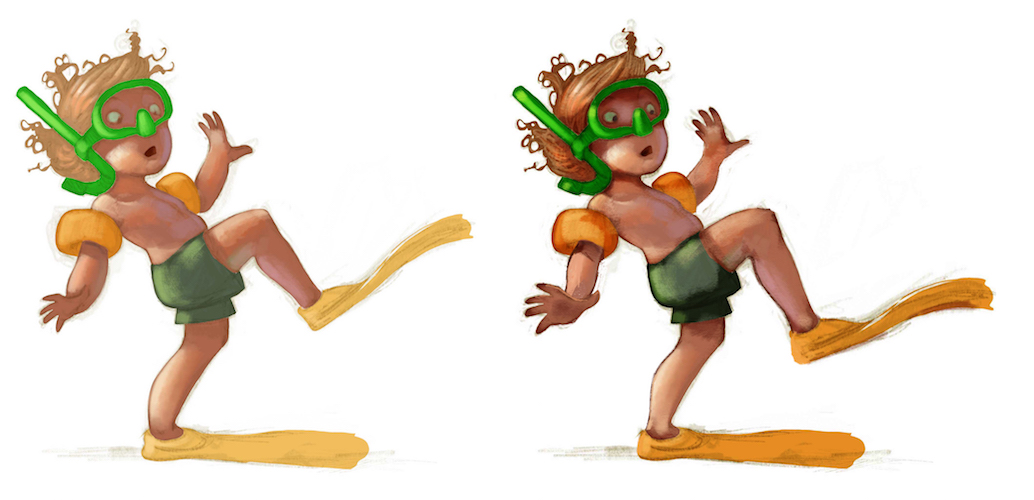
@smceccarelli Nice drawing! i do agree that it looks very slightly on the unfinished side - i thought maybe it just needed a bit in the way of sharp lines and a darker pupil in the eye (the pupil helped a lot)- i made two multiply layers and erased everything but the edges of the forms - made a couple little tweaks to calfs and hand size not sure if it looks any better to not - i was just mainly seeing if it would look more finishes with darker areas - also added a few hairs on the head - what i have done maybe does not look ideal and the lines are maybe too dark now but i think it looks more finished in a way - what do you think?

-
Yeah, I think for it to be finished at this stage you would have to add in some of the line work. The line work acts sort of like occlusion and helps to describe the forms. I'm sort of messing around with that myself. I love line work and love to render I just don't like how much time it takes. Dani Jones does a nice style like this where it's still rendered but she keeps some of the lines for a nice balance http://www.danijones.com/blog/
-
Thank you so very very much, this is sooo helpful. I spend so much time second-guessing myself sometimes - some days are worst than others I guess...
@washu - you are right with the hand, needs correcting. I very rarely use textures at all (especially recently) and work digitally very much like I would work in oils (my preferred medium before switching to digital) - so yes, I always preserve the brushwork, the questions is always how much brushwork!
@Dulcie - Szymon Biernacky uses the lasso tool throughout his painting process and lots of different texture brushes. I do not necessarily want to imitate him (though I have adopted some of his process in more complex work), but I love the freshness and simplicity of his finished pieces and I am wondering how do I bring some of that in mine (which sometimes looks overworked to me). That is why I experiment at the moment. I think a lot has to do with edges (and I am going generally harder in my terminators, which I quite like) and a lot has to do with the use of values and colors. I am looking at Aaron Blaise too, especially his use of light and color.
@Kevin-Longueil Thank you so much for the paintover! My next stage would be about occlusione and shadows indeed! And perfect corrections to the drawing, I will include them!
@evilrobot I have experimented with keeping the line in rendering. Then I experimented with dropping the line completely. Then I go in-between, which does not really work. Still have not decided what I like most. But you may want to check out "The Art of Alice - Madness Returns". It is a wonderful book all by itself (never played the game, but love the concept work). There is an artist in there that does props and has the most successful combination of line and rendering. I really imitated him in some of my older works (there is still one in my portfolio, a rat with a transport saddle), then I dropped it again. Always wonder if I should go back and revisit that.
Yes, sometimes I get concerned with the time it takes for render....but along the years it has gotten faster and faster, and if the trend goes on, I hope it is getting in the workable range. It takes me around 2 hours to render one of these kids to finish. This one I posted now was about 30 minutes into the process.Thank you for clarifying my frazzled thoughts....I will proceed to finish and stop doubting myself :-))
-
@smceccarelli I see now that i did not read your post very well - you were just wondering aloud if that stage could be considered finished - and that it was an early stage of your painting process - now i feel a bit foolish having done a paint over on your painting
