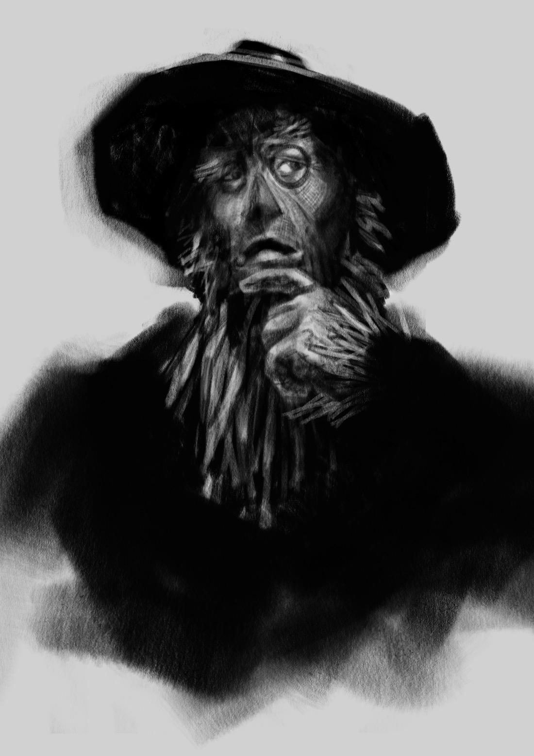
Scarecrow, Dorothy, Tin Man, and Lion sketches (updated :)
-
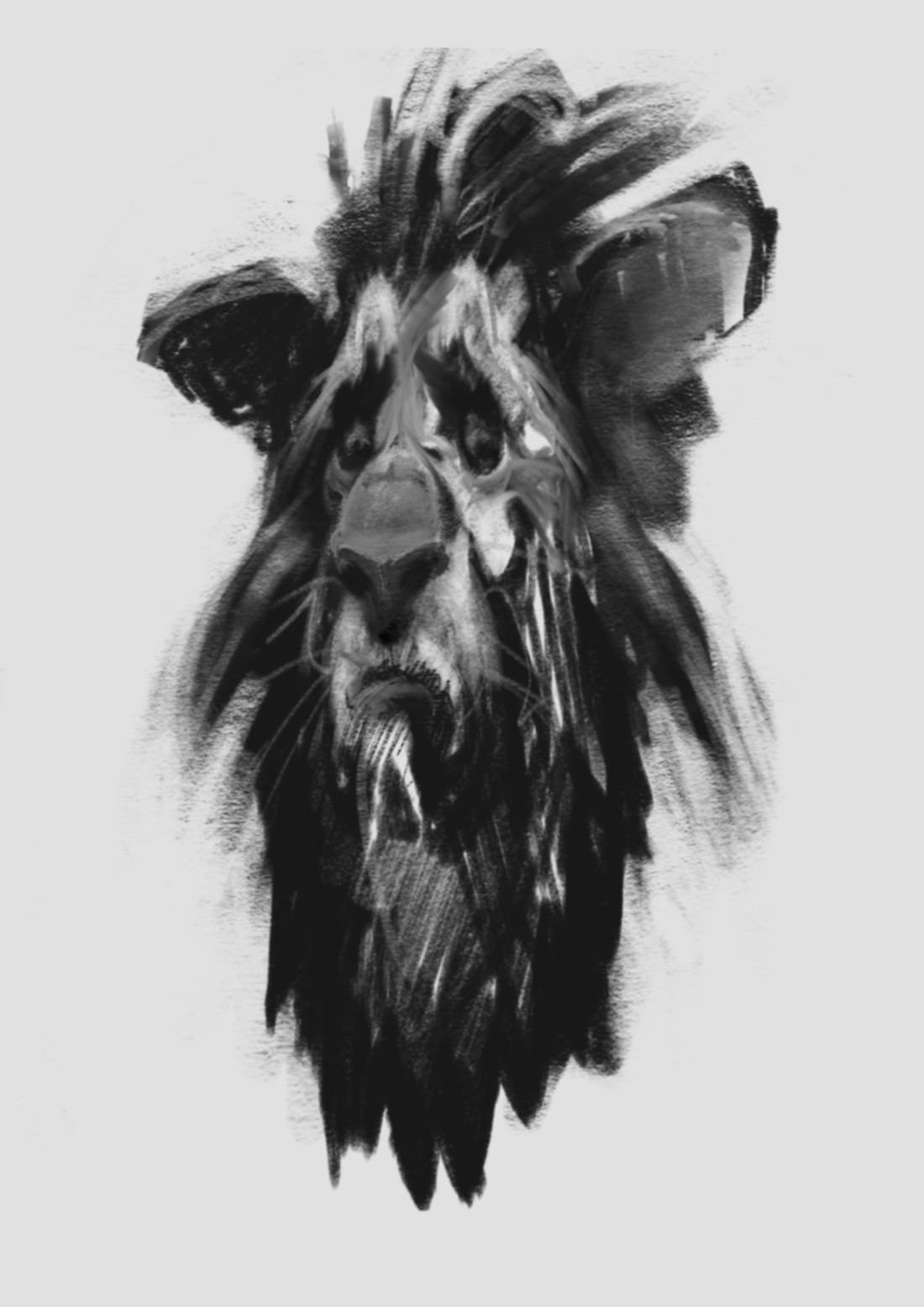
Getting a late start - i have been doing silhouettes for a few days but i have had trouble getting inspired by them - my idea now is to do a quick portrait of each character to get their personality into my head and then go from there (this is probably a bad idea but it feels more natural to me) - you will notice a serious lack of originality with the Lion - i have been avoiding looking at other artist's take on this but i have a feeling this lion has been drawn like this many times over - but i still like something about him - i think i was trying too hard to come up with a concept before working on the basics - so here is my Cowardly Lion

-
I really like this! He looks like yours. If you did the others like this but full figures it could be pretty cool.
-
I love the expression @Kevin-Longueil !
-
Yeah I would keep going this way @Kevin-Longueil! I'm sure there are many ways to design, but I also find it more natural to try and get down some sort of 'essence' first, some spark that I can then develop and fix flaws, etc. Looking forward to seeing more

-
This is a great sketch with a lot of personality. He is clearly lion and yet clearly human-like, which is a hard balance to strike. I think it is a very successful character and would definitely keep going in this direction!
-
@Lydia-M @grafithjarta @Dulcie @smceccarelli Thank you All very much!! Honestly it was quite a relief when this guy popped out - i had had so many bad drawings before this it was crazy - but i was trying to work in a style that was not my own... i feel like i am back on track though - i should have Tin Man up very soon - thank you again!
-
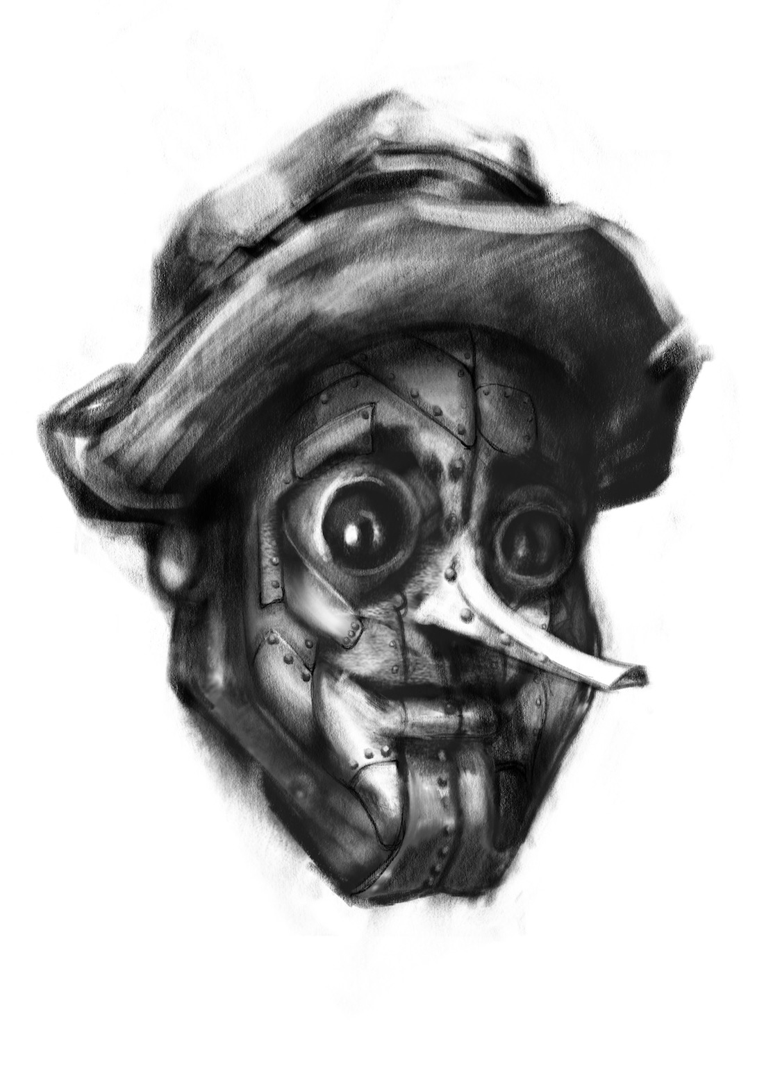
Well here is my Tin Man sketch so far - was hoping for some feedback about the nose - i keep going back to this long nose version... any thoughts - is he too Pinocchio'ish? The nose is supposed to be a spout of some design but i can easily shorten it if folks agree it is too long - he definitely has a few things to be fixed (sharp black lines and so forth) but was wondering about the nose before i get too far into it - Thanks!

-
I like it. Not so sure about the nose, but the rest of the face looks really nice - love the metal collage-effect. It does look a bit like a mask - I think it is missing volume at the back of the head, maybe?
-
cool, I like the nose
-
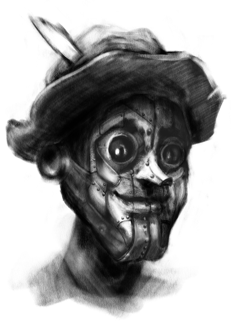
@smceccarelli I think the volume reads better now - what do you think? - I definitely had the hinge of his jaw which serves as his ear way too far forward which flattened his face - thank you for seeing that!
@Russ-Van-Dine Thanks Russ!- here is the short nose version too
-
-
Looking great as always. Love what you have going on so far.
-
@Kevin-Longueil I like the shorty nose much better. Have you come up with a theme/time period to place the characters into?
-
The style is soooo good man. It feels dark and sad but in the best ways haha
-
@evilrobot Thank you William!
@Chip-Valecek Thank you for the feedback on that - i am liking the short nose now too. I do not have a concept yet - my hope is the story will emerge as i do these drawings - i felt like i was spending too much time trying to come up with something clever before really creating the characters - i may end up missing the mark on the prompt and illustrating to the text....but i am enjoying the struggle of re-designing these well known characters...pretty challenging for me - i think the drawings may still work as a portfolio piece though which would be good
@Jack-B Thank you so much Jack! - i get a dark sad feeling from these too - "sombre yet hopeful" is where i seem end up when i can - very cool that it is coming across in the drawings - thank you again -
@Kevin-Longueil I also had a hard time trying to think of a concept that I wanted to pull off. I also wanted to do one that no one else was doing. I started on the same path just sketching the characters and then it hit me. I am also staying away from the main four characters besides for Dorthy. But you are correct, even if you miss the prompt they still look great for your portfolio.
-
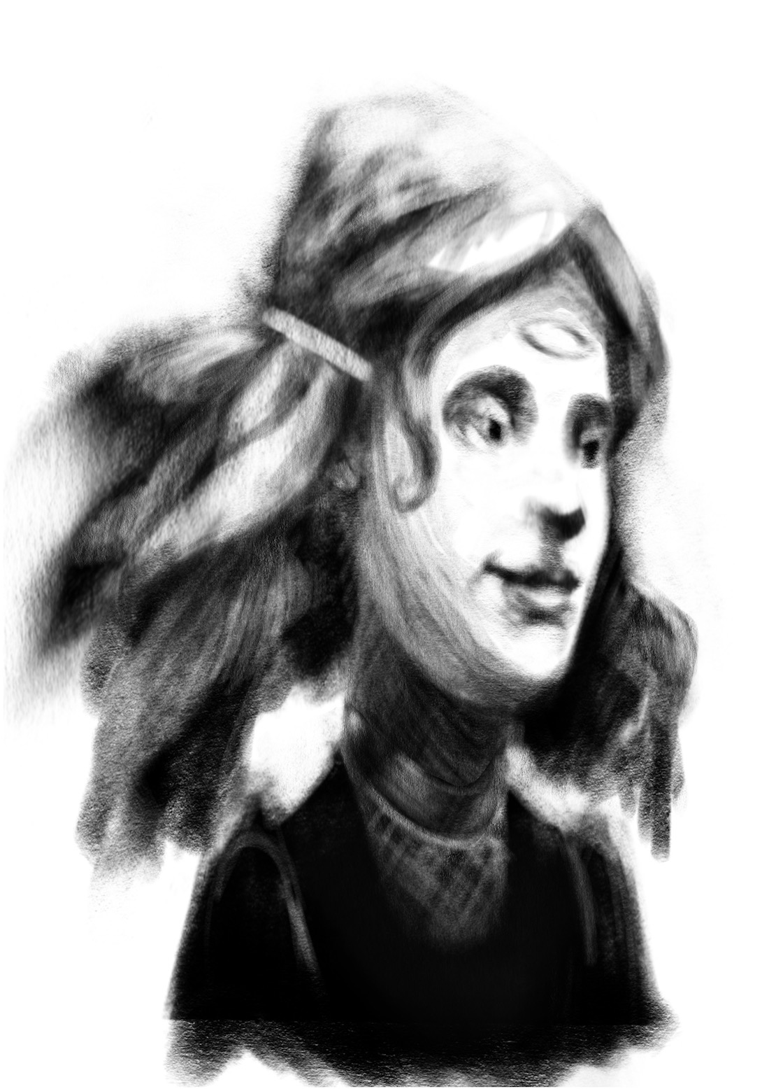
Dorothy is proving be the most challenging! This is my rough draft though (after many many attempts) - The thing on her forehead is the mark from the kiss of the Good Witch in the beginning of the book - i will most likely get rid of it but i will leave it for a while just to see if it grows on me. I have struggled with her age quite a bit but feel like i finally have it. Kept making her look too young i think. Onward to the Scarecrow

-
Very cool looking lion!
-
@Marsha-Kay-Ottum-Owen Actually they are all awesome. I love these sketches.
-
@Marsha-Kay-Ottum-Owen Thank you Marsha!
-
Any thoughts on the scarecrow so far? He has a bit of a straw beard ....not in the book but i think i like it. I'm am trying to Not make him creepy without resorting to a friendly smile. He is supposed to be thinking....hopefully that is coming across - I hope everyone is doing well on the challenge this month!
