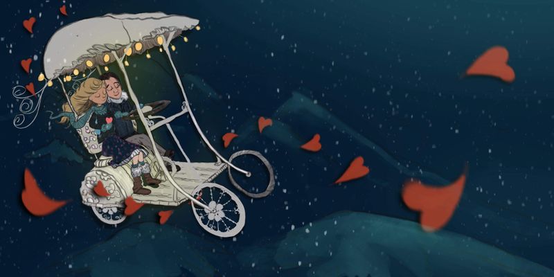
Together wip. The marriage-mobile.
-
Hey everyone,
My idea is for the Toghether prompt is a whimsical take on marriage/coupledom. I have things to sort other than Color scheme (eg I think steering wheel connection to floor is a little off center....will fix)...
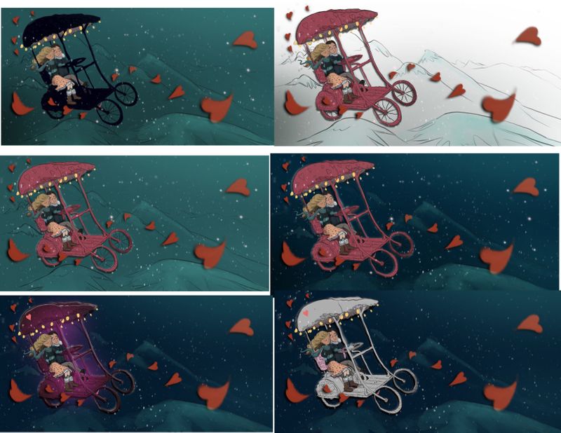
But my big issue now is that I can’t pick a way to move forward with Color. I had initially thought a night scene and referenced one of Lee’s recent images as a starting point actually. It was a dark greenish sort of background with a glowy yellow and red balloon. But my marriage-mobile isnt a glowy thing, it’s a maybe metal thing, I’m trying to figure out what’s working. I I initially had a lot of fun patterns on it as well, but when I try to paint them in, they’re distracting.
I like the black bike for silhouette but I think black isn’t the right message either for promoting a together idea.....
I added glowy bits as dangling lights. I also through the hearts in there for some visual flow. They can stay or leave.
This is often a problem for me. I do so much expirimenting as I go that I end up off course and confused, going back and forth between colors schemes, layer modes, etc, even if I start off with a Color scheme in mind. I find the expirimenting teaches me a lot and I usually come up with something in the end that I really like but it adds hours upon hours and hours to my images.
Wondering if anyone has any thoughts on what is working for Color scheme/reading silhouttes etc. I can’t see straight anymore lol. Going for a walk and taking a break
-
@Coley I love the last one! Painted white with lights, it stands out nicely and the night theme looks much better for this romantic mood. Love this!

vanessastoilova.com
instagram.com/vanessa.stoilova/Check out my Youtube channel for tips on how to start your career in illustration! www.youtube.com/c/ArtBusinesswithNess
-
@Coley #1 seems to have the strongest focal point
-
@Matthew-Oberdier Perhaps but that's not the only sign of a good illustration. There are so many variables!
") I think #1 has a bit too much dark area vs. light area. Plus it's not just the couple that's an important focal point, the marriage mobile itself is important to understand the concept, and understand how they relate to the background they're on. The piece is called the Marriage-Mobile! So I personally wouldn't pick the version where that marriage-mobile is darkened, hidden as much as possible and fading into the background. But it is a personal choice, it depend on what Nicole wants out of the image.
I think #1 has a bit too much dark area vs. light area. Plus it's not just the couple that's an important focal point, the marriage mobile itself is important to understand the concept, and understand how they relate to the background they're on. The piece is called the Marriage-Mobile! So I personally wouldn't pick the version where that marriage-mobile is darkened, hidden as much as possible and fading into the background. But it is a personal choice, it depend on what Nicole wants out of the image.vanessastoilova.com
instagram.com/vanessa.stoilova/Check out my Youtube channel for tips on how to start your career in illustration! www.youtube.com/c/ArtBusinesswithNess
-
@NessIllustration sorry I think I replied to your comment when I meant to reply to the OP.
-
@Matthew-Oberdier Oh yeah, that makes more sense haha! Sorry about that!
-
@NessIllustration and @Matthew-Oberdier , thanks for the feedback! I definitely see what you mean though Matthew about the focal point, it is more on the faces for sure in the first image . Maybe that’s a lot of what I liked about that version, I couldn’t put my finger on what it was I liked about it. But I though black wasn’t right for a romantic occasion, especially because black vehicles tied to things like funerals, but this makes me think about other ways to bring focus to the faces, like cooler colors or other options, etc...,thanks!
And @NessIllustration thanks so much . I’m attempting a spread for my portfolio as advised by yourself
  . I wanted to add racial diversity too but I decided to make this image of my husband and I so I still have those gaps to fill in on future portfolio additions! I was having trouble coming up with a concept but once I sort of looked inside my own heart (sounds cheesy), this came to mind. really happy to hear the white one looks good on the dark, I didn’t know if the white was too boring and the background too dark. Thanks again
 -
@Coley No I think the white looks very fancy and romantic! It looks like a Cinderella carriage

-
@NessIllustration @Coley I agree!
-
@chrisaakins thank you
you have a beautiful piece this month! -
@Coley Aww thanks! I think yours is going to be great! I look forward to hopefully being in the final two with you!
-
@chrisaakins #goals!

-
@Coley I personally like the 4th one (red on blue). I like the pop of the red and it feels more romantic. Also the lights would show a nicer glow effect on the red carriage.
I'd probably change the clothes to a white or lighter color so that it pops against the carriage and background.
This is such a sweet illustration ^_^ -
@Neha-Rawat that's another good idea. So hard to pick! Color always confuses me 🥴 it's fun to explore though, hopefully I'll eventually get better at making choices!
-
@Coley Lovely idea!! I prefer the white/grey carriage - it separates it from the red of the hearts although I'm thinking maybe a tiny bit more contrast in the background could be nice. I'm loving the overall design
-
@Rachel-Horne thanks
will toy with the background contrast as I go -
I'm really fond of that last one too! I find the white background one intriguing as well.
-
@Coley If your keeping to the night scene I like the last one. You may want to alter the colours in the winter coats of your characters that get lost in the background colours. And maybe also because your carriage is white lower the value a bit more I find it competes with the lights a bit. The first one with the black is nice also but maybe have the lights bring light to the inside of the carriage to vary the solid black where you loose some definition.
Instagram: www.instagram.com/heatherboyd.illustration/
Website: https://heatherboydillustration.ca
Shop: https://www.inprnt.com/search/products?q=HeatherBoydIllustration
Ko-Fi: https://ko-fi.com/heatherboydillustrationBe blessed,
-
@Heather-Boyd awesome tips thank you
. I'll work some of that in going forward for sure. Their clothes definitely need something, I may add some rim light or have lighter values. We'll see. Lots of work left to do! -
Some progress. Tons left to do. Will get little bits done at a time I think as I have pet portait commissions to prioritize. Playing with fancifying the marriage-mobile with embossing details and curly wurly bits