Serious critique requested.
-
I’m going with @chrisaakins same question. What could I have done to improve this image. To me the biggest reward of critique arena is a critique from one of the three guys. Family and friends are too sweet, and don’t have much of a critical eye.
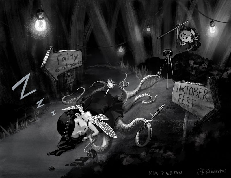
Part of me wondered if the tranquilizer dart was a little over the top. I’m definitely a creature loving person and don’t agree with violent means of getting what you want. Somehow I just thought a little hyperbole would be funny. Ellie would literally do anything to get a photo. I heard a little hint of that from @Will-Terry in the critique.
Also, I don’t think this looks inky enough.I’d love to hear any feedback. Probably should have asked before I submitted rather than after lol. I’m at the beginning of this journey and I’m ready to improve!
-
I really liked your piece and loved the fairy idea with tentacles. The characters and composition are very nice too. The first time I saw it, I wasn't sure what the concept was. Later on, I looked at it again, and noticed the dart and the tube it was blown out of. I didn't notice that the first time I saw it, so maybe that could be emphasized more (of course I was looking at it on my phone so it was very small)? It is also a very dark piece over all, which I don't mind, but I noticed they mentioned that with one of the final 16 as a possible reason for not being chosen. Also, because it is dark, th camera is sort of hidden and the ink jar too. I also thought the pen was part of a tentacle instead of a pen. These are observations, but may not be any of the reasons why they didn't pick it. It is a really nice piece.
Instagram: https://www.instagram.com/kiminyrose/
-
@Kim-Rosenlof thanks Kim. I appreciate the observations. Those are all true for sure.
-
This was one of my favorites and I’m not sure why it didn’t get picked. Maybe needed a little more light. I’m wondering if they didn’t get what was going on at first glance and I’m not sure how you would fix that. Her tentacles look awesome. Love the characters!
K.Flagg
-
This is really fun storytelling! I don't think it's too over the top. One thing that I think might have helped with clarity is a slightly different camera angle where the fairy is really big in the foreground, so that the dart is bigger and more noticeable. And one other thing I am thinking is that the light bulb on the upper left above the fairy entrance sign might be attracting too much attention. It seems like a really high contrast area that is distracting from the more important parts of the image. It could be an off-screen light source or cropped off the top of the page a little bit. Hope that is helpful

-
@jennaivy Thanks so much. I agree about the camera angle and should have tried it out. The light was almost removed but I was afraid it wouldn’t read well without it. I agree it attracts too much attention.
-
@K-Flagg you aren’t the first person to say that it wasn’t clear at first. I’m going to give that some serious thought for the next one for sure. Thanks for the encouragement!
-
@kimmypie HI! Great work tho I'd agree with @Kim-Rosenlof. I think the dart concept is not that obvious. It took me a few moments before I noticed it and I think overall, the piece is a bit too dark in value.
Portfolio: nyrrylcadiz.com
Instagram: https://www.instagram.com/nyrryl_cadiz/
YouTube: https://www.youtube.com/channel/UCbJCF1Im8ZO7hpGWTKOJMuA -
Hi, @kimmypie First, I think your piece is pretty strong. It has a great story and a good concept design. The setting is much better than mine was.
Suggestions: I think you might have too many elements going on. I kinda didn't know where to look becasue of all the details. The tentacles sometimes ended up looking like hairs or something. I think overall the value is too dark. It was at night but you can stretch the light more. If she had had a light-colored dress and a black dart it might have completely changed the scene. I think the black dress blended her in with the already dark background. As it is her silhouette is a little lost. THe more I look at it, the more I see that as really the biggest and only problem.
Here is a really crappy drawover to show what I mean:
-
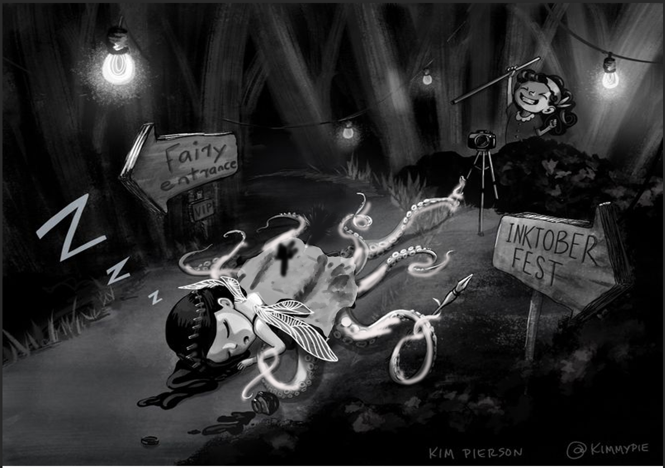
@kimmypie I love your piece, and it was one of my favorite entries in the contest. Character designs are great, the octopus tentacles are awesome, and it's delightfully weird. I think some consistency in lighting would help you out, so you could remove the top left hand light bulb. That will keep that from competing against the "z's" and being a focal point, and then you can have all your light coming from the top right hand corner of the piece. I love that the fairy is wearing a black dress, but you could add some rim light to bring out definition and details. Here's a quick draw over for how those changes could look:
From a conceptual view point, I think "Inktober Fest" is awesome, but maybe the duel signs might make the trap a little confusing. You could consider replacing the fairy entrance sign with a table that has a bunch of bottle of ink set out to entice the fairy. That placement would still give Ellie a good shot at snagging her fairy.
-
@ajillustrates Thanks so much for the feedback. Those are all great suggestions. I will tuck them away for the next entry. BTW I enjoyed your more realistic image of Ellie. The line work was beautiful.
-
@kimmypie Thank you! I wanted to use the contest to really focus on working with my brush pen.
-
@chrisaakins Hey that really does make a difference. I just figured she had to have a black dress. I guess nothing should be set in stone. Thanks Chris.
-
@Nyrryl-Cadiz That seems to be the consensus. Thanks so much for the feedback!
-
Hi @kimmypie, it’s an interesting piece and great quality! I’ll share some feedback.
-
Definitely too dark. When I look at it from a distance, I can’t tell what’s going on. Check out the SVS Course Art Critique with Marco Bucci and Will Terry. They go into great depth on contrast and values. I just took this course last night after my piece failed the value test.
-
The ink fairy is a squid; however, the story takes place in the forest. I’m not sure the environment makes sense. For example, the squid piece that made it th the sweet 16 was in the ocean.
-
The Inktober sign kept taking my attention, mainly because it was well lit and rendered. I’m not sure if you wanted the audience to focus on the signs. Also, many outside the art community don’t know what Inktober is.
Overall, your artwork is great and this piece would have probably made it with the right play on values.
Hope this helps!
-
-
@kimmypie What if in the distance in the left, just above the curve of the road, through the trees you could see what looked like reflection on the water? maybe even distant waves breaking. That would answer the question of place and why a squid fairy is in the forest. You could push the Inktober sign into shadow a little more so it doesn't pull our attention out of frame.
-
@kimmypie My critiques would be:
Others have mentioned the signs so I might just be saying the same thing. I think the inktober sign is distracting because if we're supposed to be sucked into the scene, having an inktober sign seems out of place and pulls me right out. Also, it's pointing right off the page so my eye is going out of the picture because it's so close to the edge.
The other sign I think the lighting is off on the front end. The lit parts of the left-side arrow wouldn't be catching that light. The top right side would be, but that left side would still be in shadow except for the very top. That's kind of knit-picky so I don't think it's a huge problem but it's definitely drawing the eye there.
The second thing is I think the background trees are rendered inconsistently with the rest of the piece. They don't need to be as detailed as everything else for sure since they're in the background, but the angles and brush strokes don't really match the foreground.
I agree the top right lightbulb is a bit too bright for where it is - maybe swapping the brightness of that bulk with one of the middle ones would make more sense because it would pull your attention back that direction.
On it being too dark - I'm not sure I agree with this. Being too dark seems more of a preference than anything else. Unless we're missing details... but taking it down to like 100px wide, it's pretty clear we're in a forest, and there is a squid-type character front and center, and it's asleep which is the focal point - so it's definitely reading.
-
@jdubz @David-starfas @Jeremy-Ross Thanks so much for the feedback. I really appreciate you guys taking the time to comment. I will keep these things in mind in the future.
")
-
@kimmypie Interesting anecdote I just realized that I previously hadn't thought of before. On my home computer and iPad, that image is not too dark. But it definitely looks too dark on my work computer monitor. So that is something I personally need to account for because we all may be seeing it a bit differently than we think