I need feedback on this sketch
-
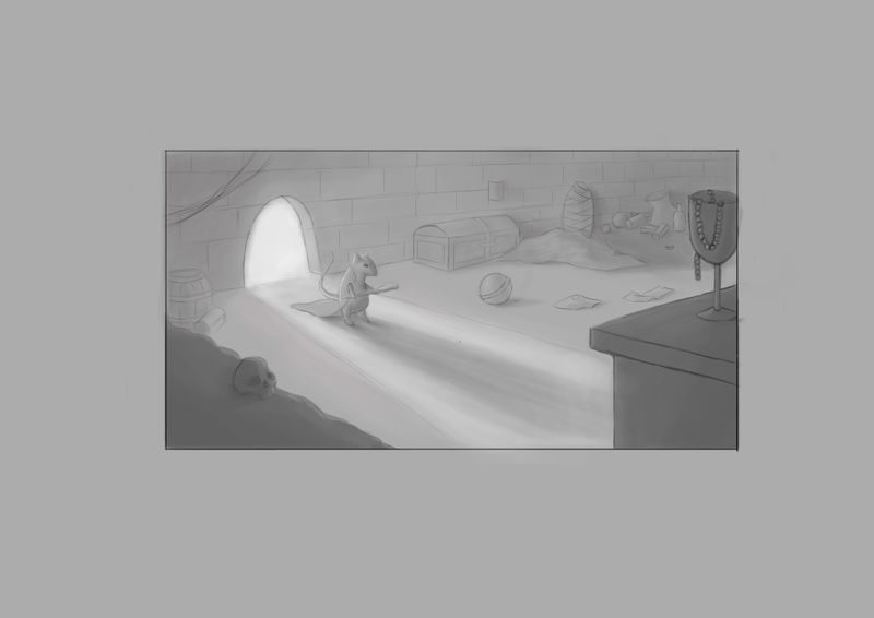
I'm new here on SVS, and this is my first time to post something. I'm trying to learn digital painting/illustration and re-learn a lot of stuff. I decided to create a full illustration and i'm taking it step by step and i'm hesitated to take it to next step which is coloring/rendering because that's my weakest point. So it would be nice to get some feedback on this sketch/value study before i move on to the next step.
-
Hi @Saher-Yosry . It looks good so far. I would deepen the contrast around the mouse since he is the focal point. The light source is strongest there so you would see the deepest contrast of shadows. You would also have more of a vignette effect around the door with the deepest shadows and least contrast at the edges of the room. I hope that helps.
-
@gavpartridge Yess i was thinking the same but didn't know how to solve that. I'll try to adjust it a bit. Thank you so much!
-
@chrisaakins That helps a a lot. Thank you!
-
I really like what you have so far. It makes me want to know more about the story! Like @chrisaakins and @gavpartridge pointed out the value of the mouse needs to change. I think you could go either lighter or darker, but it needs to stand out from the background. Not knowing the story I'm questioning the pose of the mouse. I'm not exactly sure what he is doing, but he looks pretty static. Perhaps a more energetic looking pose would be appropriate. Also most of the items are all about the same size. I think it would help to have a couple of bigger items -maybe the skull in the foreground? Good work so far! I would love to see the final piece so please post it.
-
Great sketch! I agree with what the others have said. I would personally put the mouse in front of the doorway and make him a bit darker to create more contrast.
-
I'm getting some Redwall vibes here! (Which is always a good thing in my book.) If mice and other creatures are the main characters here, I'd also recommend making the skull less human and more rodent.
-
Thank you all so much for the feedback I appreciate it! Will consider all the things you mentioned and post the final piece as soon as i finish it
")
-
@SaherYosry I'm new here too so congrats and welcome! I like your sketch and understand your hesitations. Based on some of the feedback I've heard from SVS, watch the size of your objects. Make sure you have a hierarchy: even something as simple as circling the elements in order of importance and then evaluating their relative sizes. I also wonder what your vision for the "use" of this illustration? Is it a comic panel? A middle grade illustration? A picture book page which needs to leave room for text? I find thinking about it at this stage always reveals some way to strengthen my work. Hope that helps!
-
@SaherYosry Nice sketch. I agree with what everybody is saying here.
Sometimes I find that Photoshop and other apps/programs, can be a little too much for me. I've always loved traditional media, and when I use digital as a tool, I just want to draw and paint. I don't wanna use all these other things.
But, that's just me!However, artists have used little tricks and small steps to help them accomplish their goals when working on their masterpieces.
Like grabbing a HB pencil(or any pencil, etc), and a piece of paper, and doing thumbnail sketches, of your sketch, exactly the way you have it there. And then do more.
Just quick doodles.
Also as small value studies.
And try different things.Have fun experimenting.