April WIP - feedback appreciated
-
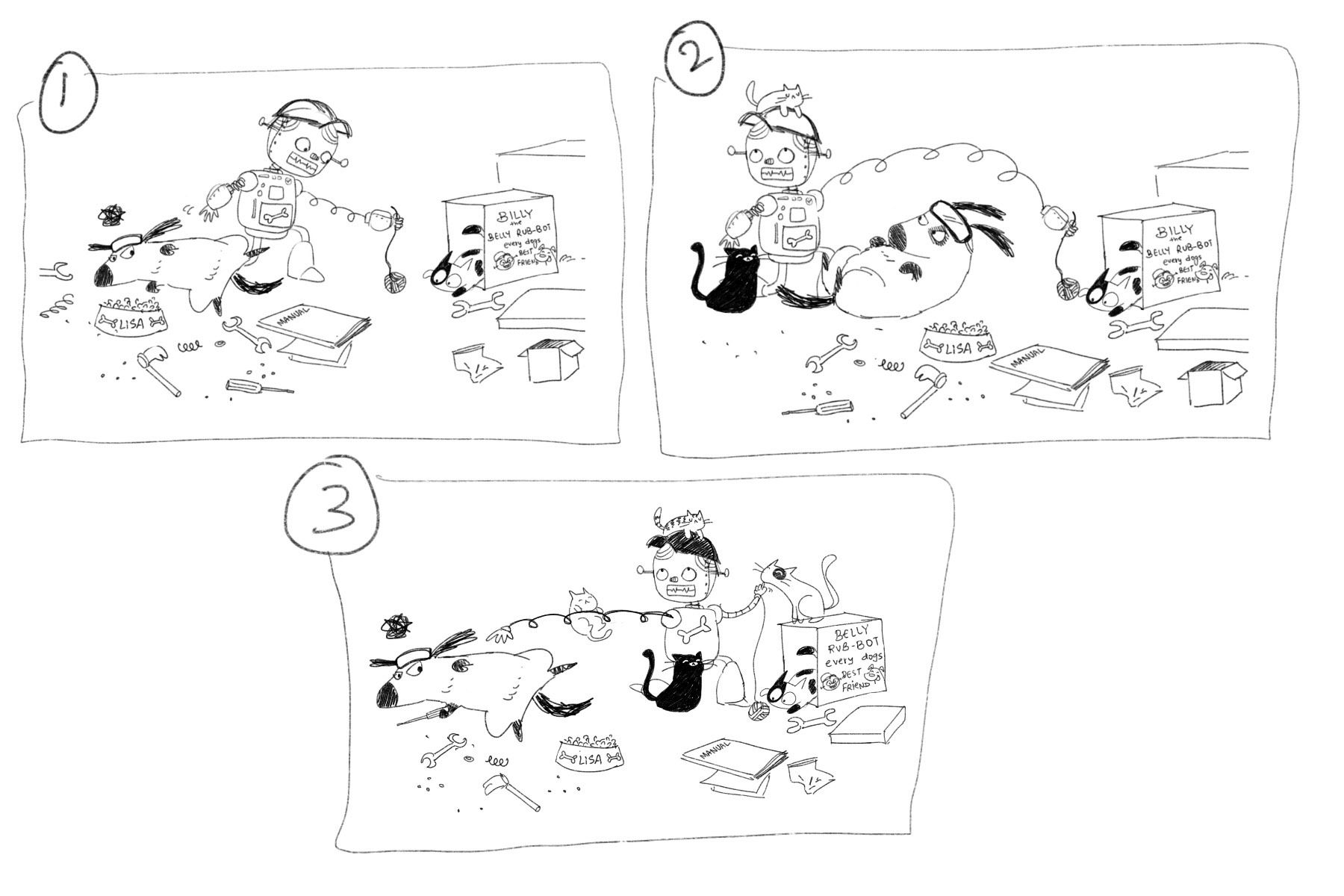
@TessaW I think this is really great idea. I think maybe you could get the message across by just making the dog look more disappointed or jealous, maybe in a seated position?
-
Yeah, it took me a minute too. I got that the cat had co-opted the bot, but not that Lisa was the dog. It's a cute idea, though!
One other thing you might want to consider is that the three main shapes are very similar, all rounded and about the same size. I'm not sure the bot has to be a boy, though that might be funny. But I might try making it slightly larger without it overwhelming the other characters.
-
@TessaW I actually had to google if cats liked belly rubs or not and it came up as depending on the individual cats preferences LOL. I guess I'll need to show that the dog has made the robot, but yeah I'll need to show that it's a dog-only-belly-rubbing-bot.
@Rachel-Horne Thanks! Yeah I think I'll try out a few more poses for them

@LauraA Oh that's a good catch! Variation in sizes would definitely make it more interesting. Thanks Laura!
-
@Neha-Rawat it's a fun idea. I skimmed what others wrote and agree with all. Maybe add things like work safety glasses or some other work items to the dog so we know he built it. Do dogs wear work gloves lol?
Could it be that the dog built the robot but now it's rubbing the cat's belly instead? The cat could be sticking it's tongue out at the dog or something lol. Just a thought.
I love your work so I looking forward to seeing what you come up with! -
Maybe try to give the dog some human-type hands as well, so we can believe that the dog could build a robot. Lots of animal cartoon characters are humanized, so I think it's believable

-
Ok, so I thought and thought and thought and came up with these alternatives for the story but wasn't happy with anything and felt like I was spending waay too much time on it so I scrapped this whole concept

-
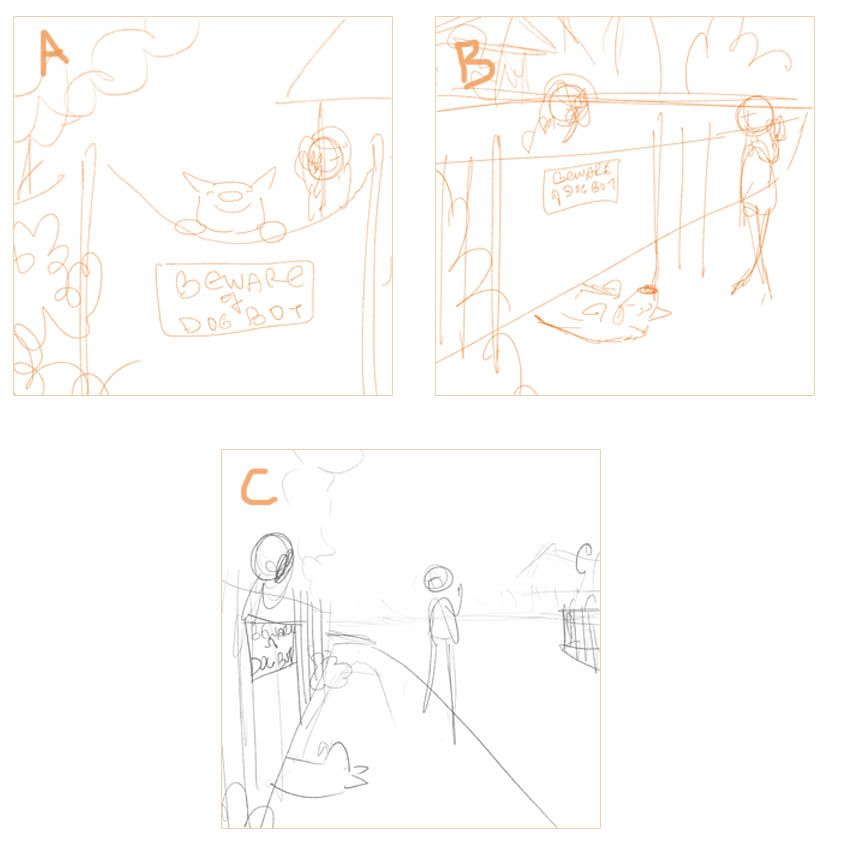
My new concept also involves a dog (if only I had a penny for every time my illustration involved a dog jeez!)
The story is about a guard dogbot who does not guard. I sketched out a few thumbnails and decided to go with C.
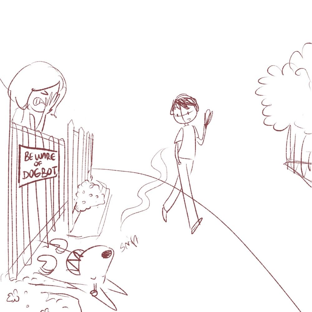
Here is where I am at now. Any suggestions to push the story more?
-
@Neha-Rawat oh my gosh that’s hilarious and soooo familiar. Lol. I like the face palm in the top pic, other than that I think the message is clear.
-
This is adorable!
-
@Neha-Rawat I love it! I did like the face palm too. The current expression is also good but the face palm really told what her feelings were. Just my opinion and current expression works too!!
We can't ever have enough doggies in our illustrations as far as I'm concerned
-
@burvantill @TessaW @Coley Haha Thanks! I changed it back to the face palm and I suppose the exaggerated emotions does help!
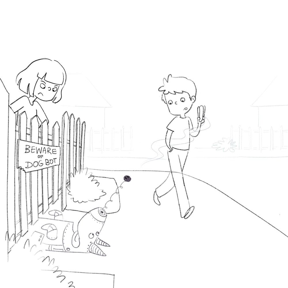
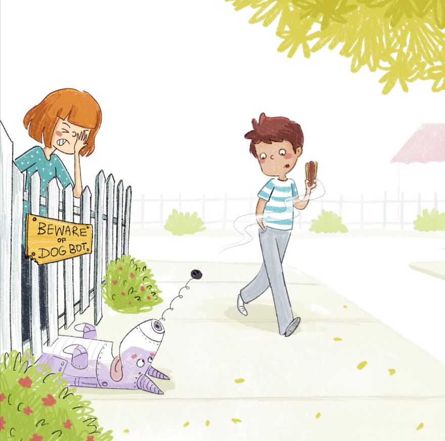
I struggled a little with the background. Does this work. Are the bushes looking out of place? Should I add more light detailing? I initially was only going to keep light sketch lines but it was looking too empty.
-
Omg, I love it! I can't get over that nose. So cute and funny. I think it's good to go as is, but if I you want to consider a few tweaks:
-
Maybe make the line of the house in the back just ever so slightly darker. On my monitor it is barely visible and at first glance the roof looked like it was floating or maybe looked like an umbrella to me.
-
Also possibly extend the left side just enough to include part of one more fence post and more of the bush. I feel like the girl is slightly too close to the edge and it causing a bit of tension for this particular illustration.
-
Perhaps lighten her pants a little? It's not overly distracting, but it is pretty contrasty for a non focal point area.
Just a few thoughts. Wonderful job! Glad you went with the face palm.
-
-
Just wanted to say three things I really like about this piece:
-
I love what happens to your drawings when you add color. I like that you chose purple for the dog. I don't even know why!
-
Your illustrations have such a nice lightness to them. They are never overworked.
-
There are some great details here: I really love that the dog's nose has popped out in his enthusiasm for the smell, and that when you look at it for a minute you realize there's a bite out of the sign. Did the girl do it to make the dog look fiercer? Is another outside dog menacing the "fierce" dog bot? Is he just that hungry? We don't know, but it's funny!
I might do a couple of things, if you feel so led: One is very simple--You might give the hot dog slightly more color or saturation to draw attention to it. We know those things have artificial color!

The other is a little harder to define, but if feels like the piece is weighted left. Not by much, because you have the tree on the right, but just a little. Maybe it's just a matter of slightly emphasizing some of the lines in the other part (like Tessa said, the house) or maybe it's lightening the lines on the fence just a little. But it doesn't need much, and I get why you have some lines a more emphasized than others.
But the message is clear, also because we have all seen dogs like this! The dog couldn't look more submissive and friendly! But I congratulate Lisa on her ability to construct a perfectly dog-like dog bot!

-
-
I think it's awesome. I agree with the little tweaks that Tessa and Laura mentioned, but it's funny and cute !
-
@TessaW Between a floating roof and a robot dog, I wonder which story would be more interesting!
 Thanks for the feedback!
@LauraA Thanks Laura! That's so sweet
 Nobody really has hotdogs in India so I've never seen an authentic one
Yeah I understand what you mean with the left side being heavy. I'll edit the outline on the fence and have a look. Thanks!Thanks @Coley !
-
This is looking good. I agree with the tips stated above as well. And maybe one more. Lol. I would darken the value on the dog bot just a bit more.
-
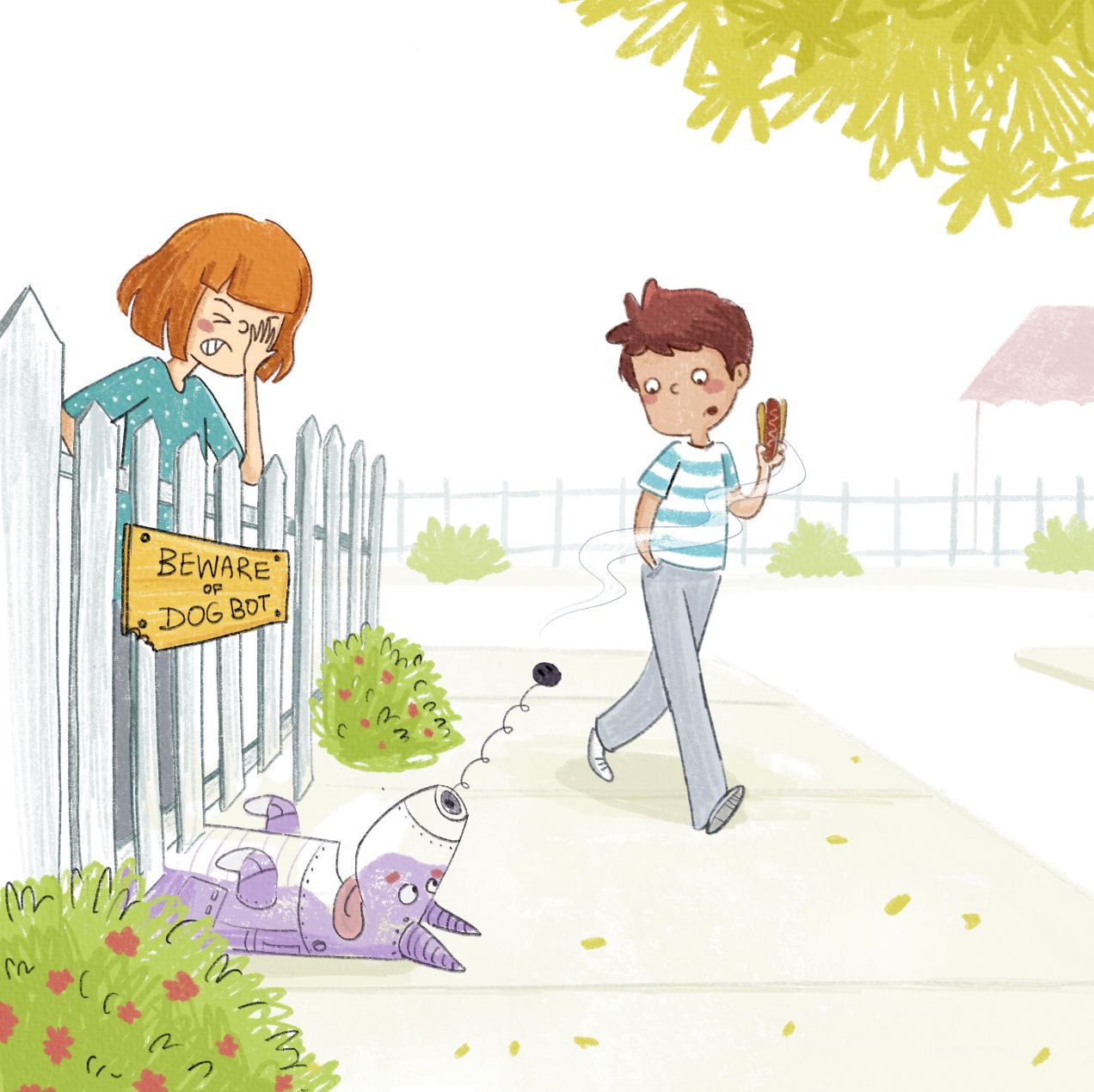
Incorporated all of your great feedback and made the following changes:
- Lightened pants and fence outline
- Darkened dogbot and house edge
- Added a little more of the fence post on the left and shifted the girl to the right
Is the big pointy fence post on the left distracting? Should I make the fence flat at the top?
-
It’s perfect

-


Very nice!
-
Looks great! Is it just me or does the boy's face look slightly blurry in comparison on Dog Bot and Lisa?
Again this is really adorable. I love it.