Our SVS Virtual Studio MAY 2019
-
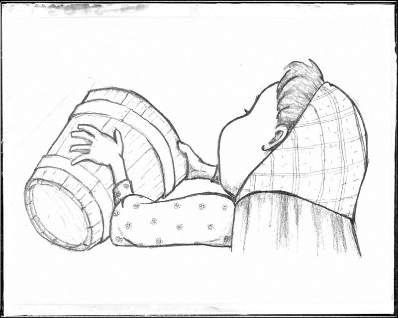 playing with some textures.
-
This post is deleted! -
@MissMushy Haha I just love it. Looking forward to see the finished version
 .
. -
@kylebeaudette Wow! How cool is this?!
-
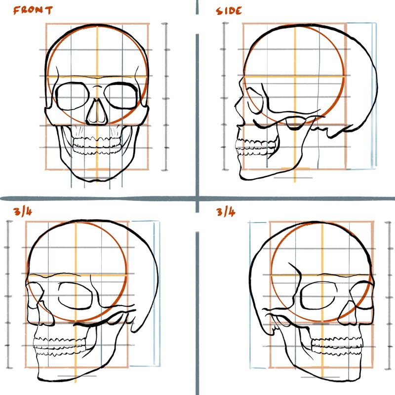
I'm going to be making anatomy my main focus over the next few months and since I'm doing David Hohn's Heads and Hands class, I thought I'd focus on the skull for a while. I can now draw it from the three main positions from memory in under one minute, which was my goal. Focusing on doing the class assignments now!
Here is one of the study sheets I made myself to nail the different proportions.
-
@ShannonBiondi thanks!
-
@burvantill haha yes theres 4, 5, and 6
They are rarely used because they’re just for flashyness but they are fun.There are also a lot of perspective “tricks” too that help you set up a grid.
And no the mastering perspective class on svs is very stabdard. Perspective can be very difficult and a lot of the time confusing.
-
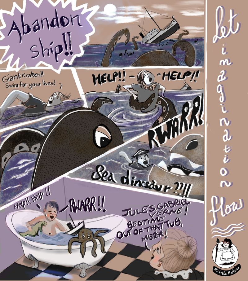
Worked on a graphic novel type page this month. Really trying hard to limit colours and vary viewpoints. Despairing of ever finding a ‘style’ even though I continue to do master studies of my fave artists. #thelongandwindingroad
-
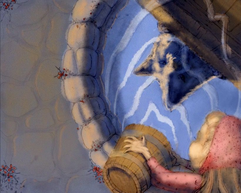
While waiting for my stretch paper to dry i worked some more on the color mockup in procreate while also watching the original Light and Color lessons.
-
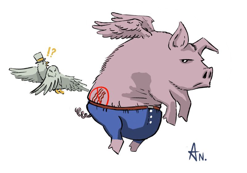
I wanted to have some silly fun
-
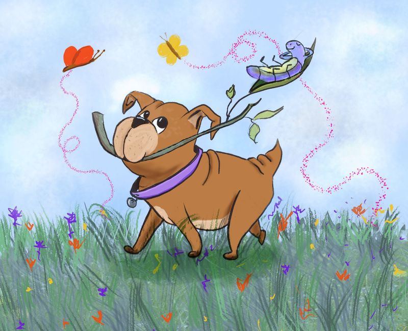
Revisited a sketch I did a long time ago - tried to bring to more finished state. A story about a puppy and a caterpillar friendship has begun to germinate
-
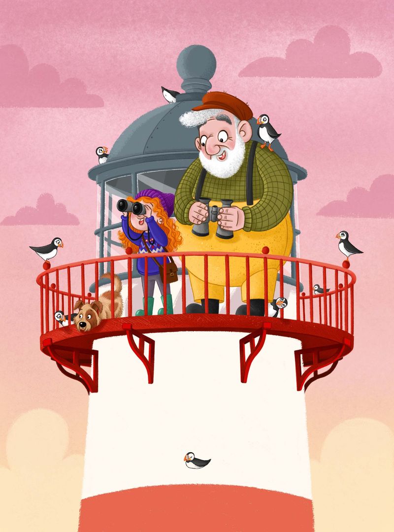
It's taking me forever to finish this piece for some reason, but it's getting there! Still need to add more values, shading and lighting, and there's a window behind that floating puffin at the bottom haha! The dog also needs to pop out a bit more I think.
If anyone has any feedback or suggestions then it's always welcome as I'd like to improve this piece as much as I can because i'm not totally in love with it at the moment
-
@hannahmccaffery I think the inside grey color should be more darker in values, as the bottom part of the red bottom part also bit. The left and right puffin ist almost like mirrored puffin, I would change it in some way or one away or it is to symetrical. Maybe I would change the position of the girl and the dog, that not everything is so middle centred or the big granddaddy more right to brake this middle..there is puffin in the middle of the wall sitting. And the background, I think I would like some white lines there? I love this pice, since you showed it on insagram...so I am happy to see it in color.
-
@MichaelaH Thanks so much for the feedback Michaela
 you're right about the values, i am going to start playing around with them as soon as all the last bits and bobs are finished.
Ah yes, you're totally right about the mirrored puffins, I'll definitely change on of them so that they're different! I think i could space out the Grandad and girl a bit more so that they're not totally centered like you say.
Thank you, it's taking forever though! Just can't seem to get into it! -
@hannahmccaffery This looks really nice! I think desaturating the railing a lot would be the only thing I would say for feedback - if it is not on it's own layer you could use the "sponge" tool to desaturate it to see what you think - great image

-
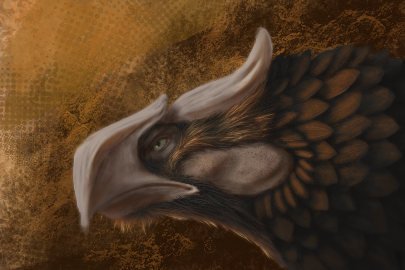
The latest thing I've made.
-
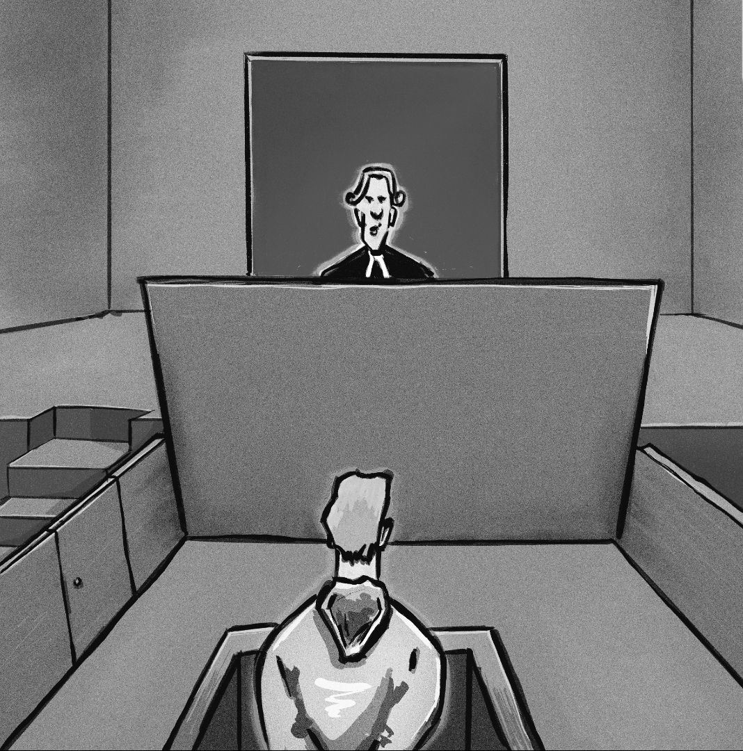
My latest doodle. I feel like I can see an improvement in basic composition and perspective.

-
That's a fabulous job and love the textured details. It's a smart and serious looking bird. Your concept creation or a bird unknown to me? lols
-
It's has a nice punch (bold) -well done!
-
@Heather-Boyd Thanks Heather!