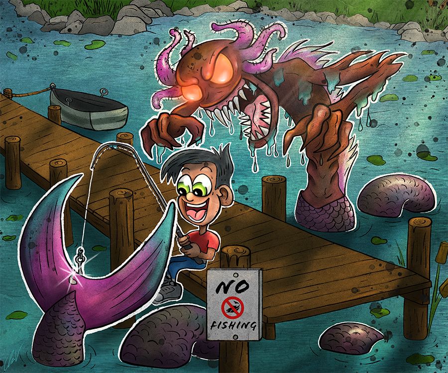
Mermay Monster
-
Hi @Chip-Valecek, I really love the concept of your piece! The monster is really ugly, that is a great contrast with the mermaid feeling! I would just maybe show the tail a bit under the water, blurred and not to clear. And I would maybe think about the expression on the boys face. He looks amazed but you don't know if it's because of the fact he has caught a big fish or a monster (I think you don't want him to realise that just yet, do you). So I would maybe change it to excitement as if he is so happy he caught something big but doesn't know jet what's behind him.
Anyway, these are details because I love the piece and the idea behind it! Can't wait to see the finished one!
-
GREAT feedback everyone! I will work on making some of those changes. @Heather-Boyd most of the image will be in water, I think at first I had the boat on the sand of the beach but I changed that so it has the lines that still make it feel like it is. I will change that up. @andersoncarman @Whitney-Simms the tail was bugging me also. I wanted to show how long he is, but you both are right, some need to be removed and others reworked. @Sofie-Schollaert I will work on his expression some more, I do want him to be excited.
-
@Chip-Valecek This is a fun piece, looking forward to seeing it rendered!
-
Made some changes and got the base values in. I don't try to do to much with the lighting yet. Just want to develop the forms a little. I create a mask for each of the elements so it is easier to get the values in.
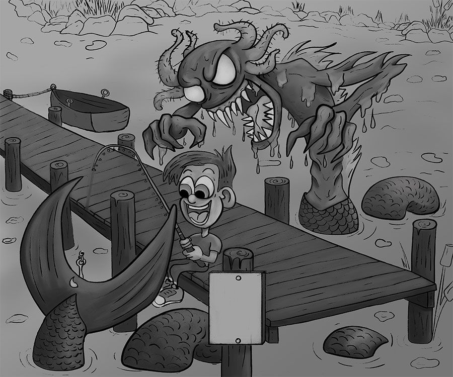
Then comes the fun part... painting it. Since I have everything into clipping masks it is very easy to start playing around with color. I like to get the background done first then I can start to play with the colors of the characters. I did a few different color samples already so i have a map to where I want to go with it.
-
Yes!! Like it a lot!!
-
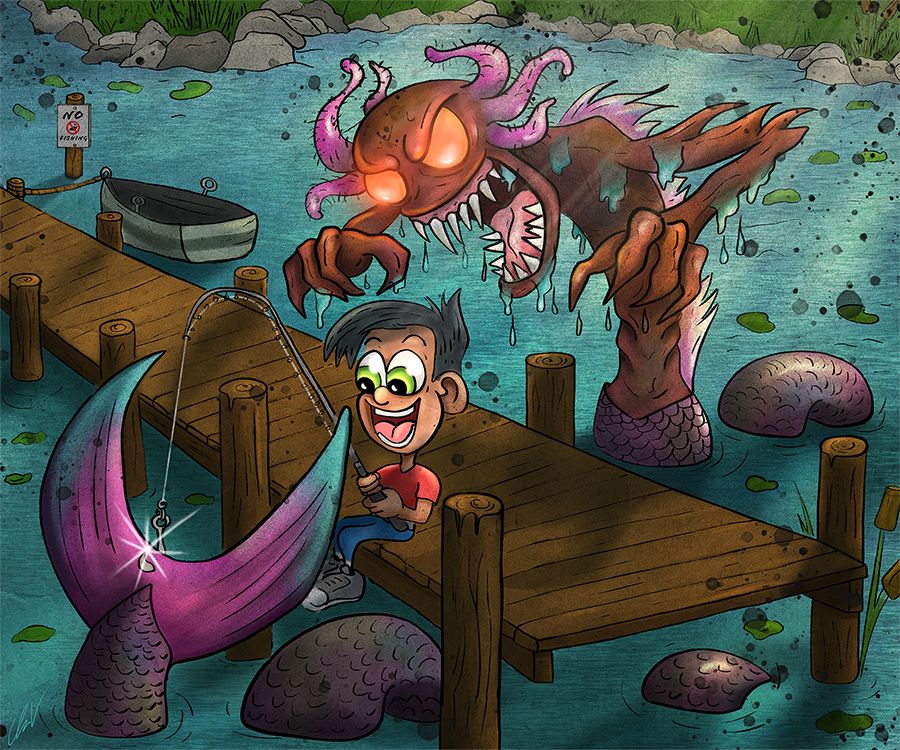
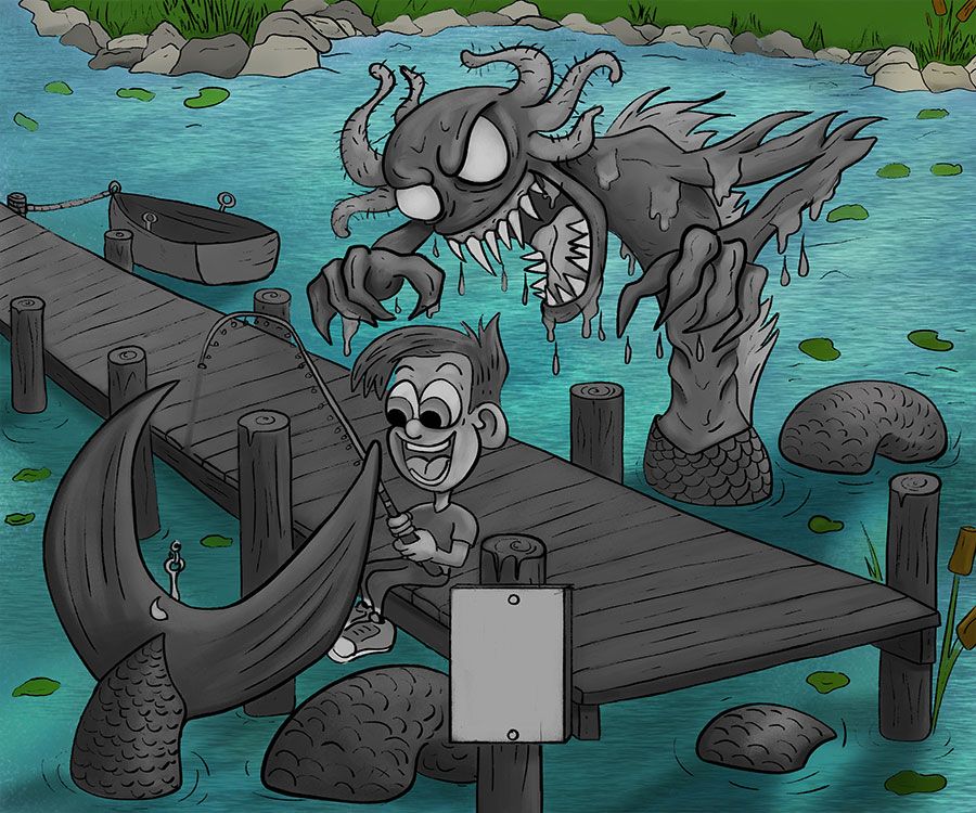
I finished off the rest of the painting and added all the little fun stuff I like to add. I saved two different versions and would like to get a vote on which one people prefer. I know which one I like better but just curious to what others think first:
SO .....
Option 1:
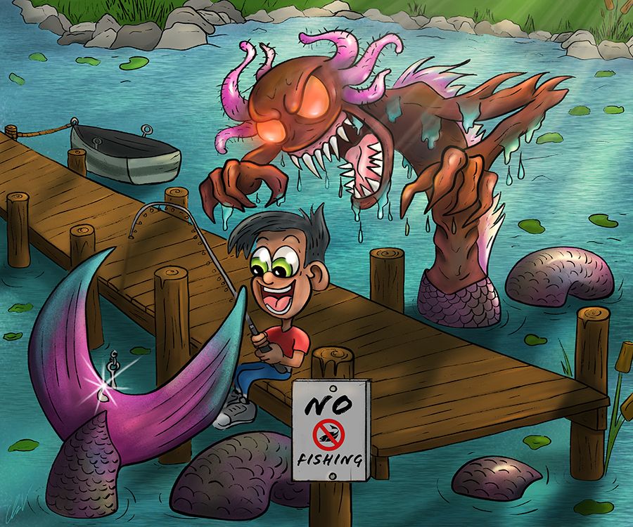
Option 2:
-
I like Option 1.
In option 2, the sticker like effect of the white border takes away the depth you have in option 1.
-
I’m curious, Replace the white border with a black border, what’s it look like?
-
@Chip-Valecek great monster! I like option one best! To me it feels more like the characters are living inside the scene... whereas in option two they kinda pop off the page more with the white border.
-
I am also votoing for option 1
-
My vote is with option 1! Also, maybe a bit late to mention this, but I was thinking that a "no fishing" sign might be placed a little further up the dock where people could see. Or maybe the boy is fishing because someone placed the "no fishing" sign on that end post?
-
@Chip-Valecek I cast my vote for number one Chip
-
Yep, no white lines needed for this one. I love how it turned out. The coloring of the tail totally give the huge clue about the mermaid! I just had to be patient. And his expression is perfect. I think you hit the nail on the head with all your words or story points with this! The no fishing sign is too much of a focal point l. I agree with the rest of the crew. Great job!
-
@Chip-Valecek Definitely option 1! When I first
saw your linework I was actually going to suggest trying this one without the white line. -
Thanks everyone!!! I guess 1 is the over all winner.
-
May I also add I LOVE all the advice and feedback from you guys. Its amazing the support we all get! Thanks!
-
@Chip-Valecek I realize this might be late, but I just had to drop in and say the story you're telling in this illustration really caught my eye! It's humorous and the narrative is really clear.
Just wanted to add also that it's a refreshing spin on Mermay, and the monster design is great! Quite terrifying while also being funny.
And for what it's worth, my vote would also have been for Option 1. It looks good. :face_savouring_delicious_food:
-
Your water is really nice.
-
Colors are really nice, if its easy to change the scales are going the wrong way at the last 3 sections.
-
Again thanks to everyone who has helped with advice, I think it really helped a lot! Here is the final.