Critique Request from last month's contest
-
Hey ya'll. I guess maybe I'm a little too outspoken, but I definitely was feeling very overlooked last month on a piece that I was so excited about and proud of and got great feedback on locally. I'm too attached to the piece and haven't received any real critiques from other artists so I was wondering if some of you might give it a second look and provide some feedback. In terms of the style, every single thing (except the little paper boat) were made out of play-doh and digitally manipulated.
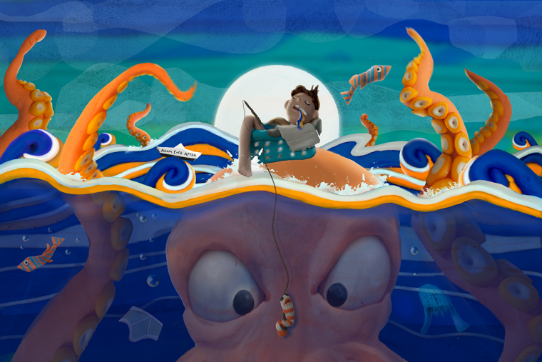
Does the concept not come across or does it take too long to take it in all the details? Is the composition too predictable? I'm just trying to figure out what could've been improved upon. Maybe create more depth in the background? Is maybe the concept too dark for this site? (I tried to be subtle with that) Focal point and storytelling is maybe unclear? Those were the only things I could think of, but again my eyes are too attached to it even now, so I'm kinda guessing here.
I know emerging from water was really difficult to illustrate, especially in play-doh, and there are a lot of layers to this piece... just curious to know what other people's reactions are to it.
-
The blue and orange pop nicely against each other. I do find I'm having trouble getting the concept. The octopus looks like he's threatening the boy with the tentacles in the air, but he's focused on the worm and the boy is sleeping and quite unafraid. What was your concept for this piece? That might help with more feedback.
-
I think it might be the concept mainly. I can't quite figure out what is going on either. The boy looks like he feel asleep while fishing and has lured the octopus in by mistake. But I can't figure out where the underwear fits in. Oh, is he floating in a laundry basket? And the fish are made of sock and ties? That makes it a little more confusing to me, I'm not sure if its supposed to be a dream or make believe? What is coming out of the boy's mouth?
As far as the medium is concerned, I didn't realize it was playdough until you said something. I think the digital manipulation rob it of something. I think you should keep playing with it. I love making miniatures and clay sculptures, it is so much fun, and you could be onto something. Check out the works of Irma Gruenholz and Susan Eaddy.
Bringing whimsical creatures to life.
www.stringfellowart.com
www.instagram/stringfellowart -
@adameverafter Hey Adam - definitely looks like you put some serious work into this piece! For critique i would say that simultaneous contrast is overpowering the image...at least for me - the saturated compliments are competing very forcefully for attention and make it difficult find a path thought the image that reveals the story - the story is hard to discern for me too - i think if you knocked back the saturation of the blue and orange in all but the focal areas it might work better compositionally ...right now the waves drive me quickly off the page - this is all coming from a guy who works in black and white so feel free to ignore
")
-
I like the design, and am really amped to see you used Play Doh for illustration. I have thought about working with clay before but decided it was way too much work.
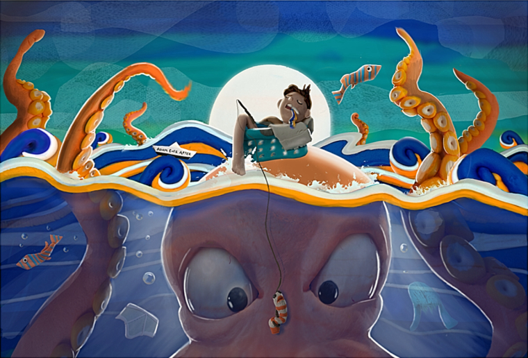
One of the things you have to consider when dropping in images into a piece, is that the light source for those images are different than the one in your image. Even if you were to use lighting on the objects that you are taking photos of you will still need to get the same lighting the other objects in your piece. Without doing so, the objects look like they do not belong.
So with the moon like you have it, there should be a lot of back lighting going on on all of the objects. Also, I think even having light pierce through the water and hitting the objects in the water woldd create a nice effect. When doing this, it creates relationship to the photgraphed images and the illustrated parts of your piece. Also, look at your original piece; some of the tenticals have shadows where light should be hitting.
I went ahead and did a little bit of lighting on your piece to see what would happen if these things were added, and I think the piece can be made even better if you go in and start to work out some of these issues. Also, some of the images seem to have been manipulated ], and when that was done, they were stretched improperly and look even more foriegn to the image. Notice how the front tenticle on the right look like it belongs. That is the one I focused in mostly. Hope this helps.
-
I think @Eric-Castleman made a really good point about the light source. You have many pieces which all have a different light source which can be quite confusing.
Others have already mentioned things that I would have said, but the main thing that I thought of when you said that it is all made out of play-doh was that I couldn't tell and thought it was a digital painting. It seems that you have spent a lot of time making each piece, but they don't read as play-doh so it feels like a lot of that effort is unseen or unclear. In my opinion once you have worked out the lighting and concept of the piece, I would work on emphasizing the texture of the play-doh to show how you have created something real and different.
-
I too, was surprised when you said this was a play dough creation and was intrigued by the concept so I checked out your page on Deviant art. Your play dough art is amazing and really unique. Not being a professional illustrator, I have no idea what the market is for that versus digital illustration but I think it's incredibly appealing, dynamic, and rare. When you turned it into a digital illustration, it lost the vibrant color and vitality, and the singular style that is so impressive to me in your other play dough work. If you feel you need to turn the sculptures into a digital illustration, you might want to think about how to retain more of the feel of the original because they are great.
Laurie DeMott
instagram.com/demotlj -
I think the straight-on POV makes the piece look flat. A 3/4 view would be more interesting visually. And I feel like the photo should be taller - I want to see more of the monster in the depths, to really get a sense of his size. I think it would help if we saw the head and tentacles connected, it would add weight to the bottom of the piece and perhaps draw the eye back up to the kid.
Take a look at this example of a huge thing in the water:
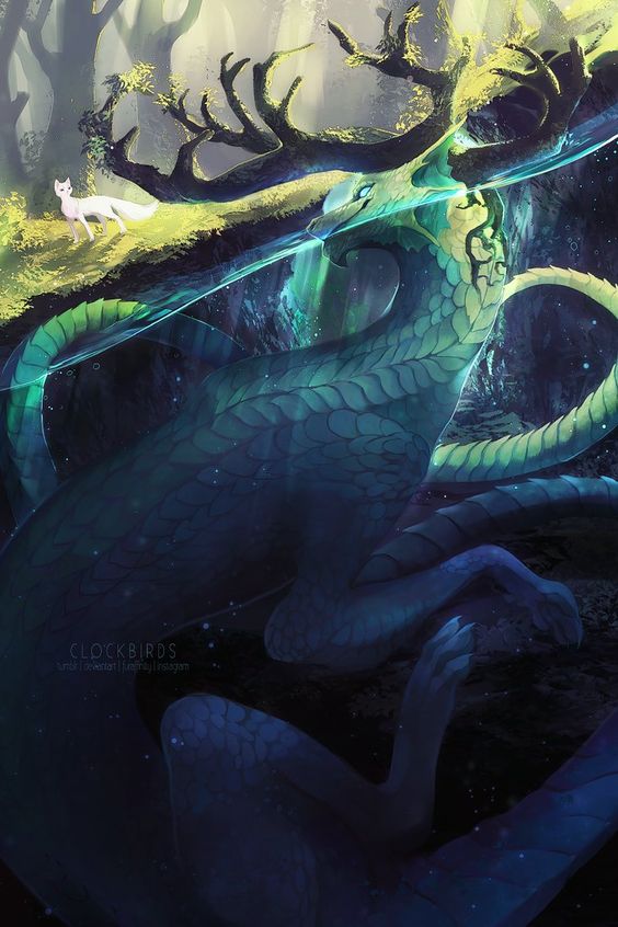
We get a lot of detail about how massive this monster is in comparison to the fox on the shore. The two subjects are looking at each other, giving us a connection. More storytelling can be found in their expressions. There's a definite fore, mid and background for depth.
-
@gary-wilkinson Yea I ended up holding back a little bit on the all the lighting because the more I messed with it, the more I lost the play-doh quality so I still have to play with it.
-
@eric-castleman Wow thanks for taking the time to do that! I was struggling to decide to go full-in with proper lighting or try to leave it with more of it's play-doh quality.
-
@stringfellowart I'm surprised that no one seemed to get it, but I didn't post the title (Tide High) here which helps give away the concept. ... soo it's essentially a drug trip. The boy ate a tide pod. So he's not sleeping, he's more like passed out and hallucinating. Hence the laundry theme and color scheme. The worm is a sock puppet, the jellyfish is a knitted hat, etc.
Thanks for the all the feedback. I think I might start making my own doh in large batches so that I can compose the whole scene at once and photograph it, because the digital manipulation was a bit of a nightmare on this piece since I was a still a little unsure of how to approach it, and definitely starts taking away from the doughyness.
-
@demotlj Thank you! I've actually just started using play-doh. My old sculpture pieces are mostly cast resin or clay. I'm working on a ton of smaller projects to really dial in the style. This big piece right out of the gate was probably a little too ambitious, but I'm still very happy with it.
-
@adameverafter Um...I had no idea this was play-doh! WOW!
-
@adameverafter you aren't too out spoken and it's ok to be invested in a piece of art! Hopefully we are all invested in our art.
Overall I really like this image. I just had trouble figuring out what was going on. The concept didn't come through. This is what is tricky about artwork. We can sit with something a long time and it makes more and more sense to us as we add things. Then show it to someone else and they don't have that same understanding that we think they will. In terms of concept, I'd draw it out quick before making the sculpture or painting and ask a few people to tell you what is happening in the piece. If they have trouble with it, you know you need to clarify some things.
In terms of technique, I really like quite a bit that is happening here. The blue and orange work nicely off each other. Although the orange in the waves is starting to confuse the form and makes it tricky to read what is octopus and what is water. I'd have stayed with different blues and greens for the water and keep the orange just on the octopus. Composition could probably be improved with some better staging and moving the focal point out of the center. Possibly dutch the camera (which just means tilt the horizon line).
Overall a good looking piece and I look forward to seeing a lot more from you. : )