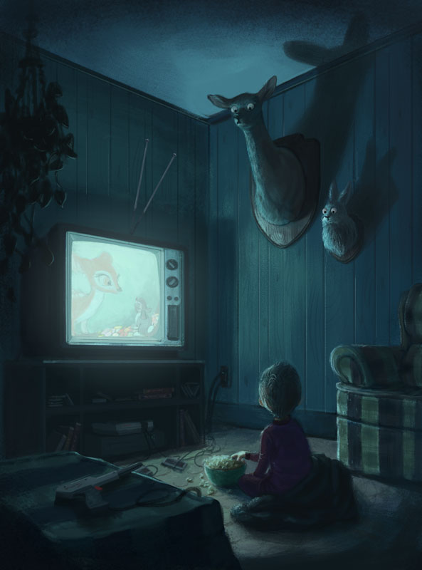
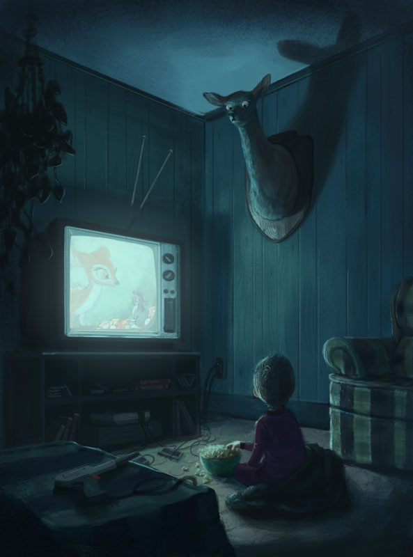
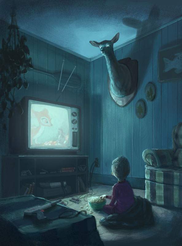
Help with another painting, please- Bambi
-
@evilrobot Thanks! I was toying with the idea of a bear skin rug and a gun actually. I'll think about it!
@Jason-Bowen Thanks for your input!
@harveywalls I will try it out and post it later. Thanks for the eye suggestion. I was playing with the eyes earlier and couldn't get it to look quite right, but your suggestion helped steer me in the right direction.
@MissMarck Oooo, that's a cool interpretation!
@Marsha-Kay-Ottum-Owen Thank you! Yes, that's the spirit of what I was going for. . . how we humanize animal characters so much and then hunt or eat them. It's strange telling your kid that bacon came from a pig, right after watching a movie with a talking pig in it.

@Chip-Valecek Thanks, Chip!
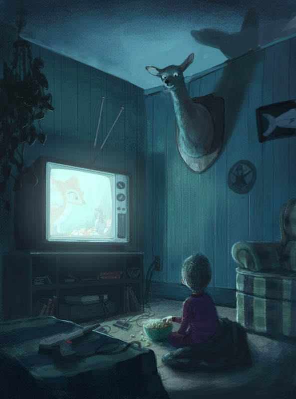
@stringfellowart Thank you. I was wondering about the antler thing. I wasn't sure where to go with that since bambi doesn't have antlers and I thought antlers might make it too scary. When I was researching hunting trophies, it looks like some people do have doe trophies, but it is often paired with a buck. What do you think? Would it be better to add antlers? What if the antler's where on the smaller side?
@gubhart Thank you. I was hoping that the rabbit would amp up the humor, cause it's sort of ridiculous to mount a rabbit like that, but it seems to turn a lot of people off!

@Jose-Ramos Great ideas, thank you!
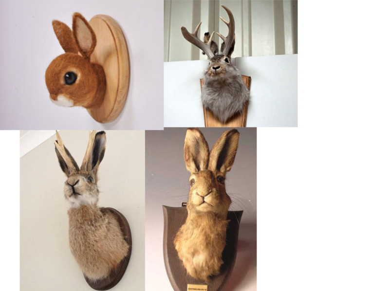
These were kind of my inspirations for the bunny, btw. Aren't they cute, even though it's kind of disturbing?
-
I love this so much! I really liked your first one with the inclusion of the bunny. I love dark humor, though. I love the deer's expression in "B" and think it would be great on the bunny, too.
Mostly I just want to say I love it! The color (colder, creepier tones), the cute/dark/funny combo, all of it. Can't wait to see what you decide. -
without reading everyone's replies, I vote for your first version. The animals need to be as realistic as the boy, and you lose that in the version with the standing rabbit.
I would make the ottoman a coffee table with a few nick nacks, or maybe show the parents legs on a couch. I like the antenna or rabbit ears on the TV as someone mentioned. The panelling should continue behind the TV. Maybe a window with late 70's curtains on that wall.
Another idea would be to lose the rabbit and have a buck and doe on the wall.
-
Fantastic painting, I really like the concept. Amazing rendering, my only comments would be to try and have the boy looking up a bit more maybe you could do this with the angel of the ears and I don't think you need the rabbit, but that is just me- fantastic work on rendering and light
-
@Lynda_Percival Thank you!
@tombarrettillo Thanks for the help, Tom.
@lmrush Thanks! Trying to figure out how to make the head looking up has been challenging without changing how he's sitting. I'll have to play with it and see what I can do.
I'm still not quite done, but I think I need to take a break from this for a few days, cause I'm losing steam!
Website: www.tessawrathall.com
Instagram: www.instagram.com/tessawrathall_art/
-
I say include the rabbit and leave the deer antler-less, it adds to the dark humor of the illustration.
-
@tessw This is looking really good. I really enjoyed seeing your process here and the evolution. I had a tv just like this one, and a Nintendo.
-
I really like the one with the bunny, and don´t worry for the boy looking up, it´s very clear he´s doing that.
")
Maybe a little more bright on the gun , and your old poster with the bear behind TV.? -
His pose is fine, I wouldn't change anything about that. The first image you put up on the post feels quite haunting to me, whereas the last one is quite comical (although the addition of the lightgun is great!). Both are great, but I prefer the scarier version myself
")
btw, I really love how you rendered the popcorn
-
If you still need to... by positioning the ears on the boy (maybe a slightly larger to be seen better) lower on the head from the center it will show that he is looking up (if need be you could always add/emphasize that swirly part of the hair on a boy's head and have that lower from center as well). I see that you've already done those things so maybe play on their emphasis if necessary.
I love the rabbit! Now it is looking a bit more comical and not heavy on the horror.
The deer's ears are great in that position. It gives her that focus and attention towards the boy.
If you still think it needs a touch more feeling of humor or to downscale the scaryness, consider more warmth such as a secondary light source (warm light) maybe coming in from the right as if from another room (kitchen light for example).
Love the popcorn rendering! Love the lighting!
Love how the ottoman is now darker in the foreground. And I love the wood panel walls! I lived through that in more that one house. Yes, and I survived. LOL!
This is looking so good! -
Just wanted to say that I think this is wonderful!
-
Very nice work. Totally pro and portfolio worthy.
I have a couple of suggestions. The first is that you can go a little lighter in the overall values. It can still be a night paintings with the lighter values.
Another change was the top of the ceiling appeared to almost be a tangent in his face and blended with it in value. So I lowered it a bit and lightened the trim up there so the head is a better silhouette.
The deer doesn't seem authentic there without anything else on the wall. I do think the rabbit was a bit too much, but having some other stuff over there gives you a chance to do some story telling.
Love seeing your work here. It really raises the bar for everybody (teachers included!).
-
I am taking a break from this piece for a few days and will respond after I've made some improvements, but I just wanted to quickly say a big thank you to you guys for all your help! It means a lot, and you are all helping to make this piece something I can really be proud of. Thank you.
-
@tessw I think the "creepy" factor is just the perfect amount. Being creepy is the punchline! Honestly, I don't think I would change a thing, overall. Maybe a little clean up, like you mentioned with the popcorn on the floor, and call it good. I think adding too much detail in the room could be overkill and distract from the paintings powerful emotion. Just thinking out loud. Awesome work.
-
@stringfellowart Thanks for your help!!!
@bnewman Thank you! I too had a tv and a nintendo like this.
@Jose-Ramos Good ideas. I tried putting the poster back there, but found it too distracting in the end, especially after I decided to take out the rabbit. I did put something on the wall in it's place, though. Hopefully it works.
@Gary-Wilkinson Thanks for your input. It was tough trying to decide on the tone, but I went with a more comical approach to hopefully fit in the portfolio better. I really like how the popcorn turned out as well, and ironically, that was probably the fastest thing to render on this piece!
@harveywalls Thanks for all your thoughts! I was considering a second light source, that's a really good idea, but I decided the eyes of the deer gave it a good enough balance between humor and creepiness. What do you think? Bt[w, I'm glad you survived your wood panelled childhood lol!
@kat Thank you!
@Lee-White Wow, thanks so much for your help, and your encouraging words. It helped a ton.
@Tom-Shannon Thanks for the kind words!
Ok, so I think I'm calling it done- at least for now, and I'm ready to move on to another piece. Again, thank you all so much. I'm really happy with the direction you all led me to and I'm glad I decided to post it here.
-
I love it! ;)...you have to upload it in your website.
-
@tessw I think what was missing before was exactly what you added in this version: the facial expressions of the animals. I love this. I also agree with making the boy a bit older, to keep it light. The piece reminds me a lot of one of my favorite illustrators (Michael Sowa) who often skirts the edge of creepy and humorous. https://www.wikiart.org/en/michael-sowa