SVS Tees
-
Hi everyone!
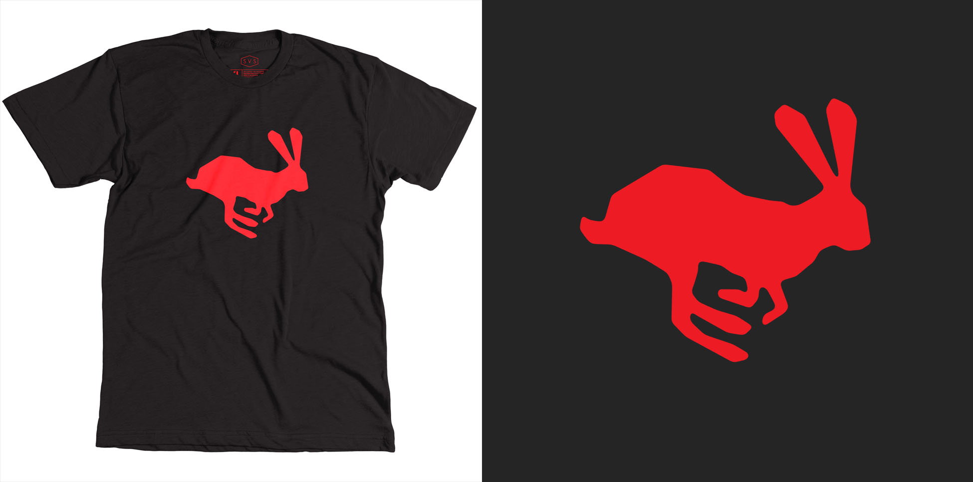
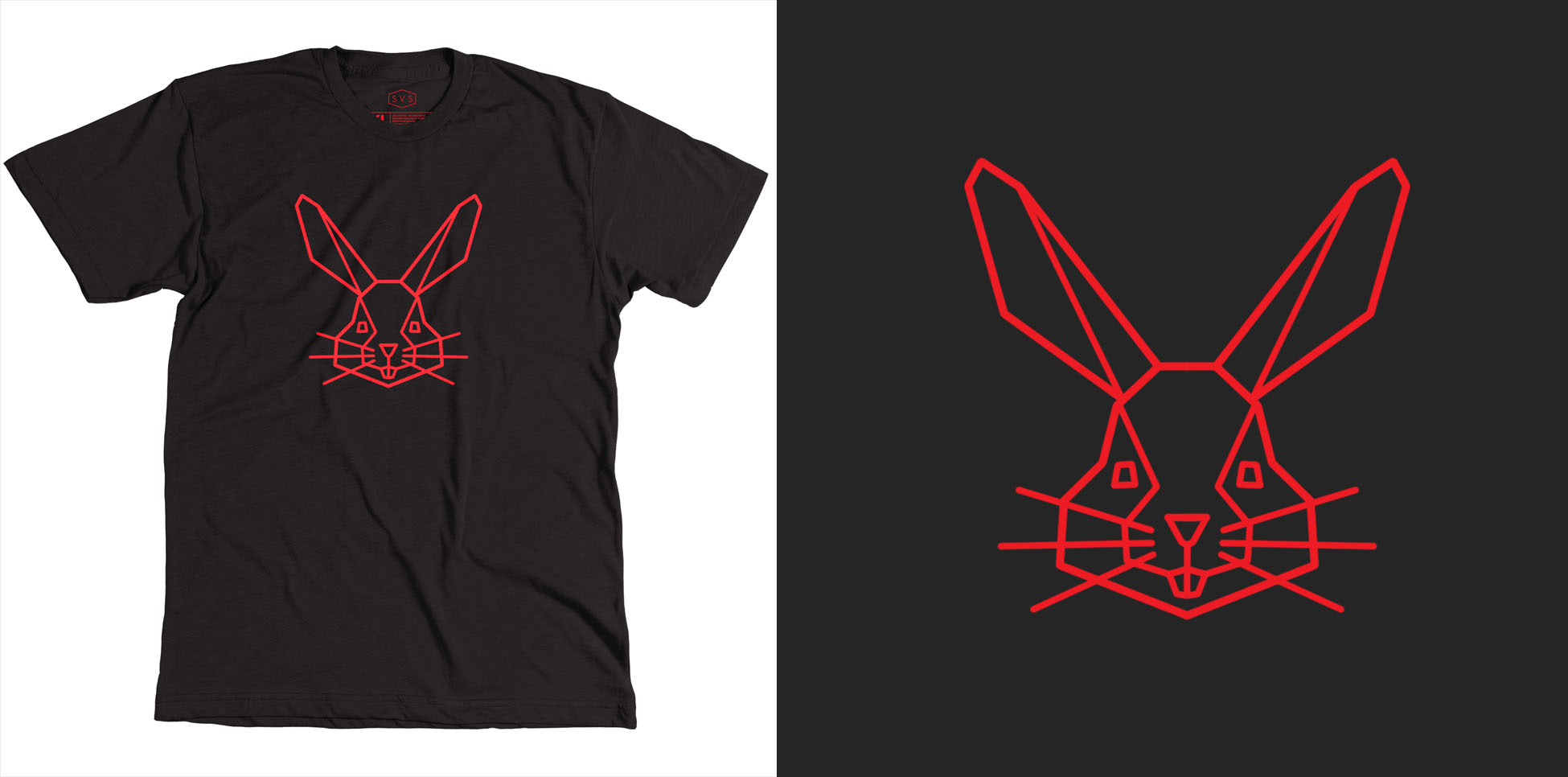
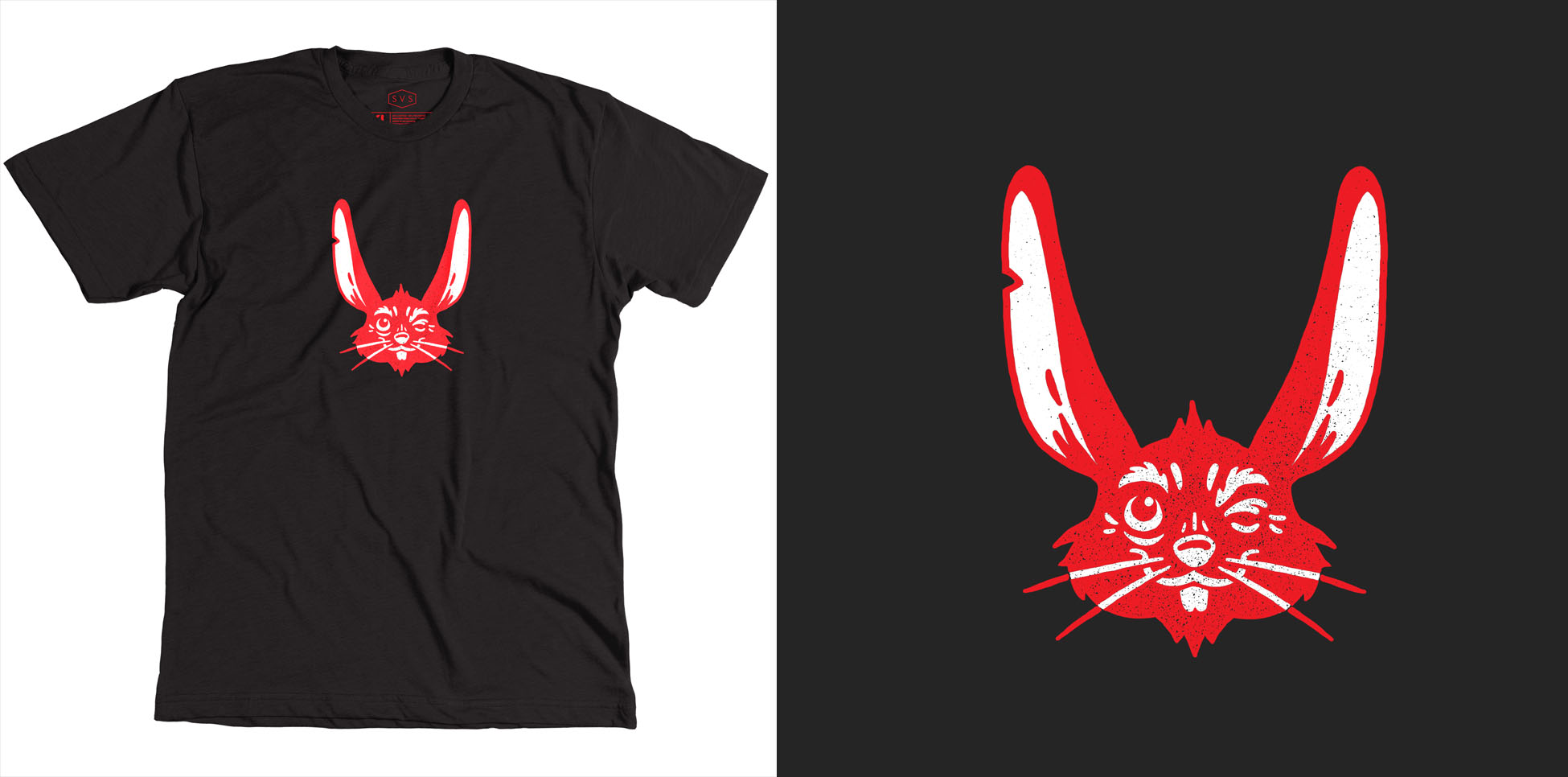
SVS is going to CTNx this year and we are going to be giving away t-shirts to subscribers who meet us there. But before we get the t-shirts printed we want to know what you think of the designs we came up with.
Which one should we print?
A:
B: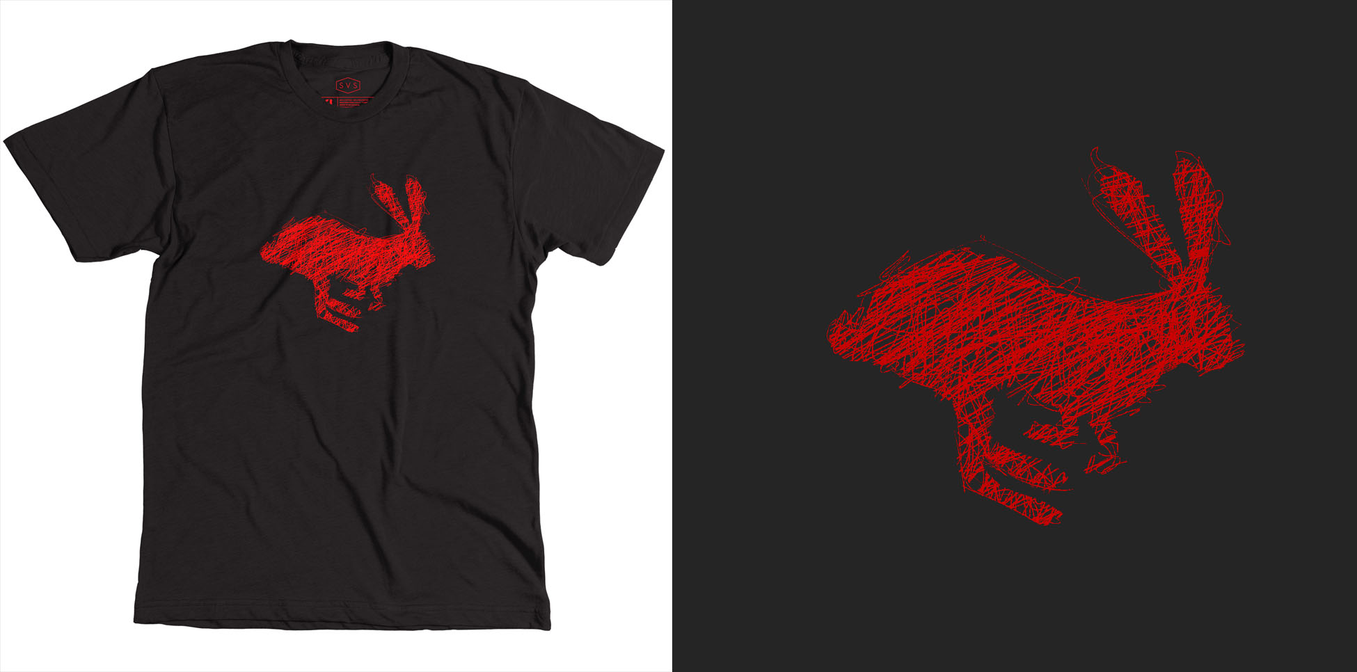


Thanks, and hope to see you at CTNx!
-
@Jake-Parker Can't wait to see what everyone picks!
-
They are all great but my favorite is B
-
@Jake-Parker @Lee-White Right now I'm torn between B and D. D reads better and the expression is cool, but there is something really interesting about the scribble line work in B.
-
If I was picking it off the rack, I'd pick B.
-
And I'm not going to CTNx but I'd love to be able to buy one

-
I like B and C but not dead center and so big. I'd want it on the back or smaller and in the upper left corner.
-
I like C the most.
-
@Jake-Parker "D" please!
-
I like B
-
D but will not be there
 Prizes for 3rd Thursday winners?
 -
B makes a very nice graphic for the Tee in my opinion. I kind of like C too if it was much smaller.
-
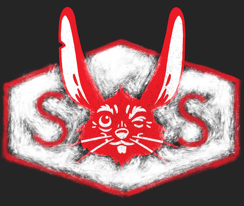
@Jake-Parker That rabbit sure looks like a very nice "V" ....as in "SVS" - how about something like this ..... really big ...super hero style

Think of all the times we can say " no..it's a "V".... Ya the rabbit is supposed to be a "V"......it's SVS..not "SOS"......it's an online school ...you should check it out...changed my life"
-
I like B.
-
@Jake-Parker B is killer, has a lot of energy and is eye catching. That's my fav. I do have a 'BUT' though. From my graphic design and marketing background I would say that D reflects more of the branding of SVS as a company, which is 'Illustration'. The others are solid designs but visually tailored more towards graphic design.
-
Oooh exciting idea! Shame I will not be anywhere near CTNx to get one

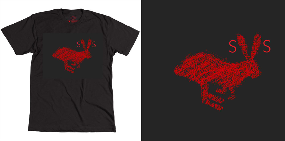
I like B best, for sure - it's artistic and interesting with the scribbly lines. But I also like @Kevin-Longueil's idea of marketing SVS a bit more strongly...making the link a bit stronger for those that don't know about the red rabbit. I wondered if his idea of the 'V' shape with the ears could also be applied to the 'B' design...just an idea though!
-
@Dulcie I definitely vote for this one! Brilliant idea!
-
B love the scribble work

-
I like B best, but I love Dulcie's idea of adding the letters. Then we get to explain to people what it is. I'm hoping at some point you put these for sale on site - would definitely buy one for myself but I don't get out of Wisconsin much.
-
I love B the best without lettering on the front bunny design and think it would look great with SVS on the back of the tee.
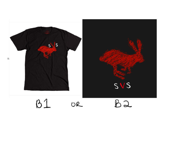
But working off of @Dulcie cute design, it could be fun to play and experiment with. I think there needs to be more clarity with the V shape of the ears and the lettering if you plan on going that route. see B1. Or you could just put SVS below the bunny too as in example B2, if you really think it needs to be stated on the front of the shirt with your SVS font. I just quickly hand drew these ones on. When I think of SVS, I automatically see red, black and white so I think it could be nice to have all three colors in the design somehow.
Overall I think having letters near the ear messes too much with the overall nice clear shape of the rabbit so it's a tough call because it is a cool idea that Dulcie suggested.
What ever one you go with, I want to be able to buy one!! So exciting!!
