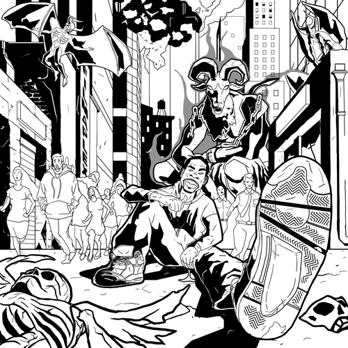
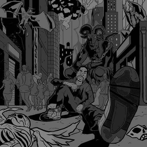
Album Cover Illustration
-
@Christine-Garner oh yeah I know. I'll prolly just add the type but reduce much of the shape in my linework.
-
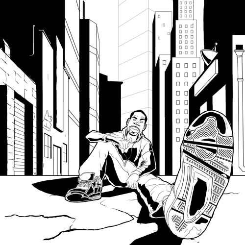
@Durrell-Odom That is one big foot! :-). Great perspective. I find perspective challenging myself so I am impressed.
Marsha Ottum Owen
-
I'm definitely no expert, but I just watched the Creative Composition class, and they say in it (Will Terry and Jake Parker) that having lines that correspond to the lines of the sides of the paper aren't as interesting as diagonals. You might want to make that horizon line more diagonally tweaked.
-
@Marsha-Kay-Ottum-Owen this one was a bit challenging for me mainly because I tried doing 1 point perspective in photoshop but you should practice this at least one hour a day from Ernest Norling Perspective Made Easy book.
-
@elisemc I will some more figures in this piece so maybe it'll give it a more dynamic look.
-
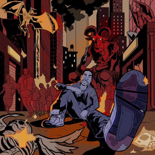
Revisiting this illustration. Giving it the Black Dynamite-Sin City appeal to it.
-
Hey Durrell, nice looking work there. I like your drawing and the black and white treatment.
One thing to consider though in terms of content. It looks like a shoe ad because that foot is SO dominant in the scene. I'm a fan of cool perspectives, but not if the overall intent of the work is lessened because of it.
So if you are selling a new tread design, etc. then I would stick with this. Otherwise think about what you want to say about your character and adjust as needed. : )
SVS Faculty Instructor
www.leewhiteillustration.com -
@Lee-White Thanks. Once I add color hopefully I could make the less when I add it. I kinda went by the feeling, lol.
My client supposedly want to portray himself like a Constantine type character sitting alone while angels and demons wage war. Which I'll add later.
Also a big fan of your "How to Make Money" courses and your work.
-
I like the strong graphic style of this. I'm looking forward to seeing all the details you describe, it sounds really epic.
-
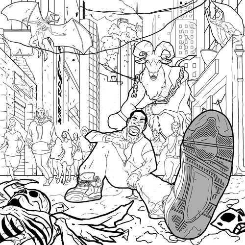
Here's what the point I've gotten to so far not too much to go hopefully.
-
-
Awesome stuff man, really liking the bold shadows. Stoked to see it in color!
-
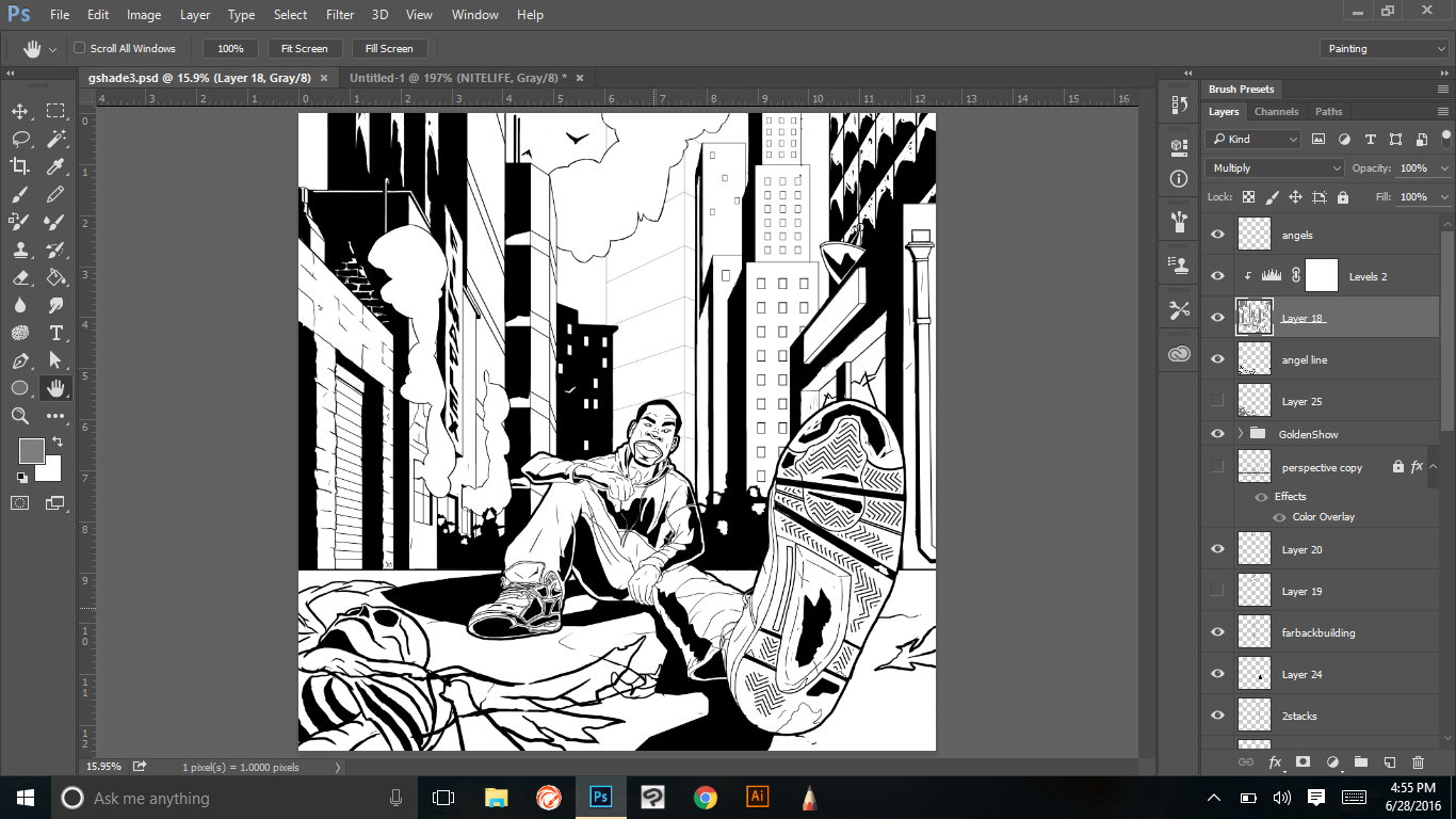
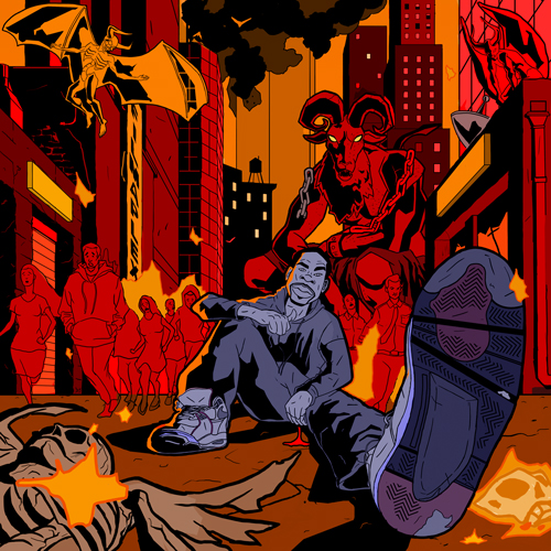
Last step before going to color
-
This post is deleted! -
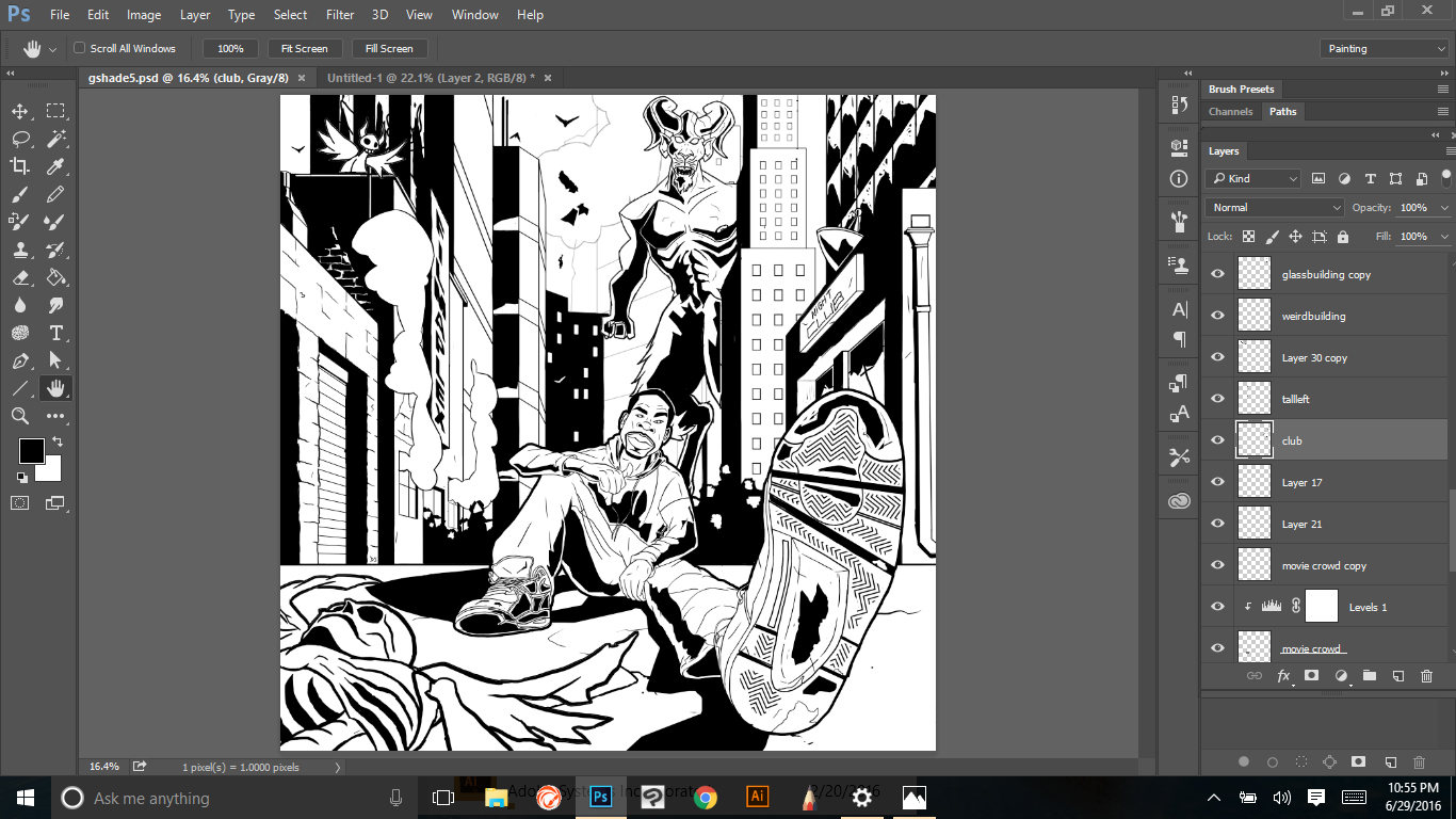
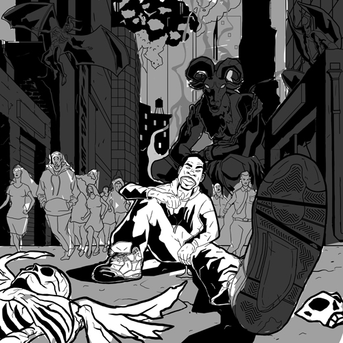
Here are some lighting experiments. Please let me know what are your thoughts are please?
-
-
@Durrell-Odom Hey Durell - looks like you are about finished! - For critique i would say that it is very saturated and hard to find a focal point - it is even difficult to look at the main character for me - my eye keeps bouncing around - everything has equal importance - i used a desaturate brush in photoshop on everything but the giant demon and the singer and it helped a bit - but i think it will take more than that because desaturate just brings everything to it's grayer self - so i think desaturating and possibly changing some colors to be a bit cooler where you don't need the viewer spending time - i think it can be subtle and still have the inferno effect you are going for - perhaps have a circular composition where the eye goes round and round - top left demon to front pedestrian to singer to giant demon and back to the top left demon - these could be the places that have higher saturation with the singer having the most... but everything else being knocked back a bit or a lot both saturation wise and color temp. Does any of that make sense? Look forward to the final!
-
@Durrell-Odom I agree, to desaturate from the farthest to the nearest, love this style.
-
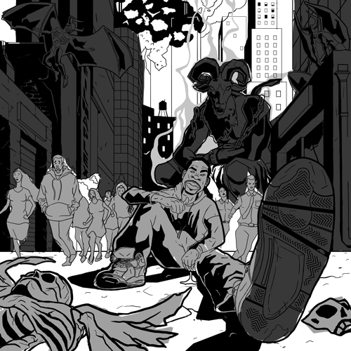
@Kevin-Longueil Thanks. I've been really looking at some of classic paintings of hell, Geof Darrow, and Mike Mignola yesterday to give it that feel. I made a change to the twin towers in the background too. As far as color, I was studying the works of Mignola and Dave Johnson for more of a simple read. As far as color, you're right. I believe red was too much. I've should toned it down a bit.
-
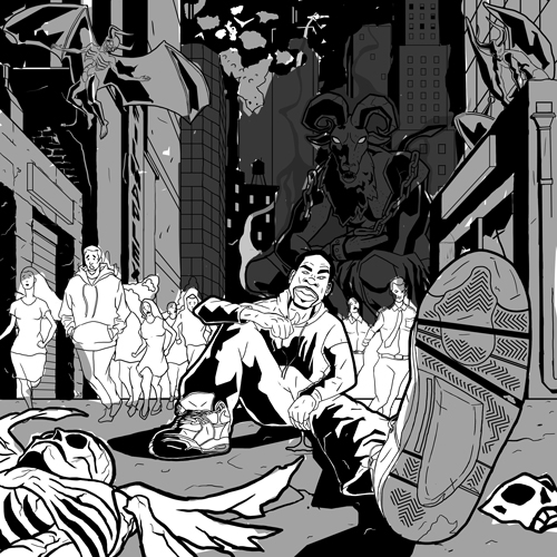
@Durrell-Odom Hey Durrell - i just noticed i forgot to load the desaturated version i had mentioned - here it is - i think this is better at explaining what i was trying to say
")