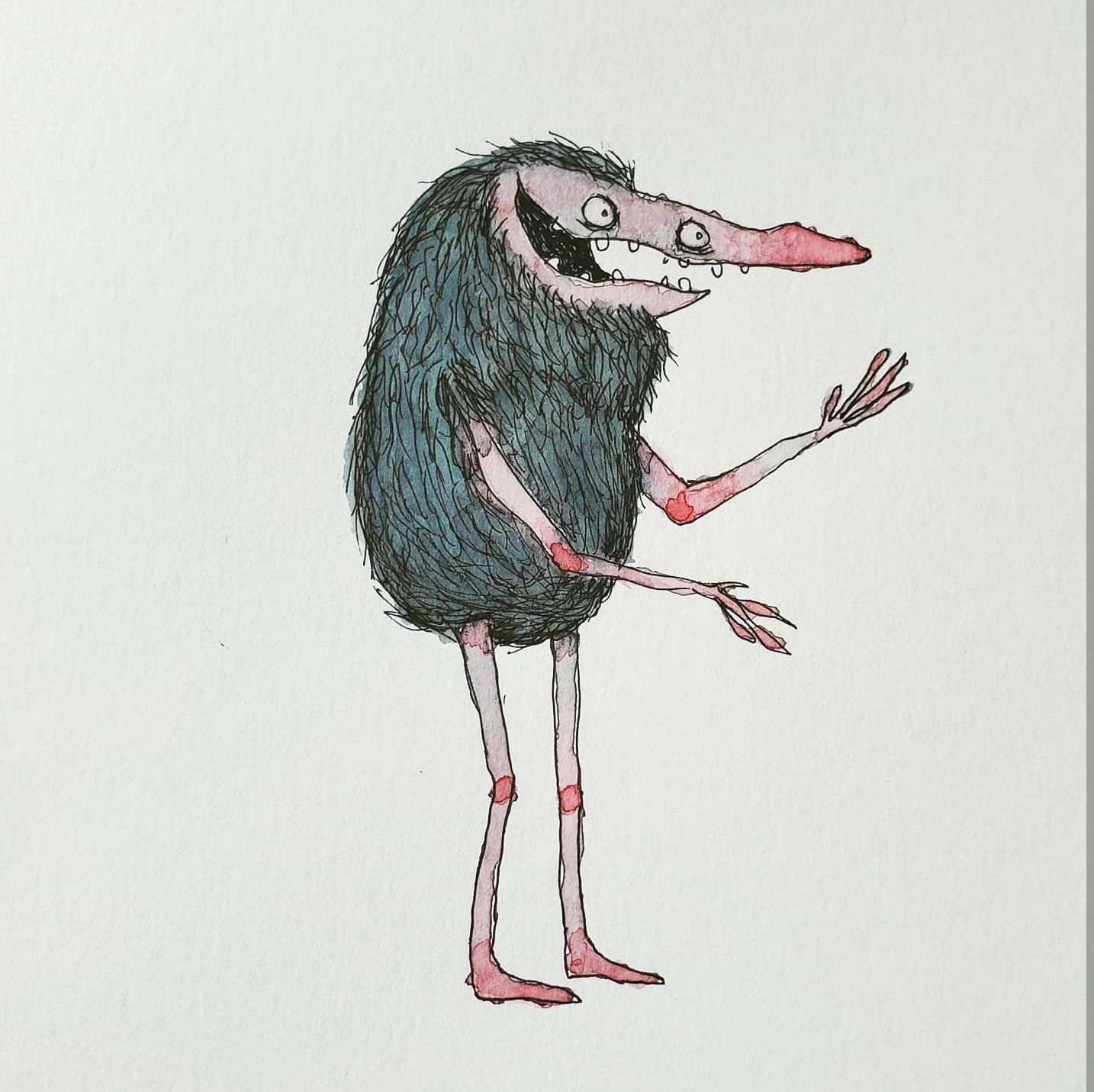
Our SVS Virtual Studio July ⛵️
-
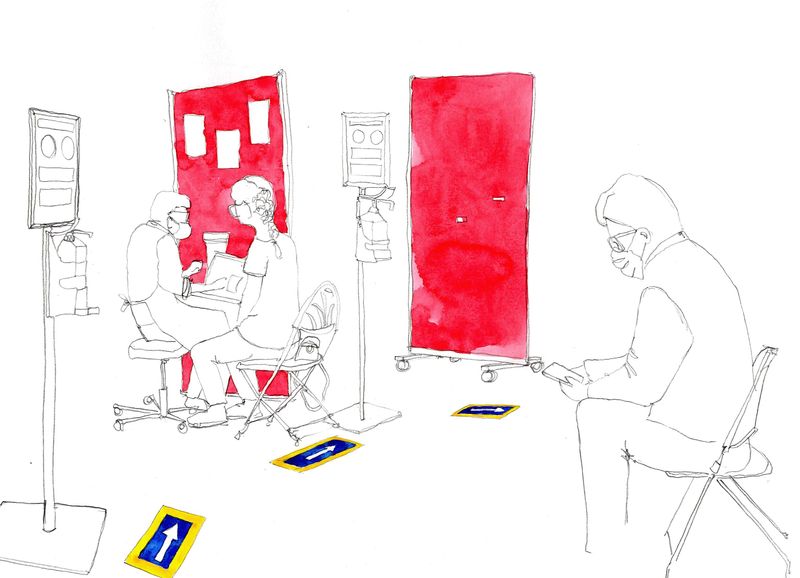
This week a local pop-up vaccine hub invited in our Urban Sketchers group to document their final day. The setting was a beautiful 17th century house and people having Pfizer got to sit in the flower gardens for their 15 minute wait

-
@demotlj
 My water loving Albert would gladly live there!
 -
@Oana You’re right. In fact I wouldn’t be surprised if there are a few of his relatives somewhere in this lake. (I loved your Albert, by the way.)
-
Whenever I'm not sure what to draw, I draw something 'turtle-y'... like this turtletank :-]

-
This week I got my first ever self-published project done and up for sale. It's not children's illustration but I'm really proud of it. I couldn't find a cheap source for the type of calendar I wanted to make, so I just did it myself. I learned so much doing this, and the things I had to do to make it happen are going to pay off in my future: I bought a nice professional printer (Canon Pixma Pro 200), I started an LLC, I invested in a good paper (thanks to @Lee-White for the B&H Photo source), a hole-punch and shipping supplies, figured out how the e-commerce offerings work on my website service... It has been a profoundly valuable endeavor with such a deeply intense learning curve--and I'm so glad I did it. Even if I don't sell a single calendar, the choices I committed to will pay off in the long run in many ways, with many potential projects now possible. It has been a very good couple of weeks in my studio!
https://www.coreyartusimagery.com/2022calendar/2022calendar

-
@demotlj this is beautiful!
@PieterVanDerBeek love the medal of honor!Here is some linework on a piece that serves as a warm up these last two days!
-
Congratulations @Coreyartus! What a huge step setting up your business! Your calendar is beautiful!
-
Hi @Janette, I really like the style and color choices!
If I pretended to be an art director offering a critique for SCBWI, I would say the following:
-
The piece feels heavy on the right. Possibly add text to upper left to add narrative for storytelling.
-
I’m not sure I understand what’s happening. Is the man selling his cat, or did he sell something already? He’s flipping a coin back, so…
-
The cat is cute, but she looks like she’s hovering on outside of the mans arm. Should she be on the inside?
-
You might consider lightening up the curvy road behind the man since his arms and neck almost bend in with the road.
Hope this helps. Also, just realized I probably shouldn’t offer feedback in this forum, so please let me know if you prefer I delete this post.
-
-
Road trip adventures! Hope everyone's summer has been great so far!


-
@Janette This is so exciting! It looks great! Please drop a link when it's available!
-
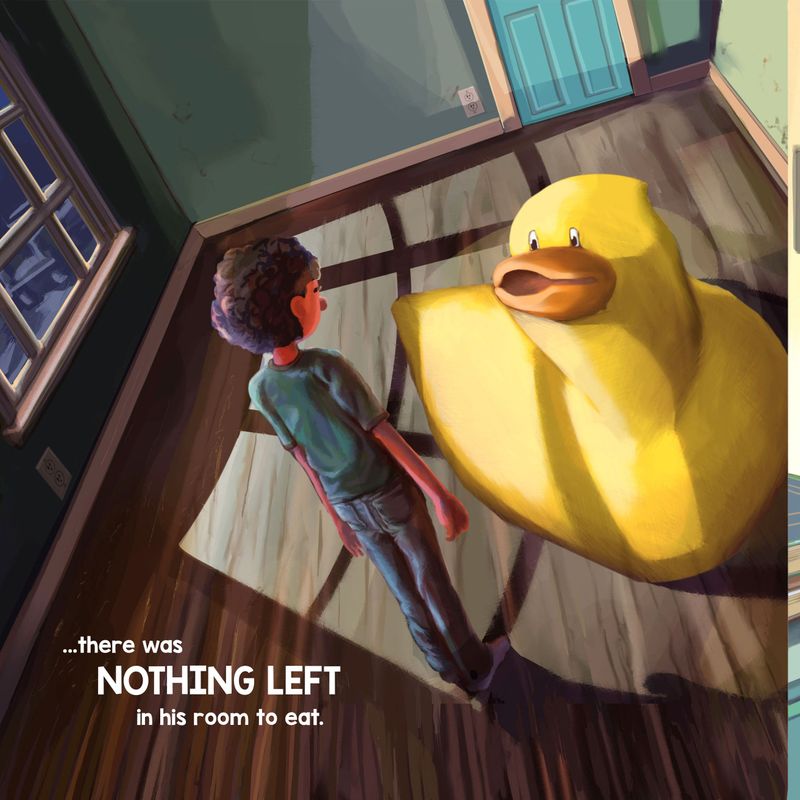
@Janette I had a similar image in my little self-published Amazon book. It was cool to see yours ("great minds..." kinda thing maybe
 ?). I love that angle! The bare light and pull string combo in the foreground really heighten that empty feel. Lovely work and congrats again!
-
@Jeremy-Ross Yeah, I need to add text, becaise its the Crooked Man Nursery Rhyme, which would explain the image.
-
@Jeremiahbrown Lovely work. Great light and shadow.
-
@Coreyartus Bravo, this looks fantastic, really impressive stuff! I can't help but see your business soar (hehe) from here! Congratulations!
-
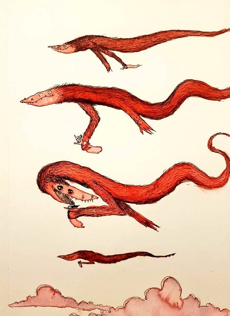
Princess Thieves -
@Janette Living the dream, way to go
 I'm already loving how this is coming out. Keep on keeping on
-
Cool @Janette! That will definitely balance it out.
-
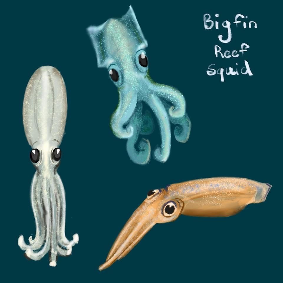
I’m working on some cute animal development and ideas for an aquarium story. I’m so happy I could convey at least a little cuteness.
-
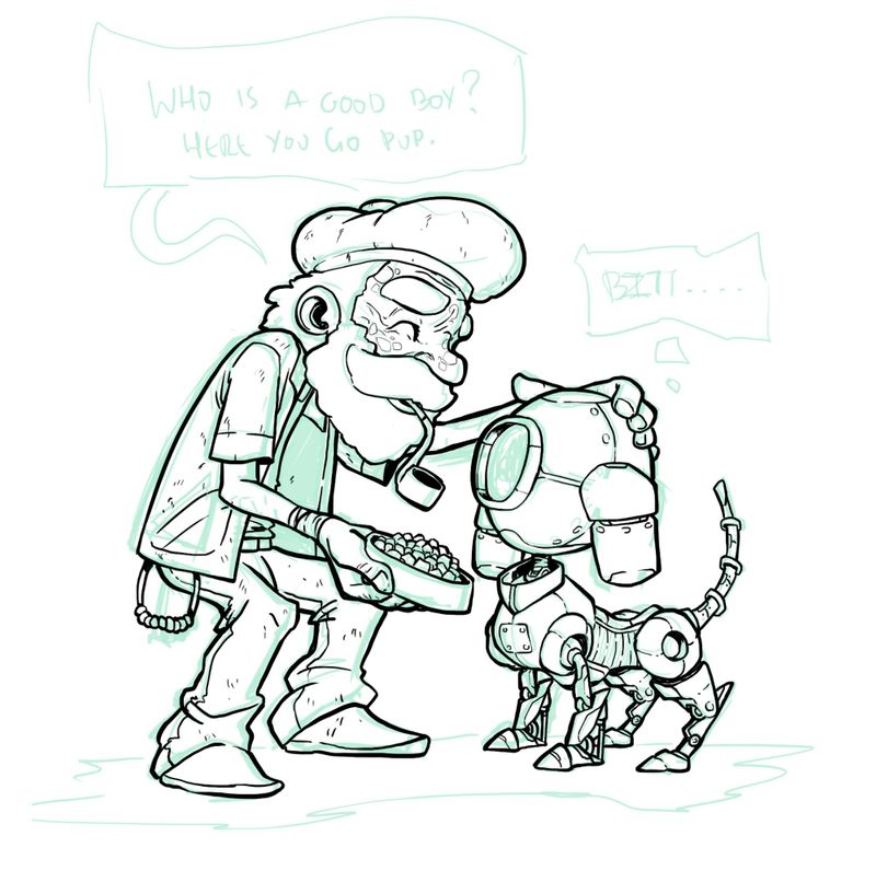
Sometimes doing good to others can have a magical and unexpected warm impact on them, even if they don't understand it!!
Grandpa tries to feed a robot pup, as they did in his times



-
