Serious Critique Requested - Picture Book Portfolio Image
-
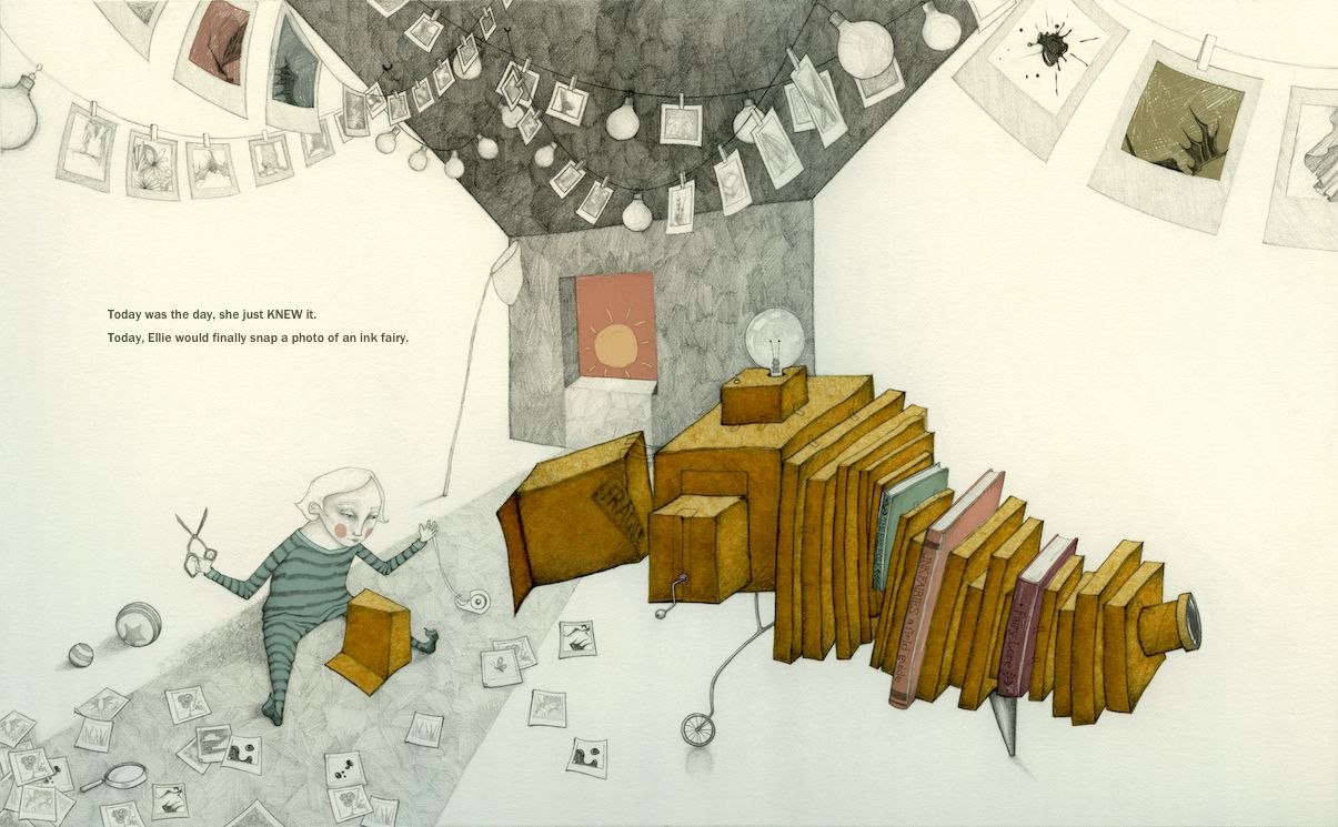
I'm dedicating this year to finally getting a picture book portfolio together! This is my first finished illustration for it. You may notice that it's a prompt from one of last year's contests - the ink fairy. I obviously missed the deadline

I desperately want to know everything that is separating this illustration from professional quality art that could get published in a picture book.
Other than that I won't ask any specific questions, other than, does it make sense? I'd love to read answers to that and any other feedback you can give me.
Thank you!
the site: katherinetyson.com
instagram: instagram.com/katherinetysonart -
@Katherine Sorry no crit. from me - this looks great... also if i saw a book with your "over the moon" image as the cover i would buy it - even if there were no other illustrations - i really enjoy your style... maybe one thing i might say is that there is a certain somber note to your work which appeals to me personally - "somber yet hopeful" is how i can describe most of my favorite art ("moonlight sonata" for instance:) but maybe that is something to think about as far as appealing to children's book market? - but then i think of Shaun Tan .... anyways .. great work
")
I should add that this advice coming from me is very ironic....
-
I also think your work is stunning! definitely more editorial than kidlit though.
-
@Katherine Quality-wise, this is super gorgeous!! But you also have to look at it from a perspective of: could an art director see this working in the context of a children's book?
Some things that may be problematic are:
- The character looks expressionless, can't tell at all how she's feeling. For storytelling, expressions and emotions are very important!
- Also hard to guess the character's age. She seems like she could be a toddler, but her face looks adult (and she's holding scissors!) In children's books, the main characters are often children. Art directors definitely want to see that you're able to draw children that are unambiguous in age.
- Book spread composition. Art directors want to see that you're able to meet the specific demands of the picture book format. That includes leaving space for text (which you did!) but also directing the eye in the image and leaving space in the center for the gutter (the binding). Here you have a contraption and architecture that are composed very centrally and this might get cut off and look odd in print.
Other things that are great to include in a children's book portfolio to demonstrate the skills required are: book covers, spot illustrations, a narrative sequence (2-3 images from the same project with same characters), characters interacting, various poses and emotions, racially diverse characters (especially diverse kids), visual storytelling in every image if possible, children appropriate themes that appeal to the target demographic (school, dinosaurs, fairy tales, robots, etc), animals and at least a little bit of environments (indoors and outdoors).
vanessastoilova.com
instagram.com/vanessa.stoilova/Check out my Youtube channel for tips on how to start your career in illustration! www.youtube.com/c/ArtBusinesswithNess
-
@Katherine bee-you-tiful work! Love your style.
As far as an honest critique goes, I was going to say everything @NessIllustration said, and she said it much more eloquently!
 ️
️
illustrator - author - smiley person
mbaileyart.com
instagram.com/mbaileyart/ -
@Katherine Hi. In my opinion, your art and style is great. It has personality and it is not going to be liked by everybody (don't have to), but sure it's going to find its public. Me, personally, I love it! It reminds me German Expressionist cinema (The Cabinet of Dr. Caligari for example) with a pinch of Tim Burton.
Some people are going to feel that it does not fit children's book's style. I completely disagree. They said the same for "Where the Wild Things Are". Children are fascinated by a good dark atmosphere.
So my advice is, continue to do the same thing.But now I'm confused. You say "I desperately want to know everything that is separating this illustration from professional quality art that could get published in a picture book"
Let's get clear, professional not always means "good quality" in the business sense. But it means "good quality" in the art sense. And it is not a black or white thing, there's a lot of gray area in between the middle of the illustrations that are clearly in the bad quality area or clearly in the good quality area. For me, your illustration is clearly in the good quality area, but that doesn't mean that you can't improve. You always can improve, always.
I say I'm confused because you clearly know all this. I mean, I think any person that can achieve this level of craftsmanship has to know, more or less, how good his work is, and has a sense of direction.The question here is, do you want to do your own thing or do you want to turn more commercial style to fit the mainstream market?
I think you have your own style and I would go in that direction. Working everyday, making one piece after another, building a body of work, consolidating and improving your style.
This way you'll perhaps don't find a place in the mainstream current, but you'll find your niche. And if the mainstream current goes your way and finds you, is in your terms.
To have your own style is a big thing. Some people spend their entire life searching for it. You have it and my advise it is "let it roll" "be yourself" "explore that"Now if you want, for commercial purposes or otherwise, to fit the mainstream market, I would go and read all the award winning books of the last 5 years and then every book that sells good. Study what they are doing and see how you can change your style to fit the market.
About personal critiques, be careful. There's a difference between quality and style. In my opinion you always have to critique quality concern issues and not style. I mean, the critique always has to mean to improve the illustration and not change the style of the illustration. A lot of people critiques, go in that direction, they try to change the illustration to fit his vision or "the rules" they learned. The rules has to be learned and unlearned, only after you unlearn them do you know you have it. People who are in the learning state usually are slaves to the rules and their work looks forced and they give sometimes terrible advice because they don't recognize a good expressive work or style, they only look for the rules to be taken care of.
So, for me, your work is fascinating and doesn't need changes, only evolution. I was attracted when I was a child to this kind of style and I am now. I don't think making the child look more like a child is going to improve your work and, on the contrary, it can take away its personality and atmosphere.
But it is your call. Have a great day!
-
@Katherine First of all, it looks awesome and I’m in line with Kevin and Samu, I personally very much like this style and I think there is a market for it. Maybe it has not that "cuteness" that most children books have but that does not mean that all characters have to be cute to like and bond with them (although it really helps!) I agree also what @NessIllustration said about the expression, she looks now blank to the ground, more expression in combination with gesture makes your character alive and likable. The story itself can really help with that too, but then you have to show a sequence of images and maybe a model sheet. I think children books can be very arty and abstract as long you take the reader (adult and child) into your world. Good luck!
-
@Katherine
This is absolutely gorgeous, and one of those pieces of art that makes my heart flutter.
My one critique- the box with the ‘fragile’ stamp leaves me guessing. Is it attached to the camera? Part of the trap? Maybe play with it. It’s the only thing that feels a bit unnecessary.
Otherwise I love the magic and design. -
@Asyas_illos Thank you Asyas!
-
@Melissa-Bailey-0 hehe - don't you love it when somebody says it before you so you don't have too

-
@KayPotter Oh that's interesting - about the fragile sticker box. It's only semi-attached to the rest of the camera right now and it's supposed to convey that Ellie is the one making the camera and that it's not quite finished yet.
-
@joosterwijk Yes - I'm quite keen to do a model sheet of Ellie - good idea! It's lovely to hear the feedback on the style - thank you. My artwork used to be much more "cute" and I've been very consciously and deliberately moving away from that as it would make me cringe every time somebody would describe my art as cute - I did not take it as a compliment!
-
@Kevin-Longueil Thank you Kevin, I'm incredibly flattered! And stunned by how epic your portfolio is. Your comment about sombre but hopeful reminded be of this Tom Waits quote, which I couldn't agree with more: ""I like beautiful melodies telling me terrible things." I think we may have the same taste in art
I know you meant your comment about there being a sombre note to my artwork as a critique, given that I'm angling towards picture books, but actually that describes all of my favourite art so if I'm hitting that note, I'm thrilled!the site: katherinetyson.com
instagram: instagram.com/katherinetysonart -
@NessIllustration Amazing! Thank you Ness
I totally agree with you about the character's expression. I need to put it away for a while and come back to it with some renewed energy to fix things like that. I'll definitely do that before putting it in my portfolio.Regarding the character's age, I'll see what I can do with a character study sheet. There's something about the ambiguity that I kind of like.
I did take the gutter into account but I think I added that crank handle on a whim and didn't take into account that it was going to fall into the gutter!
-
@Samu Wow Samu, thank you for your incredibly thoughtful reply! I've put "The Cabinet of Doctor Caligari" on my watch list
I agree with your thoughts on style. I'd never consider changing my style to suit a market and I have seen plenty of picture books that strike a sombre note. Many of my favourite picture book illustrators that fit this description seem to be European and most of them seem to be published by OQO Editions. In fact it wasn't until perusing bookshops in Paris and stumbling upon such illustrators that I ever considered illustrating for picture books. So I agree, there is definitely a market for it but I may have to move to France 
I also remember liking darker things as a child. I was completely bewitched by The Labyrinth, The Last Unicorn, and even Puff the Magic Dragon - possibly the saddest song in the world
I must admit I am confused by your confusion
There is certainly plenty about this illustration that I am proud of but at the same time I genuinely don't know if an art director would look at it and think it is of a "publishable standard". And I also genuinely don't know what they would tell me to change or improve to get it up to that standard (apart from what has conveyed on here r.e. expression, etc).Thank you again, Samu - I really appreciate you taking the time write so passionately on something I also feel very strongly about - we are of the same mind
-
@Katherine Thank you for the compliment on my work!! I'm so glad my post did not seem negative to you.. i almost deleted it after i wrote it because it seemed unhelpful and possibly damaging. I love Tom Waits - I listened to that NPR interview with Tom Waits 18 'ish years ago!