Re-visiting my Wizard of Oz Cover
-
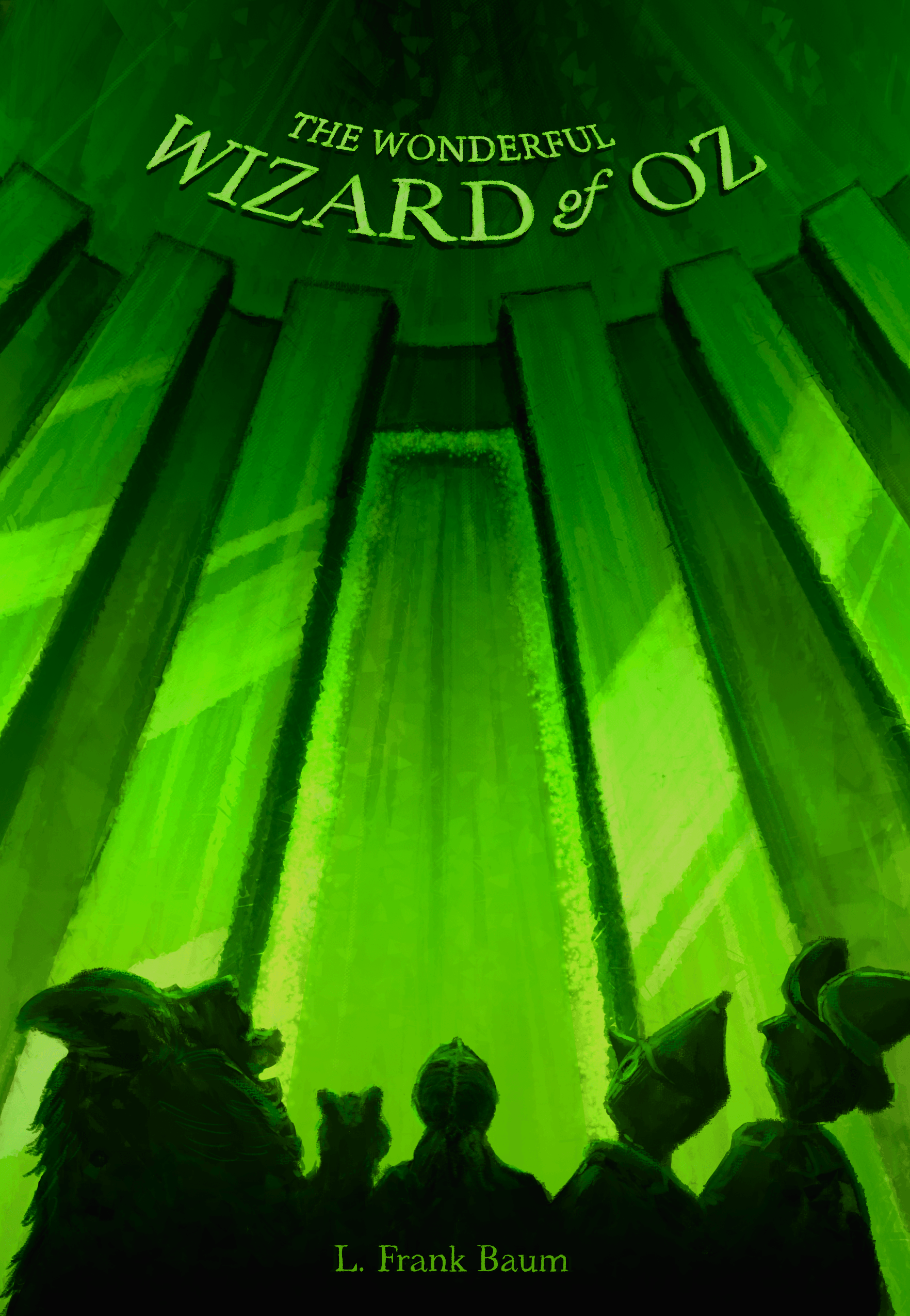
Hi All! I loved getting to see everyone's entries for last month's Wizard of Oz contest. So many cool ideas!
Though I didn't make the top 16, I would still like to use my entry in my portfolio as I am pretty proud of the concept. I am hoping to get some feedback from anyone with ideas that might make it better.
Specifically, I'm interested in:
-
how I can make the impact come across stronger?
-
what I can change about the title and author text?
-
thoughts on the style itself (i.e. is it too busy, not clean enough, etc.)
Thanks in advance to anyone who can help!
Josh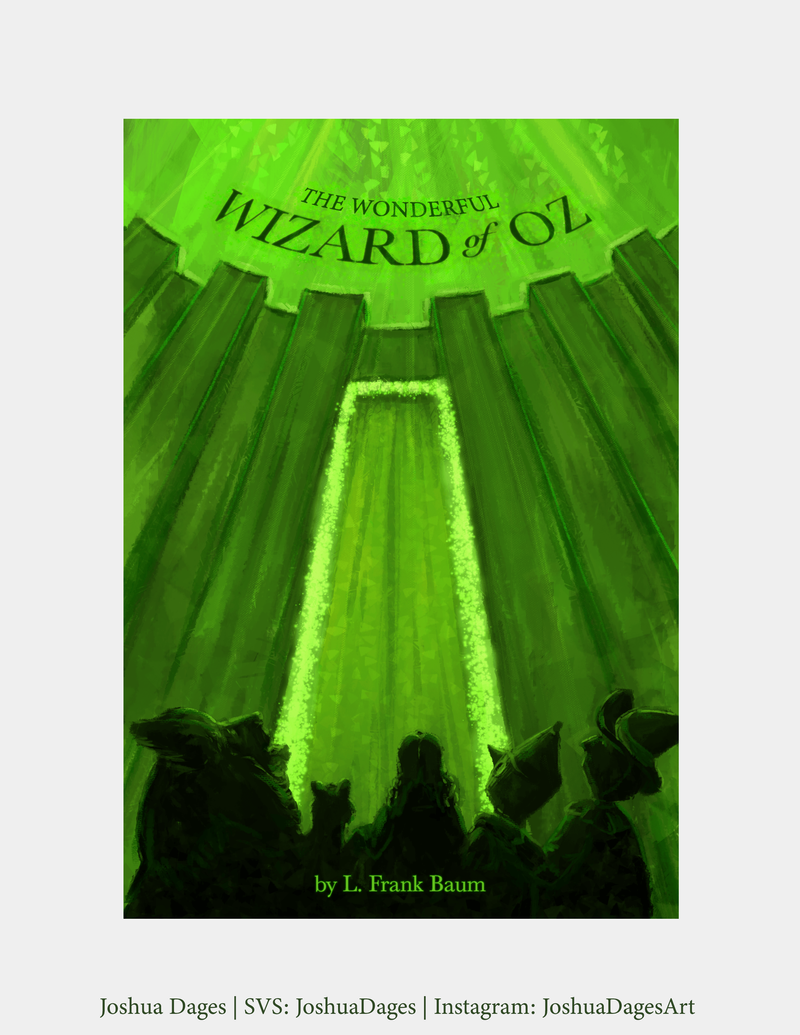
-
-
@JoshuaDages I had this picked as making the top 16 - i think it is a very nice piece - only feedback would be that if you make the image postage stamp size that the title does not come across well - light on dark or dark on light are our only real options so maybe try white text or fade the green glow above the walls to be a much lighter emerald green so the text pops more? I think text that is not curved would look good too though the curve does not bother me... it just does not pop .... i really like it though
")
-
@JoshuaDages I like this cover a lot. It’s very unique and works as a book cover. A few ideas:
-
Tin man and scarecrow stand out more clearly than the other characters. The lion is harder to see so maybe give him more of a shape or highlights so it jumps off the page as a lion
-
try a version that has Dorothy in profile to see the emotion on her face like we see the emotion on the other characters. My entry had Dorothy facing away from the camera and when I saw the other winning entries, I wish I had her facing the camera
-
-
@Kevin-Longueil Thank you so much! I appreciate the encouragement. I see what you mean about title and will try out a few options to see what works. I like your green glow fade idea. Thank you again!
-
@Graham-Williams Thanks Graham! I see what you mean about the lion not standing out and agree that seeing Dorothy's expression would add to the emotion of the piece. I am looking forward to playing around with the characters to get that perfect angle. Thanks so much!
-
Hi Joshua! This is really a stunning piece and so great for your portfolio!
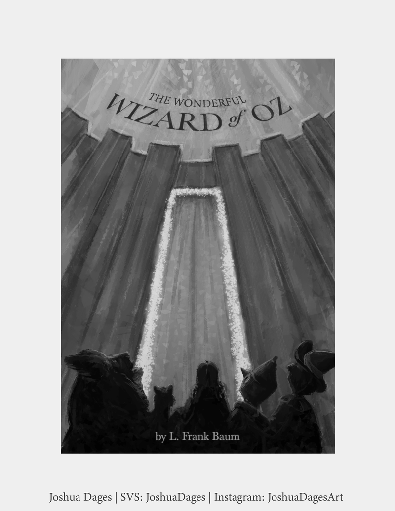
Something that could help is to increase the contrast between the wall and your characters. You have such great shapes in the wall, so I made the outward faces a lot lighter and the sides a lot darker. I'm not sure how to make surfaces look glossy/shiny like gems, but below is my attempt, haha. Making the walls lighter helps your dark characters stand out more as @Kevin-Longueil mentioned. Looking at your image in B/W helps! I also made the top darker, too, but I'm not sure if that's working as well. As with everything, take all this with a grain of salt! Kudos on your new portfolio piece!Absolutely love your dragonfly entry, btw! Such a cute and fun idea!

-
@aprilshin Thank you! This is super helpful and I appreciate you taking the time to do the paint over. I really love your ideas and am going to add emphasis to the wall (also I love the "gleam" you put on it!).
Thank you again, and for the record your wizard of oz entry made me gasp it was so beautiful, and was my favorite of the month!
-
@JoshuaDages you are most welcome! I learn best visually so I love it when people do paint-overs for me too. And thank you so much for your kind words!!

-
@JoshuaDages If I was picking top 16 this one was on my list 100%! And @Kevin-Longueil ‘s piece too. Judges had a brain fart
 (sorry judges
  I’m kidding)_ just my humble opinion , this was top 16 material for sure. Every month there’s a shocker or two for me !
 -
@Coley Thanks so much! I appreciate that! And yours was great too! I loved the tornado hat concept. I wish I had thought of that.
-
@JoshuaDages the tornado hat was sort of an accident lol but thanks
 it was a happy accident!
 -
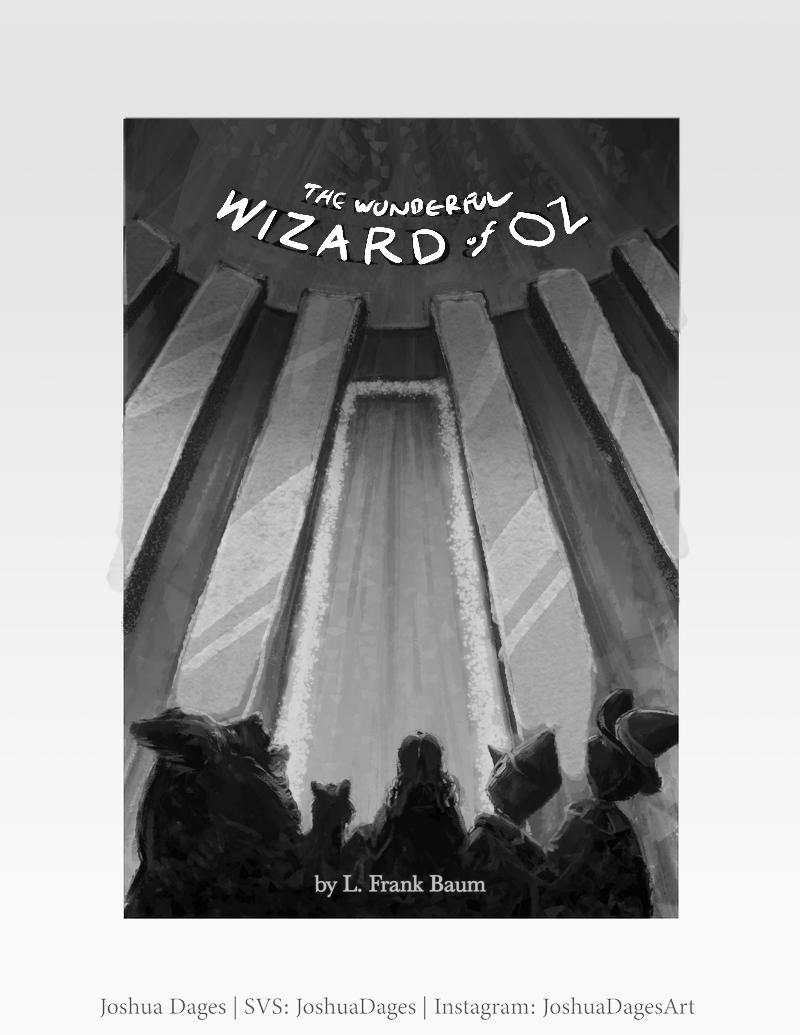
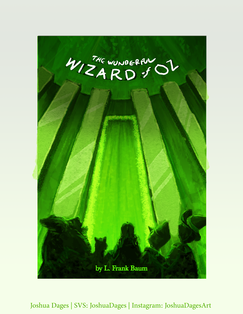
Thanks to everyone who had revision help for my cover! Below is my updated version. I loved @aprilshin's idea of enhancing the towers on the wall so I went that direction. I also kept the typeface, but hand-drew over it with a much brighter color to help it fit into the painterly look of the piece and to stick out. Lastly, I played with the figures and made the lion a little more "lion-y." I tried Dorothy in different variations of her showing her face, but it didn't have the same effect, so I stuck with her looking up.
Thanks again everyone!