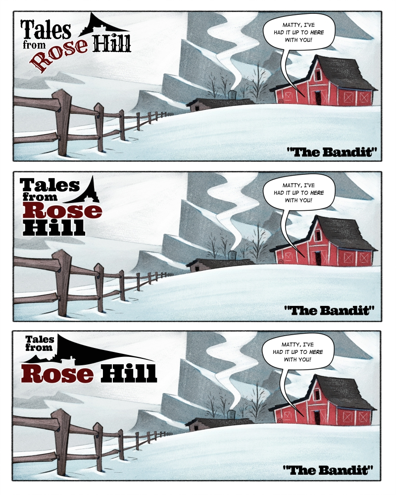
Which title logo do you prefer?
-
Halloo friends! I'm gonna be putting together some pitch packages for a graphic novel (or at the very least have some samples of graphic novel stuff on my portfolio) and I really wanna make sure I spend some time nailing things (like the logo) down.
This is the first panel from page 1. I looked at a whole bunch of classic western posters for inspiration (it's very frontier-based) I played around a whole bunch and I settled on three I like. Which one do you prefer?
Thanks everyone


-
I like the font on the top one and the black graphic on the bottom one.

-
I agree with @burvantill, but I think the black graphic for the bottom one is a little too big. I think #1 will look better without the curve. Beautiful work as always, Braden!
-
I like the font for the first way better but it might be better stylistically if you treated it like number 3.
-
I agree with @burvantill ...the font from 1 but with the layout of 3
-
I like the font and hill logo from #1. Curious: what happened to the logo you showed on the other thread and why didn't that one make the cut?
-
Number 2!
-
I think all 3 have great design elements so maybe you'll use a little from each, but the bottom one is popping professionally out at me as something I'd see in comics for sure. The title seems the most easy to translate visually in #3 (for example seeing the house silhouette in the mountains quickest).
-
I like #3. At first I thought it was too bold but I think if you adjusted the whole logo size smaller if wouldn't feel so overpowering. I prefer the font and the silhouette of the third over the first two.
-
@Braden-Hallett i love the bottom. It’s simple and very easy to read.
-
@Joanne-Roberts said in Which title logo do you prefer?:
Curious: what happened to the logo you showed on the other thread and why didn't that one make the cut?
Viewed from a distance it didn't pop. It was difficult to isolate it from the image and the logo needs to be a super quick read. It also just wasn't vibing for me.
-
Thanks everyone for the feedback! The poll says overwhelmingly #3, but I'll fiddle around with some of the awesome suggestions from everyone

-
@Braden-Hallett I like the logo on #1 and on # 3 I love the face looking at the house. So beautiful!