Howl's Moving Castle - Book Cover WIP
-
Can I get your thoughts on which book cover option is your favorite? #1 captures the movie nostalgia, but #3 has a charm to it!
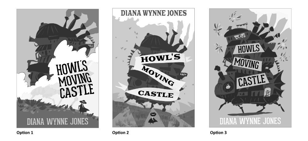
OPTION 1
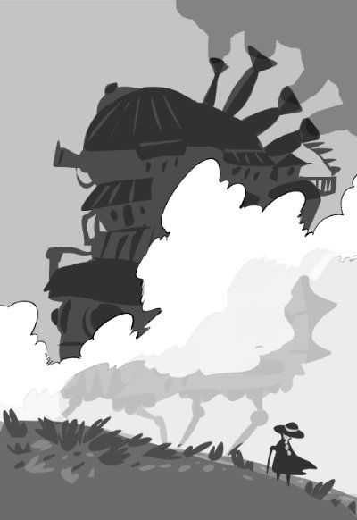
Keywords: Huge, Peaceful AdventureHowl's moving castle steps out of the morning fog into a field of heather. Some of it is visible through the fog near the ground. Sophie approaches up the hill. The castle being shrouded in mist gives a spooky sense of scale, but isn't too ominous.
OPTION 2
Keywords: Quirky, TravelerA more abstract version of option 1, a ribbon with the book's title on it surrounds the castle as it moves across the heather field. Sophie is centered beneath this huge challenge.
OPTION 3
Keywords: Cute, DiscoveryA flat graphic version with no background. The title is written on different roofs of the Moving Castle. The main characters are featured in windows in the castle too. Shooting stars burst like fireworks, and flowers will dot the ground shadow.
Carrie Copa
https://carriecopadraws.com/ -
option 1 and 3 are really good, If I have to pick one I will choose the num 3. Everything works really well. The frist one is also cool but I dont know maybe there is to much clouds?
-
Number 3 stands out to me the most. I like 1, but I think the text placement weighs it down toward the bottom a little bit too much.
-
Really cool design, all of them.
My favorite is #1, very dynamic. -
These are such cool thumbnails. I like 1 and 3. At first I was slightly drawn more to 1 because of it's epicness, but I think as is, I could envision 3 more on book shelves in libraries and in stores. I think you are hitting your keywords and you could even say that option 1 also conveys "traveler" and option 3 also conveys "quirky".
I don't think the text is incorporated as well into 1 as it is in 3. I think having the text be so large, dark, and in a block shape right in between Sophie and the castle diminishes the impact of the view Sophie is experiencing.
Website: www.tessawrathall.com
Instagram: www.instagram.com/tessawrathall_art/
-
@TessaW Would #1 be better as a full-page interior illustration instead than a book cover? I do like the epicness of it, and without text you'd get the full effect of the castle in the fog.
Carrie Copa
https://carriecopadraws.com/ -
@carriecopadraws I love 3! Yes I think 1 would work better as an inside illustration.
-
I love 3 as well..my focus is on the castle rather than the typeface. It's very exciting, even in black and white!
-
@carriecopadraws I've been so excited to see what you do with this! I really like #3 - I agree with everyone that #1 would make a fantastic interior!
-
I like the comp of 2 but the castle on 3. Good job!
-
@carriecopadraws they all look so good!
Portfolio: nyrrylcadiz.com
Instagram: https://www.instagram.com/nyrryl_cadiz/
YouTube: https://www.youtube.com/channel/UCbJCF1Im8ZO7hpGWTKOJMuA -
@Nyrryl-Cadiz I think #3 just has such an easy read to it. I do like the composition in one so I like the idea of an interior for that one. That was a great idea.
-
#1 is very good: clear and appropriate, but I feel like I've seen it before. Besides, #3 is fantastic. a great silhouette and clean design! Hope that helps
-
Thanks everyone! #3 seems like the clear choice, with #1 as an interior illustration. I'm excited to go forward on this!
-
@carriecopadraws I think this is a great choice for the cover. You don't have to take this suggestion, but I'm wondering if the clouds/negative space could be an opportunity to be a second read (maybe it's a profile of one of the characters?). Either way, this is looking good. Edited: whoops. You're going with #3 -- my comments were regarding option #1.
-
Loving this, looking forward to seeing it in color
-
@carriecopadraws Ooh! Exciting to see your progress on HMC. Makes me want to pick up a pen and start now too though I’m only halfway through the book (finally got it!).
I agree that #3 is the best cover design and the first would make a lovely interior art piece.