When to know if something's "Done"
-
I know I'm not the only one who does this - so who else struggles with calling something done?
The artists I admire the most are generally really loose and sketchy and you can see their hands in it. You can see the under painting, all the pencil lines - (Peter de Seve, Carter Goodrich,) - There's a lot of movement in their work... Which I find myself lacking.
I tend to over work and it becomes very dull to me. Flat. I get nervous that my lines are showing up too much - but then I get nervous that I took them away too quick!
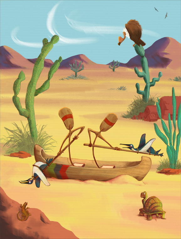
Gah - anyways this piece started off as being so fun, I even posted a thread about how fun it was! and now I'm struggling with it because it now feels messy and flat all at the same time. I love the turtle. That's about it.
Does anyone have suggestions for keeping loose but also feeling like an illustration is done and feels complete?
So tired of overworking things haha
Instagram: https://www.instagram.com/eliamurrayart/
Portfolio: www.eliamurray.com -
@EliaMurrayArt that’s really not that easy to figure out... if you work digitally you could try out to make a new layer, and set your mind to experiment ~ just say to yourself that this layer is for you to play around for a bit, maybe take a big brush an see if you can get a bit of movement into the blue of the sky, a bit of sand In the distance maybe a bit more of a dramatic light. ~ whatever but I do these pretty fast, just to see sometimes something loose and beautiful comes up doing this that I can actually work with :3 hope this may be helpful
-
I guess it would depend on what you define as being "done". To me it's a personal choice to say that a piece has gone as far as it can and that working any more on it will damage the look I was going for.
As for being loose and sketchy, that would have to be part of your own art style and if it isn't something you feel that can achieve in your own work then you would need to further study the artists that you like (as you mentioned) and experiment with that effect.
However, looking at your work , a lot of it does seem to be loose and has a really nice style to I would say its on the right path. I would say that the painting you just posted perhaps doesnt hit the mark as well as your other work, but that is less about your topic of discussion.
-
You are the one who decides when your art is finished.
For me its also hard to "finish" my art. It can be endless, but at some point we have to stop.
The illustration that you post for me is very solid and its already complete. The idea is clear and everything is well rendered. So, congratulations! Go for the next one!
The only thing I will point, is about the wind in the background, I think is not needed. For me it breaks with the style or dont feel integreted with the other parts. Without the wind stroke the image can still work perfectly, probably even better.
-
Many years ago I read a thing that said (approximately) "a piece is done when it says what you wanted it to say." It stuck with me because it resonated on some level, but it's also such an opaque statement that it was frustrating, haha. At the time I think I was in high school and I didn't really have a purpose in doodling around; I would do a lot of drawing just because I was bored and the concept of having a statement in my art felt really pretentious.
Your mileage may vary on how helpful you find that little nugget, but these days, I like to use it as a question to ask myself. Knowing what I set out to "do" with a piece can be really grounding, even if it's recognizing that you're working on something light-hearted. Maybe the statement is that you want to demonstrate the joy in a physical relationship, or communicate what kind of character someone is by way of their costume and facial expression! Or maybe you're taking a stand against totalitarianism. All types of statements are valid, and it can be helpful to check in and feel like you've executed it to the extent that you want to explore it.
And of course, sometimes something is done because it just hits right. That's valid, too.

-
@EliaMurrayArt I have to say it does look like this piece lost something from the last time I saw it. It feels a bit like a photo that was overly airbrushed... Your sketchy lines really do a lot to add energy into the piece. I used to struggle too with the question of when to stop. In the end what worked for me is when I learned that not all parts of the illustration need equal rendering. Characters and especially their faces and hands often need more rendering and it helps the piece feel more finished. But most of the time, a large part of the background elements can keep so much of their messiness and that helps the piece feel energetic and vibrant
")
-
Trying to keep my final artwork loose and full of movement is something I've always struggled with! Sketches always turn out so much better for me

One of the things I do which helps, is that I don't really 'commit' to something being a final piece. I work by doing my lineart traditionally and then scanning and colouring on Photoshop. When I'm doing my lineart I draw a lot of the elements separately on different pages. For example I might draw the main character 20 different times very quickly and then I'll pick the one I like best. Then I'll collage all the 'best' elements on photoshop to make the final artwork. This means I won't stiffen up because I'm worried I will ruin the piece. I also never sketch out proportions etc first as I find that stiffens me up, I kinda just trust my instincts for the proportions to look okay This way of working is probably strange for some people. You just need to find a way that suits you!
While I'm doing the colouring I might save the image at different points so that if I overwork it I can easily go back to an earlier stage, but I do quite a simple colouring style so I don't have as much as an issue with over-rendering when I am colouring!
I have also learnt to trust myself more which stops me getting to nervous when working traditionally. I had the realisation that if I can draw something well once, I can definitely draw it well again if the first one gets ruined. I became a lot less stressed about working traditionally and stopped stiffening up because I was nervous!Instagram and Twitter: @eriberart
Website: www.erinmcclean.com -
@EliaMurrayArt I may be in the minority on this, but I do it over if I'm unhappy. Before the redo, I make an angry layer of edits over the piece in orange. haha. I wait a day, or until I see what's not quite what I wanted, and tear it apart as best I can.
When I start over it can be with words describing what I had wanted originally, what I thought was fun. This was an inside joke most of us don't know, iirc, and so we don't know the story exactly, but it seems like it should communicate anyway. Are the penguins meant to be a contrast with the desert? In that case, maybe find references for deserts that show how vast and dry they are, maybe with cracks and a more desolate feel. Play with the orientation, maybe make it a landscape because that would reference a normal landscape on the person's wall and the penguins can be closer. Try to crop it and see how much you can crop out while the illustration still reads. The cacti are not as important, I don't think, so try losing those. Maybe the turtle can take the place of the rock in the corner so that the focal point can be closer.
I've come to accept that I sometimes do things three or four times before I get a final piece. So I guess the question isn't knowing when a piece is done, it's when your process allows you to move on.
-
@carolinebautista The importance of being willing to start over can't be overstated! Having that resilience as a practitioner is so valuable.

-
@thousandwrecks Well since it's a bit embarrassing to admit, thanks for putting it that way. It certainly sound more dignified than getting nowhere.
-
I don't have enough experience to run into this problem yet (my issue is finishing in the first place), but I'm reading with interest for future reference. But maybe a few master studies could help to try get in your fav artists' heads and finding the right balance?
For this piece one easy thing you could try is to add tracks in the sand where the oars go, with some sand spraying up to provide additional movement emphasizing the gesture.
-
It's still quite funny for what you intended it for! A couple of things popped out at me, the values aren't really grouped together which kind of makes the eye jump around to all the different elements? I'm squinting and I think it could use more value structure. And also I think the background could have potentially softer edges to establish more spatial perspective. That's just my quickie take! And that's being picky too
-
@Freya-Chakour - ya know, that isn't something I do often.... Which is so weird because my day job is essentially all photoshop experimentation and yet for my personal work I so rarely just play around and "smudge paint"... That's a good point! I should definitely try playing more.
@Gary-Wilkinson what you say is true - I probably need to study more and experiment with the look... The SVS team mentioned getting your top 10 artists and putting your work next to them to see if you fit in - currently I don't! So I think I need to go back to the drawing board for a bit.
@Jordi-Ventura Thank you for pointing out the wind! I took it out. You are so right.
@eriberart That is a really interesting way of working - that I always sort of forget you can do with photoshop haha I treat it sometimes like it's traditional medium that I can't just "cut and paste" things. But what a great way to work. I think I'll try that in my next illustration - composition, and then building up the elements separately and playing with the best elements.
@NessIllustration I agree this piece definitely lost something - unfortunately I had to turn it in. The client still loved it which is great but I feel like I kind of let myself down. It got really stiff. But on to better things, right?
@thousandwrecks I have not heard that quote but I really like it - This piece did not meet that mark for me unfortunately. but I think I'll keep that quote in mind for my next one and really dig into what I want it to say and how I want it to feel.
@carolinebautista I think you bring up a lot of good questions actually - and to be quite honest that was my mistake not figuring those things out. I didn't really understand the joke, as it's not my joke. And I think in the end I wasn't quite sure what I was illustrating haha. I had gotten this composition approved - and felt like I couldn't turn back. I suppose in the end this project was a learning experience in acceptance haha. I don't feel like this turned out to be the piece I imagined it would be. But I like your point of the process - and at this point I have to move on so, I'll move on!
@ina - I agree fully - Master studies are going to be my to-do until I get my groove back (and continue after that as well)
@Coley I totally agree with you!!
 the values have lost me again. That was the critique for some of my other pieces too - I'm thinking perhaps I need to work more in black and white and leave color alone for a while. Womp!
Woo that was a marathon reply - Thank you ALL so so very much for pointing these things out to me.
 I've got a lot to work on for my next piece!
 -
@EliaMurrayArt One thing that I've been doing that might be helpful is I have a checklist I go through. I'm bad at calling things "finished" before they get to that polished stage so it keeps me honest

Here's the list as of right now, and it's been changing as I've seen things I tend to do that messes me up.
- Did you do a grayscale check for value range? (whether I'm working in PS or Procreate, to do this I always have a solid white layer set to Color at the top of my layers so I can check it frequently)
- Did you fix the obvious tangents?
- What are your ratios? (this is the rule of thirds - I don't always follow it, but usually if something isn't working, this is something that's off)
- Did you use smallest/little/big rules?
- Is there a noticeable size difference between my focal point characters and any secondary or tertiary characters?
- Did you use more contrast on the focal points?
- Do the light and shadows follow the same rules?
I've found at least personally when something isn't looking right or I'm getting to near the end and it's just not giving me what I feel like is in my head, going down this list has really helped me take work I wasn't happy with and really bring it around. I've felt a lot like even if I lose sight of specifically what isn't working, I can trust the process.
-
@jdubz that is an AWESOME check list!
Thank you for sharing. I'll definitely be using that. Especially the white layer on top - I have never thought about that.
I think this will definitely help as a check in to practice. I seem to avoid my value studies and it's now been multiple pieces that don't have a strong value structure. So it will be important to double check that.