Buffalo run!
-
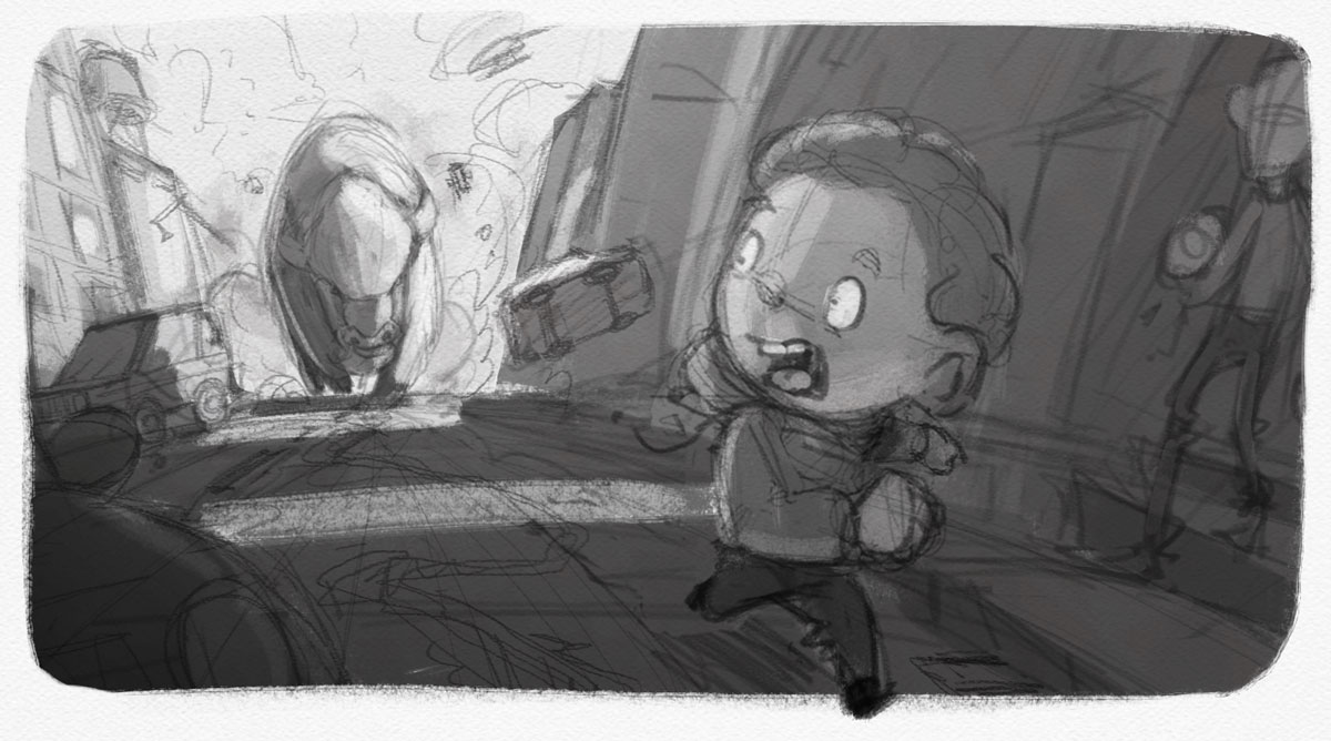
Had to draw this tonight! Composition and values and thought I'd get feedback before moving any further. Thanks!

-
@natiwata really nice idea, composition, value and I can really feel how scared Stanley is! Nice start!!
-
The dramatic lighting is well placed.First you see the boy then the giant bison. I like it. Is this the one you are doing for Third Thursday?
-
Sweet perspective.
-
Shaping up so far - what's this for?
-
I love the drama and lightening, also that he's running out of the picture!
-
Looks great natiwata.
-
Great drama with the perspective and lighting. The movement and the way you angled the buildings is really effective!
-
I love this! I think it's an awesome concept and executed beautifully. My one and only suggestion would be to the car on the left side of the page - right now its edge is touching the edge of the paper, creating a tangent. I' move it forward just a little bit so that it's exiting the page. Otherwise, it's great!
-
@amberwingart - I'm not sure what you mean, are you talking about the very front car on the left or the one behind it? Forward meaning more off the frame or pulled back from the edge?
Would you mind doing a quick draw over so that I can see what you're talking about? Thanks!!!
-
Very cool image and I really like the light/dark patterns you have going on here.
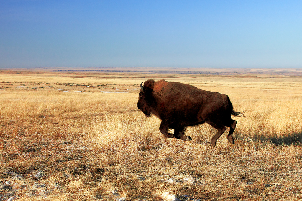
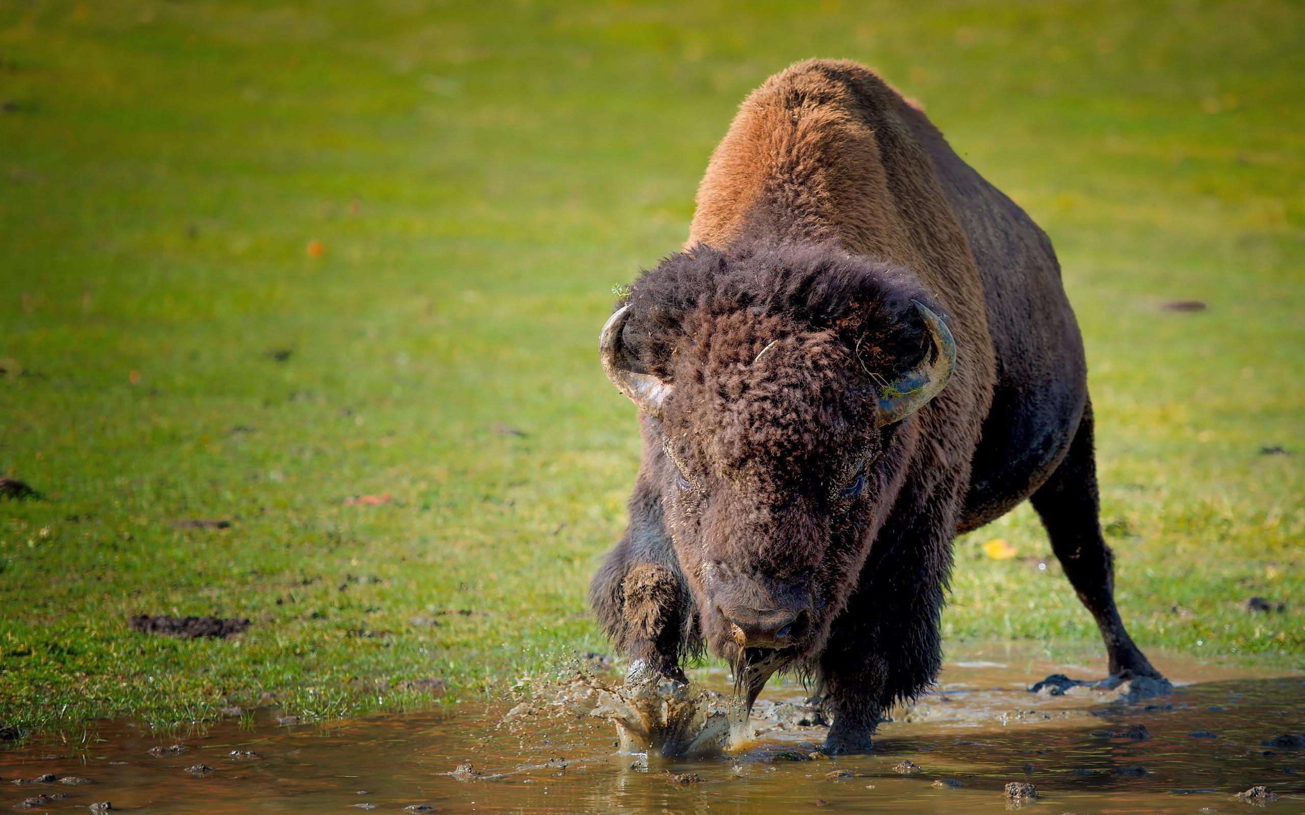
One thing I might suggest is really looking at how your compostion relates to your pose. Typically the front view is very limiting in terms of creating imposing shapes. This is because everything is seen in a foreshortened view. If you compare These images of buffalo (or any animal) you will see how informative the side view is and how it trumps the front view in terms of giving a clear silhouette to your characters. Now, of course you don't want to draw everything from the side view, but knowing that the side view is the clearest view can influence how your composition works.
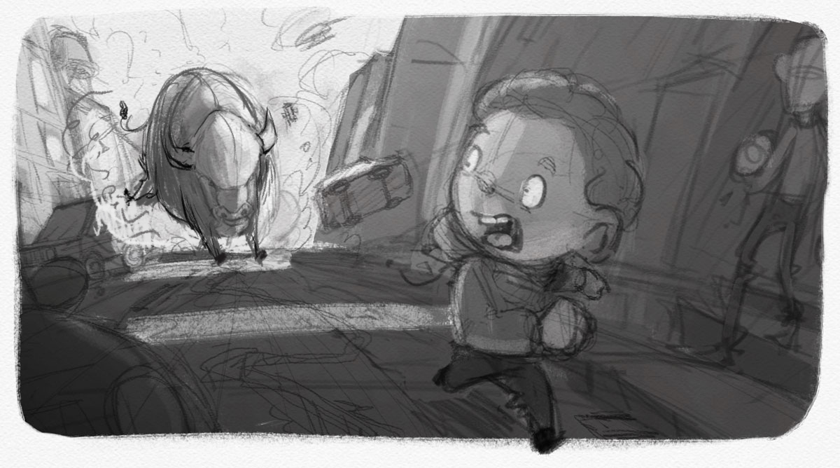
With your composition here, using a good 3/4 view of the buffalo would be much better. Maybe have him coming around the corner or something. Then you can really get in there and draw those overlaps and big ol' shapes those creatures have.
So basically if a creature is much clearer from the side vs. front, I try to give them an angle to be shown from so it gives you a clearer read and gives you more that you can draw. I did a slight turn on your buffalo here just to show how much difference even a slight turn can make.
Hope that helps some. Can't wait to see this guy finished up! : )


-
@Lee-White Thanks for the suggestion, I still wanted him coming at you full on, but I will try this for sure and see how it looks!
-
@natiwata Is this for the 3rd Thursday? I see that @will-terry was wondering also. I don't presume to know his reason (or if he didn't really have a "reason" and was just curious) but I am wondering because if it is for the upcoming January contest this seems to actually be an illustration of the NEXT scene. That is, after Stanley steps out and hears the noise, NOW he is on the run.
Unless "Stanley" is that taller guy on the right (as we look at it) and he is stepping out of a doorway.
This is such a great image so I just wanted to throw out a note of caution that something little like that could "hold it back" in terms of the contest.
-
@mattramsey @Will-Terry - No this isn't for 3rd Thursday, though I had thought about it but decided against it for the same reasons you point out Matt. This was just a midnight inspiration

-
I like it! I like that he's running out of the picture

-
@natiwata Loving the drama of this piece. There's a real sense of panic. I love the suggestion by @Lee-White but it looks like it's bucking rather than charging. I'm looking forward to seeing the finished concept.
-
@natiwata I like this image as well. I look forward to seeing it finished.
-
@mattramsey I recall in one of the videos on SVS (not sure which course as they are starting to blur together) one of the instructors mentioned that literally illustrating what is written by the author is not the best approach and that some of the most successful picture books actually illustrate the events after what is written providing more information that the text alone originally provided. With that understanding I think we can be more flexible in our illustrations. I would be curious what @will-terry or @lee-white thinks.
-
@seanwelty it was Lee White in his Visual Storytelling Techniques class who talked about illustrating the events after what the text indicates...and this certainly does exactly that. It is a wonderful sketch @natiwata!
-
Great idea and composition! Look forward to seeing it progress.