Looking for Feedback on July Contests
-
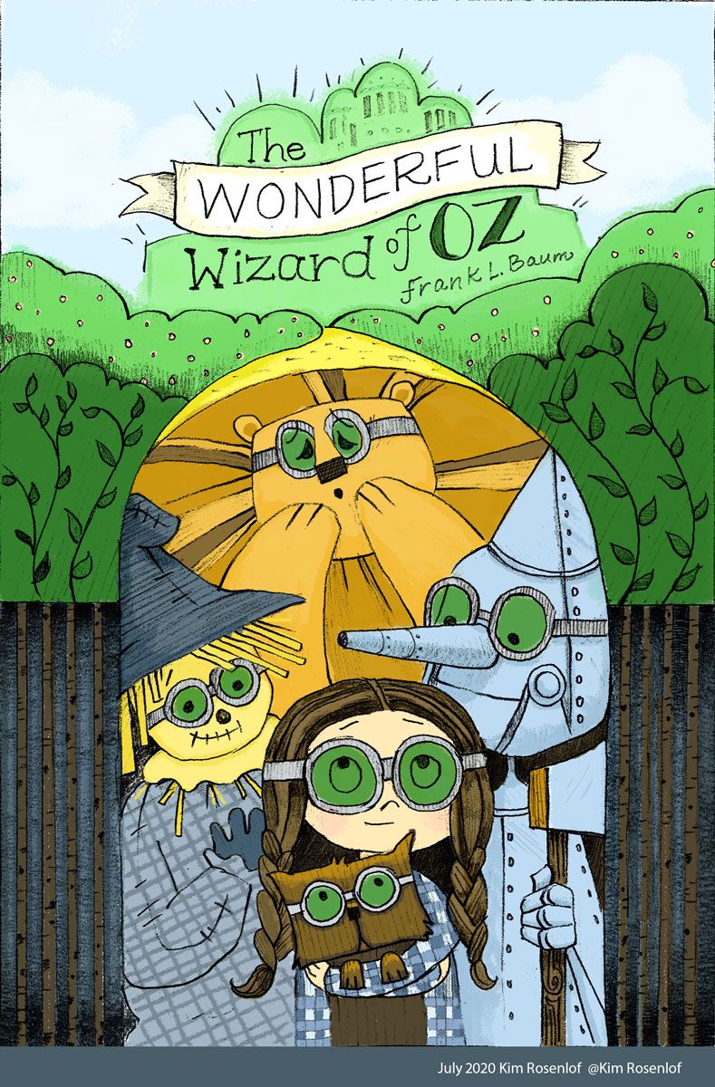
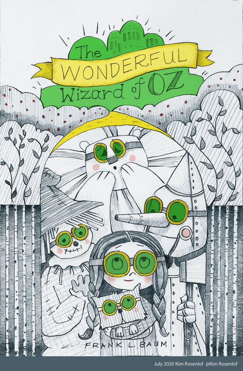
Hi. I am pretty new to the forums and have only commented once or twice, and have only entered the contests a few times. I really like this forum because everyone is helpful and encouraging! It is a bit nerve-wracking to ask for feedback, isn't it? I had planned on posting in the earlier stages this month, but that obviously didn't happen. I did two versions of the same cover: one with full-color and one with just a little bit of color. If anyone would be willing to give me feedback to which one looks better that would be great! I am leaning toward the one without a lot of color (mostly because I am new to digital painting and feel like it shows and I really like simple designs), but it would be nice to get different opinions. Thanks!
Instagram: https://www.instagram.com/kiminyrose/
-
@Kim-Rosenlof I like the colors, the values help it read better. Great job!
-
@Kim-Rosenlof Hello!
 It can be daunting to post your work and ask for critique, but I encourage you to do just that. The more you post; the easier it is and more comfortable you'll feel in doing so. Easier said than done though!
 ")
I'm really liking the colored version here! I agree with Holley that the values help the image as a whole to read better. I really like the design of Toto. He's looking so cute!
-
I'm on team Full Colored Cover! I agree that it looks more harmonious!
-
Hi Kim! Super cute cover. I love how you did the title with the city. I would go with the colored version since it's more catching and looks more finished.
-
@Kim-Rosenlof super nice! For feedback I would just mention that the author’s name is a bit off - his name was Lyman Frank Baum so it would be L Frank Baum