Feedback please...if you're feeling generous.
-
Hi everyone,
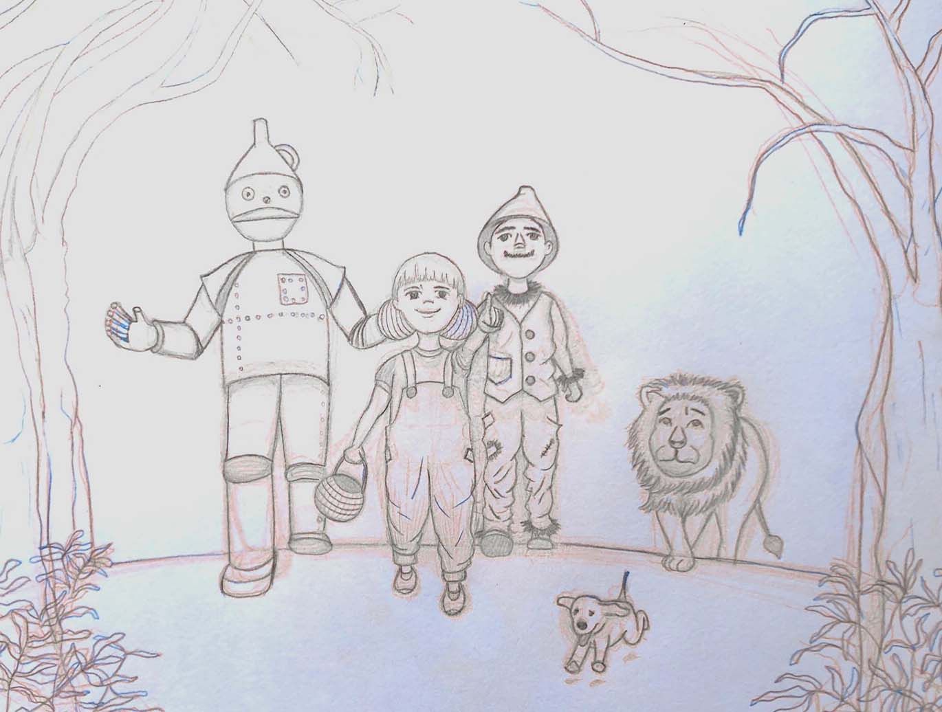
Let me start by saying that I am not the most active person on this forum, probably another manifestation of my introversion, so I understand if you don't want to give me feedback on this sketch but if you're feeling generous today and decide to give me feedback I really appreciate it. Sorry for the poor quality image, my sketches are messy because I keep drawing and erasing until it looks like what I want. This sketch is not for the July contest, I just decided to try to illustrate parts of the story, this one would be when Dorothy and friends spot Emerald City for the first time. I am looking for some feedback on composition and characters. Does it bother you that Dorothy is not wearing a dress and instead an overall? Does tinman look too simple? Does the picture work when it comes to describing a moment? Any other comments will be appreciated.
Thank you very much,
Catarina
-
@catarina-c I think this is a great start. The characters are cute and instantly recognizable. I think it’s fine that Dorothy is in overalls. A couple things I see... 1. The lion seems to be a little off by himself. Maybe he’s hanging back because he’s scared, but I think his expression would read better as “afraid” instead of tired and dragging behind, if he were maybe hiding behind the group and peeking out or something. 2. The tin man looks a bit flat. This is a struggle for me too, but visualizing those cylinder shapes in perspective and even drawing through in your underdrawing can help keep them looking fuller and make it look like his features are wrapping around the shape. Does that Make sense? 3. I think you need a bit more background and foreground. Just to show where they’ve come from and where they’re going. Maybe more trees directly behind to show they’re emerging from a forest, and the start of that field of poppies before the emerald city...
You might have been thinking about those already and I’m jumping the gun a bit. Hope that was helpful. ️ Can’t wait to see what you do with this!
 -
Its a lovely line drawing! I have found it difficult drawing all the characters together as a set so well done. A few suggestions I could add to @catarina-c 's :
Dorothy's arm looks like it could be the Scarecrow's. The Tin Man's left arm looks a bit awkward ending behind Dorothy's head. Perhaps try alternative positions or layering. Good luck! -
@catarina-c It's a lovely drawing, but it's not really telling a story. You say this is the moment they spot Emerald City but really it just looks like characters standing around smiling. The only storytelling element to the image is Dorothy's hand pointing at something, but the combination of the front angle and the hand being lost in the silhouette of the other character makes the hand incredibly difficult to see. I would pick a different angle entirely, and create a layout and composition that emphasizes what I'm trying to show instead of hampering it. Also, since the moment you chose to illustrate is light in terms of story to showcase (seeing something is quite passive, not a physical action) then I'd try to add some secondary story elements in the image. Maybe some of the characters interacting with each other (like Dorothy pointing while looking at tin man, like she's showing him). Maybe someone is so surprised they trip over something (maybe trip over the dog?) Possibilities are infinite but I'd try to add in a little something because otherwise you're only showing characters looking at something, which is not visually appealing.
-
I think the overalls are super cute. I would expect wonder on their faces if they're looking at their destination. I don't really make the connection that they're looking at something specific, more that they're just walking together. Tin man's body looks pretty good, but I think his face is a little off. The features just kind of sit on top of the structure. You could play around with the head shape or humanize his features a bit more. Good work so far!
-
Hi!
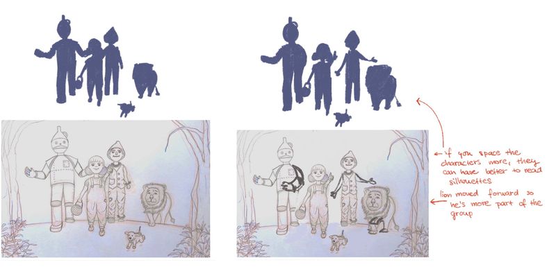
Some great stuff was already pointed out, here’s a quick draw over of what might help you?
I love the character design of them, specially Dorothy looks super cute! So my points are only on their silhouettes - I think their gestures might read better if they have more space? It’s ok (and even desirable) to have some overlapping, but In this case, it breaks Dorothy’s gesture and creates a weird tangent between her head and Tin man’s arm. Hope it helps! Looking forward for the finished picture!

-
@Pamela-Fraley Thank you for your comments, you are right about all of them. I will incorporate more background and move the lion, and the other characters too, because as others mentioned there is too much overlap between them and it's difficult to distinguish where one ends and the other starts. Thank you for taking the time to give me some feedback, I appreciate it.
-
@akterrey Yes, thank you, I will reposition the characters so that it's not so confusing.
-
@NessIllustration You are spot on and I was worried about that. I am working on making my characters/drawings more alive, I guess I usually focus so much on the proportion/anatomy/etc that I neglected the story part. I will try to rearrange the characters and draw them in a more expressive way, as if they are really seeing something really impressive. Thank you for that comment, it's really helpful.
-
@amiklo Glad you like the overalls. You are right, the expressions do not reflect what I was trying to say with this illustration, I will try to make them more expressive. Thank you for taking the time to give me some feedback.
-
@mag Wow this is super helpful, thank you. I will move the characters, make them more expressive and incorporate more background. Such good comments, thank you.