Colouring Book Pages - Facing Inwards or Reading From Left to Right?
-
Hi guys,
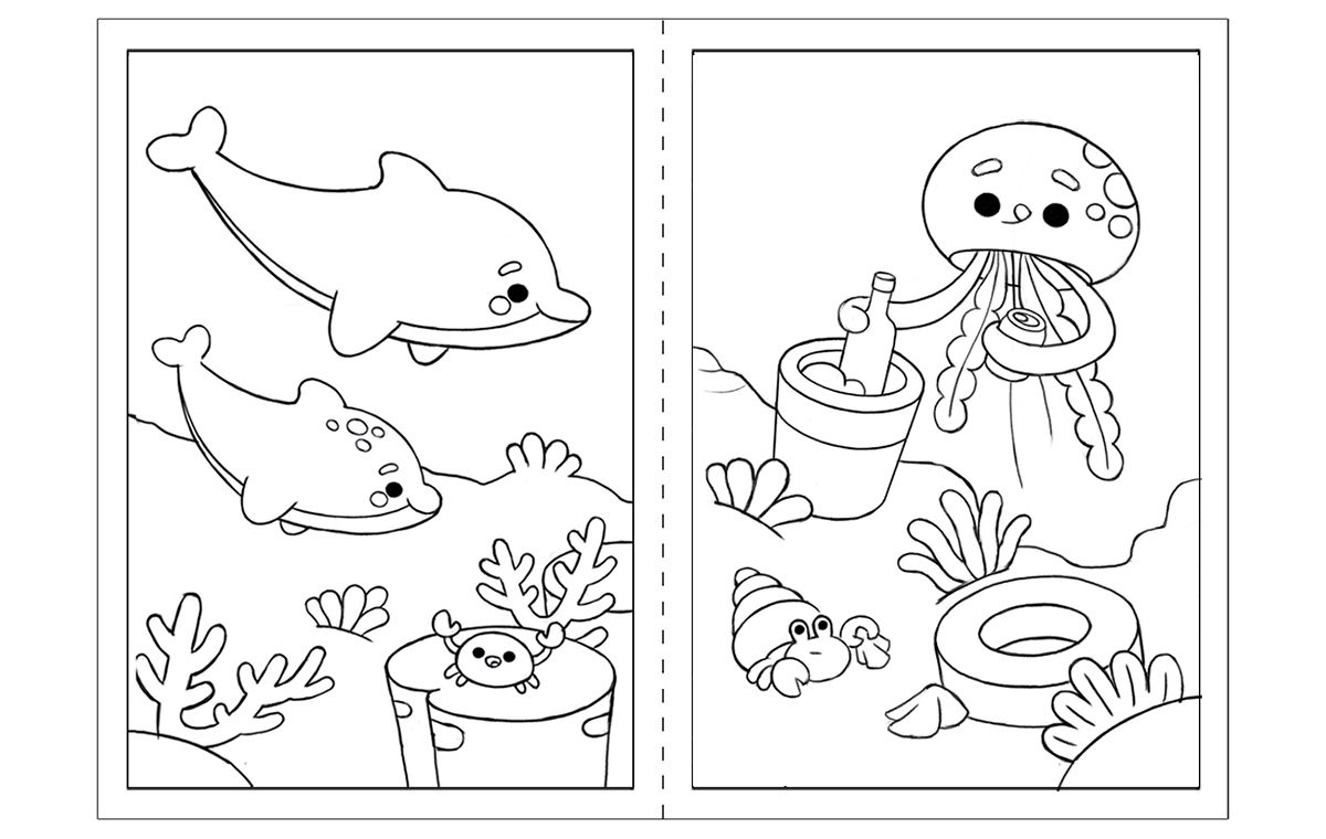
I'm working on a kids colouring book with each illustration on one page, and my question would be on how to organize the pages. Should they alway face inwards, looking to the gutter:

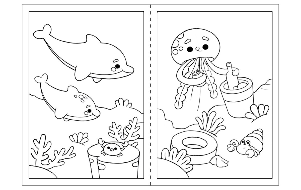
Or should they follow the line of reading, from left to right:

-
@TamaraDomuzin Is this really a thing?
-
@Nyrryl-Cadiz Not sure, that's why I'm aksing
 Just to make sure that if there is a ''rule'', I make everything right.
 -
@TamaraDomuzin This is the first time I've encountered it.

-
@Nyrryl-Cadiz Sometimes even I surprise myself with the questions on my mind

P.S. I know that in tattooing there's a rule that tattoos should face inwards the body, so I think this might be why it crossed my mind. -
@TamaraDomuzin I didn't know that about tattoos.

-
I know picture books shuld be left to right. Maybe just follow that rule if you're not sure or look at a bunch of coloring books and see what they do.
-
I'm not actually sure... And that's really interesting to know about tattoos!
To my eye, this initially read as a spread, but I'm not sure if that was the intention. Especially in the second option, because the ground line looks like it crosses through the gutter and meets together.
These are super duper cute! I love the dolphins.
-
I like the bottom one better, because it reads as a spread better (to me at least :)).
They're really nice! -
Thank you guys for all the replies so far
 I looked into other colouring books, and there doesn't seem to be a certain rule. Each illustration is positioned as it would look the best to be read as a stand-alone illustration. I ''might'' overthink things, but I thought this would be a good question to check.
 -
I don't think it matters...they both look great!
-
The first one is much more balanced, maybe you could draw the ground in a way that it gives you the impression that it is a continuation from the first page.
Cant wait to see you update! -
@cszoltan The first one looks better to me as well
 The client wanted them as separate illustrations (not as spreads) and they might end up with frame around them (as in the picture), so I'm not working on them as spreads, having that continuation. I think these two I've put together just might look that way.