Give me a goddamn critique pretty please. 😆
-
Hello,
I am experimenting with a new style and would please appreciate a critique. I am not sure what the direction will end up with but I like hearing tips. Check out my insta to see the progression of this style.Link to drawing is here. Also I have a hard time loading photos on this forum.
https://www.instagram.com/p/CClhgK6nUVC/?igshid=cc87fw4m6pmj
Thanks

-
This is a pretty cool style. My only advice would be to simplify the less "important" areas by using fewer shapes.
I also have a hard time loading photos to the forum
 I always have to look up how to do it.
 -
What do you mean by more important elements
-
@Ari-Sorokin For instance you can have a high number of shapes on important defining features such as faces and hands, but can simplify the body into a smaller number of shapes. Less complicated areas would create some "breather" areas in your picture. Right now, it feels a little crowded and heavy. I also think your seal is very dark. It's hard to see all the detail in the face because it's very dark.
-
This is a really cool technique but I agree with @NessIllustration that the lines are making the image feel a bit heavy. It's difficult for me to make out the features of the face because the lines are getting in the way and I wonder if making the strokes around your shapes thinner or removing them all together would help?
Keep going, great stuff!
-
@Ari-Sorokin Sorry if I was too vague, but exactly what @NessIllustration said.
-
I agree, it's a bit busy, dark, and hard to make out. I'd play with taking out the number of shapes in the background, and maybe in the areas of the walrus where the light hits, if not all over.
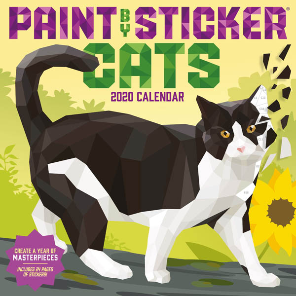
It's a cool technique overall though, and it very eye catching. It reminds me of a paint by sticker craft my kid did once. If you haven't seen those, check them out, it might give you some ideas on how to simplify just a bit.
