Final stretch for OZ...help me finish up!
-
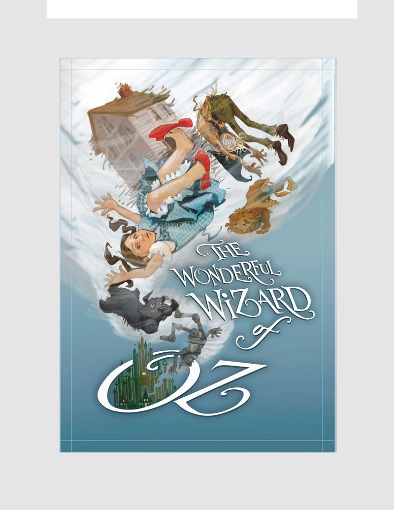
Hi guys... July prompt is right in line with a re-work I did a few months ago...but (as usual) I am second guessing myself in the final details. Does anyone else do this (too many options with adjustments!) Which version do you like?
Darker type:
 image url))
Or lighter type:
 ....Thank you in advance!!!
 -
Looks excellent! I think I’d go with the black text. The only thing I could think to change is to make the text a little bit darker. That’s a picky thing though. Looks very finished!
-
I like the darker text version! One thing to note: The slippers aren't red in the book, they are silver. The movie changed this detail because it was one of the first movies in color, and the creators wanted the shoes to really pop on screen. (imagine making a color movie where the important object was...gray.) It's not in the book, but I'm curious if it could be allowed anyway because the movie made them so iconic.
Carrie Copa
https://carriecopadraws.com/ -
I'd say the darker one, but i agree with @Griff It might look better even darker.
Love the scarecrow btw.
-
@carriecopadraws I know!! But I LOVE the red... and it has become so iconic with the story. (I think the MGM was showing off the new technicolor technology)... And that color is important in my composition!
-
@Laurasketches She's still in the cyclone, so maybe she had red shoes before she was given the silver shoes? I can't remember off hand when she was given them. I think maybe by the witch when she landed
 !
! -
Wow, love this color palette, and the flow of characters! Maybe you'll want a big more overlap between Dorothy and other objects to give a sense of depth. For example, Dorothy and the scarecrow are tangent to each other. There are also a few other objects that are almost tangent to each other too.
-
@gavpartridge
 Probably not something you would say to a client who wants you to do a BOOK cover - Who reads your old book anyway . . .You made me laugh!!
 -
@Laurasketches I'm usually a sucker for lighter text, but my vote is for darker on this one to give contrast and balance against the tornado. Also, this illustration is dope.
-
The darker font ties in better with the emerald city.
Love your Illustration, would stick with the red shoes since they are iconic and you didn´t just pick a scene from the book, but made your own mix. -
I prefer the contrast of the white text, but if you wanted to go with he darker text, I would suggest finding a way to make it 'pop' more/have more contrast with the background.
(Also don't forget to add the author's name if you go with the white
") )
)Looking forward to the final!