Bongo of The Congo composition and colour, Critiques welcomed!
-
Hi all. So from what I understand, the main problem (among several other smaller ones!) I had with last months contest was that my piece didn't emphasise the important areas on the first read, the contrast basically drew the eye to a massive unimportant shadow. I had already been made aware of that, but I didn't change it enough to overcome it. I got married to the initial lighting scheme and tried to force other aspects and the piece suffered.
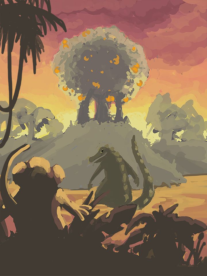
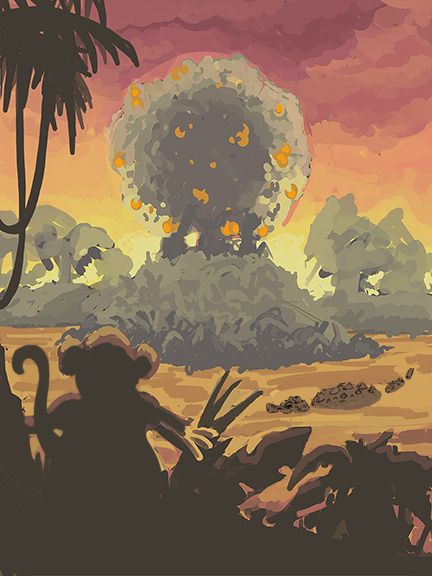
For this month I want to do a Sunrise scene, last months was all sunny and beaches etc so i want something different, I've got the camera behind old Bongo looking up at a centrally placed orange tree, with a menacing Clyde slowing turning toward us as he hears the rustling in the leaves.
Can I please ask how its reading to you, and does the composition work? Any advice/critique/contribution of any other kind is gratefully received. Obviously the characters are glorified blobs at the minute, but I think they give you the general idea of what the finished piece will resemble!!
If you're still here, Thanks, I know that was a lot of reading! Lol.
-
So the way I read this, was more like the monkey and gator were going to the orange tree together, and the orange tree was the thing that was ominous?
I'm wondering if this would work better if the gator was not a focal point? So we see the monkey looking at the tree, and then notice the gator in the water later?
I think because they are similar size and importance that it's making me feel like they go together.Compositionally I think the gator is smack in the center, and the orange tree is also in the center, so maybe try doing the tree more on a 1/3?
I love how you did the sky so far! Very sunsety but also kinda ominous. And the silhouette of the palm trees is going to be really cool!
-
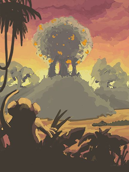
@carlianne Yeah that had not occurred to me, now you've said it, it does look like they're friends. Hmmmm. I'll put the croc in the water, like you normally see them, just bits of him poking out, and move him over to the side, see what that does.
That's really useful, thank you for that!
-
This feels better to me, now I think its more clear that the monkey is looking up at the tree. I quite like the idea that the tree might be a bit ominous, its a dangerous risk trying to get those pesky oranges! Does the Croc now seem a bit boring though, should I try something fancy, like have him chilling on his back or something, or is the subtle half hidden-ness a good thing?
-
@gavpartridge The first one gave me a "The good, the bad, and the ugly" famous duel scene vibe - could be the way they both have their arms in that one - like they are both about to draw their six-guns. The alligator read as an obstacle to the tree for me..which is what you were going for i think - it does feel like they should be scooted over to the right a bit. The new one is cool too - would still scoot the monkey over a bit to the right a tiny bit - I really like the the chilling on his back idea - it maybe would not nail the prompt if the alligator is taunting the monkey but it will be a great piece anyways.
-
I like this second one. This one causes me to wonder what's going to happen to the monkey. Is he going to get his orange or is the alligator going to interfere?
-
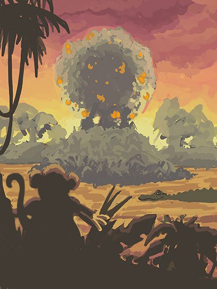
Thankyou @Kevin-Longueil , yeah that was the mood I was going for, I just didn't realise it until you said it, that Clint Eastwood scowling over his shoulder type thing, exactly that! I think he has to go though, he was a distraction. Shame though, he had so much more character than this new one. ill have to change him, he's rubbish. Placeholders, don't they call them? lol. That's tomorrows problem. I've shifted monkey over a little bit, that's definitely better. might have to go bit more, we'll see. I've brought the river up a bit too, I felt that without Cowboy croc there was just a massive empty space and i'm not sure what to fill it up with.
-
@deborah-Haagenson Thankyou! yeah seems that the second one is probably the way to go, ill try and give the alligator a sort of 'unseen threat' kind of vibe, i think that's what makes them so scary, just their eyes popping out the water. when you see their stunty little legs and fat bellies they look a bit funny I think!
-
@gavpartridge Oo I like the dramatic feel of this composition and color palette. I really loved the first one too, but I agree that it wasn't telling the right story.
I'm just thinking out loud here, but what if you turned Clyde to face Bongo in the first composition. So that it would actually look like cowboy croc and cowboy monkey having a face off. You could keep a second gator floating in the water if you need the balance the composition.
You may also need to make Clyde more massive to emphasize that he's a threat and also to vary the sizes of the main elements. Something like a low angle shot. -
@Neha-Rawat thanyou! Yeah i think basically this has highlighted to me that i just havent done enough prep, thumnailing and such. Like you say, a low angle shot might look pretty cool with the colours. Ill do a bit more playing around i think and see where we go from there.
-
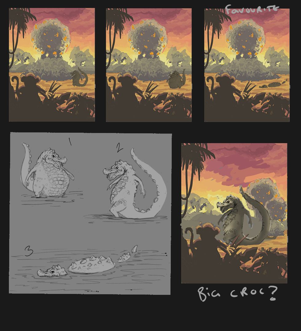
So I think i've made my mind up. The standing up crocs would probably look weird unless the river was 6 inches deep, so the swimming one it is. Cheers for your input all, much appreciated!
-
I love the alligator’ intimidating pose. It is awesome. I don’t usually comment but I’m really digging this. The sunrise speaks time passing by like he has been doing something other (thinking about which fruit). The depth of the island is believable that bongo has a challenging task. I didn’t even think if that as my bongo can simply climb across. Way to go. I’m eagerly excited to see the finished piece. As for critique I don’t think I’m qualified to critique. Only think very very minuscule would be the symmetry with the back two islands. With all respect. Much love and God bless. One!
-
@dafoota thankyou for the kind words, hope i can do it justice now! Youre right about the symmetry, ill push one side back further with atmosphere and vary the tree shapes, hopefully that will add a bit of interest.
-
Im just wondering the time of the day, because he wakes up in the morning, didnt he? and didnt want the fruit, then how do we get to night time all of a sudden? i do like having the croc in the water down below, rather than having him standing up
-
@MirkaH Yeah fair point,I thought this might be an issue. I wanted it to be at sunrise, which can appear identical to sunset, as obviously its the transition between night and day. Last month i did a piece in full daylight so wanted something different. The problem is, people see this sky, they think sunset. They associate daytime with bright blues and green, like a high noon image.
Ultimately, I'm not too bothered about winning the contest, and i think the piece will look alright with these colours, its really an exercise to see if i can make the colours make sense in this lighting scheme. Its only the people in this forum that will know bongo was searching for breakfast and not supper! -
@gavpartridge hello! I lived in Australia where you have stunning sunrises and sunsets. For me, the difference is, there's less pink during sunrise and the light changes in a matter of minutes. The sunlight on the vegetation is quickly white (not golden). Sunset on the contrary brings a large and dramatic pink sky with different pink, orange and reddish colours and sometimes clouds with even more shades.
Your landscape has currently very much the values of a sunset. Maybe work your shades lighter, your light whiter and brighter and bring a little bit of blue in the sky. Keep the pink, but at a smaller scale?
Of course, I only compare with what I know. Sunset and sunrise skies may be different in tropical locations.
Good luck with the contest! -
@Julia Nice one cheers. I genuinely cant see a theoretical reason why there would be any difference though, light frequency doesnt change at different times of day. Ive been reading and some people say that there is more dust and particles in the atmosphere at night, but again, i cant see why that would be, the wind doesnt stop blowing at night. Ive googled both sunset and sunrise so many times looking at images, and i wouldnt be able to reliably tell which image related to which time of day. There probably is a difference, ive definately not seen enough sunrises, but i think im just gonna slap down a load of colours and try and make it look pretty. The contest itself is just a bit of motivation for me to actually produce something, if it looks like sunset rather that sunrise to some people, thats fine. I do genuinely appreciate the input though, so thankyou, im just not sure i have the energy or skill to make the necessary changes.