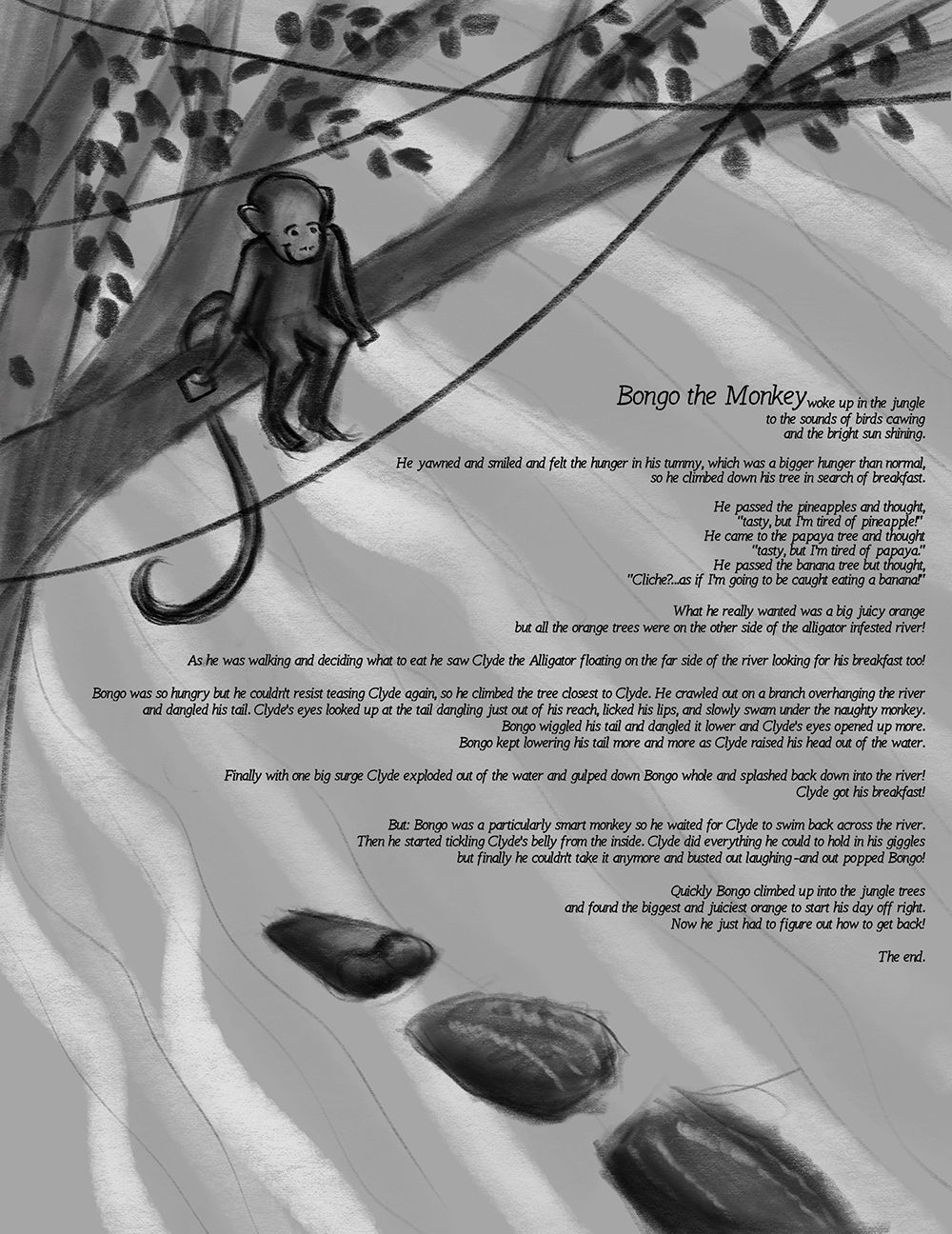
Bongo options
-
Lots of decisions to make with this month's prompt. We have to choose the point of the story to illustrate, yes, but I'm also trying to decide between creating a two-page spread with room for text, a single-page with room for text, or a single-page facing the text on the opposite... I may be making this too complicated. LOL!
I've decided I want to embrace making room for text, as I feel I haven't really explored that in my illustrations. Not knowing workflows yet as I've never been published, I'm guessing a decision like that comes from the Art Director and Editorial team. So I'm pretending that's the choice I've been told.
")
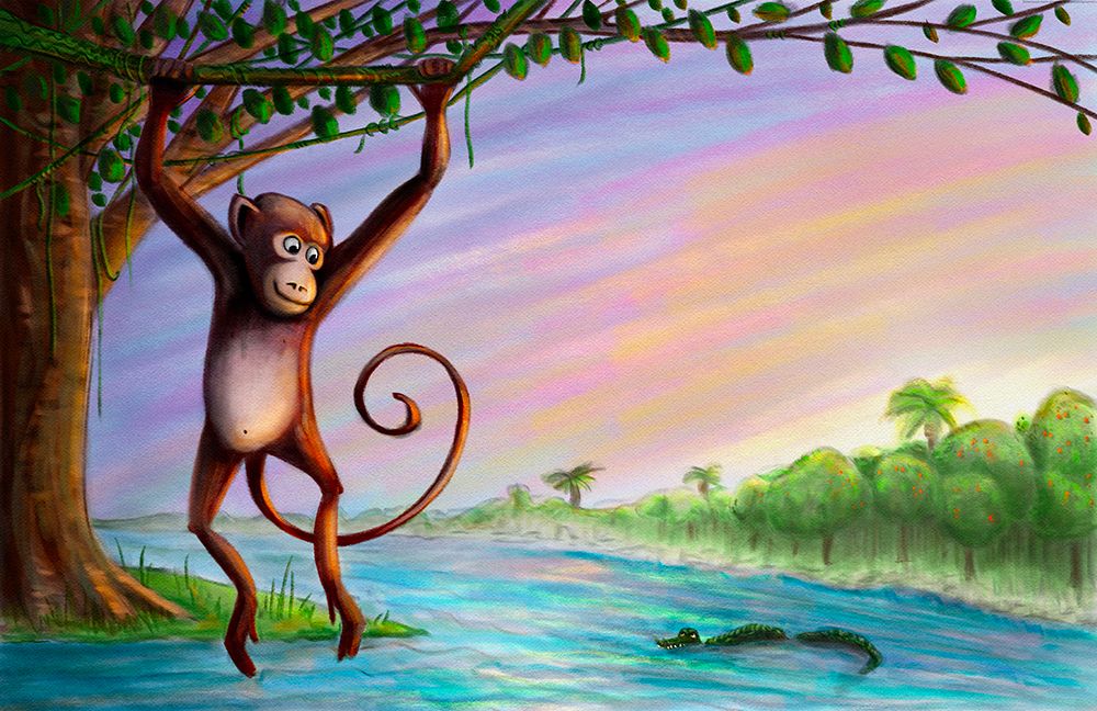
The story feels more "horizontal" to me because I feel like it hinges on the idea of distance and the near/far paradigm. But I have a lot of very wide images in my portfolio and would really like to do something in the 4:5 ratio that emulates a magazine page.
So I've made it through my thumbnails and moved on to glorified value studies a bit. I bought a new pencil for Procreate that I LOVE (it's called the Koivu pencil and it's from Tuhis--available for free here on his Gumroad) and may have to seriously consider using it when I move into color. But I'm also wanting to use a lot of layered textures, too.
I would really appreciate your opinion on which one is stronger at this point--A or B. Thank-you! One is more "mature and dark" than the other, I feel. I'm not sure that's a good thing or a bad thing...
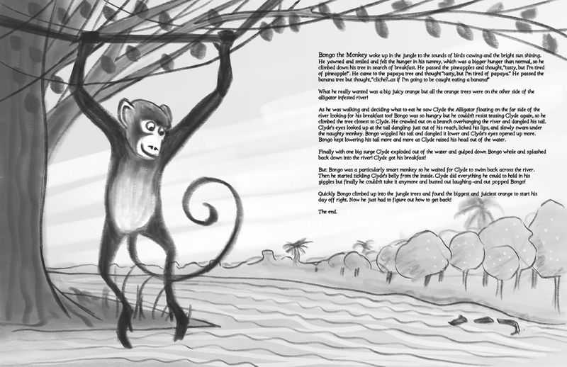
A: Vertical or B: Horizontal
Children's Illustration Portfolio: https://www.coreyartusillustration.com
Art Portfolio: https://www.coreyartusimagery.com
Mastodon: https://mindly.social/@Coreyartus
Pixelfed: https://pixelfed.social/Coreyartus -
I think you've done a good job with both of them, but I'm gravitating toward B, because I love the open feeling of the environment and that little monkey body hanging there is so adorable I want to scratch it's tummy. A. feels more menacing, even with the pleasant expression, B. feels more positive and airy.
-
I really enjoy A (vertical) because it makes the tree seem taller. The tree in B feels stumpier. I also like the looking down perspective of A because it feels like I'm seeing Bongo's perspective. I also like in A how the illustration "flows around" the text. However, I do like the energy of Bongo's pose in B.
If you go with A, my suggestion would be to mirror your composition horizontally. From a graphic design perspective, because we read left-to-right, many people struggle to read right-aligned text because the left side is ragged and uneven.
I like the texture of that brush! I'm going to try it out. Thanks for the recommendation!
-
@baileymvidler said in Bongo options:
energy of Bongo's pos
I agree with Bailey, the text definitely has to be left aligned. I had trouble reading the text because of that and because the lines are not far enough apart. I swear sometimes p's and t's touch the line above it.
-
@Coreyartus I like B better! It's a great composition. However on both version, the text is way small and there is a LOT of it for just one page/spread.
-
@Coreyartus Right now I think the composition works better in B, especially because there's a nice balance between the monkey and the text. I think A could also work though if there was a bit more emphasis on the monkey relative to the text. Maybe it would help to increase the size of the monkey and also lightening up the branch behind his head to increase the contrast?
-
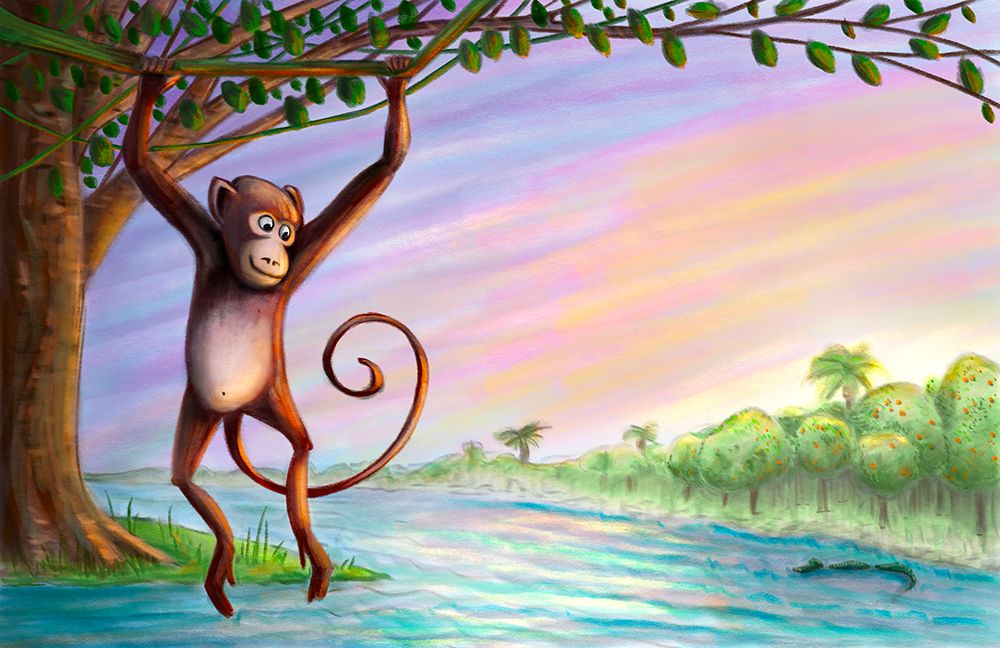
Alrighty, I went ahead with Option B and gave it color and I removed the text. I figure it's pretty clear there's room specifically for text, and as Illustrator I wouldn't be formatting that anyway. Anything stand out as weird/confusing/distracting/needs marked improvement?
I didn't add the rich textures I was contemplating, and I think now it would destroy everything. I fell in love with the smudgy pencil brush I mentioned earlier, and it's too tight to go looser now (which is inevitably what always seems to happen in my work process). I know Lee likes to purposefully "destroy" things when they get to a certain point in his process, but I'm too chicken to do that. LOL!
I'm thinking about doing Option A just to try to incorporate layered textures similar to Pamela Zagarenski's work, which I have always admired.
Children's Illustration Portfolio: https://www.coreyartusillustration.com
Art Portfolio: https://www.coreyartusimagery.com
Mastodon: https://mindly.social/@Coreyartus
Pixelfed: https://pixelfed.social/Coreyartus -
@Coreyartus i love the second one. My one suggestion is to bring Clyde closer to Bongo.
-
Hi @Coreyartus, this looks really nice! Love the color palette and POV!
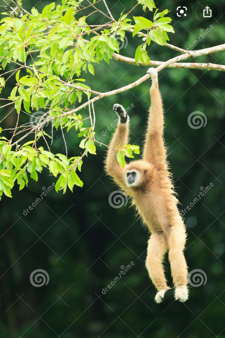
Take it or leave it, but the bending branch feels a bit off, like it’s a curtain or tight rope. I can’t help but to keep looking at the way it’s bending. Maybe it’s a vine, not branch? Also, the monkey’s hands look a bit small.
I have pasted a stock image of a monkey hanging from a branch as an example.
Again, it’s an awesome image and feel free to ignore.
-
@Nyrryl-Cadiz Hm. If I pull Clyde in closer, I feel like that makes him a more active and present element in the image, and I feel like that would require a much more substantial compositional change. I had intended him to be in the background, lurking near the orange trees, but pulling him closer would shift him into the middle ground and the middle of the river, and might imply he's moving forward toward Bongo. Do you think that's a stronger choice?
@Jeremy-Ross Ah, I see--I need to make the vines look more like vines and differentiate them from the tree branches a bit more. He's supposed to be hanging from a vine, not a branch. If that's confusing it will look weird, you're right. Thanks!
Children's Illustration Portfolio: https://www.coreyartusillustration.com
Art Portfolio: https://www.coreyartusimagery.com
Mastodon: https://mindly.social/@Coreyartus
Pixelfed: https://pixelfed.social/Coreyartus -
@Coreyartus This is such a fun illustration - Bongo looks great hanging from the vine. I'm just wondering what he is looking at? Maybe if Clyde comes closer, his gaze will be directed at him? Overall I think it's a great composition and color palette (and Bongo really is so adorable - I'm rooting for him to get one of those oranges!)
-
@Coreyartus hi! Yeah, It makes him more of a threat.
-
Ok, I made these improvements--Thanks so much, everybody!! Clyde makes more of a comically cute statement now, and I made the vines look more like vines and increased the scale of Bongo's hands. I also added a texture overlay which bumped up the intensity of the colors a bit.
In the process of making these changes I started to develop some questions I hope some of the folks here can help answer. I'm not sure there are actual answers...
Is choosing the moments in a story to illustrate normally the purview of an Illustrator? I would think Art Directors/Editors would have very specific ideas regarding which moments of stories they want illustrated. I'm asking because I simply don't know--I've never worked with an Art Director of any type of children's publication. Most of the Art Director discussion panels I've seen and workshops I've attended through my local SCBWI seem to be with ADs that are incredibly specific about what they've directed their Illustrators to do... One AD from one of the "Big Five" even took selfies, which she would then email the illustrator saying "I want the expression on her face to look like this," and had the Illustrators compose imagery around text that was already formatted on the page (she called it a galley sheet). I can't imagine they'd just let Illustrators choose which parts of a story to illustrate.
@Nyrryl-Cadiz's simple suggestion of pulling Clyde closer to make him more threatening really made me think about what purpose this illustration was serving in the telling of the story, and it made me wonder if that was the kind of question an Illustrator is even allowed to answer... What kinds of parameters are Illustrators given on a projects like this, normally? If I was an AD for a magazine and needed a single illustration for a specific story, do I normally let an Illustrator choose which moments to illustrate? Does it depend on the AD? The publication? The project?
I'm curious, because I've seen illustrations that don't necessarily articulate specific moments of a story, but capture the emotional essence of the characters involved, much more similar to the monthly "word prompts" we normally receive. This is a nice change of pace this month, and to be honest I'm completely thrown. LOL!
Children's Illustration Portfolio: https://www.coreyartusillustration.com
Art Portfolio: https://www.coreyartusimagery.com
Mastodon: https://mindly.social/@Coreyartus
Pixelfed: https://pixelfed.social/Coreyartus -
@Coreyartus Beautiful! It feels like a very hopeful image.
-
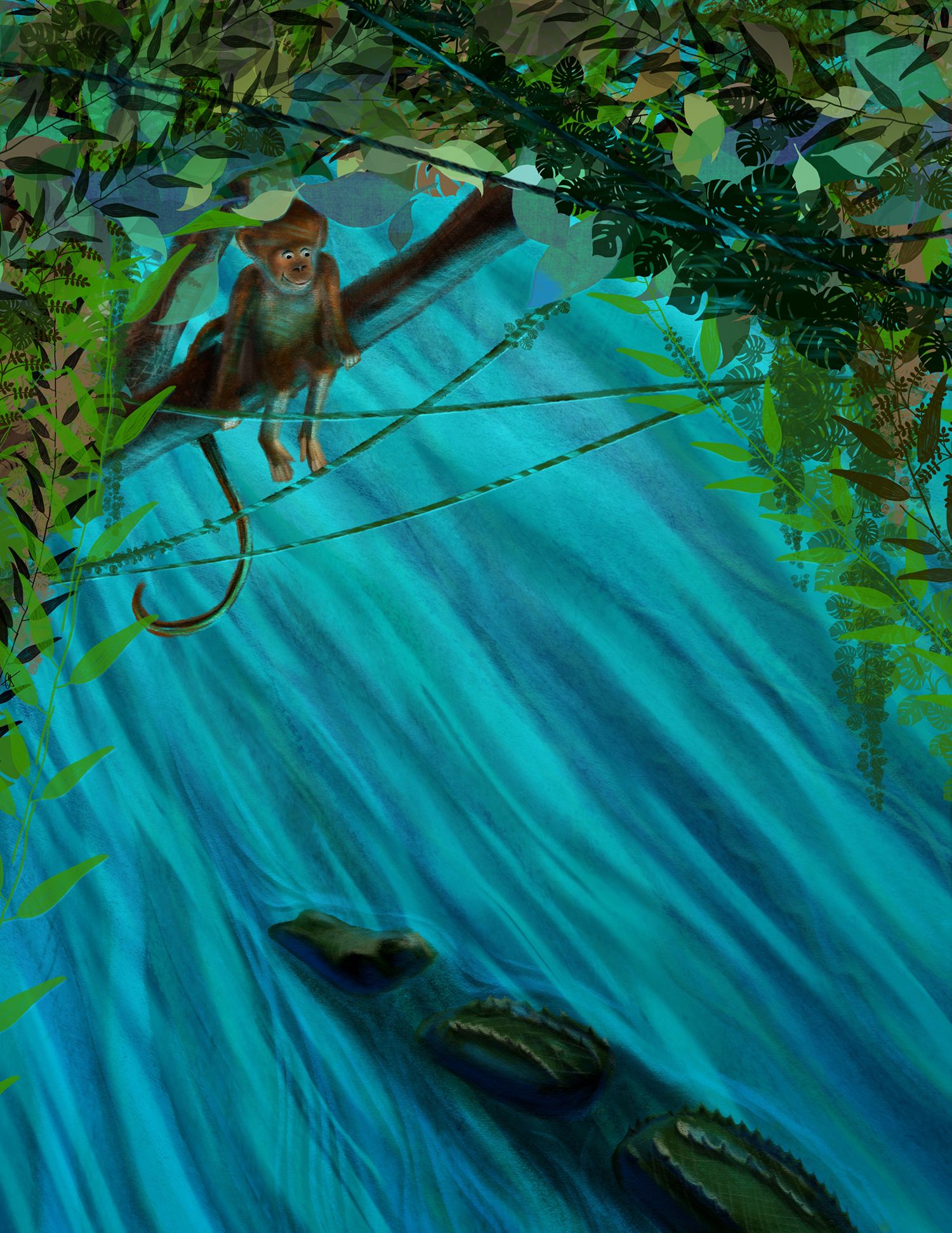
Used the prompt to play with some other features, too. This one isn't as "kidlitart" oriented, and doesn't have much to do with the original prompt, but it was fun to play with!
Children's Illustration Portfolio: https://www.coreyartusillustration.com
Art Portfolio: https://www.coreyartusimagery.com
Mastodon: https://mindly.social/@Coreyartus
Pixelfed: https://pixelfed.social/Coreyartus -
@Coreyartus, might be a curve ball, but I like this one better for the prompt...
-
@Coreyartus I love how you handled the leaves! Great colors~ and I feel like you had more fun with this one than the other one. I don’t think it’s any less “kidlit” than your first one. It’s an awesome image! Love that you’re experimenting and having fun with it!

-
@Coreyartus I really like the first one because of the color palette and an obvious space for the text placement.
The second one is great because of the perspective! I love the collage of leaves. I do feel the whole piece is a little dark though. Maybe try lightening it up a little?
Great to see you having fun with the prompt!
-
@Jeremy-Ross , @aprilshin , @Neha-Rawat I enjoyed making both of them in different ways, but I'm more confident in the first being more appropriate to the challenge than the second. The tone of the short story doesn't gel with the second image I drew. It may be more visually interesting, but the short story seems to hinge so much on Bongo's confident fearlessness and wit (bordering on arrogance) that I feel like the second image just doesn't apply... The second image has more of a Jungle Book-vibe that speaks to danger a bit more. I don't ever feel Bongo is in much actual danger in the short story prompt--in fact, it seems he knew what he was doing all along...