Lone Wolves vote
-

As promised I am back with some clearly labelled compositions for voting. Keep in mind that you can also make suggestions for which versions of the animals you like best, to be included in any version. But my main goal today is to choose a basic composition--horizontal, square, vertical, and how the scene is positioned within that format. One of my main concerns is that with all these windows I may just have too much going on. Thank you!
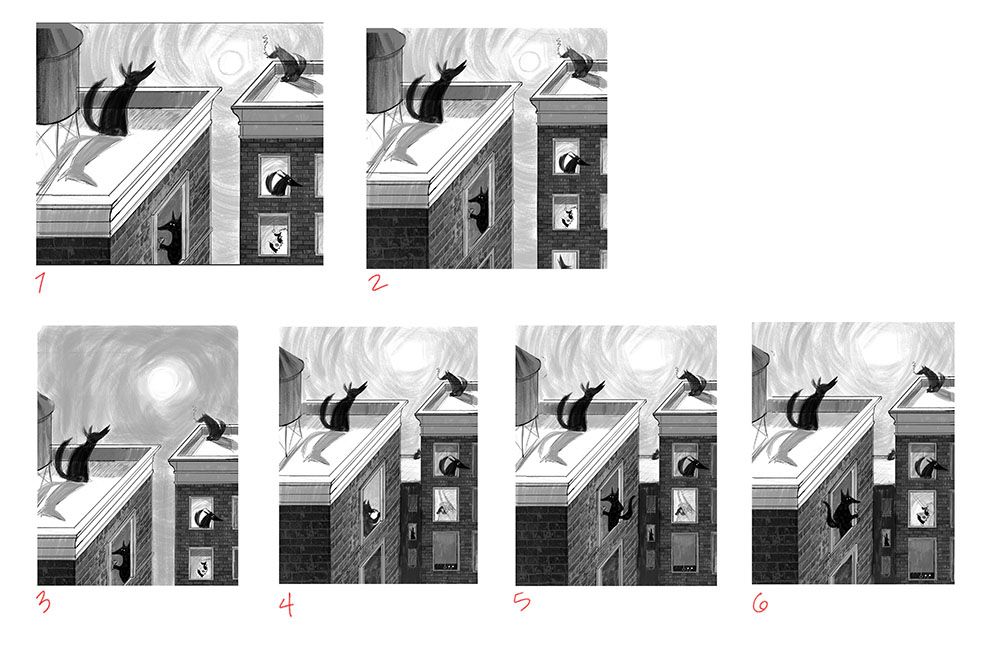
1 The original composition, 8.5 x 11 horizontal
2 The same composition but in a square format
3 An 8.5 x 11 vertical version that has more sky
4 A vertical version that has more building, one added in the back, the sheep looking out the window, and a wolf reading from an iPad
5 The same but with the wolf drinking wine and turned away from the scene (isolating himself)
6 The same but with the drinking wolf facing the sheep, who is reading. This one is also zoomed in a little.
I tried to make a poll but it didn't work!
-
@LauraA – Nice compositions! I think I prefer the square crop (2), with the window cut off at the bottom, since it's a little more natural to not have the windows aligned too much with the frame.
To avoid the wolf in the skewed window (on the front building) looking flat, it would definitely help to make him break the window frame, like you do in 5 and 6... :-]
-
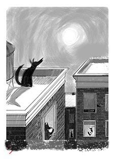
I like a blend of #3 and #4 the best! I made a small draw-over with the the basic composition of #3 with a few small tweaks:
-
I removed the wolf smoking on the right side because I felt that he/she was competing for attention with the main wolf on the left side.
-
I added the extra building in the middle because I feel like it helps direct the viewer's eyes up to the main character. The high contrast in the gap (without the added building) made my eyes go to the gap and then follow it straight down off the page.
-
I replaced the wolf on the top right window with the window from #4 with the blinds pulled down. I wanted the main wolf to be the only one outside while all the other characters were inside in order to solidify the idea of isolation.
-
I extended the buildings at the bottom of the image because I felt like the left window needed a little more breathing room.

These are just my two cents! I love seeing your process!

-
-
I like the square format Better for some reason. Maybe it's less broken up in halves? ( Along a diagonal across the composition if that makes sense?).
I like the last three best for the wolves but I think Chip mentioned in another thread about having them facing in? That seems good to me. I don't mind the wolf at the laptop tho .
I really like this! It's a fun concept. The howling wolves that show they're wolves as well as the human qualities of them is a fun mix. -
I guess some of these choices depend on whether the story is primarily about the wolves being "lone" or the sheep being prey. It's both, but I think the first read should be about the character of the wolves. I have the wolves facing away from each other so they look more like they're all in their own worlds. They try to adopt human habits, but like you say, @Elena-Marengoni and @Coley , their thin veneer of civilization is mostly limited to wine and cigarettes
 .
.I've had a lot of different opinions about whether the windows should be cut off or not, or where the roof lines should hit, and that's where most of my confusion is coming from, I think. My compromise is darkening some of the windows. I'm still not sure about the roof/sky proportions. Although I was very fond of that wolf looking out the window @aprilshin, I think I like the eyes up there better! As for the wolf on the other facing roof, I'll have to take a look at that again, but I can always put him on a separate layer and try different variations.
Thanks for all your help, guys! I think I can start a final version now and perhaps I'll make it extra big so I can crop it how I want.
-
@LauraA Hi Laura - I initially thought I still liked number 2 the best although I like the additional building and the little wolf on the roof in the background balances the image nicely. I like the wolf looking at the sheep too so I'd probably opt for number 6 now. Hope this helps!
-
@LauraA You could make any of these thumbnails work. A total winner concept, love it. I agree with @aprilshin's draw-over, it would make more sense ot have one wolf on the roof if you want to emphasis the "Lone wolf" concept :-).