Isolation WIP update
-


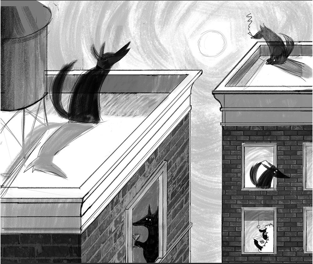
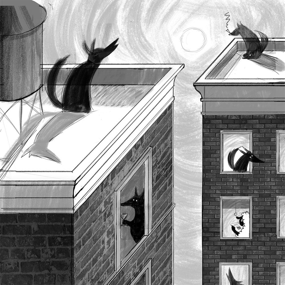
I have been proliferating too many versions with wolves in different positions and so I'm trying to make some fundamental decisions and move on.
-
8.5 x 11 or square?
-
How does the isolation aspect read to you? Is there enough storytelling and is it clear?
-
These aren't necessarily the final character sketches, and I also hope to add architectural elements and loosen up my rendering of the buildings, but do you see any glaring errors?
Thank you!
-
-
@LauraA I really love this - I would say:
- perhaps the 8.5 by 11 because you get the extra wolf howling at the bottom
- I think the isolation aspect reads well, it's much like what was (and still is) actually going on for most people during confinement. I particularly like the humour of the sheep in in the midst of all the wolves and the wolf smoking on the roof - the animals all have good character
- I can't see anything technically wrong myself although I'm maybe not the best person to judge.
I love your sketch so far and can't wait to see what you do with it.
I just have a question - did you work on this in Photoshop and will your final piece be created in Photoshop too? I'm interested in seeing how people work. I've been doing most of my initial thumbnails and sketches traditionally for now and I think it's making these phases really hard work and difficult to get right. That said, I don't have much experience of Photoshop and can't get the up-to-date version on my Mac, but I'm thinking perhaps the Ipad could be a good alternative...
rachel-horne.com
@rachel_horne_art -
@Rachel-Horne It's Photoshop all the way down! This creates its own problems, as I tend to proliferate versions and spend too much time looking for layer x, but it also allows me to proliferate them in the first place, i.e. "I wonder what this would look like with the wolf over there, flipped?" That said, I would like to move back into a process at some point that is at least partially traditional!
I am also interested in Procreate on an iPad, but can't justify that expense just now.
Also, I think you're actually voting for the square? That's the one with the extra howling wolf. Thanks especially for the feedback on the concept/storytelling aspect!
-
I love this concept so much!!
I think the square one is a bit stronger - I'm not the biggest fan of the very bottom window being cut off in the 8.5x11 version. It looks a lot like it was originally intended for the square. If you want to go for 8.5x11 I think it would be better if you rearranged some things to make it flow better.
((I'm up WAY too late so let me know if none of that made sense/you'd like me to elaborate)
-
Wait, I'm getting confused! Just for clarity, the square version is the one with the howling wolf at the bottom, cut off. The 8.5. x 11 version is the one with the sheep at the bottom, not cut off.
-
@LauraA I think you can edit the first thread and repost your 2 images and mark them "A" and "B" and put them side to side so that it's easier to compare and vote.
-
@LauraAuppose I'm not an expert on Photoshop but I don't think you're missing out with the ipad and procreate if you're able to use Photoshop, it's maybe a little bit more convenient and easier to use? I prefer working traditionally too.
I did mean the square then, the one with the wolf in the bottom right window. It's hard to see the difference in size on the screen and oddly the other one looks more square on mine!
-
I'll be back later with some clear, redone images and do a poll...
-
@LauraA I like the 8.5x11 and my only comment would be to flip the wolves that are looking out of the image so they are all looking in. But that's really not a big deal.
-
I actually like both formats, but I am thinking whether zooming out a bit would help the composition 'breathe' a little more.
As for the story, I like that there's an isolation theme going on with the wolves (the proverbial lone wolf who's highly prone to all sorts of vices like cigars and cocktails
 ) and then there's a little harmless sheep, who's even more isolated, cause interacting with the neighbors isn't really an option
  I wonder if the sheep could maybe be hiding a little more (behind the curtain?) and I agree that having the wolves all looking in could help. In that case, the threat posed to the sheep would become even more evident.
Anyways...Lovely concept!! Can't wait to see it finished!
-
@Elena-Marengoni I like your hiding sheep idea! I already darkened him a little in my latest version.
-
I started a new thread here with clear choices and a vote.