Simple composition changes for a much improved sketch
-
Hi everyone

My agency is re-doing their website and they're requesting a new illustration from all their artists to act as a sort of header for each portfolio. Having been busy with client work, I don't HAVE a new illustration made in the last 3 months that's not client work hahaha.. So I have to make a new one. Since time is short, I went fishing in my sketch folder and found a draft for a Red Riding Hood illustration I made about 2 years ago.
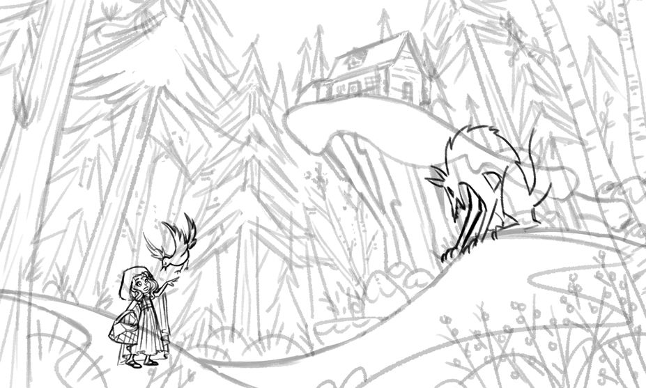
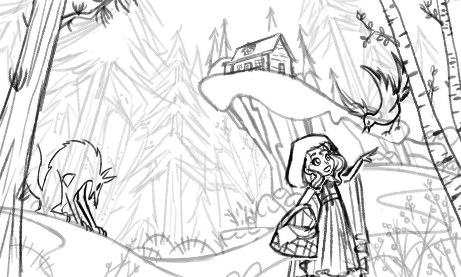
This was right before I started freelancing full-time and I didn't have any children book experience at the time. My agent looked over the sketch and suggested some composition changes that MUCH improved the illustration! I thought that was really interesting and wanted to share. It's making me think about what I've learned in the past 2 years about what works best for compositions specifically for children's books. The original composition wasn't really wrong per say, but the second one puts more emphasis on the main character and the simple reversal of the wolf and the girl gives more narrative to the illustration, because it now looks more like he's stalking her. It took less than 5 minutes to make the changes that my agent requested and the improvement is stark!
If you see anything else that could be improved, I would love to hear your advice! I'm all pumped to make this the best I can possibly make it

Original sketch:

Tweaks:

-
@NessIllustration Ok this is me in super-picky and somewhat useless feedback mode:
The stance of the wolf, previously looking down at her, might be better at an angle, or higher. The over-arched back isn't slinky, like I would expect from a predator low on the ground.
The bird's tail isn't quite behind the tree, but isn't quite showing.
The bird's legs could be reaching for her. Maybe one can be moved forward, open, and about to take hold, and the other can be clutched and held back for contrast.
Edited to add: Hide her skirt hem, so that the hem of the cape squiggles to the edge of the image.
I can't wait to see what it looks like. Feel free to to ignore all comments here to finish as fast as possible so that I can see the final

-
@carolinebautista Picky is good! I'll take all your comments to heart and seriously give them thought, thank you!
 I totally agree about the tangents for the bird's tail and her dress hem, you're so right! For the bird legs it's something to consider, although it's subtle and I'm not sure would make a significant difference... I'll probably try it out and see. I'm more hesitant for the wolf, because although I totally get what you mean about being lower to the ground, more stalking, I really wanted him to be looming and intimidating so I do really like the pose now
  I'll try it out and see! Thank you so much for your great advice, hun!
 -
@gavpartridge Oh that's a good point, it looks okay now but when I go to color might have to clear out some of those trees so the wolf stands out enough. Thank you Gav!
-
@NessIllustration Yeah, I wouldn't change the pose! And I wouldn't want to put the wolf higher either, because I like the composition so much. But I wonder if angling the wolf slightly forward might help. If it were my drawing, I'd probably angle it forward, and then rotate it right back

-
@carolinebautista I will try that, thank you for the suggestion!


-
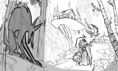
@NessIllustration This is already soooo good I feel terrible suggesting you change anything, but if this were my piece I would try and hide the wolf. Once her clothes are colored red everyone will know the story and instinctively look for the wolf. I think it will be more engaging if he is hidden.
Think of Steven Speilberg "monster" movies. You don't ever get a good look at the monster (alien, dinosaur, shark, etc...) until the movie is half over because it is scarier to let your imagination run wild.
Maybe only show his glowing red eyes from within the trees in the back ground. Or his tail or a claw sticking out from behind the tree in the foreground. Footprints and broken branches might be enough to suggest the wolf is near.
Now that I've completely suggested to change the entire composition of your piece...please feel free to ignore my ramblings. Good luck on this one and please let us know when we can see the finished illustration.


-
Hi @NessIllustration, your agent is spot on. Just wondering if you could stealth the wolf a little more? Right now I think Red would easily spot the wolf, or at minimum, the bird would. Maybe add a few more trees or a rock in the same shape as the wolf?
Also, I think it would be interesting to draw a chimney and have some smoke coming out of the chimney to the sky. Just a thought.
Can’t wait to see the finished piece! Love your work!
-
Wow, that's such a dramatic difference! Thanks for sharing. I love the flow of the ground, leading all the way up to the house.
-
@NessIllustration looks awesome! only thing i could think of was maybe vary the scale between little red and the wolf by bringing the wolf into the foreground. I'm sure it will look great no matter what you come up with


-
@j-sienkowski LOLLL no no, I'll definitely give this serious thought haha! It's a very interesting suggestion and you make very good points. My instinct is always to try and emphasized the important elements so it definitely feels against the grain to me to try hide a character on purpose haha.. However it makes sense in the context of this particular story. @Jeremy-Ross also mentions the wolf should be a bit more hidden so that Red can't easily spot him. I wonder if I should put him behind the tree he's currently in front of. Do you think that might be hidden enough, yet obvious enough?
@baileymvidler Thanks Bailey, the advice I received from my agent was really spot on and made a big difference!
@Kevin-Longueil That's an interesting idea! Whereas the others suggested I hide the wolf more, you suggested the opposite: put all the emphasis on the wolf instead. This is an original solution and I think works just as well! However I think I do personally want the focus to be on Red as the main character, and the wolf be a still hidden looming threat, not quite yet entering the story. Thanks for your suggestion, you've given me lots to think about! It really goes to show how there are so many possible solution to each illustration we make.
-
Wow, what a difference! And such a great image! My only two cents is that the bird looks very big. It looks like the size of a large bird of prey instead of a tiny bird that might rest on her finger. Love your character designs, though! Your shapes really convey the right emotions!
 ️
️ -
@NessIllustration this is maybe due to inexperience on my part but I think it's pretty much fine just the way it is. I like the fact that we can see the wolf in that sinister pose, maybe he could be just a tad further back but nothing much and I also agree that maybe the bird is a little large and the dress-hem comment but I really like the composition a lot, it's got a lovely flow to it.
-
@NessIllustration another composition that remind me yours and you may find interesting : the cover of the mitaines gang by a French illustrator
https://www.izneo.com/fr/bd/action-aventure/the-mitaines-gang-31462/the-mitaines-gang-1-a-bear-s-tale-74540 -
@aprilshin Thank you for your insight! You are quite right about the bird, I think I will revise it.
@Rachel-Horne Thank you for giving me your thoughts on it, dear!

@Julia Wow quelle jolie couverture! J'aime beaucoup l'ombre du sapin qui se transforme en loup, comme c'est original!
-
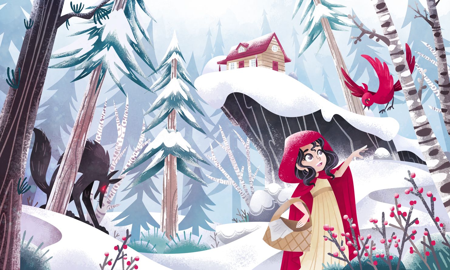
Pheeew it took me a while to find this post again haha! I finally finished this piece and wanted to show you how it turned out
 Thank you so so much everyone for your help!
-
@NessIllustration Really nice!!
-
@NessIllustration So good!
-
Thanks guys!
-
@NessIllustration lovely!