Isolation WIP - therapeutic process
-
Hi everyone,
This month’s topic evokes some deep stuff for me, so I’ve been working on this as a way to decompress. The process so far has been kind of random, but I’m mostly working on this for the purpose of thinking through the topic, so I don’t mind.
") I’d appreciate feedback so that I can learn from the expertise that you all have. Thanks for taking the time to look.
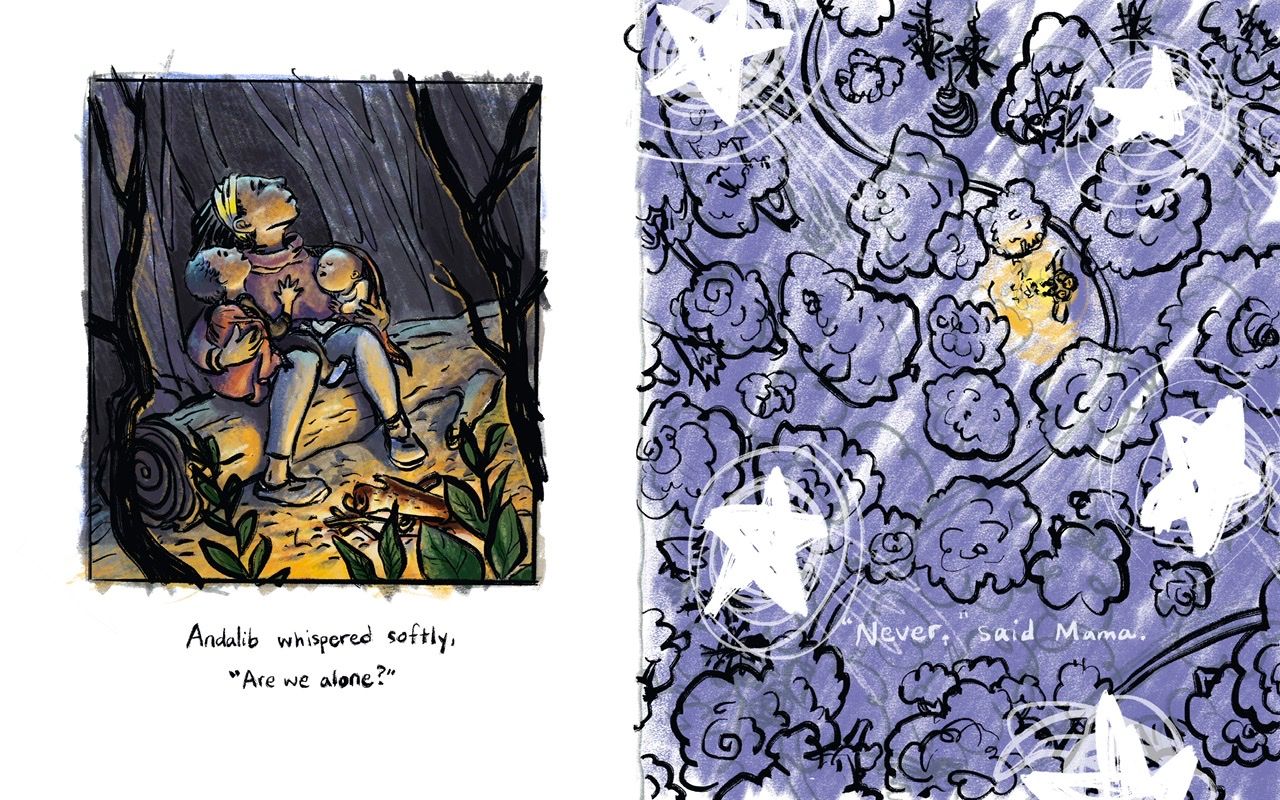
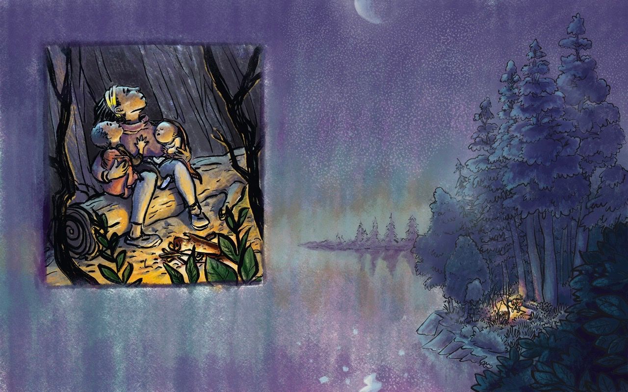
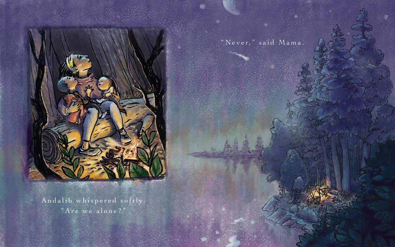
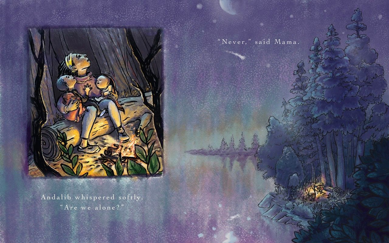
I’d appreciate feedback so that I can learn from the expertise that you all have. Thanks for taking the time to look.The idea is that this could be a book spread... the mom and children are on the left and an aerial view of the same scene is on the right. It shows the forest that they’re in and their little camp fire. Shooting stars are overhead. The intended vibe is cold but hopeful, maybe a little scary but safe.
Some things I struggle with are colors, line work and the way that light falls on faces.
-
Wow, this is powerful! I don't know what your situation is, but I agree with you that the isolation from the pandemic is a little too intense to process still, especially if it's combined with personal situations. You seem to have done a great job!
And yes, I see this as a spread, with both parts necessary. I think the lighting looks good on the closeup. Trying to decide whether the cast shadows need to be darker, but maybe not. The aerial view is less developed, but I suppose that in the aerial view it will eventually have more shadows under the trees.
Great start!
-
Hi Kathryn! Really lovely pieces~ You're really great at evoking emotion from your artwork, which is tough to do, so great work!
In terms of feedback, I feel like you have a great handle on lighting in the first one although I would like to see more actual fire in the logs. The aerial view was hard for me to understand. At first I thought it was a view of the sky with clouds, but the orange part made me realize that we're looking down at the main characters. I think the stars threw me off because we normally don't see stars from that POV. I would suggest making it more abstract if you want to include the stars with that POV, or make the POV slightly angled so that we can see part of the sky with the stars.
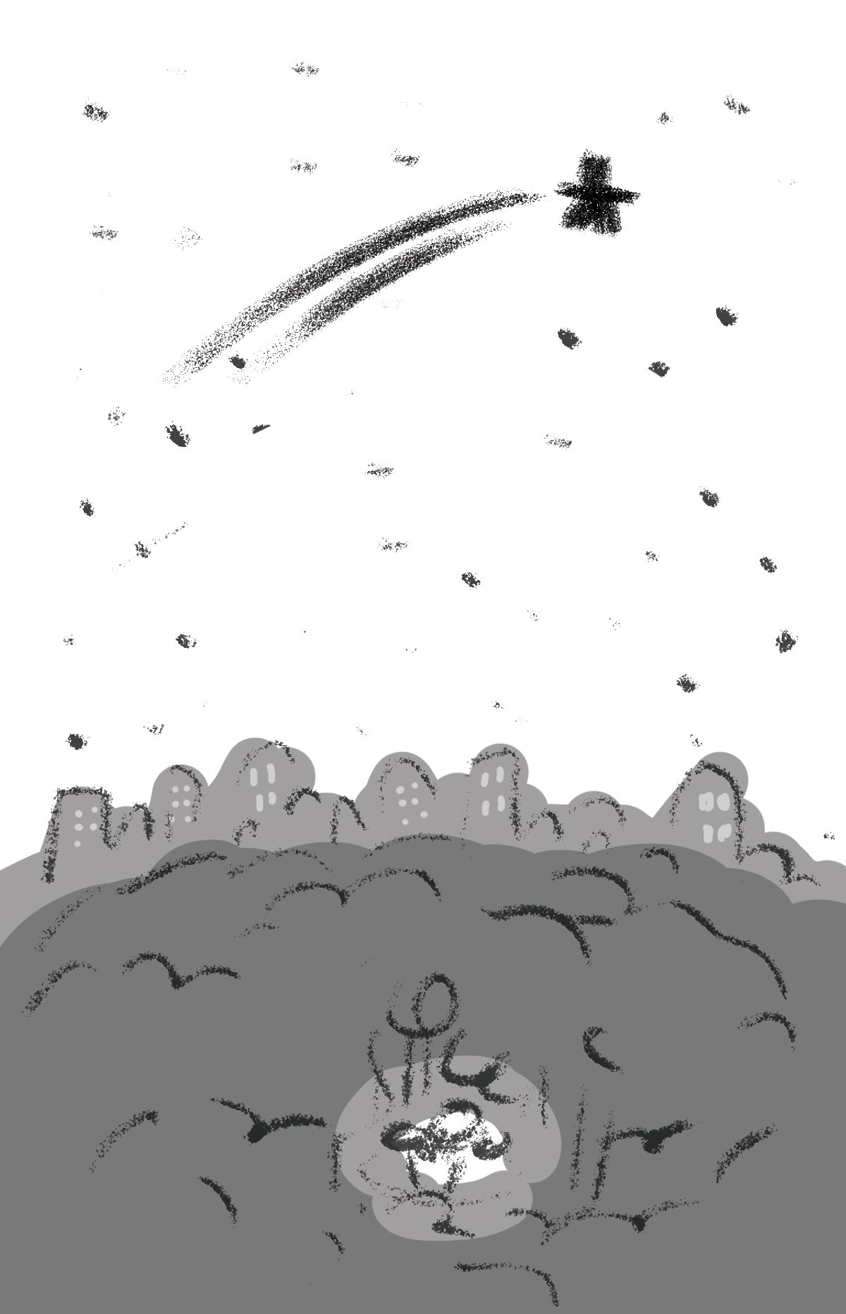
I don't know if you can tell what I hastily drew here, haha. But the white is the sky, then there's a skyline of buildings, then the forest, and in the center is a glow with the 3 main characters.
For the linework, your lines seem to be really thick in some places, but I feel like your style would go really well with thin, delicate lines. Try experimenting with different line thicknesses to see what you like best!
As with all advice, take what you need and discard the rest! We're all learning the same as you, so my advice may or may not be helpful, haha. Great work, though! Good luck on the contest, and I hope to see your work in the critique arena!

-
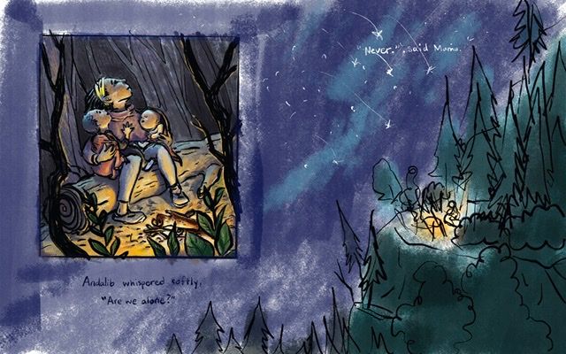
@KathrynAdebayo I wonder how it might change if the aerial view was actually spread out over the two pages, with the mother and her children in a floating panel on top of the forest illustration where it is on the left. That kind of close-to-far perspective mechanism is common in comic spreads where the scale of the full spread is important to show over two pages and we get that impact of size, but a floating panel over part of the spread draws our attention to much more specific and intimate moments that are either happening concurrently or moments before or in different locations...
I would think the same thing has been done in children's illustration to hide the gutter in the middle. It could be done with a gentle gradation from left to right as the spread becomes less and less transparent, or a shift in hue or value or contrast... Just a thought.
-
@LauraA Hi Laura, great to hear from you. Thank you very much for the feedback. I hope your own situation during these times is safe and that whatever challenges arise lead to greater victories.
@aprilshin Hello! Thank you so much for the amazing advice and for taking the time to sketch out your idea. It has been very helpful to think through what you wrote and try to apply it. I agree that it would be better to see part of the sky, so I gave that a try.
@Coreyartus Hi! Thank you for the very valuable feedback. I really like the idea that you shared about trying to make the spread less boxy and have the two parts of the illustration overlay somehow. I gave it a try, but I’m not sure if I like what came out of this first attempt. Any thoughts?
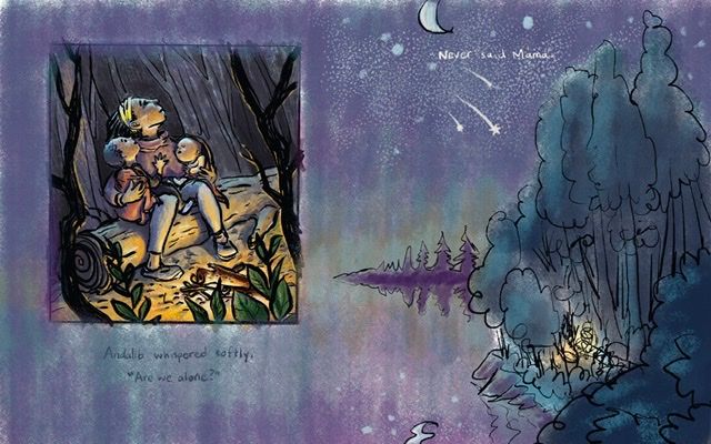
Here are two new options...
A.
B.
-
Oh, wow, I'm really loving both of those, B especially. I especially love the watercolor sketchiness of the vista of the water--it's like the sky and the sea are one thing. To me, that's gorgeous. I would love to see what you do beyond the sketch. The lighting and angle are so much stronger in that composition than your previous one--it really pulls the viewer in. Seeing the scale of the trees helps to make them feel smaller and more isolated. Lovely!!!
Maybe push the panel a bit more into the upper left corner and make it smaller? I dunno... That starts to make it look more "comic-bookey" in some way, though. Maybe the frame of the panel itself with the hard line is what's making it feel that way? It's very defined. Are there other ways to "frame" a "vignette" like that? Just throwin' out ideas here...
If this isn't a mechanism you feel comfy with, then it simply doesn't work for ya--but I gotta say I'm personally really connecting to it so far. I know it's a sketch but using the watercolor so loosely really takes us from the crisp definitions of reality with the mom and her kids to the soft majestic fuzziness all around them that they are connected to. I love that choice. I can't wait to see what you do with it regardless of where that is!
Children's Illustration Portfolio: https://www.coreyartusillustration.com
Art Portfolio: https://www.coreyartusimagery.com
Mastodon: https://mindly.social/@Coreyartus
Pixelfed: https://pixelfed.social/Coreyartus -
@Coreyartus Oh man, thanks for your feedback. This is going to be way better than it would have been if I had just gone with the initial idea. I'm glad to get your reaction to the second one... I think it's growing on me too. I like the water/sky oneness as well. Now I wish I had done that color study with layers! It's all one layer and i feel like I'm going to mess up the sky effect if I change it.
Thinking of trying to keep the image on the right softer and looser like you mentioned...Does anyone have other ideas about how to overlay the left image in a graceful way? I agree that the line around the edge is questionable.
Thanks again for the help!
-
@KathrynAdebayo THis is really looking great! I love what you did with the watercolor and the palette.
-
@chrisaakins Thanks, Chris! Any advice?
I've been watching your thread and like the piece you're doing this month! It looks great, and flipping the image really highlighted your main character and the nice lighting you have in the scene.
-
I like both A & B. I think the design of having the image overlay the background image is working.
Painting the two images with the same style/medium/techniques will help tie them together & reinforce the concept.
@Coreyartus mentioned vignette. I think the straight lines of the rectangle would set off the image without the dark line around it--especially since you've done a good job framing within the illustration with the dark branches and foliage. The light "shadow" around the rectangle helps too--maybe just add more of the white around the sides? (But I like how it's varied & fuzzy/blended, so I wouldn't make it solid.)
-
@KathrynAdebayo I like the lake better than the mountain but both are lovely. I really love your line work in the characters and they look finished. I think you biggest challenge will be to render the large spread in a way that complements your small picture. I would simplify your lines in the forest and/or use a lighter shade rather than full black for linework. It creates the illusion of space. Keep your detail for the figures rather than the shrubbery because they are getting lost.
-
This is such a lovely concept. I got goose bumps! Can't wait to see it progress.
Website: www.tessawrathall.com
Instagram: www.instagram.com/tessawrathall_art/
-
@Miriam Hi Miriam, thanks so much for your advice. I took to heart what you said about making the two parts of the illustration seem cohesive, and I hope it’s working well, but please feel free to let me know what you think.
-
@chrisaakins Wow, thanks so much for your valuable advice. I tried to make the characters on the right stand out and more detailed, but the line work in the trees did end up getting really busy... hmm... Do you think it's too distracting? Thanks so much for the advice about making the larger picture compliment the smaller one. Now that I've worked on the zoomed out image for a while, I feel like I might need to go back into the smaller one and tighten things up a bit. Thanks again for taking the time to comment.
-
-
Here’s where it stands now...
-
@KathrynAdebayo It's really beautiful
-
Thanks to the good advice given here, I thinned some of the line work on the image on the left and added flames to the fire.
Any advice at this point?
-
Well, after a few days of letting this sit and making some minor changes... maybe it’s done? Any other feedback or suggestions that could improve the overall feel? Thanks for the help so far guys.
-
@KathrynAdebayo Wow! That looks beautiful! I love your use of colors! Also, I think the shooting star placed under "Never" has a nice effect.